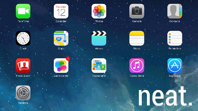
After months of drooling over flat icons and clean lines, I’ve finally gotten my hands on iOS 7. Let’s take a look at 10 fresh features of the revamped operating system, from essential changes to the just plain neat. For instance, the new default wallpaper is an illusion. Ooooo.
1. The New Default Wallpaper Is An Illusion
Did I mention the new default wallpaper is an illusion? Are the apps moving, or the stars? I played it for 10 minutes. I need a hobby.
2. Game Center Has Less Felt, More Feeling
Seriously, what was with the green felt?
3. Apps Open From Icons, And Return From Whence They Came
We’ll stop noticing within a week of the iOS launching, but for now it’s the best thing ever.
4. Folders Are Their Own Little World
At any given time (when I haven’t recently reset my iPad to load a new OS), I have at least 50 apps loaded on my iPad. Putting them into folders was an ugly task. Now it’s pretty. I still won’t remember to put them into folders, but if I did, wow.
5. No More App Loading Bars
Bars are so late 2000s. They’re out. Circles are the new bars.
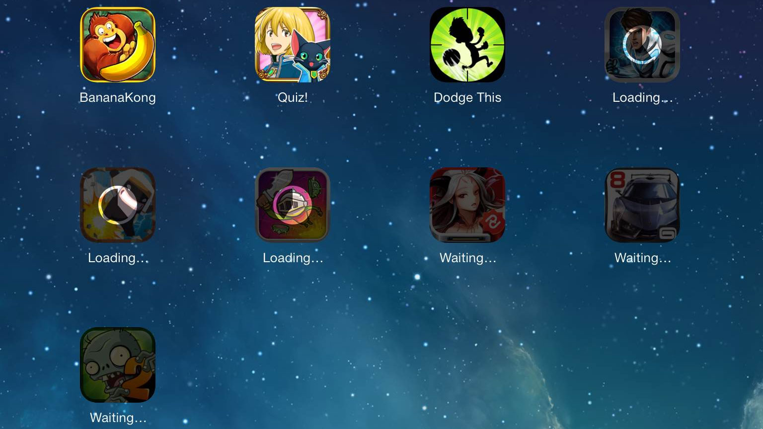
Circles, ladies and gentlemen.
6. iPhone Photo Hoarders Have It So Much Easier Now
Not just an excuse to have a photo of my child on the internet — I need no excuse for that. This new functionality makes me want to load every photo on my PC onto my iPad, just to see them organised.
7. Multitasking Is Much More Android
Considering the number of games I play on my iPad on a weekly basis, the ability to easily close programs is pretty important. iOS 7 makes it kind of fun. Sorta.
8. The Soothing Sounds Of iTunes Radio
I am old. Keeping up with music is a chore. So is downloading any of the dozen apps that already do what iTunes radio does. Get off my lawn.
9. Death To The Search Your iDevice Screen
You’re four pages into your iPhone or iPad and suddenly you have to get to the Settings menu. You rapidly swipe and end up on the damn search screen. Screw that. The search screen is dead.
10. Controller Support
You can’t see it yet, but it’s in there. It will be like a beautiful swan or something. Here’s a picture of a swan.

These 10 things are just the tip of the iOSberg. Find out for yourself when iOS 7 launches on September 18, or just cheat like I did.
Comments
40 responses to “Check Out 10 iOS 7 Features That Will Make Everything Better”
One thing I’d really love to have is the ability to grab any setting and create a shortcut icon for it on the home screen. I have to always turn my VPN on and it would be great if I could create an icon for that toggle and stick it next to my Netflix icon 🙂
It supports per app vpn!
Nice, but none of these will help the Safari icon not look ridiculous.
Instead you now have the search bar that you sometimes swipe down by mistake.
I’ve been using this for a while now and it’s got some nice features.
But still no ‘kill all apps’ feature. 🙁
But I like clicking all the red circles!
No more circles now for you young man!
You swipe the image of the app up to kill it. It’s actually slower to kill all the apps this way I found. Form over function in this case.
“Form over function in this case”
From my experience with my (still current) iPhone 4, form over function was at the core of a lot of iPhone/iOS design ?
There’s a little bit of that. But you end up getting used to it.
I do like their, not sure what it’s called now, ‘menu’. Swipe from the bottom and you get shortcuts like the airplane mode, wifi, calculator, etc.
In the new app-switching mode you can grab all 3 (or just 2) visible apps and drag them up to close all at the same time. If you want to stick to the old way I’ll race you any time 😛
Yeah, I like that google-esk design as well 😀
where’s the icon to make phone calls gone? I would like to see that on a mobile phone
(it’s called an iPod Touch)
Shhhhh, don’t tell him!
it’s been far too long since I’ve had a separate MP3 player to my phone 😛
For some unknown reason I still use my old iPod. Probably because it has the same music loaded on it that I haven’t changed since 2005!
…in all the pics/vids above? pretty sure that’s an ipad.
The way the multitasking display and “swipe up to close apps” appear to work is very much how webOS does it on the now defunct HP Touchpad (aside from needing a two finger swipe rather than single). That really was a very natural feeling part of the webOS interface so its nice to see Apple liked it enough to pilfer it (maybe Android did it first, Im not sure really).
Android has had the swipe to left or right to kill an app, instead of up/down
In landscape mode, you swipe up/down.
As an avid hater and reluctant technical supporter of idevices, I do have to say that removing the search screen sucks. I support iPhone’s at work and don’t have the damn time to search through pages of crap to find the 1 app that I have to support. Swiping over to the search screen saves me so much time. It was the 1 feature of iOS that I actually liked and now it’s gone…
You obviously haven’t looked into the matter, now you can swipe down from the top and a search bar will appear from whichever home screen you’re on.
Unfortunately if you don’t watch the video the article basically says “search is gone”. I can see where he is coming from, he may have these particular videos blocked at his workplace. I also agree with you, he should do more research into the matter.
Frankly I think EVERYONE should do more research into iOS7, most people (especially people who love to bash Apple) rant about how it’s nothing more than a facelift, and you sort of stand to one side watching and thinking “No… no, you… you don’t get it… you obviously haven’t looked into it… at least understand something fully before you decide to hate it.”
I’m kinda torn. I hate the “facelift” but I love everything else! Grrrr!
Closing an app on the iPhone by pushing it up and away feels like a gimmick. I’d prefer if the old method was still applicable on top of the new preview pane layout TBH.
Be careful doing this – apps built for iOS 7 can download in the background (like, facebook would be able to periodically check your status) but if you close an app by swiping up – it will not be allowed to do this.
the double tap home button list isn’t a “these are the apps running” list, it’s a “these are the apps you most recently used” list – *some* of them will be running, but some won’t be.
I can now see how these 10 features make up for having a tiny screen and pastel covered UI. THANKS……(Out of all honesty I wasn’t sure if this was a serious article or not, seriously a moving background makes everything better?)
By “tiny screen” you mean “device you can hold in one hand” right?
By tiny screen I mean tiny screen. It’s got to the only top end smart phone with a sub 4.5″ display. You just need to see people on the train/bus, everyone with an iPhone has to hold it 10cm away from their face to see whats going on, people with htc ones/galaxy s4’s are holding it at a distance like they would a magazine. So you may be able to hold it with one hand, but you need to sacrifice your posture to use it.
My eyesight’s perfectly fine thank you. I can see my phone from arm’s length. I prefer a phone that fits in my pocket. If you don’t mind carrying about a purse or manbag to lug your giant phone around, that’s your perogative.
I don’t think you know what pastel colours actually look like. The colours are actually a retro Californian style from the eighties/early nineties. Hot pinks and gradients aren’t pastel. So you mustn’t like the kotaku logo either…
Yea okay I see your point about the pastel (me being wrong), I do like the kotaku logo, perhaps I don’t mind it all in small doses 😉 I guess I just don’t like the colour scheme they went for, I actually thought the old one looked more modern, perhaps just needed a few tweaks or something?
Welp, 80%+ of those ‘features’ have been around for a long time on Android. Nice to see iOS7 catching up some more.
Android may have had the features but I do not see this as a catch up.
Don’t forget, one of the problems with Android was the UI took heavily from iOS (which is what lead to the law suit by proxy between Apple and Samsung).
Also, while features are slower to emerge on iDevices, when they do there have been thoroughly tested and well integrated (except the Passbook trainwreak).
Android it seems to be add-first, fix later. What the people behind Android need to learn is their consumer base is not also their test team. They cannot use the same community expectations as Linux operating systems.
Android UI is completely different to Samsung TouchWiz, which was the point of concern for Apple.
Features are thoroughly tested? That may be true overall yes. But some stand outs are: antennagate, Apple Maps, Podcasts.
Podcasts and maps, that’s why they fired Scott Forstall, because he kept fucking up the OS. Antennagate was a big problem, I’ll grant you that, but they admitted they fucked up and they were swift to try to resolve it.
Also Apple Maps is improving, and frankly to expect a Google Maps substitute immediately was daft, Google had been collecting maps data for years.
How does point 1 and 5 actually make ANYTHING better in iOS?
Can I get rid of the news stand yet?
Biggest fault: the interface looks like the freaking metro interface.
The illusion of the homesceen wallpaper is one of the most pointless “improvements” of iOS 7. Who cares.