I like Windows 8, but only because its desktop mode is basically Windows 7 with faster boot times. The thought of using the “tablet” mode, or even swapping between the two, fills me with dread. Unless, that is, future versions of the operating system look like Jay Machalani’s design.
The “self-taught user-experience designer” has shared a detailed and far-ranging redesign of Microsoft’s OS with The Verge, and I love what I’m seeing.
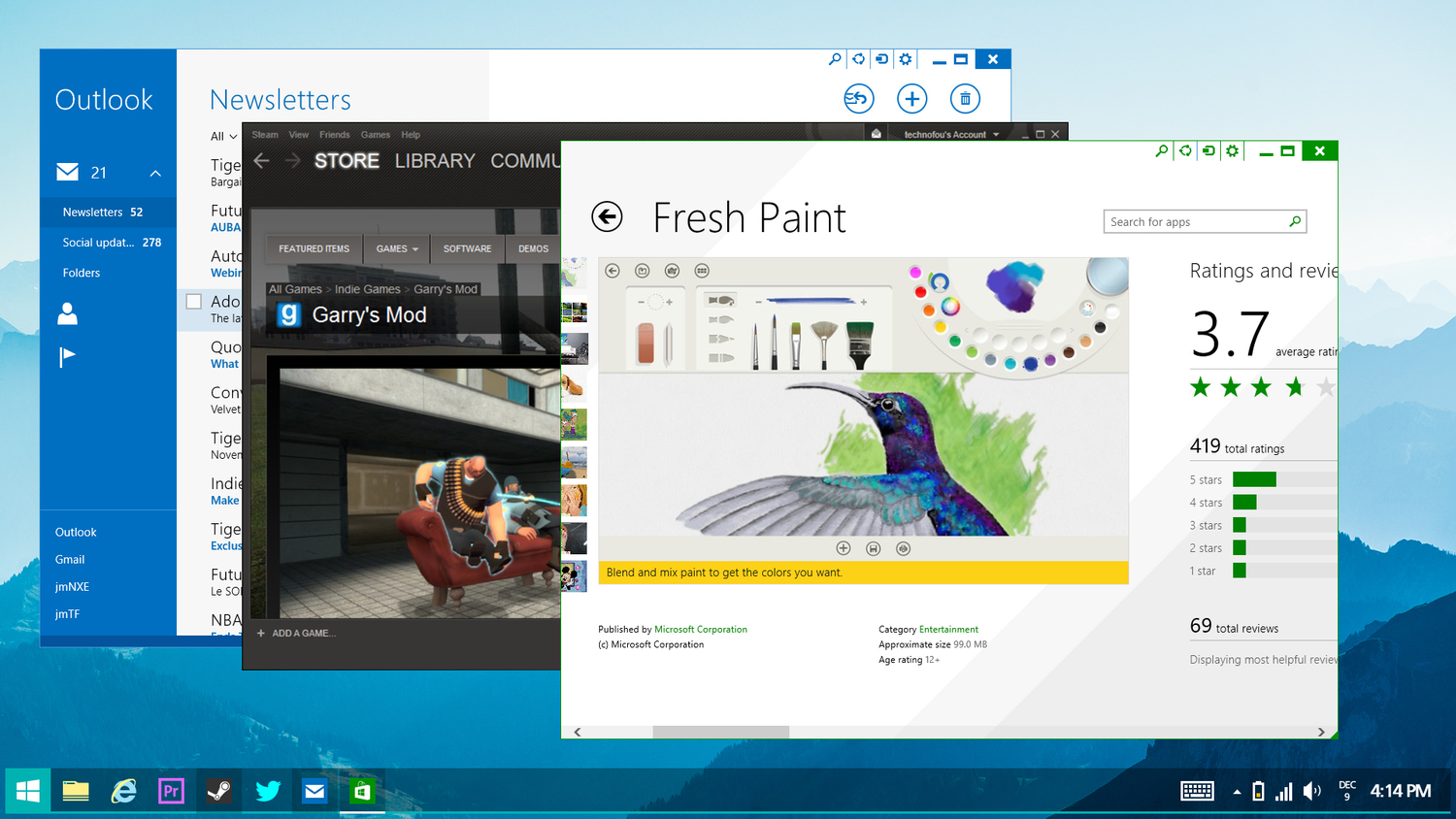
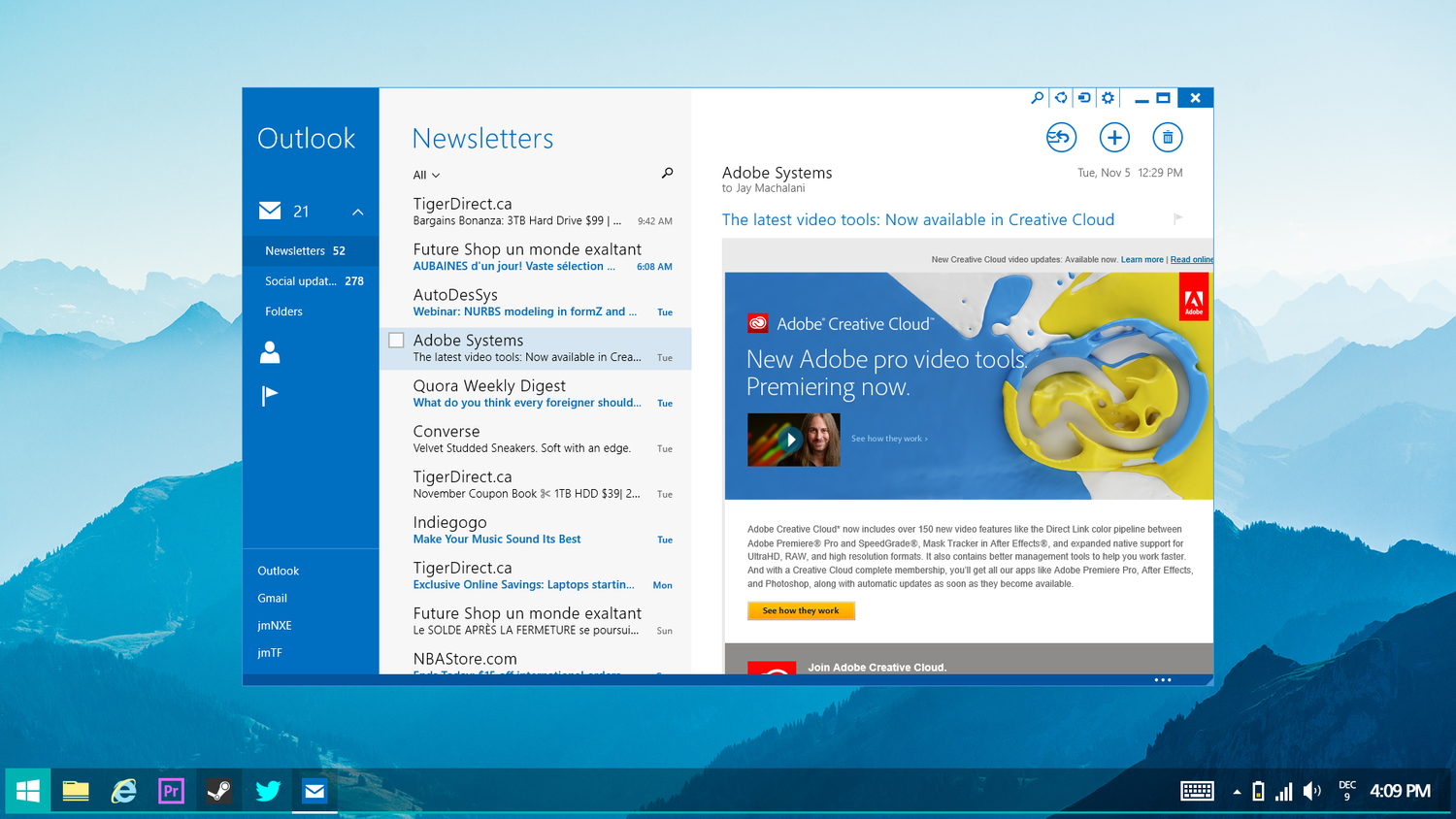
The short version is that he’s found a way to bring both of Windows 8’s modes – the separation of which is clumsy at best – and brings them together, making for a more seamless and intuitive experience.
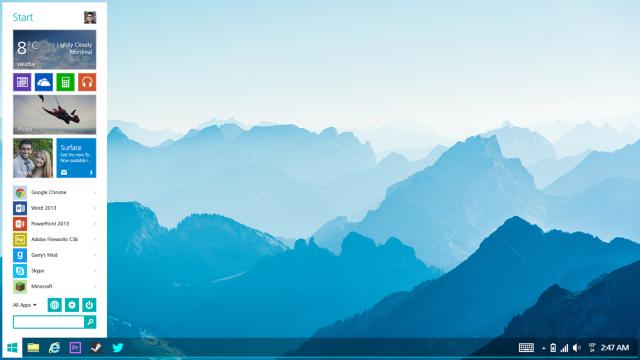
The “Start” menu returns, and serves as a hybrid dashboard of sorts, combining the functionality of a traditional Windows menu with Windows 8’s Metro “tiles”.
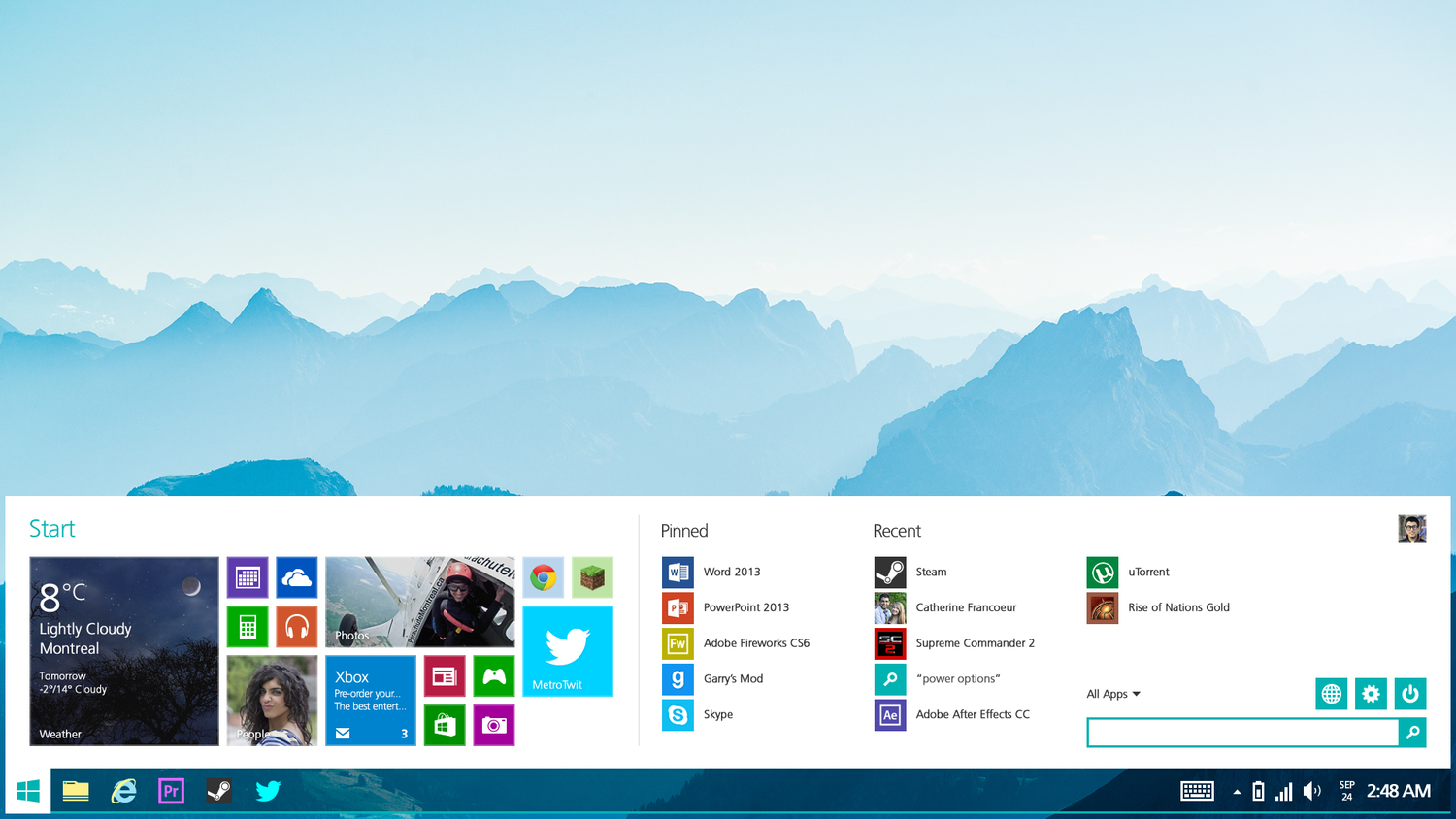
Perhaps the most useful idea though is one I’d have loved to see in Windows 8 from the start; the ability for Windows 8 tiles to be snapped in desktop mode.
Of course, he’s just a self-taught kid, not a Microsoft executive or programmer, and while his design is certainly technical in parts and very involved from a UI perspective, he’s hardly going to know if Windows code can actually (and reliably) support a design like this. But maybe the elegance of his design, irrespective of a background in engineering or coding, is the point, revealing everything people have so far failed to warm to in Windows 8.
With Windows 8, Microsoft tried to completely redesign Windows, but the “Metro” side lacks functionality while the desktop side is too tethered to the past.
The company’s solution was to awkwardly partition the two. Machalani’s design is showing that maybe things would have been better if the two hadn’t been kept so apart.
If you’re a design or UI junkie, you really should go read the whole thing. If you’re thinking it’s just a guy using Photoshop to make Windows look prettier, it’s a lot more thought through than that.
Fixing Windows 8[JM, via The Verge]
Comments
19 responses to “20-Year-Old Designs A Better Windows Than Microsoft”
So basically Metro apps in windowed mode, and a gimped Start menu with cramped screen real estate? No thanks.
But better than the current alternative where everything is separate. Big companies are pig headed so I don’t think Metro is going away any time soon, the best outcome for users is better integration and a more unified interface.
It’s not about being pig headed, it’s about consumers adapting to gradual change processes. If they were to have just made everything metro in a single generation – would that have made you happier? God no.
And as it happens, they ARE taking a LOT of refinements forward, yet another great reason to do an incremental update.
New things will always scare those entrenched in their ways. As always in technology, it is the constant balance between pleasing those that want continuity, and those that want innovation.
I think you’re doing a bang up job, Microsoft… Just don’t start reverting now out of it just being those stuck in their ways complaining the loudest.
I don’t see how Metro is a new technological way forward. using it on a non-touch device is horrible and pointless as it’s clearly built for touch. So I assume you saying touch-screen computers are the way forward? Have you ever tried using a touchscreen PC for more then an hour?
Ignoring gamers completely for a minute, (because tablets are great for games right?) just writing documents and basic tasks like that is horrible without a physical keyboard. Just because something was in sci-fi many years ago, doesn’t make it a step forward. Touchscreens are good for small things, like phones/tablets and would be a neat addition on PC but not a replacement.
If you still disagree, try holding you arms up at your moniter (as if typing on it) and keep them there for a few hours, then see if you’d still prefer that over a keyboard/mouse.
I use it on 2 desktops without issue. Once I got used to it, I love it. It is quite different, which I believe is what you’re overstating.
And yes, for many games my Surface Pro has been great – about 10-15 unmodified PC games that seemlessly transition to touch. Not even new games – games like Pirates!
Your final metaphor is equally as silly to me.. Why would you do that. Nobody is asking you to type on your desktops monitor.. Though I suppose you do now have the option if you prefer..
You seem to be mistaking the merits of change, for your opinion. In reality, as with Science, any progress is progress. In this case, I quite like it, you clearly don’t.
I’m using W8 on a 24″ monitor and it’s hilariously unoptimised. The fact that I need to do a charm gesture, flip down to a settings menu on the bottom right, then ‘power’ just to put my PC to sleep is clumsy as hell and obviously designed for tablets with a power button within reach. Ditto with touch elements within Metro/Modern UI which are great for thumbs on a 10″ screen but are comically-oversized once you blow it up on a monitor.
Then there are things I’ve noticed but use so rarely that they only become apparent when I use them, but constantly remind me that W8 was not designed for mouse/keyboard first. The fact that MS inevitably relented and returned the start button says volumes. But even that was a hollow victory, as you’re still going to need to hit Win + S or Q, otherwise you’ll be forcibly dragged back into fullscreen Metro. Oh and don’t forget that Metro and legacy are like oil and water and you still can’t use Metro apps within the desktop environment.
You’ve bought a Surface? Like these changes? Good for you. For everyone else who’s used to classic x86 Windows workflow, W8 is a step backward. And before you snidely imply that we’re luddites for not buying into Microsoft’s vision; the sliding PC sales, generally negative reception of pre-8.1, steep learning curve and poor Surface sales seem to support my impression that W8 is a deeply flawed product. I don’t care for Metro and my (anecdotal) experience is that most normals don’t either.
Give me the option to completely excise Metro while retaining W8’s other refinements to Explorer, DX, etc and I’ll hazard a guess that most people will choose that. Change is not the same as ‘progress.’ Progress implies some undeniable improvement or benefit, and I simply don’t see it in W8. You like it? Wonderful, but please don’t assume that I, or people like me must be ‘entrenched’ and hate the wondrous innovation of Microsoft. I’ve used Windows for nearly two decades and now happily use modern, touch-based OSes like iOS and Android. Those products, along with that mock-up in the article seem to have a more unified vision to me than W8.
W8 gives more variety, with the features win 8 have, its made ultrabooks and convertables a more viable formfactor. Less and less people have desktops, more people have laptops, w8 is better for laptops that have touchscreen as well. A tablet is never going to be as good as a desktop or a laptop, but different tools for different things.
And on the sleep/shutdown thing, yeah i found it akward to move the mouse to the corner to bring that thing up, especially since I use 3 monitors, but I found a better alternative. Windowsbutton+d then alt+f4 takes me to the shut down function very easily.
Change is change, it feels weird at first and then down the track, you wonder how you managed before.
x2 on this, it looks shithouse, do not want.
I’d be happy to test out your Windows redesign, where is it?
Metro apps definitely can in in the desktop, just look at metro apps launched in debug mode in visual studio, they run in a window in the desktop. The start menu fancy widgets etc. could easily be achieved with an api if a separation between win32 and metro apps is desired.
Oh wow……that actually looks fantastic. I’m throwing money at the screen but nothing is happening.
Of course. If he builds then accepts money he’s done for copyright infringement.
What makes you say that? By your logic, old software like Windows Blinds would be illegal too..
Thats because you’re doing it wrong. Use coins and let me know how you go.
Yeah no… It has some good ideas but looks kinda cramped and ugly. All your doing is making metro apps in windowed mode (which Stardock’s modern mix already does mind you) and making the start button launch a smaller cramped start screen on top of the desktop (Which Stardock’s start8 also does)…
So yeah, nothing new or special here.
The whole idea of Windows 8 dashboard was for touch screen devices, this design, not so much. While it looks great for desktop pcs. The touch functionality is not there. I like the idea of the start screen opening out from the start button instead of switching to another screen, but it could open out to almost full screen instead, maintaining the open touch interface.
This looks amazing!
I totally agree that Windows 8’s biggest flaw is in the divide between desktop and Metro, but while he has some good ideas I feel like the bulk of what he’s done is just an attempt to bring things back in line with Windows 95. Showing us something we already understand rather than designing something better and teaching us how to use it.
As I’ve said before, if you want to make another copy of Windows 95 there’s no point. Windows 7 has taken that as far as it can go. It’s refined to the point where you struggle to add anything significant to it but it’s also not quite meeting modern demands. Like a sitcom in season 10.
Windows 8 is the equivalent of moving away from DOS into Windows, or Windows to Windows 95. It’s not perfect but you don’t move forward by replacing mouse interaction with a command prompt or removing the Start menu and throwing everything back on the desktop.
The core ideas Windows 8 is built around will make the desktop experience better. Shortcuts are a joke compared to Tiles. Metro may feel alienating right now, but with a few tweaks it will make throwing a bunch of shortcuts onto a small bar seem stupid. The inability to scale from phone to desktop is becoming an actual flaw.
I say add an XBOX One style ‘notifications’ button where the new Start button is to consolidate all App notifications (with custom filter options, also it cycles the icons of the apps with unread notifications). Introduce collapsible folders to Metro so that you can pin stuff like ‘My Pictures’ and navigate them on the Metro page. Add ‘Live Interactions’ to Tiles that allow you to operate the apps without actually entering them (ie, right click/corner swipe a Live tile, have the context bar appear at the bottom like it does now, but add options to it that are about more than just pinning). Combining those last two gives it the potential for some pretty powerful stuff even in phone mode without really making any drastic changes. That will allow a crystal clear divider between desktop and Metro modes, but also allow for seamless, quick and highly functional crossing between the two.
Well… It’s no Geoworks Ensemble…
I think it looks fantastic. I would def be more inclined to upgrade my desktop machines and it would make using my Sony Vaio Duo 13 much more appealing.
Lets hope Stardock give the guy a job and make this happen soon!!!
He got it almost spot-on with the new Windows 10 update. Weird.