Outside of budget lines, video game box and disc art these days is a unique and varied art. No two games’ presentation looks the same. But for a short time, right back at the beginning of their days in the home console market, Nintendo bucked this trend. And it’s a shame they never stuck with it.
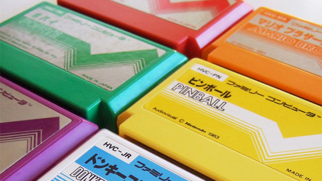
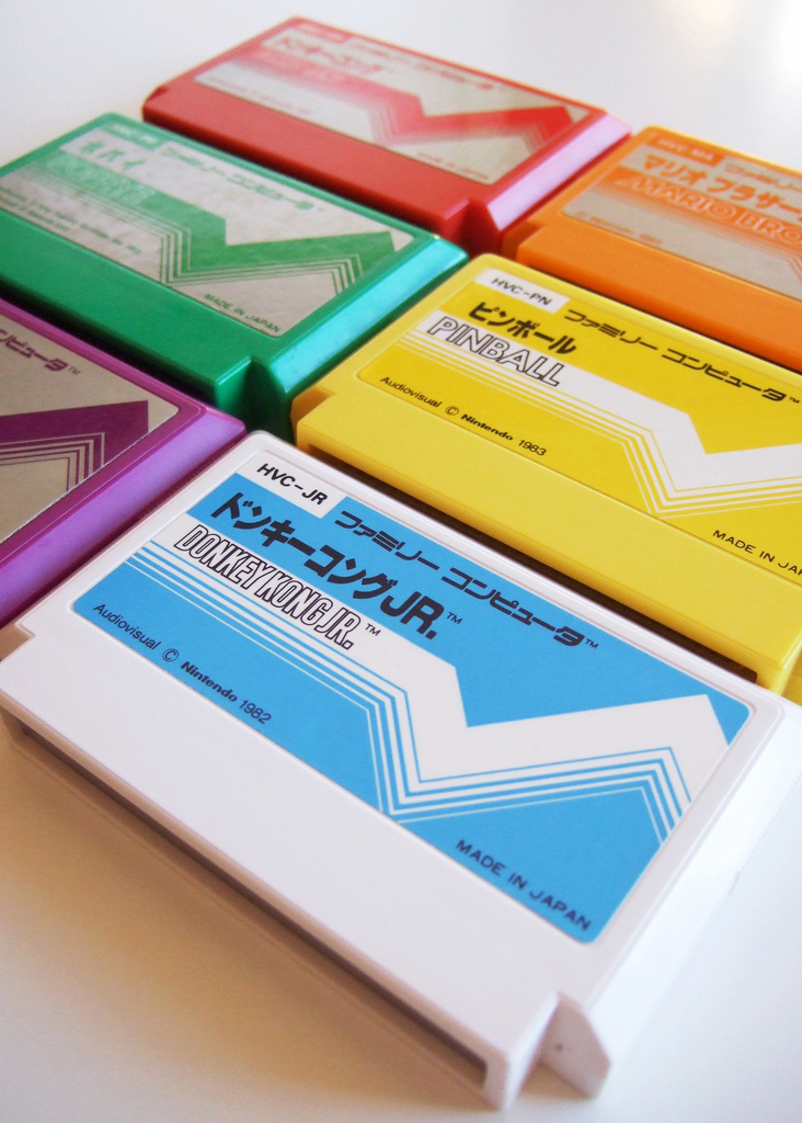
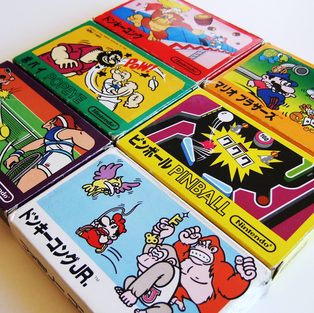
Between 1983-84, much like it did in the West, Nintendo’s games for its Famicom system in Japan had the same box art template. And almost the exact same cartridge art as well (with only colour changing between games).
There’s an argument that this made things a little too bland, but just look at these things. Thirty years later, and they look better than they did at the time. The simple design, the strong colours, it’s all so timeless.
This design flourish that dominates everything, the jagged bar running across the middle of the carts, was known as the “Pulse Line”, and you might have seen it now and then in retro-themed Nintendo games, or on merchandise. Or even our logo for Kotaku East , which I designed a few years back with the Famicom design philosophy firmly in mind.
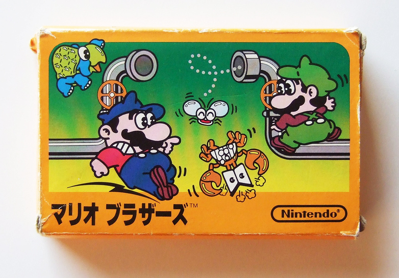
In all, 14 games were released with this template design, including the original Mario Bros. and a whole ton of Donkey Kong games.
You can read more about Pulse Line Cartridges at the excellent Famicom World (via Game & Graphics).
And these amazing shots were all taken by Bryan Ochalla.
Total Recall is a look back at the history of video games through their characters, franchises, developers and trends. You can find more stories like this one here.
Comments
11 responses to “When Every Nintendo Game Looked The Same (And Was Better For It)”
Thats how my neogeo games look
I like it. And now i’m really missing cartridges. What’s today’s equivalent of a gold Zelda Cartridge?
Exclusive in-game hats.
I don’t want to live on this planet anymore.
You’re right, and I really wish you weren’t.
I originally said it in jest, and then the reality of it dawned on me and I died a little inside.
The Master System had something similar too, including the box-art template.
No way, no way. Tried it once, doesn’t work. You got all of you fighting over who’s gonna be the Black cartridge, but you don’t know each other, so nobody wants to back down. No way. I pick. You’re Pink. Be thankful you’re not Yellow.
It’s not bucking a trend when things are just kicking off and their are no trends.
It’s actually in line with their game and watch products which, for a time, all looked identical in form until about 85 when they started to experiment with individual logos and art
That’s so true. On one you have scowly man with gun, on another you have scowly man with gun and he’s got his back turned. Then another has a scowly man with gun and a mustache! Sometimes he’s wearing a hat, sometimes he has no hair. My favourite cover though has to be the slightly frowny man with a gun. You can really feel his anguish over racking up incredibly high body counts in those linear corridors because you know, men have feels too sometimes.