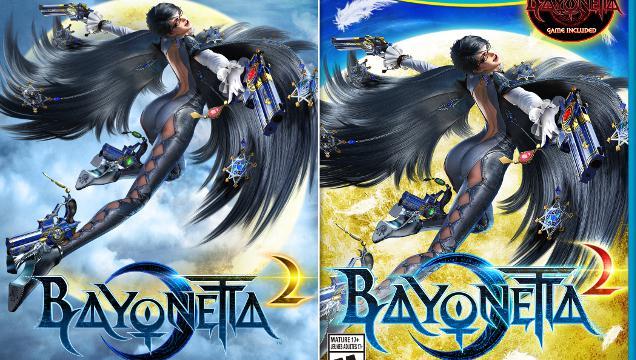
OK, let’s be clear. The guy is happy with the character design. And the character’s pose. And the outfit. But there are a couple things that are ticking Bayonetta creator Hideki Kamiya off.
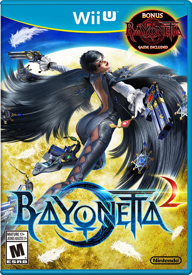
“I hate the logo of WiiU ver.,” tweeted the outspoken game creator in English. “Junk.” In Japanese, Kamiya was slightly more salty, tweeting, “The Bayo 2 package is shit. Who’s the damned bastard who changed it…”
When asked if he had control over this, Kamiya answered, “No. They did it without any permission.”
When asked why he was upset, Kamiya replied, “They removed the crescent behind Bayo & put full moon & changed the colour of “2” in red. JUNK.”
In the top image, you can see how the original art compares to the game’s Wii U box art. I kind of agree with Kamiya. The new Wii U box art isn’t as good as the original design.
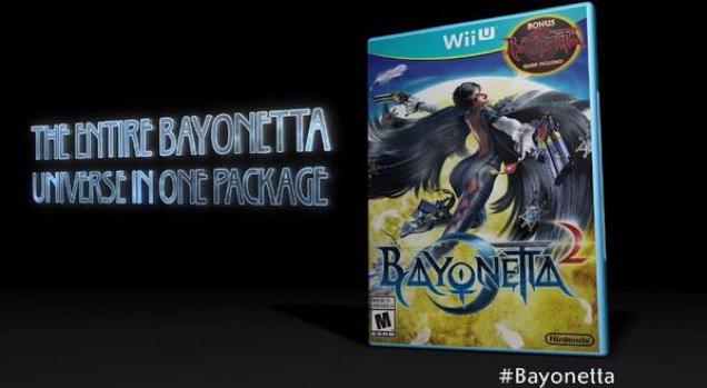
As Kotaku reported yesterday, Bayonetta 2 comes with the prequel Bayonetta, free of charge. That’s pretty cool. Those box art changes? Less so.
Comments
12 responses to “Why Hideki Kamiya Hates The Bayonetta 2 Wii U Box”
It does look pretty bad seeing the two images next to each other. Removing the clouds to see that cheese yellow mooon. -__-
Honestly though, is anyone looking at the moon, with that badass babe right there for all to behold?
I thought her moon was what they were referring to!
It’s got FIIIIIIIIRE under it! See? ACTION! FIRE! COOL SHIT! THINGS KIDS LOVE! SEE BOARD MEMBERS! IT’LL SELL HEAPS NOW THANKS TO FIRE!!!!!!!!!!!! AND MORE FIRE!!!!! GET THAT 2 MORE RED FOR MORE FIRE!!!!!!!!
Or something like that, that’s the only way I can imagine that possibly went down… fuck me what a terrible change from the original.
This is possibly the most trivial thing anyone has ever cared about.
Also http://junkee.com/flip-it-and-reverse-it-how-to-fight-the-gender-wars/15081
People not caring about decent design are the reason comic sans will not fucking die.
I blame you. For everything.
If I could reply to you in comic sans, I would.
You invented those chip packets that are so hard to open that you end up pulling on them until the whole thing explodes at once, tearing the whole packet open and the chips fly everywhere.
You are Tim Curry evil.
Goddamn it. That made me laugh enough I nearly spat my coffee all over the screen.
You don’t care because it’s not your work being altered.
I’m sure he put a lot of time into getting the cover just the way he wanted and than they changed it with out asking.
The original covers looks better, and although I didn’t notice much on the initial viewing other than a more pleasing back ground colour, when I examine it in more detail it becomes far more obvious.
I guess they did it to be more eye catching for the guy browsing for a new game instore? lets be honest, anyone who cares about the change in design would already be buying the game anyway.
They turned up the contrast, blacks, and vibrance of the whole thing to make it more appealing on the shelves. Classic standard marketing. But I can understand how the original designer might be peeved off. I agree that the new design for the Wii U kind of now has a Sailor Moon magical girl thing going on.
Slight correction there, people buying the game anyway and the guy who created the Original Artwork.
inb4 boxed collectors edition with original artwork on the front
inb5 10 out of 10 GOTY review-score-plastered edition.
check this unseen footage of Bionetta 2