At any given time, there are tens of thousands watching and playing games on Twitch. Some people are obsessed with one game, other people watch lots of games. The service recently enlisted its “science” team to visualise what communities of Twitch look like, and it’s beautiful.
Wait, they have a science team? Yep. It’s a group within Twitch dedicated to studying Twitch.
OK, back to the surreal images.
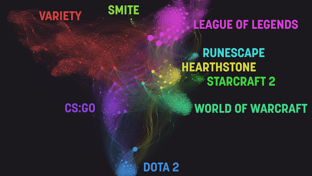
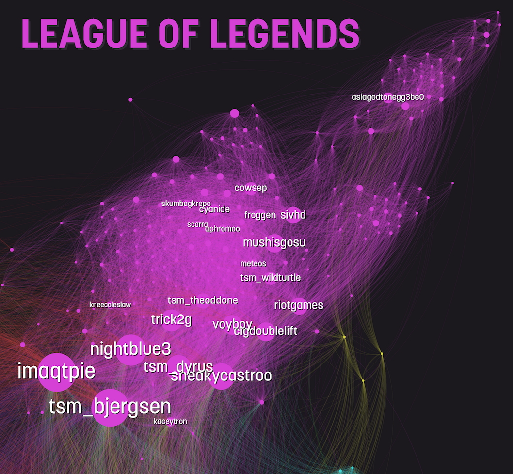
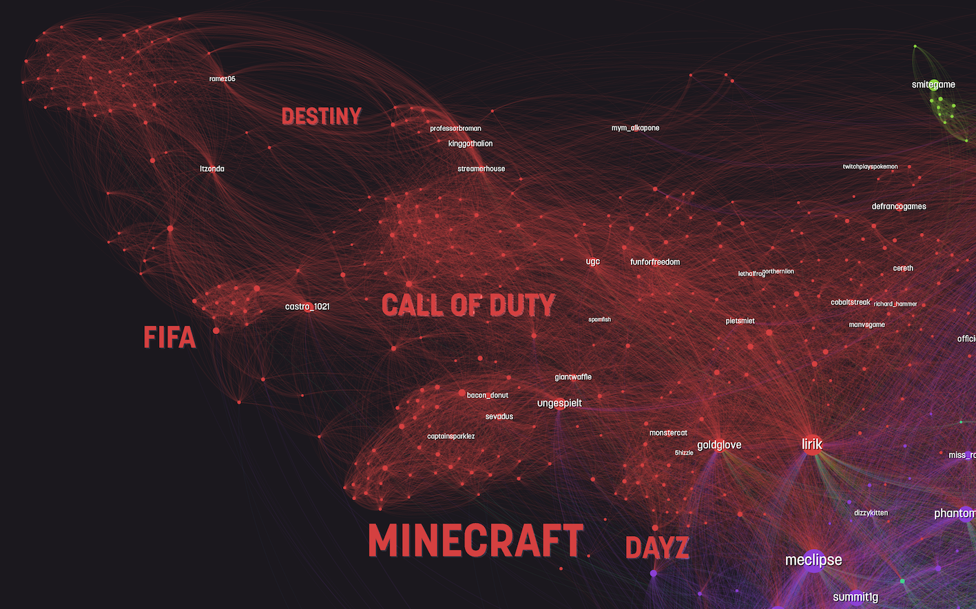
There are lots of circles on each one, and every circle represents a channel on the service.
“The lines between channels represent the amount of overlap between the audiences of those channels; each time a specific viewer watched two different channels during the time period this data draws from, it makes the connection between those channels a little stronger. Because we’re only drawing on a short time period in December, not all channels are represented here, and sizing only approximates activity in that time period.”
The company follows this up by breaking down the specific patterns within various communities, including League of Legends, DOTA 2, Hearthstone, Minecraft and others.
Games like League of Legends are their own beasts, which is why they’re dominant, and other games are lumped into a catch-all “variety.” How the small stuff breaks down is interesting:
It’d be cool if this could be generated in real-time. I’d love to have this massive, macro sense of what people were playing and watching all day long. We’d all be Professor Xavier in Cerebro!
There’s plenty more on Twitch’s site. If it weren’t for the giant text, they would make rad wallpapers!
Comments
2 responses to “How People Use Twitch, Visualised”
That is some very pretty visualization.
Ugh – the biggest games on twitch don’t interest me in the slightest – ill either check out new games, Nintendo classics or head straight for Dark Souls!