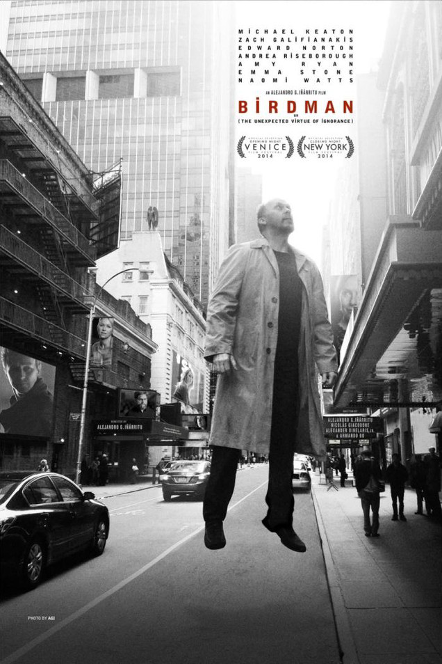
This is (part of) the US poster for Birdman. It’s a rather simple poster. Surely, there’s no way you could screw this up, right? Right? Well, actually…
Here is the rest of the poster — in case you don’t live in North America or, if you do, haven’t been near a movie theatre.

Not bad! I mean, it’s not amazing, but it’s interesting. Doable. Workable. Whatever. I kind of like it.
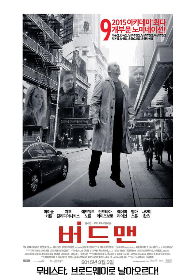
Below is the South Korea poster.

Pretty classy! I actually like the white border.
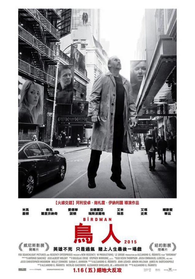
And the Taiwan poster.

Yes, it looks like the Korean poster. Not sure if the same company is handling distribution or what (or maybe marketing), but like the above poster, this makes some changes, without fucking up the original.
And finally, the Japanese poster.

Which totally f**ks up the original poster. The above poster is being derided on Twitter in Japan as “uncool” and “awful”. Though, on 2ch, some say the original poster is bad, so there’s not much to work with. Eh, whatever! This localised take isn’t just a terrible poster, but a case study of someone running amok with Photoshop. Whoever did this must be stopped. Stopped, I say, before they strike again.
Crap poster aside, the Japanese font for “Birdman” (バードマン) sure is cool.
Pictures: Micchii520

Comments
12 responses to “The Japanese Birdman Poster Looks Dumb”
epic birdman photo-bomb
I think the Japanese version looks fine, just different.
Japanese version looks better personally than the levitating birdman poster that doesn’t make much sense on its own.
Is the guy in the bird costume actually in the film? Or is it just classic Japanese zaniness?
yeah he’s in the film
He’s in there but I won’t give away how…
I was going to say you should watch it and find out but, yes, he’s in it.
“The Japanese Birdman Poster Looks Dumb”
… no it doesn’t
… great article, 10 points.
What’s more interesting is that the US poster relegates the female lead to a small pic in the background, whereas the other posters have her prominently displayed centre-left. maybe Patricia Arquette was on to something.
The only poster I have seen was the artistic sketch of a side profile of Birdman. Was this AUS only? Surely not.
I think it was a US print ad only? I know the one you mean, it’s really good.
I feel like saying you’re prejudiced against things. Not sure why, you just seem that way to me. The poster’s fine, it actually fits a little better with the film’s tone.