Now that the Tokyo Olympics has scrapped plans for that stupidly expensive stadium, it can focus on other things. Like questions over its new logo.
The 2020 Tokyo Olympics logo was revealed this week with a fancy intro clip. Art director Kenjiro Sano, one of Japan’s top graphic artists, designed the logo.
According to the official press release (via Under Consideration), the Tokyo Olympics logo is filled with symbolism:
The black colour of the central column represents diversity, the combination of all colours. The shape of the circle represents an inclusive world in which everyone accepts each other. The red of the circle represents the power of every beating heart.
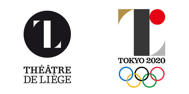
However, many Twitter users have alleged that the Olympic logo is similar to the logo for Théâtre de Liège in Belgium, going as far to call it “plagiarism” (パクリ or “pakuri” in Japanese).
【超絶悲報】東京五輪エンブレムがベルギーの劇場のロゴに酷似 124 2015/07/28 15:38 ベルギーの劇場のロゴのパクリだな 完全に一致!フォントまで同じ!! 927 22:32 仏のデザイン会社が速攻気づいて海外で拡散中 pic.twitter.com/FJsUnlr3xn
— さんぽねこ (@patrolcat) July 28, 2015
The Théâtre de Liège logo dates from 2013.
On Twitter, graphic designer Olivier Debie uploaded the animated image below, asking if the Tokyo Olympics logo was plagarism. Note that even the fonts do appear somewhat similar.
Théâtre de Liège vs Tokyo 2020 #Tokyo2020 #ThéâtredeLiège #plagiat? pic.twitter.com/u64MpWBAI2
— Olivier Debie (@OliDebie) July 28, 2015
As Fashion Snap reports, other Twitter users say the logos are different. Well, what do you think?
Comments
6 responses to “The Rip-Off Controvesy Over The Tokyo Olympics Logo”
at least it doesnt look like a chicken
Since when does a theater in belguim have a international presence with their logo? this is obviously all coincidental seems a little low blow to claim plagiarism over this.
Exactly, the Théâtre de Liège doesn’t seem to be well known to the general international public, would be different if it was a logo seen around the world on a daily basis.
If you had 100 people sit down and told them to draw a brand new logo, at least one of them would draw something similar to an already existing logo, either purely by chance, or that it is an image in the subconscious.
This is just another example of people finding things to complain about
Perhaps that’s why, using a slight likeness of a fairly common looking logo.
Artist is prob loving it.
Could be worse it could be Lisa Simpson performing a sex act. Right London?
I’m not hugely into the world of thearte, but I’d never heard of this place until now. Perhaps the guy who did Tokyo’s hadn’t heard of it until afterwards.
I suppose in these days you need to run a google image search on anything you do to see if it’s similar to something else.
It is difficult to design any type of logo these days without it resembling something else. With millions of organisations out there someone is going to find something it looks like.
I remember designing a logo for my old company from scratch but people still said that one letter in it was similar to another company. I had no idea first, nor did I care after.