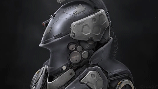
Dayshot: When Hideo Kojima announced his new studio the other day, he did so by showing off a very fancy new 2D logo. Which artist Jarold Sng has decided to unofficially flesh out a little.
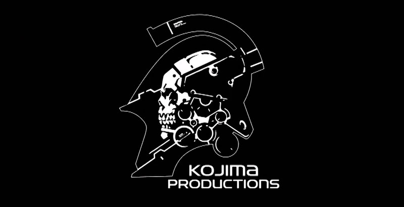
Here’s the actual logo:
And here’s Jarold’s take:
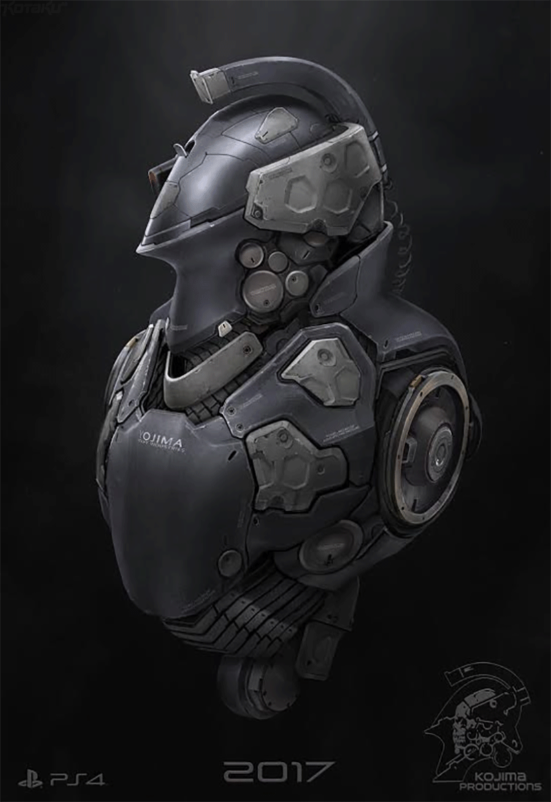
Neat! We featured Jarold’s art on Kotaku last year, if you want to check some of his other stuff out.
Dayshot showcases some of the prettiest, funniest game-related screenshots and art that we can find.
Comments
7 responses to “A Flashier Version Of Kojima Productions’ New Logo”
As a graphic designer I can honestly say that this is not a logo. It follows none of the excepted criteria for how a logo should work. It’s fiddly, won’t scale well, lacks balance and subtlety and is a bit bloody ugly. It’s because of this that it will more than likely have longevity and therefore work but will always have it’s detractors (comprised of mostly designers) and no one else will care! 😉
As not a graphic designer, I wonder if there is some hidden hinting at an Easter egg a-la phantom pain logo, for a future project , or some inside joke middle finger to Konami.
I’ve studied graphics design & multimedia. You are correct about the artwork fitting none of the normal criteria of standard logo design, but I completely disagree with your statement that it is not a logo. It’s messy, it’s overly complex, but it most definitely is a logo. It’s just not a good one. 🙂
Yet another designer.
The worst thing about it is the two lines of type being different sizes, but not enough to look intentional.
Still, beats most Japanese video game type that always ends up being a weird blend of Trajan and Times New Roman.
Its Kojima. He doesn’t care lol
Also Graphic Designer. Yeah it flouts rules but also nah, like whatever they’re just guidelines.
Personally i like it because Knight-Skull-Spaceman
A large part of the video game industry have logos that are so bad you’d think they started life as rasta images and not vector. It’s part of the market. Mostly the middle sized companies make logos before they get big and have to start thinking about t-shirts, shorts, and all the other paraphernalia that this kind of logo is a pain in the ass for.
They just want a logo that looks good when they run it center screen at the start of their game trailers on Youtube, which is why they go for complicated, overly artistic brands. They don’t want simple and distinctive to differentiate, they want artistically attractive to add to the spectacle of their game trailers.
And in video game marketing, the trailer is worth almost everything else put together.