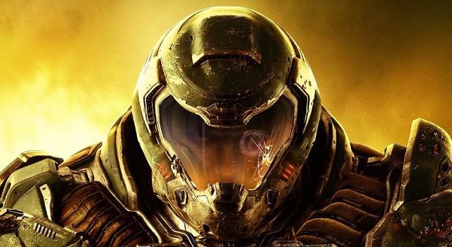
Yesterday, alongside the announcement of Doom‘s release date (May 13), Bethesda showed off the cover for it’s next big shooter. It’s… generic.
From the drab space marine to the piss-yellow background, everything about the new Doom‘s cover feels kinda cookie-cutter. Just look at it:
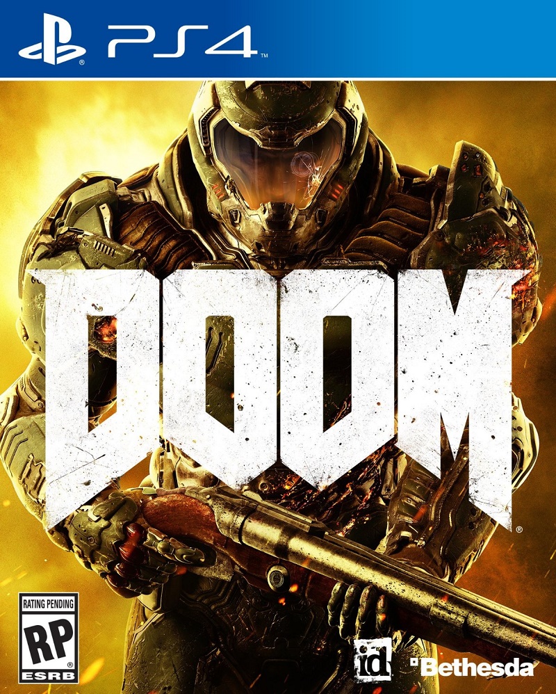
In fact, as NeoGAF poster shagg_187 points out, a cover like this would fit perfectly with just about any other game.
For example:
Or:
Perfect fits, right?
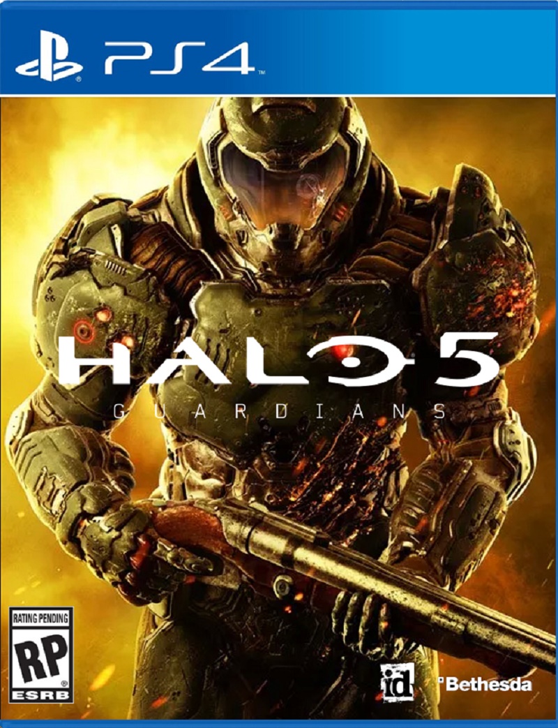
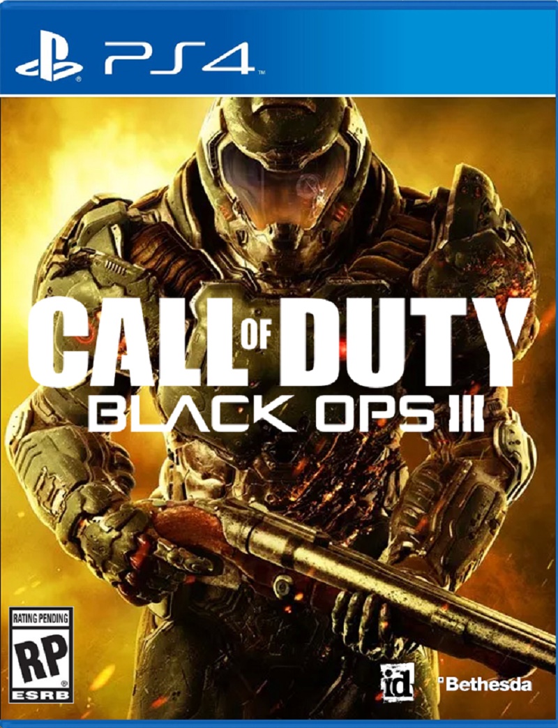
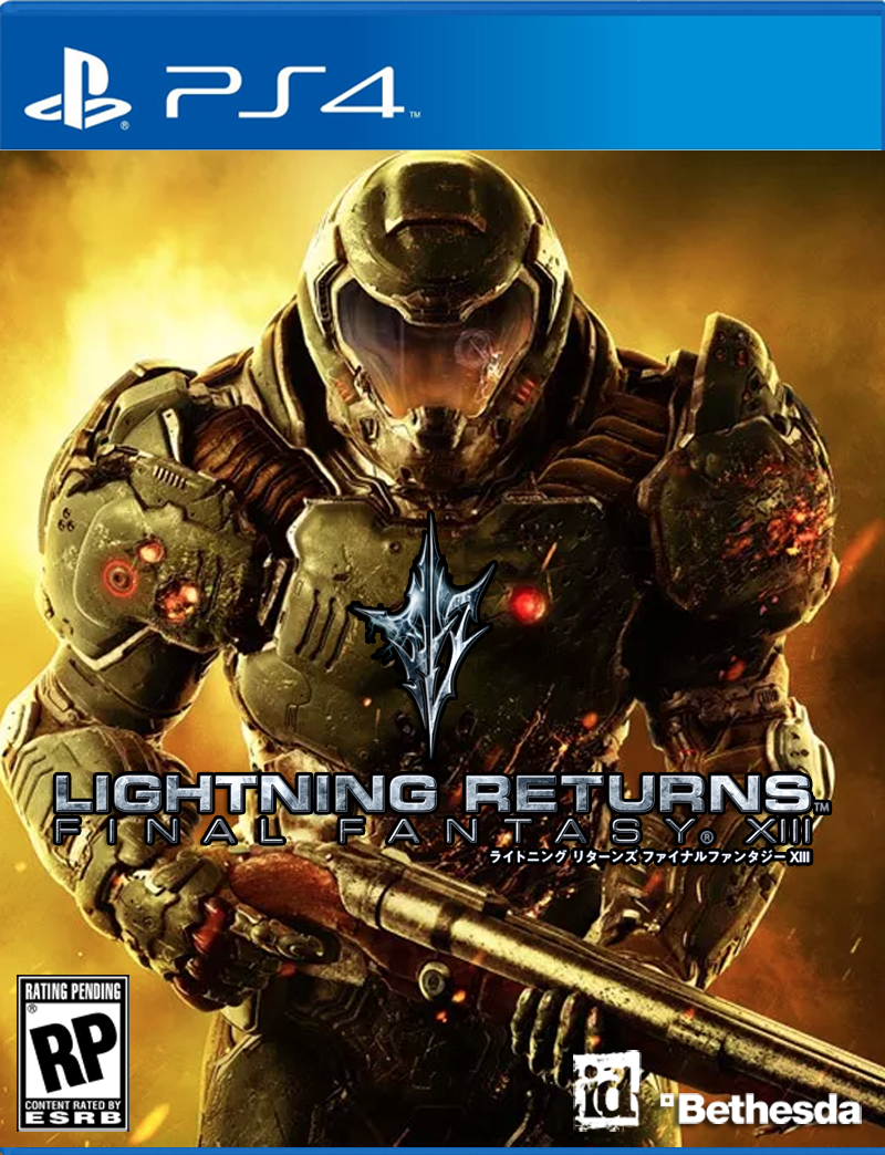
But hey, let’s not stop at shooters. Here at Kotaku, we like to take things to the next level. Thanks to the power of Photoshop, we’ve done a few more experiments and found that the cover really does work for every game.
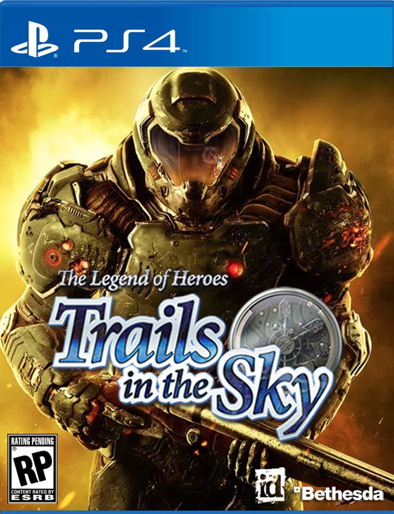
See what I mean?
Beautiful.
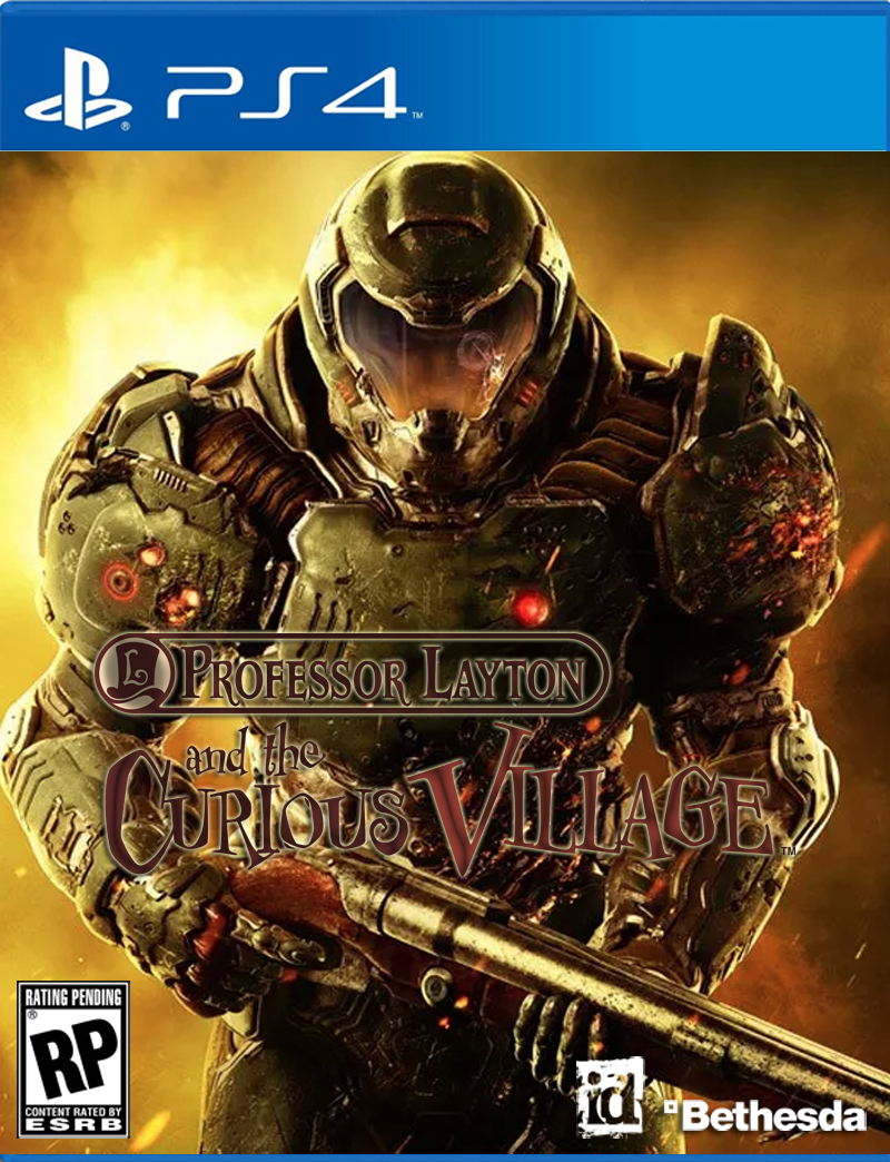
OK, OK. One last try:
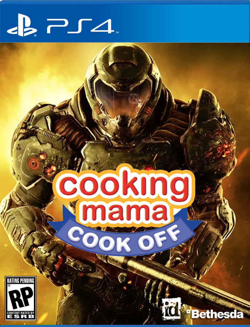
See? Perfect fits all around.
Comments
29 responses to “Doom’s Cover Fits Perfectly With Every Game”
While i agree it’s generic, most AAA titles have generic covers with dated design features. COD, Tomb raider reboot and sequel, halo, and a thousand other games are all horrible.
I’d argue it’s harder to find games which have excellent and unique cover art.
As much as I hate the games, Assassins Creed titles have attractive graphic design. Journey Remaster was decent. Quite a few JRPGS have lovely design.
I like Xcom 2’s cover, that one really stood out from the rest at JB.
I agree, i saw the alien face on steam and immediately had to know what game it was.
That got a good laugh.
I have a few jrpg games from the sega cd (yeh, that happened). They were us imports and had the large ‘twice as tall’ covers. They have beautiful art with bright colourful foil writing for the titles. They are the only games I have on display with my memorabilia.
Every other game lives in a draw.
And there lies the crux of it. Why spend big bucks on making multiple designs when you can just follow a formula and get one done, nice and safe, knowing full well nobody is really going to look at it. Even on a store self you are not buying games because of their pretty colours… Besides, having a giant demon with flesh hanging off it is probably not a good idea for several stores.
wow…. there’s zero effort in that cover. I mean like, zero effort at all…
I see it as being smart. There are plenty of gamers these days who wouldn’t have touched doom, so the cover is designed to catch them as they would be the COD generation.
I do actually agree lol. It’s going to catch the people that know Doom well, the BF crowd, the COD crowd, anyone who knows the ‘orange explosion/character walking away from stuff/mil shooter’ crowd. It’s technically got zero effort realistically, but it’s one of those ones where little effort will work in its direction in a big way.
I’m betting it was marketing mandate, because it’s such a last minute inclusion. Up until now, it’s just been the name.
Because it’s Doom. Everyone who would remotely consider buying the game knows what Doom is about, it sits in game Valhalla alongside Pac Man and Tetris as one of the most iconic games ever made. The creator of Deathmatch, rocketjumping and speedruns.
It’s a shame they made the decision either way… It would have looked unique on a shelf as just the name. And they could have made it as insanely metal as Doom 1 and 2, given the nostalgia bend the game’s on. Instead, it’s kinda middling.
A more than fair point too, a simple black cover with DOOM written on it in the red and yellow colour would’ve looked pretty boss…*
True, remember the reasoning behind Bioshock Infinite’s cover.
They totally missed an opportunity for a Metroid spoof cover.
It’s not that generic; there are a few things that make it stand out as Doom though – namely the Super Shotgun (there’s no other sci-fi FPS that would feature a double barrel on the cover instead they would show an AR or SMG). The other main feature are the burn and claw marks appearing ‘hellish’. Strangely enough the combination of the shotgun and the hellish marks make the Cooking Mama spoof far more plausible than the others.
I haven’t played Halo but if I saw that cover and the classic double barrel shotgun I would wonder why my sci-fi is using that classic weapon and also why isn’t my suit green? For CoD I would wonder why does it look live I’ve raked by fire claws because last I checked terrorists aren’t some combination of Wolverine and the Human Torch, the FF one just doesn’t make sense and I have no idea what the other games are.
Both of those things I had to go back to see if it actually had them. I just saw ‘gun’ and glossed over it. The burns I wouldn’t reallydescribe as hellish, especially when the title is covering half of the ‘claw’ marks on the chest. Just looks like ‘generic battle damage’ to me.
This seems like a really trivial thing to complain about. I don’t care what’s on the box cover, I don’t even buy boxed games any more. I care about how the game plays.
Youre right in saying that, it truly js what the game comes down to that is the imporant thing. But what about the average Bobby Bloke who hasnt even heard of Doom except in the newspaper talking about immigrants sneaking in and taking over? What would they think when they see a big fella in armour with a gun and the title on the front? “Ah, its just another shooter, just like COD, or HALO, or whatever other popular shooters are about. Ill just stick with what i know and play Rainbow.”
Compare this to the Original Doom cover, which had the big fella being completely overrun by various demons and monsters. Surely the same Bobby Bloke would go “Thats teling me a story about how some poor fella is getting the rough end of the pineapple from hideous deformations from what can easily be assumed to be Hell. I wonder what more there is to that?”
And so begins Bobby Bloke, someone sauntering through his EB looking for something to do, finding an actual new adventure in blood and gore, surviving his way through Space Stations overrun by Hell. And statistically, a new digit on Bethesdas sale records, that they may or may not be able to count on if a sequel were to be rolled out.
Assuming the gameplay is that good, of course.
I think very few sales for this game are going to come from people who have never heard of Doom before. This is a title that will sell entirely on its name. I doubt Bobby’s going to have the wherewithal to know that the cover resembles COD or Halo (and know that those are titles he isn’t interested in) but not know the name Doom. If he is, he’s welcome to make whatever judgement call he wants about the game based on the box art, but I’d consider him a statistically insignificant outlier that isn’t worth publishers catering specifically for.
Results from SuperData’s analysis of 2015 game sales had digital sales up 11% in 2015 to roughly two thirds of all game sales. Meanwhile brick-and-mortar sales dropped 13%. Sure, a third of sales isn’t trivial but it puts into perspective the number of Bobbys out there that are going to be in a position to judge the cover in the first place. Physical retail sales aren’t where publishers should be focusing attention at the moment, it’s a dying sector.
But even all that aside, I think the cover looks fine. The marine looks suitably badass with the claw marks in the armour and the double-barrel shotgun.
Should have Romero’s head on a stick on the front cover.
It reminds me of haze.
That’s not a great omen.
Meh, it’s doom people know what it is by now. It’s all about the gore and they can’t show that on the front of a box. And if kids don’t know what doom is, it doesn’t matter because they can’t and shouldn’t be buying it. Can’t wait for this one tbh.
1) who looks at game covers anymore, anyway
2) its DOOM. The name (and technically reviews) sells itself.
these days advertising happens long before the shop front. sadly gone is the day when we hang out in a computer game store (or record store for that matter) where we hang out for hours, shifting through looking at covers, trying to decide what to buy.
I would’ve put him on the cover of Dead Or Alive: Xtreme Beach Volleyball, but with a bikini photoshopped onto him
Article idea: Best game covers of all time?
While its generic, Doom is probably the only game that can get away with it cause they did invent the zero personality invincible space marine.
It’s definitely generic as fuck, but no, it doesn’t go with every game :\
thatsthejoke.jpg
GTA has the most original cover art.
I guess sticking a mutilated alien corpse would’ve been the other option, but yeah………
Fuck this, where’s my demon from hell with the rocket pack?!
wow, lazy as.
still totally picking this up….but yeah that cover sucks.
You’ll still buy it, even if the cover was drawn by a 3 year old with crayons.