
Most video game box art sucks. The new DOOM’s cover, however, is especially bad. Thankfully, Bethesda seems to have taken note of this, and is offering fans a “vote” on a reversible second cover.
I say “vote” because while two options are being presented to fans to choose from, one is so bad — and the other so good — that the winner seems a forgone conclusion.
(Indeed, the good option is trouncing the other in voting).
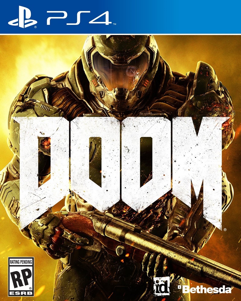
First, here’s the default front cover in all its blandness.
Now here’s the bad option for a reversible inside.
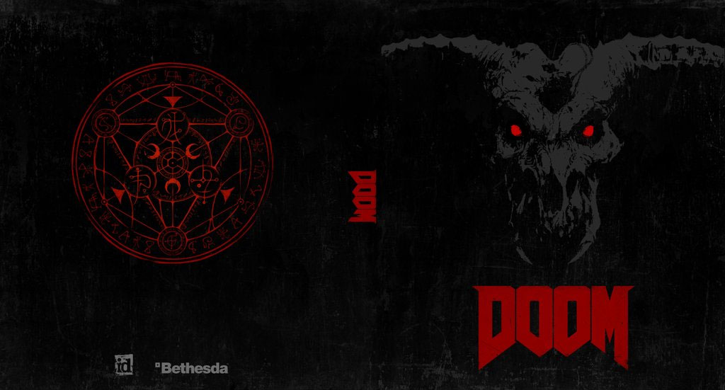
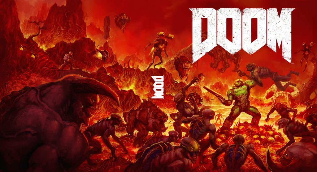
Now here’s the good one. The one that should have been the game’s front cover in the first place.
This is nothing new, of course; Okami was made famous (or infamous) in 2008 for offering alternate reversible covers, only then it was because the original artwork had an IGN watermark on it, not because it sucked.
Comments
20 responses to “I Like What’s Going On With Doom’s Box Art”
Any smart retailer would pay some schlub to flip all of those covers..
Schlub, word of the day.
Except I’d want a sealed copy, not something off the shelf some grubby jerk stole the codes out of.
Not the codes! Whhhhyyyyyy….
It’s happened to me and my friends a few times, we get a game and when we try to input the codes for a GOTY or Complete edition we find they have already been used. How easy is it to open up a game, take a quick photo with your smart phone of the codes (or it’s actually a used copy EB put on the shelf as new) and your missing out on things.
Sick.
Hmm, the top one has an Icon of Sin vibe about it.
I think A is actually pretty damn good, but its obviously not as good B, but both are just 10000000000% better than current piss-stained cover
Yeah I wouldn’t say it’s bad either. A lot better than the current boxart.
I saw the current cover on a pre order ad and thought it was Mock place holder
First one really reminds me of halo… second one is awesome!! lol
seriously, gamers could find a reason to complain about anything, wake me up when they are happy with something, that might be easier
Gonna have to get a physical copy now!
the good reversible one is literally just knee deep in the dead
I wouldn’t mind seeing it embossed with a few more demonic symbols and/or other nasties hiding in the black background.
Don’t mind the original one but the new one looks awesome
It’s a nice throw back to the original game’s box art. Too bad it isn’t the official cover for the new game.
Is there some objective reason why generic ‘hero’ covers work? Without any foreknowledge or in store promotion…you’d only have the cover to catch your eye. People wouldn’t have made fun of it if it didn’t look like every other hero cover. It’s become generic.
Offering reversible is such cynically deflective move. I just wish I understood why generic cover art is the go to choice. Does anyone reverse covers anyway.
My own completely uninformed and irrelevant opinion on this is that the box art triggers something a bit subconscious. Everything that is modern seems to have a minimalist approach to it, from houses to phones and cars, sleek lines and monotones seem to indicate that something will be of high quality. So in this sense the original cover tells you everything you need to know. You can absorb everything they wanted you to think in just a glance at that cover. The option B cover does almost too good a job of giving off a ’90s feel. I like the idea, but people walking past may have a quick subconscious judgement that the game is low quality, old or indie based off this cover. I think the option A is probably the best one to go with for a front cover.
I think the the second reversible cover should be the box art and the “bad one” (that I don’t mind) should be the inside cover.