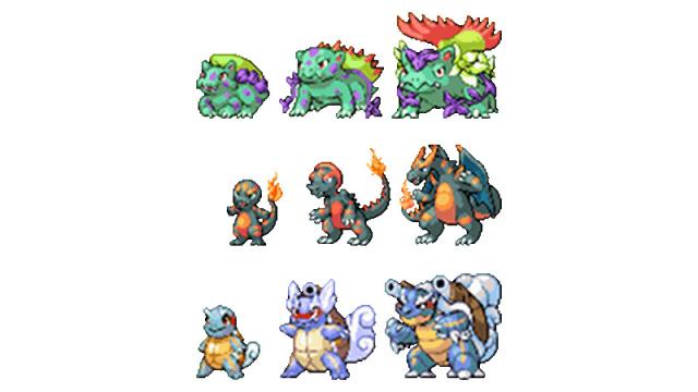
Dayshot: “What would the first Pokémon generation look like if they were introduced today?” To answer that question, Pokéfans infinipede and ShedSimas embarked on a project to redesign the original 151 Pokémon, with their first targets being, of course, the original starters.
As the introductory post on the New 151 Tumblr blog states, the pair of artists’ aim is to bring the first 151 up to the modern games’ standards and move them closer to their original concepts. The redrawn starters debuted on Pokémon Day last Saturday, and the project’s current plan is to introduce one new evolutionary family per week.
Here’s the concept art the sprites at the top are based on, accompanied by commentary from the blog:
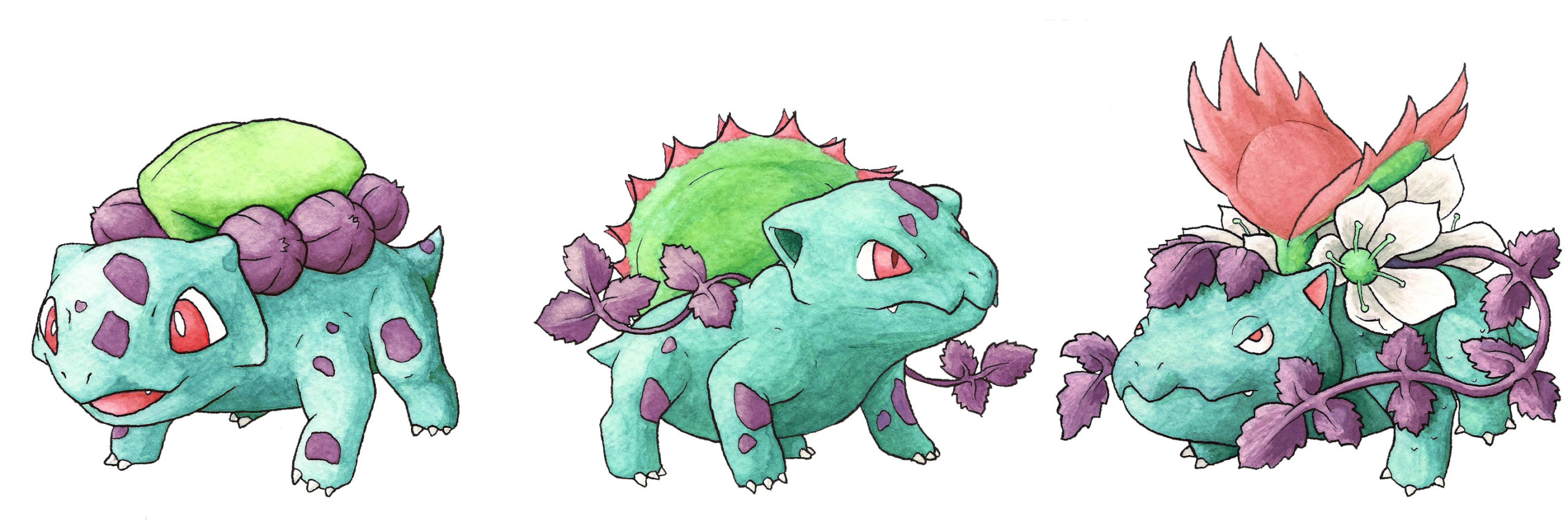
To start with, the original Grass starters. Physically, Bulbasaur and family are based on Dicynodonts, so we made them less pudgy. Their japanese names are all plays on “strange grass” — not a lot to go on, so instead we brought in the “bulb,” “ivy” and “venus” parts of the English names and gave them characteristics of climbing ivy, poison ivy and Venus flytraps.
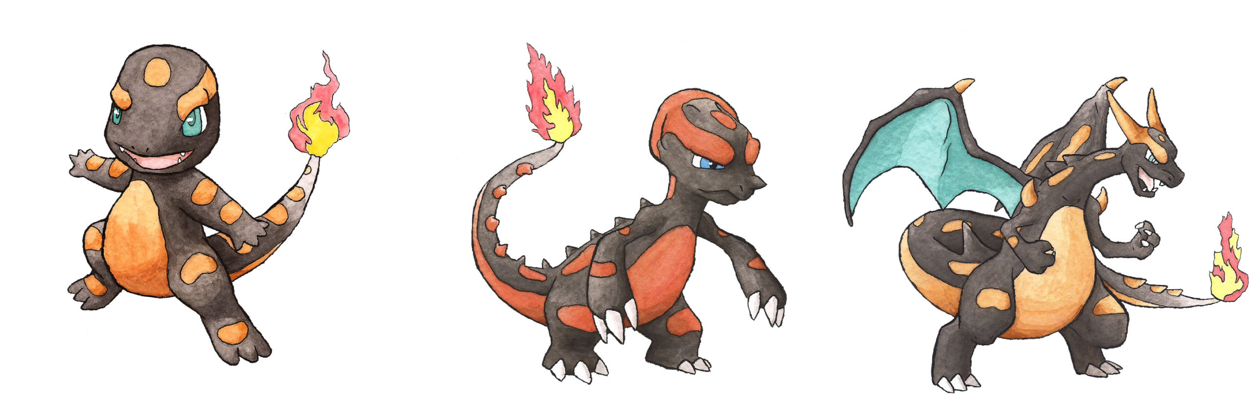
Charmander is of course based on the mythical salamander, a fire spirit often depicted as a lizard, but the original Charmander doesn’t have much in common with the real-world salamander. The black-and-orange pattern is loosely based on the spotted salamander. At the other end, Charizard takes several cues from its two Mega forms. Charmeleon serves as the in-between form, offering a bridge between the salamander and the dragon. It also gets a head crest reminiscent of chameleons.
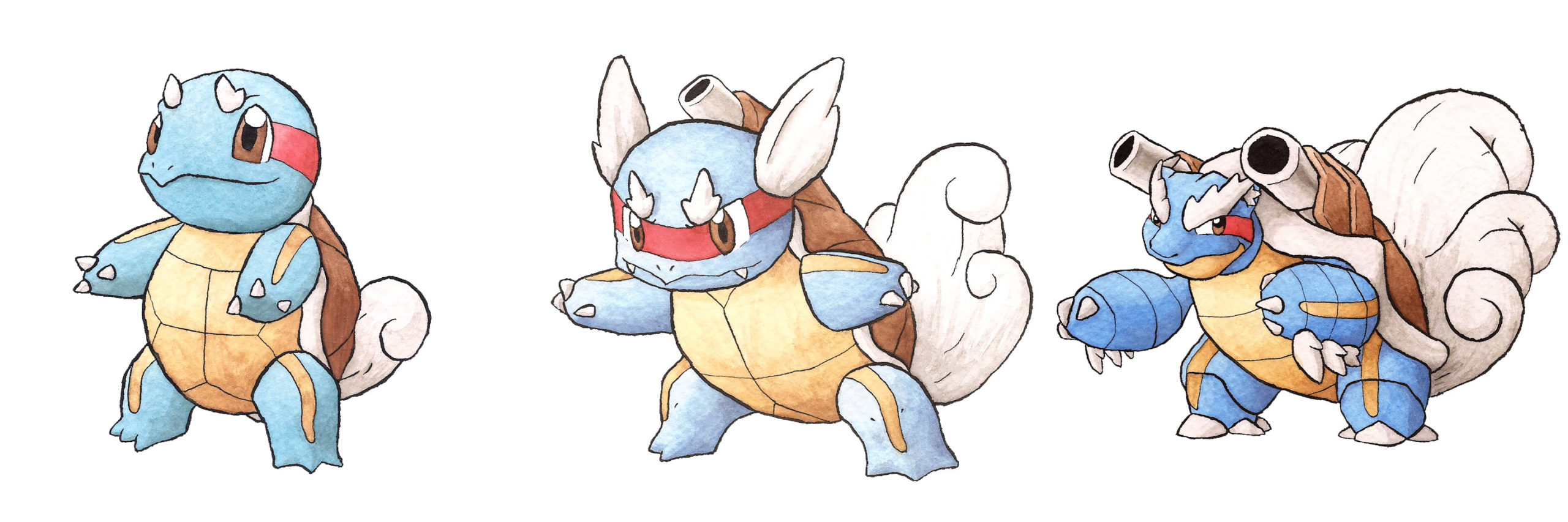
The original Wartortle’s fluffy ears and tail are a reference to the minogame, a Japanese mythical turtle that is 10,000 years old and has seaweed growing on its back. We used that idea of age and gave the family increasing amounts of white seaweed-hair. The red and yellow stripes are based on the red-eared slider, and also harken back to war paint. Wartortle’s single cannon reinforces the idea of war. Blastoise’s design also takes a few hints from Mega Blastoise.
Dayshot showcases some of the prettiest, funniest game-related screenshots and art that we can find.
Comments
9 responses to “The Original Starter Pokémon, Re-Imagined”
That would be an interesting thing to see, but that is not really what I’ve been shown in the article. Instead it is a re-imagining making the designs more literal to their names.
It’s also clearly an exercise in complexity, more than saying this is exactly how they would look if Game Freak redesigned them. The original 151 are very basic, for obvious reasons, and more recent generations have become more complex as the technology has become able to render the detail more clearly
For better or…for worse. http://cdn.gamerant.com/wp-content/uploads/Magearna-Pokemon.jpg
Worse. Definitely worse.
I guess I’ll be the one to say that these look gross.
The sprites are just okay, but I enjoyed the concept art and the breakdowns.
I like the idea of wartortle with a tiny cannon and blastoise with a bug fluffy tail
Meh, prefer the originals. These just try too hard.
These look cool! But I’ll be honest, when I first saw the image, I thought it was one of those ad rip offs you see on Facebook advertising a “Pokemon-like” for mobile.