This week was The Designer’s Republic’s 30th birthday. If you don’t know who they are, know that they are a design studio that played an instrumental role in how cool WipeOut looked.
In celebration, then, I thought I’d post a range of the work they did for the original game, which first appeared in this post.
It’s almost impossible to understate the impact WipeOut and its refined, adult slant had on video games. Yes, it had an amazing soundtrack, but the visual influence the game has had is staggering. Not only is its bright, neo-Tokyo style still being admired today (you can see echoes of it in everything from Mass Effect to Mario Kart 8 to Destiny), but it showed that games could be brave (and smart) enough to not just rely on their own artists, but enlist the help of world famous design studios.
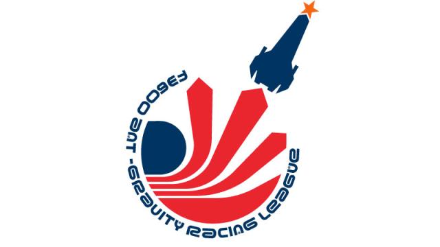
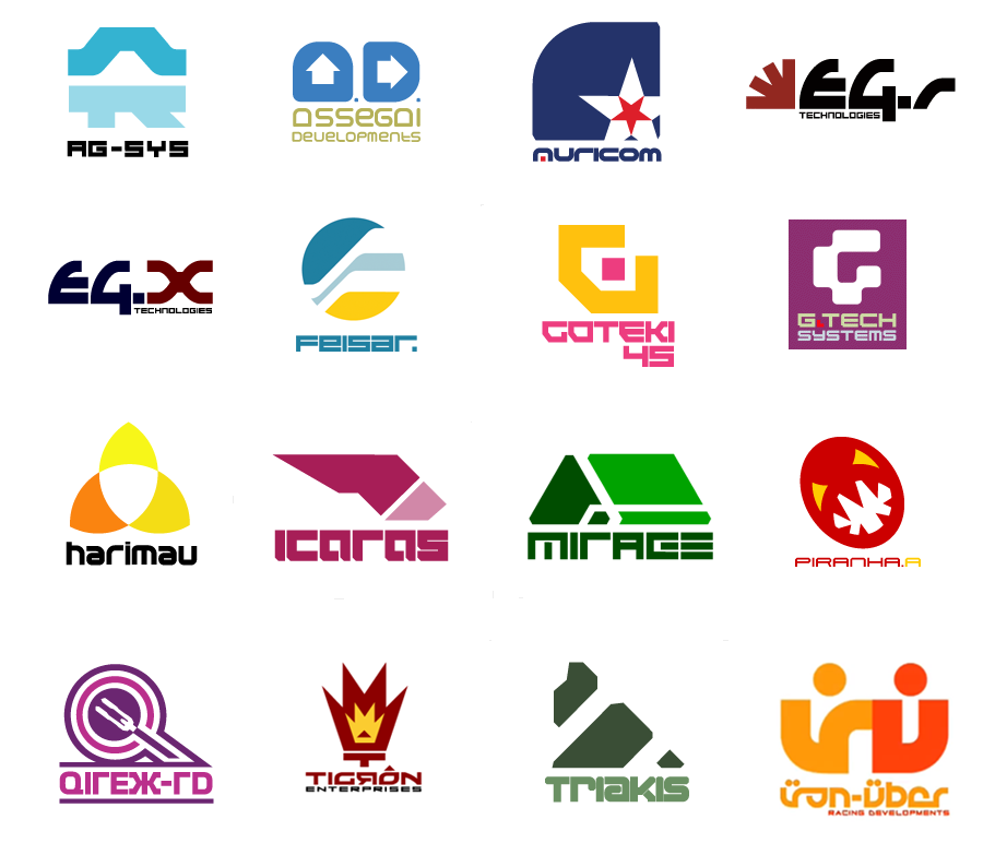
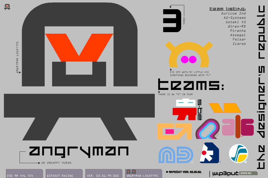
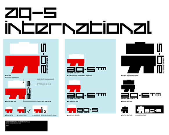
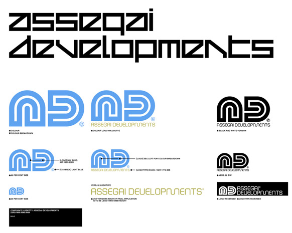
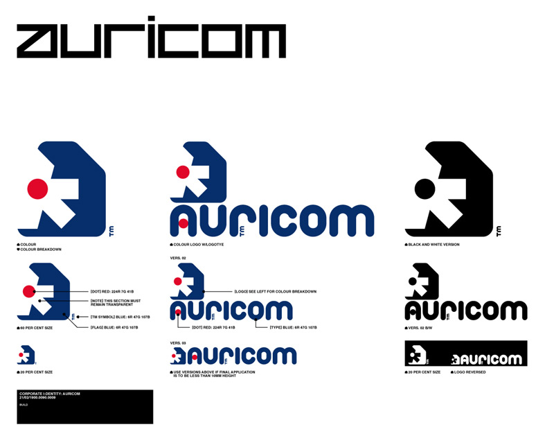
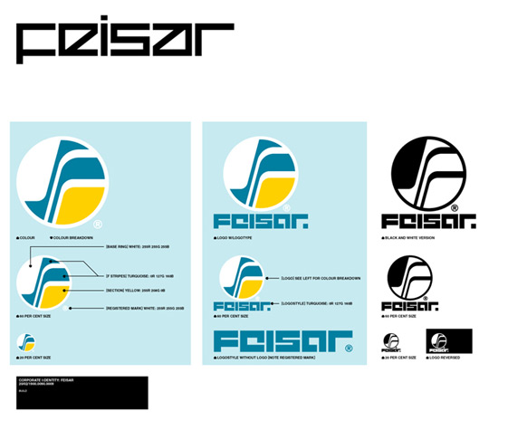
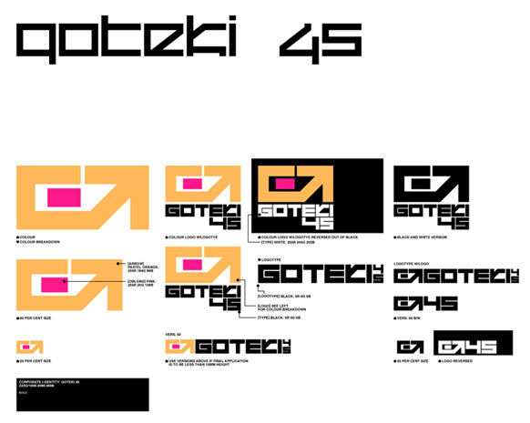
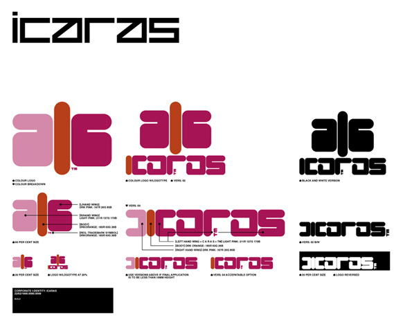
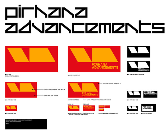
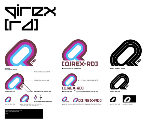
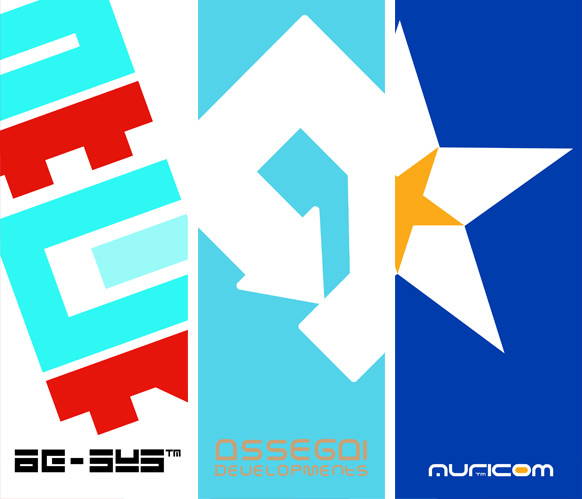
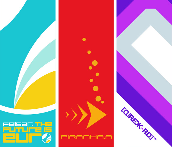
The Designer’s Republic main role was in creating the game’s branding. All those posters and logos and icons you see in WipeOut (and without, since they did poster and box design for the game’s marketing, too), whether on a ship or flying past you on a billboard, were made by a company that had become famous for its work in dance music and advertising, not video games. And that outside perspective did wonders.
WipeOut was a game set in the future, and it looked like it came from the future. Even today, over 20 years after it was first released, its J-Pop vs Syd Mead style looks fresh as hell.
So happy birthday, Designer’s Republic! And thanks for all the desktop wallpaper over the years.
Fine Art is a celebration of the work of video game artists, showcasing the best of both their professional and personal portfolios.
Comments
9 responses to “Fine Art: WipeOut Had Some Of Gaming’s Coolest Branding”
I was always a fan of the Piranha craft.
Damn…I need Formula Fusion to come out on PS4…
I think you mean that Wipeout was just one of the coolest games in general. As the series evolved the visuals became so distinct, around
Pulse it became so easy to tell if you were looking at a wipeout title.
We really need an updated version on current gen.
Wipeout had some awesome art, loved playing it as well.
I bought a PS1 for Wipeout, I bought a PS2 because of Wipeout Fusion and I got a PS3 because of Wipeout HD.
I’ve yet to buy a PS4.
Qirex RD represent!
Wipeout really was something else when it came out. The ships had a real weight to them that made learning to drift soooo rewarding, especially to Prodigy and Dust brothers 🙂
I remember making fun of opponents that used the pit stop, damn casuals, who gets hit in Wipeout? Me, all the time. It’s fun to make fun though.
In relation to the article, all the team logos looked suitably futuristic… except Assegai Developments which is clearly Team Sega.
Not as cool as Splatoon imo 😛
Amazing work. They also creates the Warp Records site back in the late 90s.
YES
i loved their work in wipeout and especially the intro where all the logos are animated