In the past, Kotaku has shown how Japanese animation has changed (here and here). But we haven’t really had a look at how Western animation designs have evolved over the years. So let’s do that.
[Image: Harry Partridge]
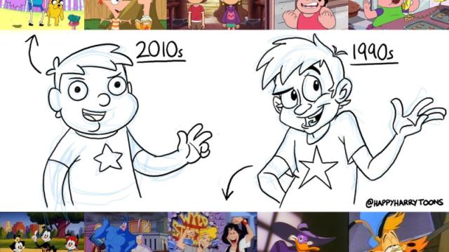
A while ago, animator Harry Partridge drew this wonderful and fascinating comparison. If you haven’t seen it, it’s worth a look:
A quick thing I doodled to show the differences I perceive in 2010s TV animation design vs 1990s. Thoughts? pic.twitter.com/dykLQT7wDI
— Harry Partridge (@HappyHarryToons) June 13, 2015
And what it would be like if the two styles were mixed:
.@SamGreenMedia Had a quick go at it. pic.twitter.com/vuUYDtpH4Q
— Harry Partridge (@HappyHarryToons) June 14, 2015
The full evolution:
[Image: Harry Partridge via Scotty415]
But what caused this sudden change? Some think it was The Simpsons or The Family Guy, and I’d add King of the Hill to that list. But there is a clear move away from the house styles of Warner Bros. and Hanna-Barbera.
Wonder where Western animation will go from here…
Harry Partridge is a very talented animator, and you can follow him on Twitter here or check out his work on YouTube here.
Comments
15 responses to “How Western Animation Has Changed”
Looks like it’s heading towards something like this.
I’d say that’s hardly the case. Shows like Steven Universe, Gravity Falls, and Over the Garden Wall definitely have less bold and slightly simpler character designs compared to other decades, but the overall quality in the art design (particularly the background art) and animation of the shows overall continues to improve more and more over the past few years. In other words, its softer, but getting much smoother and complex, not more basic.
Western Animation is definitely on a very quick decline as they focus on cost savings. This is apparent even with Disney since Saturday Disney no longer even features animations. I am guessing this is because its much cheaper to hire kids for live-action shows rather than animators for cartoons. 80s and 90s animation is far above millenium animation. Darkwing Duck, Talespin, Duck tales… instant classics
You ever watch Steven Universe or Gravity Falls? What about Rick and Morty? ‘Millenium’ animation isn’t any worse than the old animations – in fact, we’re actually experiencing a sort of golden age of animated storytelling right now, there’s so much quality coming out of unexpected places.
Rather than animation, this is merely a change in art styles. We’re trying new things in our animation that we weren’t doing before- minimalism, for example, in the case of things like Adventure Time. It distinctly creates the idea of a scribbled imaginary world that has come to life. We’re also using a lot of brighter colours than we used to, because of a distinct artistic direction that spawned as a contrast against the edginess of the late nineties and early 2000’s. We’re also seeing more unified colour palettes, like that of Steven Universe, with a solid focus on pastel colours (which, might I mention, are very popular in the indie comic scene right now as well).
I would definitely point at the Simpsons as a starting location for this shift in culture away from imitating the late greats and trying new, highly identifiable art styles. Albeit, there are a few Simpsons imitators as well, but the general movement has been a kind of ‘age of enlightenment’. What you have is rose-tinted goggles.
I was going to reply to the above comment with something very similar, but you summed it up perfectly better than I ever could here.
Over the Garden Wall probably has the best animation and art design overall I’ve ever seen from a western TV show. Its beautiful. And especially when you compare it the the funny and simple but often corner-cutting animation of early Simpsons…
Our current animation age is anything but “declining”, “cost saving”, “cheap”, or “far below” 80’s and 90’s animation. We’re essentially existing in a golden age for animation in general. Anybody who doesn’t believe me should actually take a look at the best of what we’re getting instead of judging right from the surface.
The peak was in the 1980s yes.
Hardly.
In fact, not even in the slightest.
You’re mistaking a style for quality. The character design of the 80’s was more detailed, yes, but it could also be very stiff and bland.
The shows today appear simpler but boast better art design overall, more unique character designs, smoother animation, and better stories/characters in terms of writing. Deep and simple is better than shallow and complex. The style of thr creator is now taking presidence in the show’s look overall, rather than feeling samey or manufactured like 80’s shows could. Its an evolution, slowly changing, not a line of quality with a definite peak.
If you don’t believe me, watch Over the Garden Wall from 2013. I dare you to watch it and tell me that the art in that show isn’t some of the most beautiful, creative, and atmospheric to ever come out of television animation. And the story and characters are endearing and memorable, to boot.
I like to cry into my episodes of C.O.P.S., Dungeons and Dragons, M.A.S.K.,….. Oh what it used to be like.
My theory is that it’s due to the decline of the “house” styles. The “90’s style” showcased in that tweet is what defined Warner and Disney cartoons (and those who’d copy/emulate them), of which 3 of the series in the screenshots belong. Warner’s style in the 90’s was the brilliant end of the long road traced by the “Merry Melodies” cartoons while Disney’s series were greatly informed by their famous movies. And yet, both styles, while clearly separate, shared several similarities fruit of the strong influences of the first masterful cartoons such as Felix the Cat and Betty Boop, which established “plasticity” and visual hyperbole as the common language for cartoons for the next half century.
Not pictured, because it was on its way out by the mid-90’s was the Hanna Barbera style, which was much more stiff, samey and cheap to produce than the other two. However, from its demise (and what a visionary producer raised from its ashes) we get what is, in my opinion, the greater influence for modern cartoons —much more than the Simpsons and similar: The “Cartoon Cartoons”. Series now almost legendary such as Dexter’s Lab, The Powerpuff Girls, Courage, Johnny Bravo, Samurai Jack and many others, employed a more simplistic and geometrical character design than Disney and Warner’s, with slightly less fluid animation and exchanging visual hyperbole with liberal use of surrealism, and slapstick with situation comedy. Sounds familiar? Yes, that’s also a good definition for modern animated series such as the 2010 ones in the tweet.
It bears mentioning here that the Cartoon Cartoons were, on their own, influenced greatly by Nickelodeon’s Nicktoons, and in fact, the great mind behind the Cartoon Cartoons had been also behind the Nicktoons. Now we’ve come to the important point of all this: both the Nicktoons and the Cartoon Cartoons, although each associated with a house name, did away with “house styles”, instead allowing the flourishing of “author styles”. This quickly became the more attractive path for young animators tired of being merely anonymous style-guide drones and who craved having ownership over their work.
And so, we arrive back to my very first point. “House” styles are mostly gone. Even the modern iterations of traditional cartoons by Warner and Disney have greatly diverged from their pre-2000’s recognisable features and almost every cartoon out there has its own style and visual identity. However, due to its increased production efficiency they, generally speaking, resemble more the Cartoon Cartoons than the other 1990 examples selected for that tweet.
This comment was better than the article!
I think you’re definitely onto something here. The biggest shows around now are all driven by a key creator/creator team (or as you say Author Styles) that set the aesthetic of the show. Personally I see this approach leaving us with much more entertaining and innovative projects than the old factory method.
Looks like Western Animation is following the tread of Western obesity….
Its just showing how lazy today’s western animators are becoming. mind you this is from a older guy so my view is warped from the likes of he-man and others i grew up with. no longer can we see a beautifully drawn background with detailed characters, now we get adventure time and teen titans. simplified very cartoonish somewhat abstract drawings with “adult” appeal!!! i want the 80’s and 90’s back where the golden age was!!
That’s old man’s talk 😛 I can categorically tell you that the stiffly animated and dull-sounding He-Man and its ilk had nothing on the incredibly fluid animation set to an orchestral soundtrack of the 50’s and 60’s cartoons such as Tom & Jerry, the Pink Panther and classic Bugs Bunny or Goofy. And in turn, someone could allege that those garish, loud and somewhat repetitive cartoons had nothing on the surrealist B&W classics like Betty Boop and Mickey Mouse’s cartoons, or the original Merry Melodies.
My point is that animation (and almost any other human endeavour) doesn’t “worsen”. It merely evolves. It’s just that as we get old and see the styles and genres we loved and grew up with be replaced, we cannot help to feel bitter.
I dunno, catching some old eps of TMNT on late night TV recently I was struck by how detailed and beautiful the title sequence looked, far more than I ever would have realised as a kid. And I think one of the episodes was from later in the series where they’d cut the budget and the animation style of the episode itself was far lower quality than either the title sequence or the ep that was on before.
I do think it looked better than what seems to be the norm now though, no modern cartoon I’ve chanced upon has made me sit up and take notice like that 😛
Oh for sure you’ll find individual examples that are worse of better than the average of their kind, this all is mere generalisation. Also the fact that you were already familiar with the material allows your subconscious to crawl for new, unnoticed things, also helped by the more discerning eye of an adult. Not saying, though that that intro wasn’t great or that such things are unlikely to be replicated in today’s cartoons. They just have a different set of values.
The worst offender: Problem Solverz
A lot of the comments here seem to be confusing quality with style choices. As a 30+ year veteran of the animation industry, from 2d to 3d, I think the current generation of shows are some of the most brilliant, innovative, and artistically beautiful animated shows ever seen. The quality of the story telling we’re seeing in shows like Rick and Morty, Adventure Time, Gravity Falls, Regular Show, etc. is far beyond most of the cartoons we were making in the 70’s and 80’s. There was a major shift in the technology we used in the early 90’s that dramatically changed the visual aesthetic (for the worse in my opinion), but we’re well into a generation where that technology has evolved to a point where artist are once again able to make the stylistic choices they want while still benefiting from the time and budget saving aspects of this technology. Another thing to consider is that the current generation of creators would have mostly come of age in the late 70’s through the 80’s. So it’s not surprising that their artistic sensibilities are more in line with the softer, curvy aesthetic of that generation than the sharp, angular designs of the 90’s. Animation is far from being in decline. It is simply moving in the direction that the artists and viewing public push it.