Valve just rolled out what they’re calling “The Discovery Update 2.0” on Steam. It revamps the front page of the store and (slightly) changes the role of curators in Steam’s broader ecosystem.
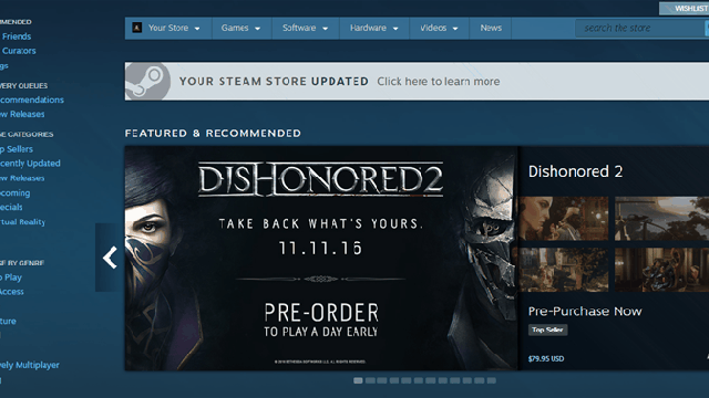
The new front page is actually pretty similar to the old one, but with a few key differences. Handily, game listings are now accompanied by screenshots, and if you mouse over them, you can see them in glorious Big-O-Vision.
There’s also a new section for friend activity, so you can see what your friends are into and, if you’re willing to fork over the cash, join them. The sidebar now includes more information, and many sections like “recently updated” and “under $10” are now personalised based on the games you own. Also, many buttons are now bigger and bluer. It’s a bold new world.
On the curator front, it’s no longer just about recommending games. For quite a while, curator groups like The Framerate Police and the Anti-Consumer Practice Report have used the system to provide information and warnings as well as recommendations. Valve has finally baked that feedback into the system’s DNA, allowing curators to indicate whether they’re recommending a game or not, or if they’re just offering information.
So anyway, those are the basics. I haven’t had enough time to render a verdict, but to be honest I’m not super impressed right now. As I’ve discussed at length in the past, Steam has serious issues. Valve’s positioned this as their big update for 2016, and all it really solves are a few minor usability problems. I’m not looking for a silver bullet, but an indication Valve is moving Steam in a different direction would be nice. I’m sure they have more cooking, but it’s hard to say when they will roll it out. For the time being, Steam remains largely the same – which is to say, deeply, deeply flawed. Have you had a look around? What do you think?
Comments
8 responses to “Valve Overhauls Steam’s Front Page”
sigh* wtf is wrong with people, my email, Steam and kotaku/Giz all look the same now and it looks like shit.
I dont want the massive areas of wasted Space and HUGE banner like adds/articles.
What moron decided this was nice to look at?
People always talk about the big problems with steam, but I’ve never really understood what they’re referring to?
I’ve had a few REALLY frustrating game installation bugs over the years where I’ve wasted tens and tens of gb downloading games that then loop back to 0% and start again, is it about stuff like that? Or the amount of the PC market steam controls?
I think what people are talking about when they say it has problems is less about the game experience and more about the marketplace and features surrounding the core game experience. (eg. The social aspects)
Issues with Steam are-were…
A) poor storefront design, especially with 100s of games out each month.
B) No oversight on greenlight and shonky developers using the system to make and sell crappy games to consumers.
C) Australia tax creep when they bought region locking
D) Australia still has to pay in USD.
E) Lack of customer support that isnt a copy and past email that doesnt answer anything
F) Lack of accountability or care for the community/customers from Valve unless they are in serious trouble from authorities. (Csgo gambling, hacking, fraudulent developers, refund policy etc)
F) No Half Life 3.
I don’t feel like Steam has ever run reliably on my iMac (maybe there’s the clue). Lately the screenshots and videos haven’t been loading, I’ve had text appearing in the wrong places, buttons not working etc. I’m not sure whether it’s a problem on my end but no amount of fresh installs seem to help. I’m hoping this update improves things on that front…
Do you use Privacy Badger by any chance? I had resources not loading on Steam a few days ago and it was because the Privacy Badger plugin is broken on Chrome right now. Probably not your issue but thought I’d mention it.
Nah, got nothing like that running and unfortunately the new update didn’t resolve things. Thanks for the tip, though.
The new update, as I expected, has crammed even more useless crap I don’t care about in front of the things I do care about without any way to configure my preferences for what is shown on the front page. I now have to scroll a lot further to get to the list of new and upcoming items which is all I want. If I want to look at the other things, I will go and look at them, but on another page. It’s like when I walk down the street and every five seconds there’s someone either trying to get me to sign up for something or shoving leaflets I don’t want to read at me when all I want to do is get to the train station. /rant