The fencing game sequel arrives next month with a bigger, more detailed art style, including a beautiful recreation of the start screen from Super Mario World 2: Yoshi’s Island, prompting the question: why are so many level select screens usually so boring?
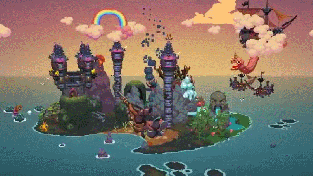
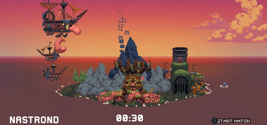
Although revealed earlier last month during a gameplay demo, Nidhogg 2‘s level select screen didn’t catch many people’s eyes until creator Mark Essen tweeted a nifty GIF of it in action earlier today:
So close! #Nidhogg2 launches Aug15th on #PlayStation4 https://t.co/z8yihneTwU and #Steam https://t.co/VMVKlQsg2i Preorder for a discount! pic.twitter.com/D94FzxxhCA
— Mark Essen (@messhof) July 29, 2017
If you’re anything like me, you recognised that the setup was familiar before being able to recall exactly where you’d seen it before. The camera panning around a 3D island with unique, oversized locales bursting forth is of course taken from Yoshi’s Island on the SNES.
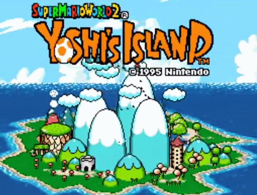
Definitely one of the system’s more memorable opening menu screens, it revealed all of the different worlds the player would visit by the time they finished the game. Deeper into the actual game, however, levels were reduced to rows of small square panels with thumbnails for each stage that started out grey but were filled in with colour once beaten.
Being a 2017 game, however, Nidhogg 2 was able to take the starting menu screen idea and make it into a fully-fledged level select menu. In the game you and your opponent try to stab one another, forcing your way tug-of-war style across a map until one of you is out of room and defeated.
Like a lot of side-scrolling 2D games, it’s claustrophobic and constrained. The map UI helps balance that out a little, like an establishing shot in a movie, book-ending the experience of each fight with the memory of larger, more open world and a refreshing sense of scale.
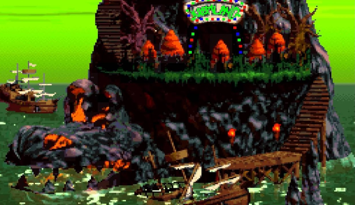
The island surrounded by a colourful abyss was also employed in the Donkey Kong Country series, most notably in Donkey Kong Country 2. The island didn’t rotate, but unlike Super Mario World‘s overhead map view, players got to choose levels by navigating a detailed and lively background with different sections of the Crocodile Isle corresponding to different worlds.
Nidhogg 2‘s callback to some of the SNES’s most creative UI work is a reminder that not every select screen has to be a flat labyrinth of thumbnails. Maybe the Mega Man series can get away with using the same setup of the Blue Bomber shifting his eyes to whichever Robot Master the player currently has her cursor on given its now iconic status, but there’s no reason other games have to be similarly lazy.
Fighting games especially, of which Nidhogg 2 is one, could stand to get a little more creative with their presentation, not in the fights themselves but before and after. I can’t hear the word Japan without thinking of the announcer calling it out every time someone chose the stage in Street Fighter II.
Over two decades later, however, the series’ method for choosing locales hasn’t really changed. If anything, it’s regressed. At least in SFII you could globe trot on a 2D map. In SFV, you just swipe through a collection of slanted panels.
Comments
2 responses to “Nidhogg 2’s Level Select Screen Is A Nifty Callback To Yoshi’s Island ”
God this game is ugly, can we go back to the first games simplistic and easy to read style already?
That looks like wonderful, I love it! What a great homage.