The latest update to the Xbox One’s dashboard is rolling out to preview program alpha members today, adding cool new features such as a modernised community page, a revised guide menu, and the ability for players to build their own home page using custom “content blocks”.
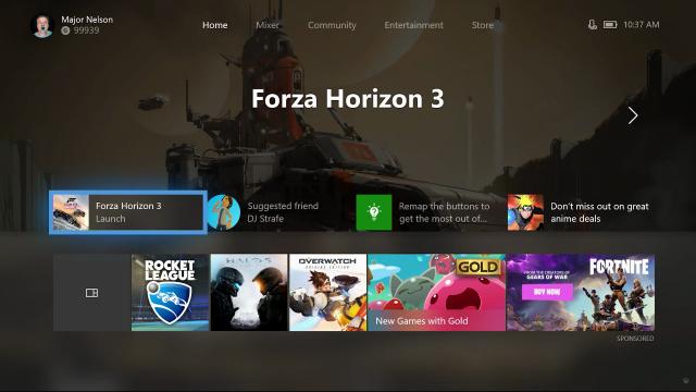
That’s right, the Xbox One dashboard is changing again. Gone are the vertical columns introduced in the March update. Now console owners boot up their systems to a relatively clean top page featuring their most recently-used games plus a couple of ads, hints and suggestions. But the home page doesn’t stop there.
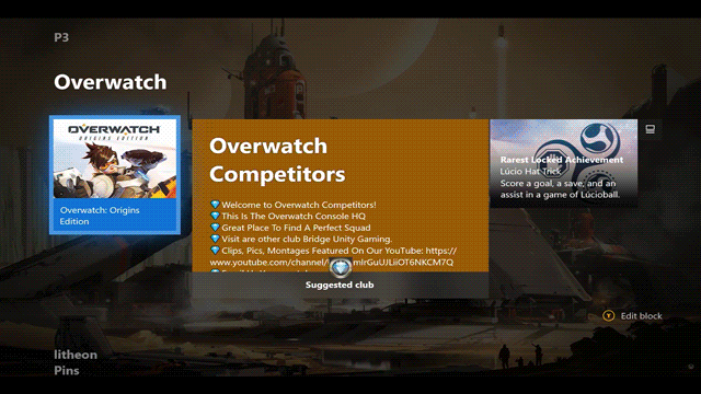
Using the new content blocks concept, players will be able to pin just about anything they want to their home page. Games, friends and services can all be pinned to home, generating a personalised page that shows up when users scroll below the newer, cleaner splash screen.
Players can pin as much as they want to their home. Or they can pin nothing at all. It’s all down to personal preference.
Also much improved and revamped is the guide, AKA the menu icons. Right now they are running down the left side of the screen, where they look like garbage.
We were so stupid back then. In March.
In the new dashboard, the guide is a pop-up box with a series of topics along the top, easily navigable with the Xbox controller’s bumpers or analogue stick.
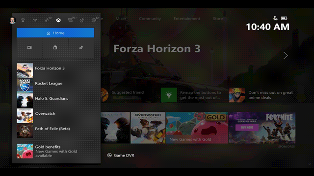
Not only is the menu more easily navigable, it also looks to be a great deal faster, as seen in the preview video below.
Also included in the update is a refined community page, where players can choose what sort of feeds they want showing up, with options such as friends, popular games, followed clubs and other favourite content.
You can find out more about the upcoming changes in today’s post on Xbox Wire. No word on when the update will go wide aside from later this year. Hopefully that will give Xbox One owners a chance to say goodbye to the dashboard introduced just five short months ago. Oh March update, we hardly knew ye.
Comments
10 responses to “The Next Xbox One Dashboard Update Lets Players Customise Their Home Screen”
Hmmmm….
For something they say is very customisable, it still looks like they are taking up a lot of space for their ‘ad space’ and suggested menu items.
Personally I would love to start up my console… and the ‘home’ screen I see is two blocks of pins, one on the left for entertainment apps (netflix, stan, spotify, etc…) and one on the right for games, and that’s it. No suggested friends, no deals with gold, no latest release movie deals… That would be my definition of being fully customisable.
Maybe keep the ‘deals with gold’ there are some good prices for games there sometimes.
I’d love it if it’d let me ditch the Mixer, entertainment and community tabs, 3 things I NEVER HAVE and NEVER WILL use (especially Mixer)
The new home screen design is absolute trash. Give us back the original setup or at least give us the option to change back. This is bullshit and the vast majority of people don’t like it.
I hate the Xbox One dashboard so much. I have an original Xbone (not the S), and I think it’s a slow and bloated piece of trash. I also hate the ads.
The PS4 and the Switch on the other hand, have great dashboards.
A good dash should be simple and responsive. Users should be able to figure it out at first glance.
Oh god no – the X1 I can get to any piece of content in about 3 clicks. PS4’s XMB is unorganised trash that feels reliant on randomness.
Horses for courses I guess.
Bloody hell, it still looks awful. This is just one of the major reasons my PS4 pro has primacy over my xbone. Despite the bone-S being the only machine with a 4K blu-ray player.
Fuck’s sake, why do they keep doing this? Good UI doesn’t have to be this difficult!
Ditch the ads, reduce the number of button-presses I need to make to get to any one function (especially without already knowing where it is).
MORE MENUS = BAD. I don’t understand how this isn’t rule one tattooed onto every ux designers’ forehead as punishment for past dashboards.
Whilst i agree that the xbox menu system isn’t the best, neither is the ps4 menu – that single bar of non-sortable games that you have to scroll through is stupid and a major waste of screen realestate, I find myself using the library page instead.
Both systems could really learn from the modding community, the custom games launchers and dashboards out there like multiman and freestyledash/aurora are so much better to use
Or you could organise your games and apps into folders. I have a 2tb HDD in my PS4 and I have organised all my games into folders for RPGs, Shooters, Action, Adventure ect and my apps into an app folder for Plex and the like. I have 11 icons across my bar including the store and the feature one. You can sort the games position in the folder, and when you use an app from that folder it gets moved to left most position.
It’s simple, clean and easy to navigate.
Maybe it’s the rose tints but i can’t help remembering pretty much all of the dashboards on 360 being better than any of the iterations so far on the One. Or the PS4 for that matter.The store too is a poorly laid out & clunky mess, luckily the PS4 one is even worse so it deflects some of my negative attention away.
Just written this on another comment somewhere but sometimes less is more – the dash would be a lot clearer/more responsive if it only loaded all of the movie stuff if i asked for it, same for all of the other tabs – just make them all easy to find and let me decide if i want to see them or not, instead of the slow moving, janky rubbish we have now.
I get that some people will complain regardless of what they put out, but the fact they’re changing it so often suggests they’re not happy with it themselves – it shouldn’t be this difficult, especially for a company founded on OS/UI/UX software?
The 360’s dash went from strength to strength until it ended up just full of ads. Every god damn page of the 360 dash had at least two adds on it at one point, really started to get to me. Xbox one is slowly going to same way.
I still crank the 360 every now and then and my god, it’s just so easy to navigate. X1 is a giant POS. They’ve just tried to make the X1 into Windows 10 but (Without the ads) the xbox 360 dashboard was absolutely perfect, could be even more perfect if you could manage each tab yourself.
I mean we’re in a world where the most basic of smart phones can move around apps on the home screen… why cant we just do that still on console? Sure keep ads on the side, I dont care, I just wanna have an icon for the ~5 games I’m playing at the moment as well as a few of the main apps I use on the home screen with nicely sized icons so I can see them all at once