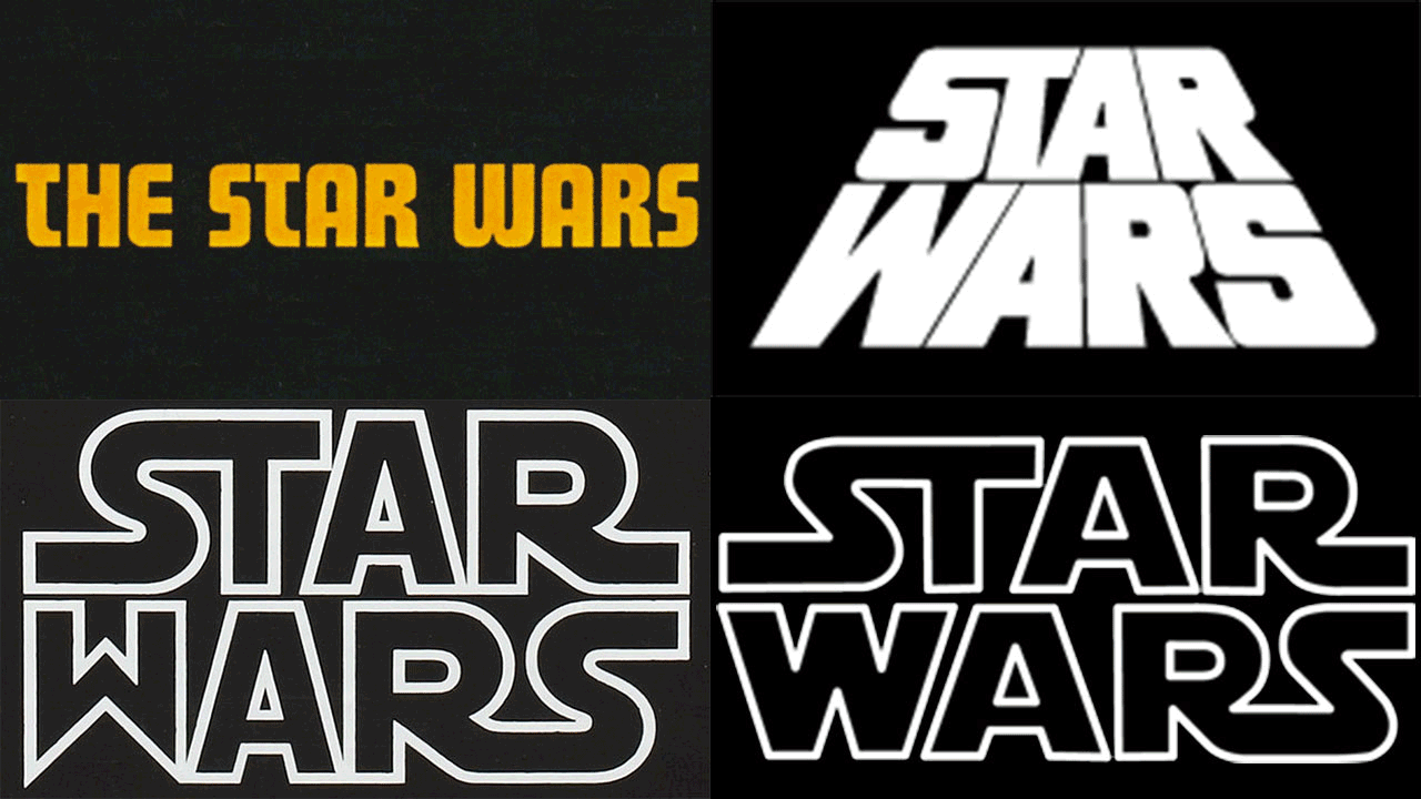
It’s one of the most iconic logos in all of pop culture, right up there with – ahem – Disney’s branding, but for the longest time, Star Wars enjoyed a mish-mash of logos and title fonts, a mess that, believe it or not, wasn’t locked down by Lucasfilm until well after the first film’s release.
Changing names from The Star Wars to Star Wars, changing fronts from Futura to Helvetica, anyone who’s followed the history of the series will know that early promo material and posters for Episode IV could be sporting one of 3-4 title logos.
It wasn’t until Suzi Rice was approached by George Lucas to come up with something “fascist” – a fascinating story in its own right – that we got the logo we know today.
You can see some of the major changes above, but for the full list, including some bizarre iterations used for stuff like novelizations, check out a big write-up at Tenth Letter of the Alphabet below.
Anatomy of a Logo: Star Wars [Tenth Letter, via Boing Boing]

Comments