Then they’d probably look a little like these emblems created by benjamagnus — which are clever even if you don’t follow hockey stuff too closely.
And if you do follow hockey, you might even think some of these are better than the original logos! Personally, I’m a fan of the Detroit Red Wings’s logo reimagined with Pidgeotto above, and Brockhawks is just too good. Owen notes that the Columbus Bluedrills not only have a better logo than The Columbus Blue Jackets, but also have a better name. You be the judge, though:
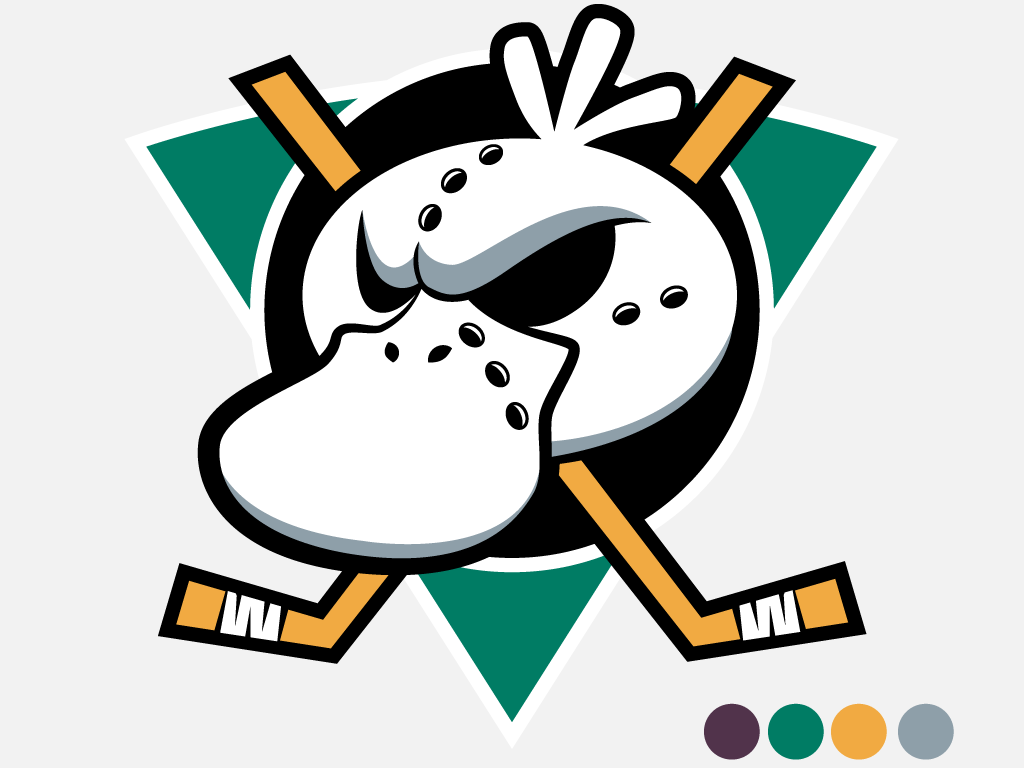
Anaheim Mighty Psyducks
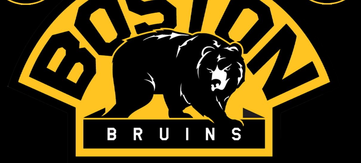
Boston Bruins + Ursaring
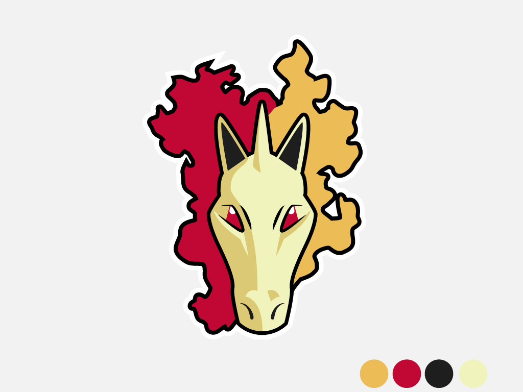
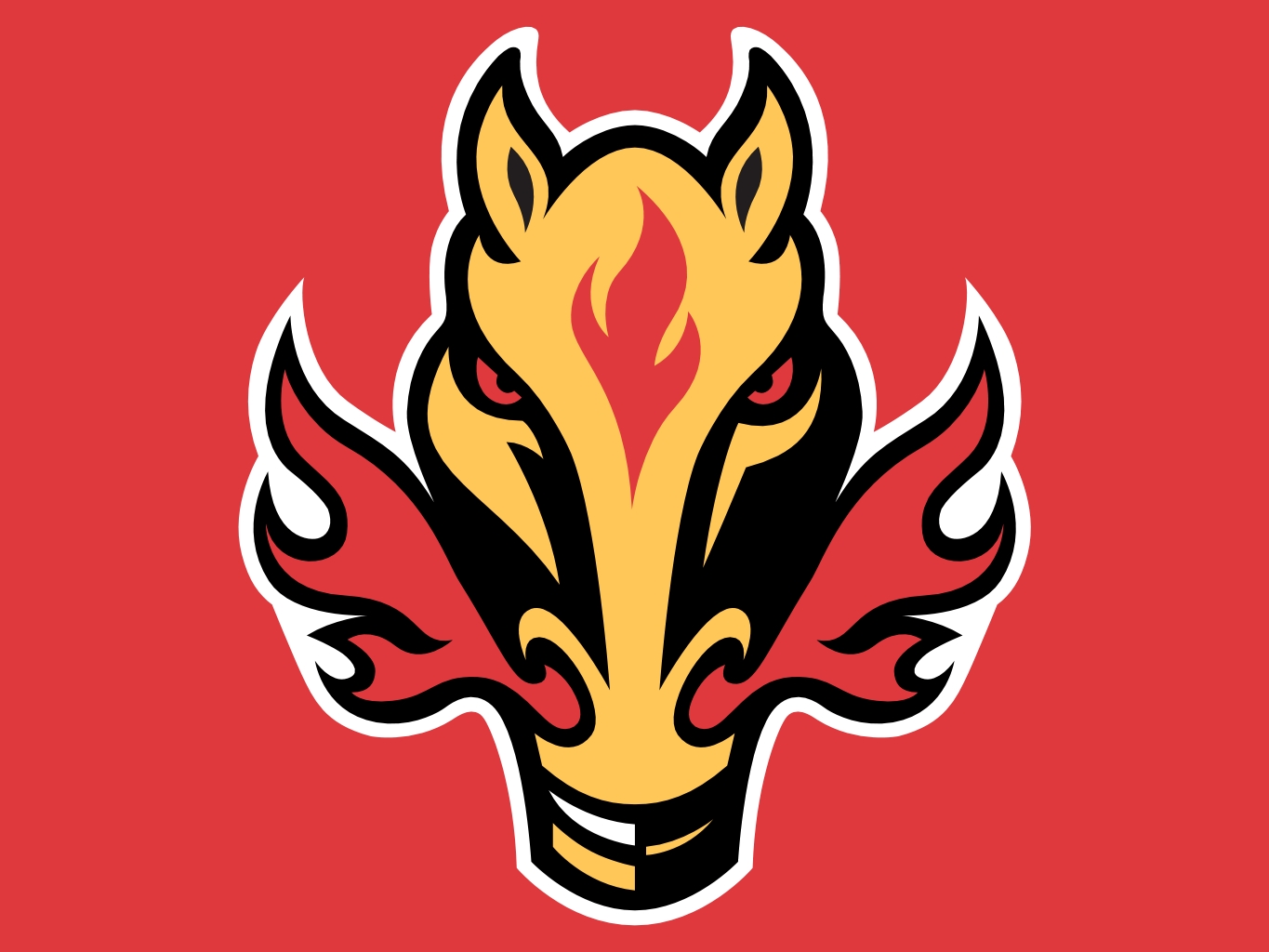
Calgary Flames + Rapidash
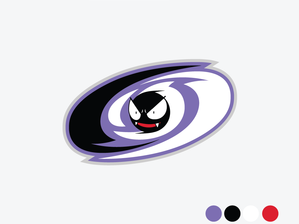
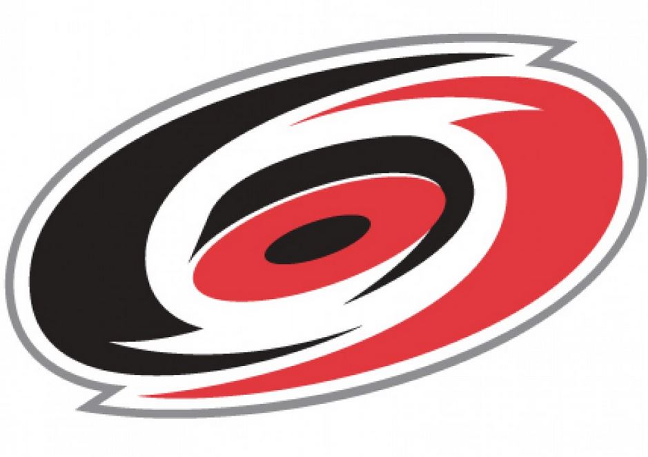
Carolina Ghastlycanes
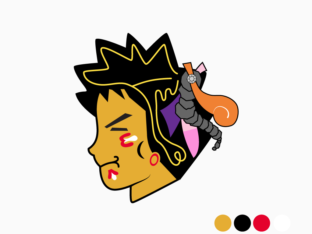
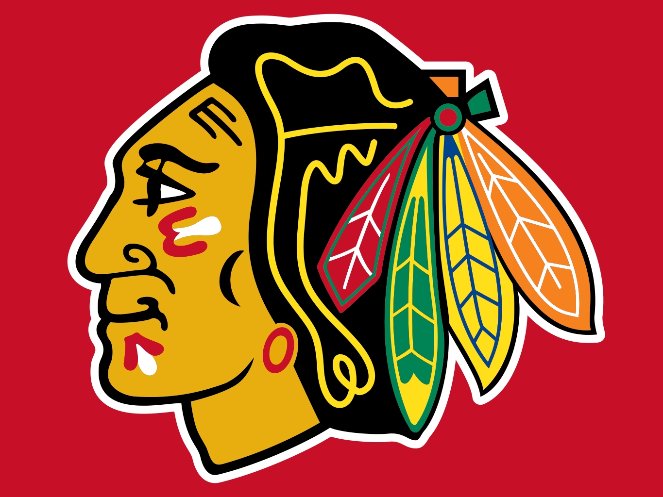
Chicago Brockhawks
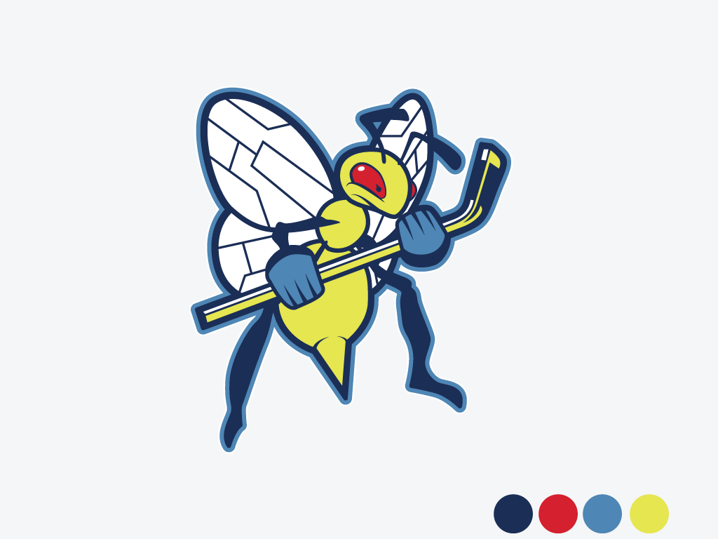
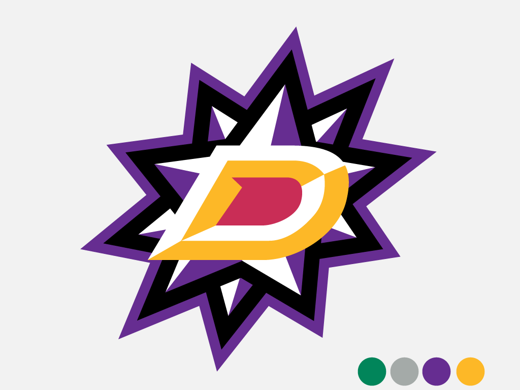
Columbus Bluedrills
Dallas Starmies
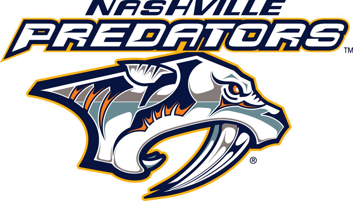
Nashville Predators + Raikou
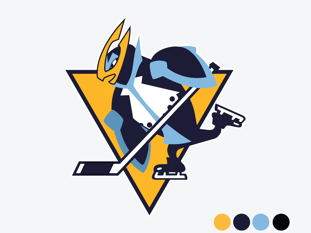
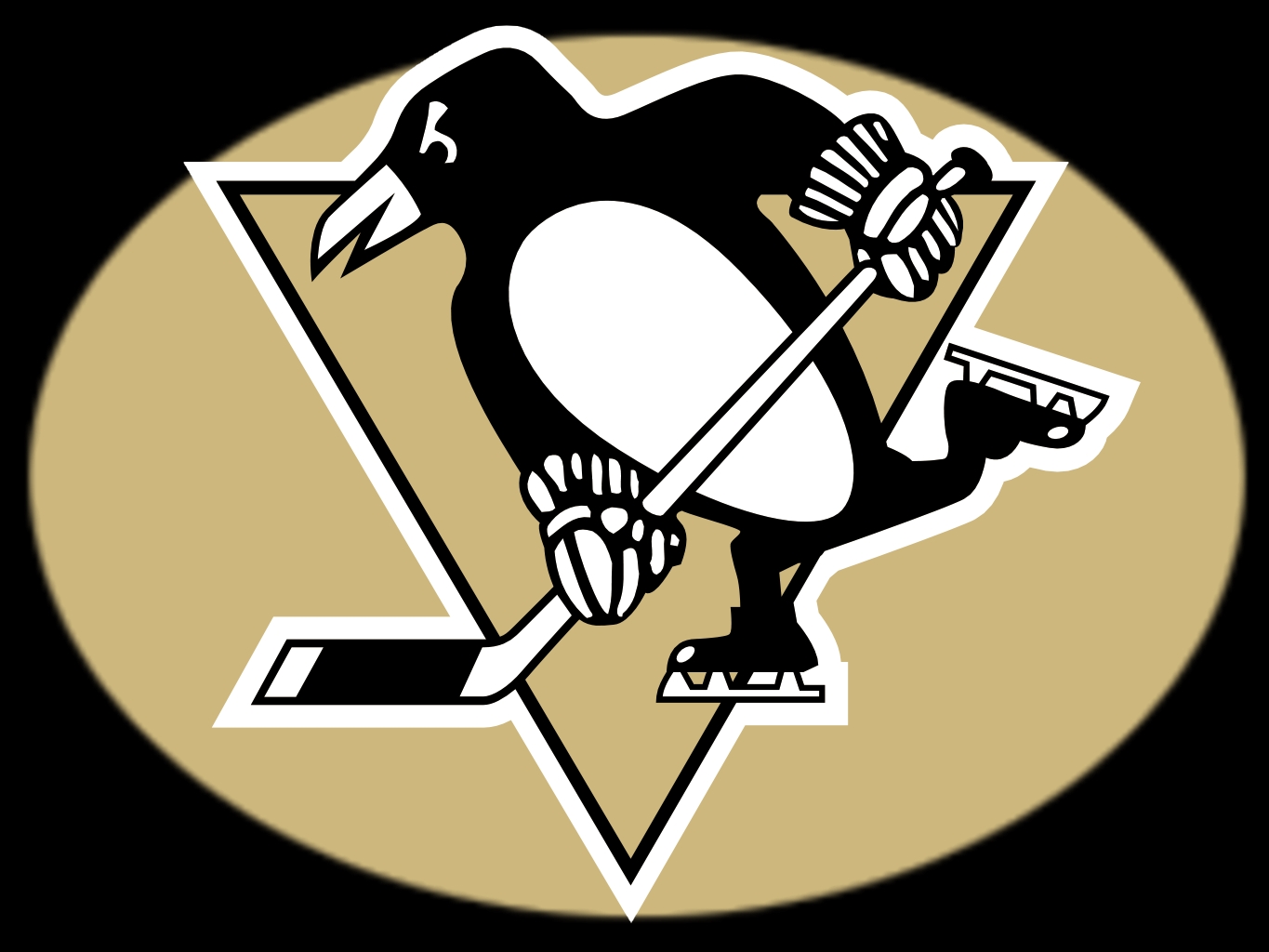
Pittsburgh Empoleons
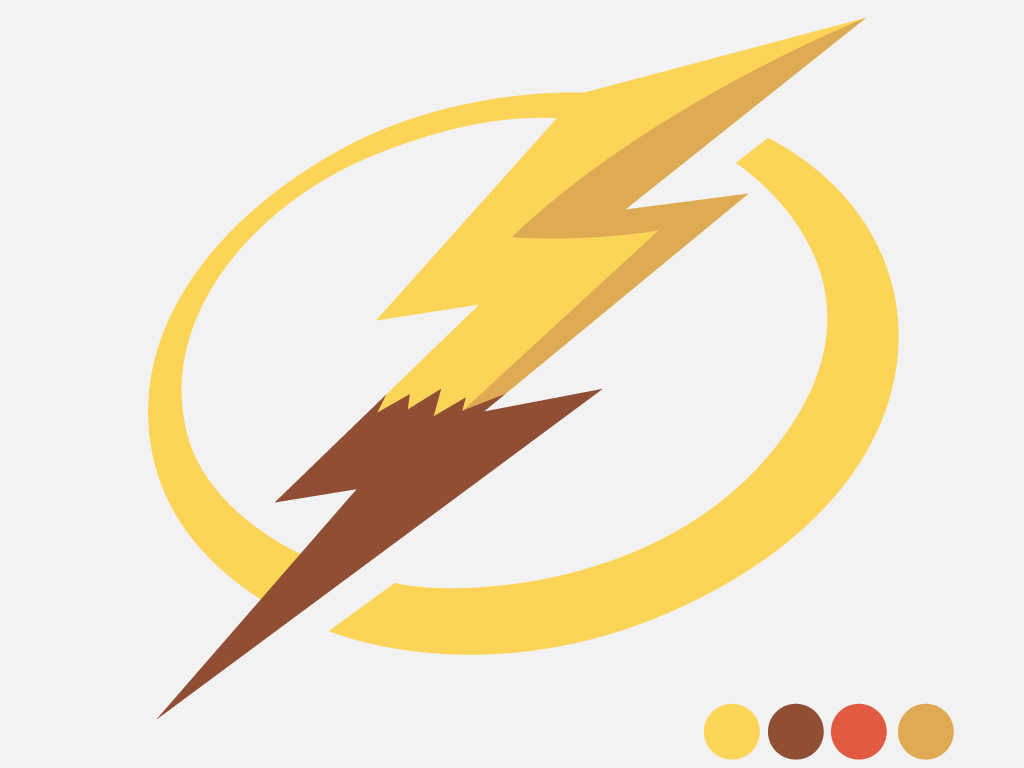
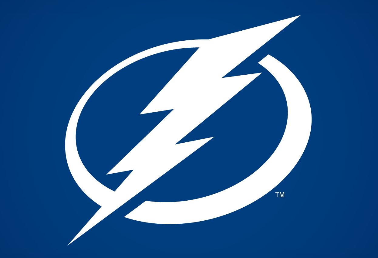
Tampa Bay Lightning + Pikachu
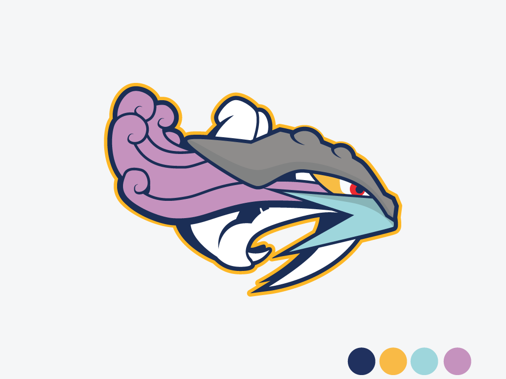
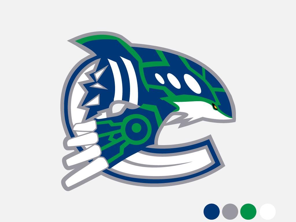
Vancouver Kynucks

You can view the rest here.
NHL Pokemon [imgur via Unreality Magazine]
Comments
3 responses to “If NHL Logos Were Redone With Pokemon…”
These are awesome!
2 things that couldn’t be more far apart actually fit well together.
It would appear they forgot my team… 🙁 ….(San Jose Sharks)
some of those work so well that they should be adopted.