This is the Lightning Returns: Final Fantasy logo. You might have also seen this logo with an all-black background. But have you ever seen the rejected ones?
At a recent event in Tokyo for Lightning Returns and Final Fantasy X/X-2 HD, Square Enix showed off the Lightning Returns logos it didn’t end up using. Below, you can see a photo of the logos, courtesy of Japanese blogger Ayumi.
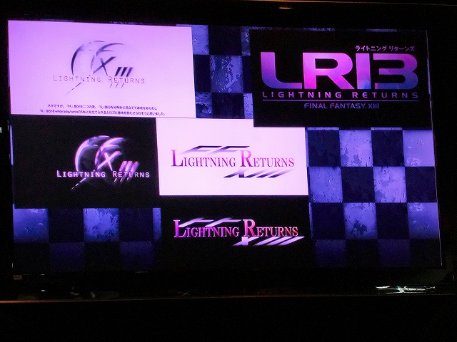
Do you like any of these more than the logo that Square Enix finally decided on?
FF10HD&LRFF13 合同のクリエイターズイベント【東京】に行ってきました あゆみの徒然日記2 — Thanks Alex!]
Comments
7 responses to “Check Out The Rejected Lightning Returns Logos”
Nope, they definately made the right choice with the Skyrim logo
Would have upset a lot of people with that X themed logo. Especially if it was used as a teaser image :p
Their graphic designer seems to have the skills of a first year design student. Someone inside obviously digs it.
I think the two on the left are okay, but the other three look like someone’s first attempt at Photoshop…
Yeah, a first year design student in the 90s.
They all look like NES Titles except for the top right – which literally looks like it’s supposed to say GRID instead 😛
To be honest, I don’t like any of them, including the one they settled on. They all feel derivative. Maybe I’ve just seen too many logos.