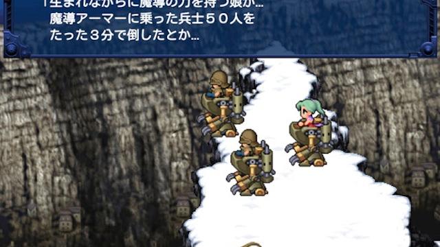
While there is no way I’m not going to replay Final Fantasy VI on mobile — it’s one of my favourite games of all time, and I want it on my phone — these sprites are seriously bumming me out. They feel flat and boring and lifeless, like the artists were told to transform everyone into goofy, watered-down cartoon caricatures.
Seems like Square Enix is using the same graphical revision that they used for the mobile port of Final Fantasy V. It doesn’t work. It looks like a weird emulator filter or a collection of generic sprites from RPG Maker, which is not exactly how newcomers should experience one of the greatest games ever made. I’m not looking forward to seeing what the sprite animations look like now.
For comparison, here’s the same shot from the original version of FFVI on the SNES:
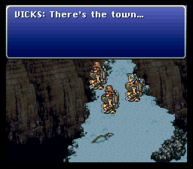
How do Super Nintendo sprites from 1994 look so much more layered and interesting and detailed than iOS sprites from 2013? We need an intervention, Square Enix. This is getting out of hand.
[via NeoGAF]
Comments
19 responses to “Final Fantasy VI On Mobile Isn’t Looking Too Hot”
Japan has got mobile gaming as wrong as America does. The amount of people playing these mobile games aren’t that high, it’s just that they do it so often that they seem like it’s the next evolutional step of gaming.
Not only that, but these people only do so when they’re bored and waiting for the bus. Asking them to get invested in the story of FF6 is too much.
It’ll look better in motion
This is my favouritest game ever….Thankfully I already have it on my vita so I’ll give this weird lookin one a miss
Yep yep! i love my Vita purely for the PS1 store and VI was the first thing i got!
Holy crap, I completely forgot I even had FF5 and FF6 on PS3 as PSone Classics, which I can also play on my Vita! Nice!
yep FF6 is brilliant on the vita.
definitely in my top 10 games.
it had been a looong time since i had played it and damn if it doesnt have a great sound track
All sony’s ports have been on the cheap and way to expensive to buy as an app. I think ff7 was about $20, i’m pretty sure the original game when it came out for pc was $20, 10 years ago… I just can’t draw a line there.
not sony .. derp.. i meant square..
Wow, that really does suck.
I don’t hate it… But I don’t like it. Certainly looks less depressing, which is a bad thing.
I thought it looked alright but there was just something wrong that I couldn’t put my finger on… I think you’ve got it though, it’s too bright, too ‘crisp’ when it should look dark and depressing.
I don’t mind the new style but I don’t think it fits in this case.
Meh, looks ok to me.
Maybe I’m just not a snobby hipster.
Although FF6 is one of my all-time favourite games, I will be passing on this, simply in protest. I don’t want to be seen supporting Square-Enix in making quick crappy ports to iOS instead of doing a proper 3DS remake like they should be.
As someone who doesn’t have a nostalgic connection to Final Fantasy (and therefore kind of unbiased), I think the new ones look better.
They’re the same design as the old ones, just less pixellated.
I have the nostalgic connection and the new version looks vastly better. I’m not sure what people want, short of redoing the game from the ground up, which personally I think is silly.
They updated all the sprites in the last few FF’s. If you’ve played DIMENSIONS (which is a great original phone game), it has this style.
I had a look at both those images and I think I know what the problem is – it really seems to come down to a single final lighting layer. None of the top image character have specular lighting while the bottom ones do. As such they look like they’re made out of completely diffuse objects aka playdo. The metal doesn’t seem metal and the eyes have no “sparkle” to them.
FF6 is one of my fav games as well, but I think these look just fine. They are almost exactly identical to their 16-bit originals. If you want the retro-feel of the pixels, just play a classic version. For the new generations that couldn’t give a damn about nostalgia, this will be an excellent and palatable introduction to this wonderful game.
I’m not fussed either way since it was never the graphics that made me love ff6. http://youtu.be/eX7KZg8ZQj4 I’ll just leave this here.
I’m a graphic artist. Aside from the color tone changing, and changing the whole vibe, what you’re seeing is lower peception of detail. Part of this is because they’ve foregone the hard black-to-white scale that was necessary to get as much detail as possible from the lower-color palettes on the SNES. They indicate implied shading levels that are absent from the newer visuals, the new version should’ve gone for a harder contrast and used the increase in resolution to depict depth, but the art lead has apparently chosen not to do the obvious, probably for production reasons.
You’re also missing that hard textural/patterning contrast you see in the ground which also represents implied detail but also creates a pattern contrast, related to how your mind compares circles to lines, horizontal lines to vertical lines, etc.
There are merits to the new visuals, Terra’s face not looking like it’s been stretched over a crate being one of them. Overall it elucidates not only what’s absent from the original game, though, but also what they’ve foregone in highlights is what sold the suggestion of depth in the original.