
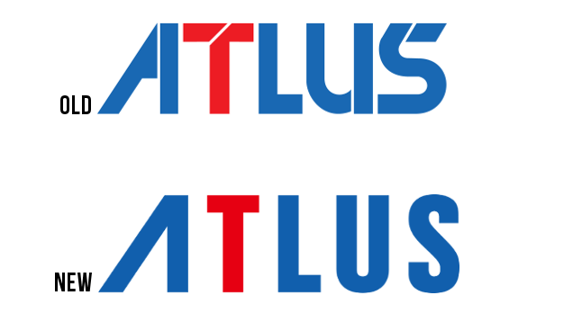
Atlus is back! And it has a slightly tweaked logo as well. Do you like it or hate it?
Some commenters on game forum NeoGAF do not like it. “Please be April fools,” wrote GAF commenter Kulapik. “It’s hideous.”
This isn’t April Fools’ as Kotaku previously reported that Atlus, as a corporate entity, was being reborn on April 1st. This seems to be part of that. (That is, unless this is an April Fools’ joke, which it doesn’t appear to be.)
As FluxWaveZ on NeoGAF noted, the logo is now on the company’s official Japanese Twitter, Facebook, and the Persona Channel website:

There were also comments that the new logo looked too simple or too compressed.
Other GAF users weren’t too fussed, saying there was barely a difference and this didn’t even matter. There were those who even dug it. What about you? Do you prefer the new logo? Or do you like the old one better?
Atlus has a new logo: /|TLUS [NeoGAF]
Picture: Megami Tensei Wikia
Comments
11 responses to “Atlus Has A New Logo. Some People Hate It.”
Yeah, I think it looks bad and the old one better. The original feels far more distinctive, but that seems to be the trend these days – take your logo and turn it into something more plain, boring and generic.
Hey as long as they keep releasing Persona games their logo can be a poop taking it in the butt for all I care.
The horror…THE HORROR!
The A is better, the old one was horrible, but the loss of the iconic T is just stupid. And the new kerning is godawful.
The kerning is mostly ok I think it’s just that the A is so much wider than the other letters and that’s throwing off everything else. It’s probably technically correct, but optically, i’d pull in the kerning for the T and adjacent letters slightly.
Ah yeah, it is technically correct. I just have a strong dislike for airy tracking in texts rendered in a thick, solid grotesk, especially in logos. It makes it look like someone just typed it on a word processor without much of a second thought.
Yeah that line between minimalism/intentional restraint and creatively deficient is so fine. Sometimes it is a case of the “audience” not having the necessary knowledge to recognise and appreciate what’s being done, but sometimes it’s just a boring end product.
IT’S OFFICIAL GUYS PERSONA 5 RUINED
They’ve done GAPped.
Looks like a knock off of Mobil now.
It is just… Boring. I agree in hoping it was an april fool’s thing, but I doubt it is, because it is even more boring as a joke.
There’s way too much whitespace now, and for some reason it keeps making me read it as “Altus”.