It’s been over a decade since Duel Masters debuted. The manga spawned a trading card game, which is still widely enjoyed. If you’ve never played, you’ll need to know something very important: bring sunglasses.
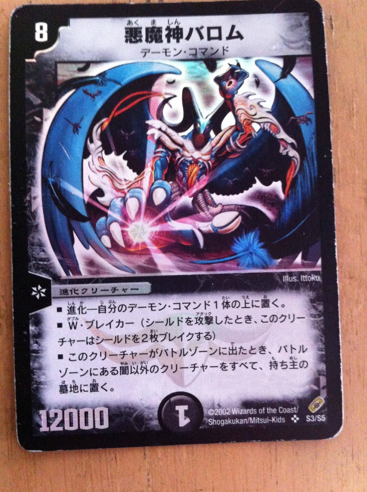
Here is what Duel Masters trading cards used to look like.
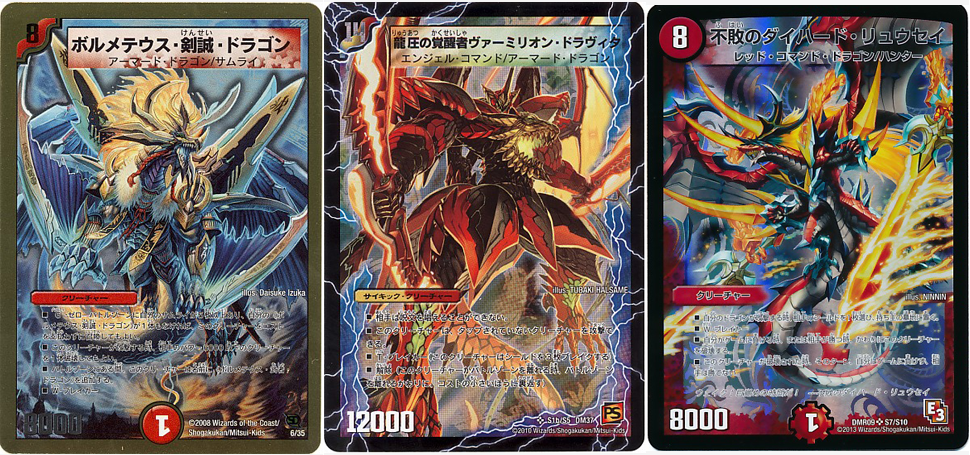
Over the years, the cards have become increasingly… busy. Which is fine!
Pictures: Duel Masters Wiki
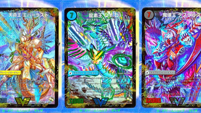
And now, as pointed out on 2ch, cards from its latest set, Dragon Solution Gaiginga, look like this:
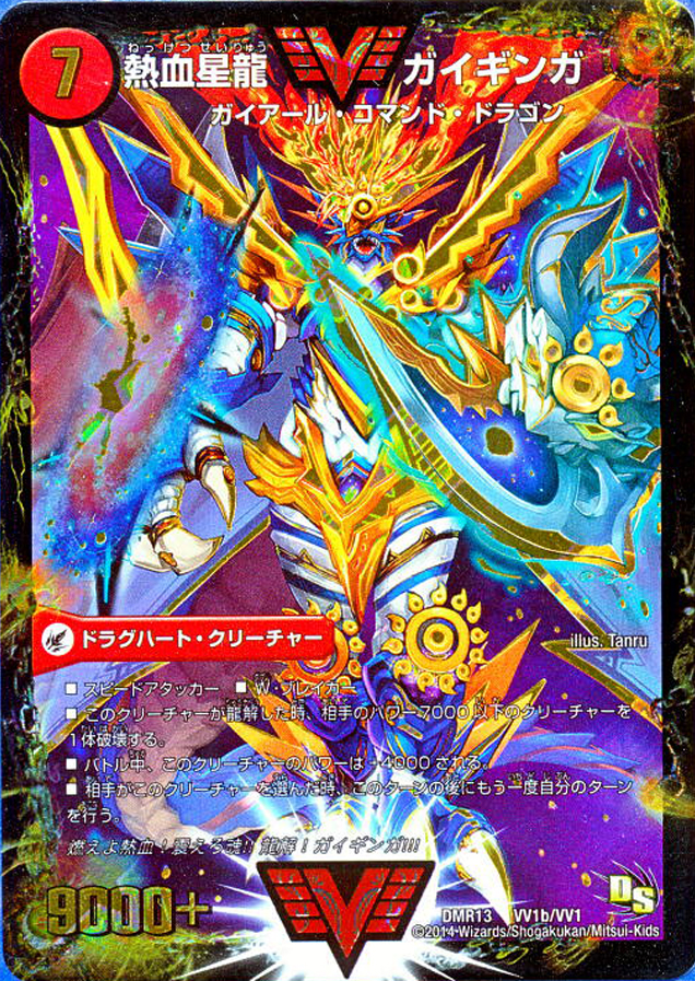
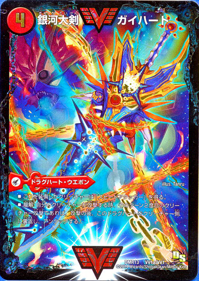
The art is dramatic and all, but man, it sure is difficult to make out text! Maybe it’s just the background of the original photos, but I keep having to hold my hand up to shield my eyes. I blame the increased use of turquoise. (Seriously! Stop with the turquoise.)
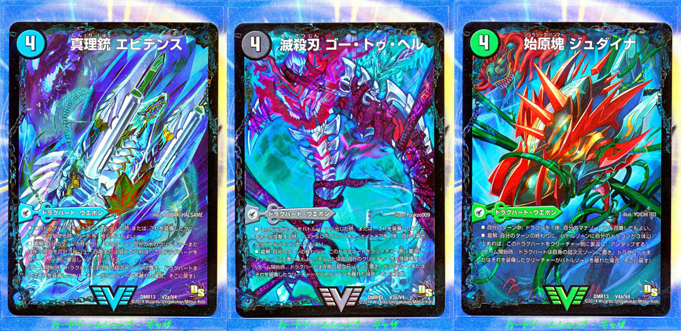
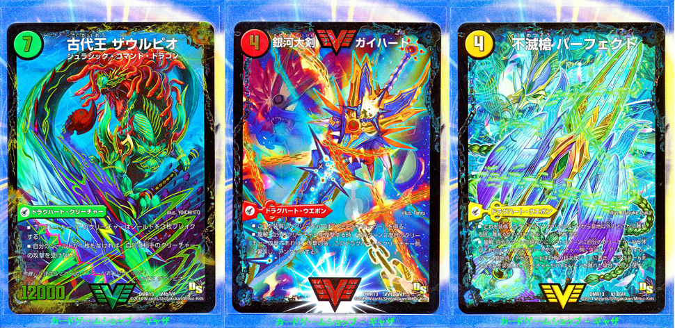
I haven’t seen the full deck, so I can’t say whether or not all of them are as eye-melting as these. But you got to give the Duel Masters folks credit: Dull, these cards certainly ain’t!
デュエルマスターズの新カードwwwww [2ch]
Comments
5 responses to “Popular Card Game Is Now Melting Eyes”
If you look closely the illustrators are different for many of the cards, so it’s not just a matter of some artist going rogue, but a deliberate policy.
I’m not their target audience (as I don’t play CCGs) but if I were inclined to play the game, the recent designs would put me off. I suppose the assumption is that everybody playing the game is so familiar with the cards that they don’t need to read the text, but this puts unreadability on a whole new level.
To be fair, I have seen worse. Have you tried reading the credits from the back of a DVD case lately? Miniscule, thin type in a size at the lower limit of human visual resolution – with a grey on black colour scheme.
Sorry gregor, I tried to look closely but my eyes melted. Now I’m blind. That was poor advice.
Have these got some kind of holographic foil treatment on them? It looks like they do and it hasn’t come out well in the scans / photos. Foil can sometimes make text like that easier to read, not harder, since it will catch the light differently.
The backgrounds are so garish, they detract from the creature/monster/alien (whatever they are) being showcased. If I was a fan of this card game (or a fan of any card game in general), I would want the card to display the thingamajigs from the Manga correctly and clearly.
The dude in the first modern card looks like he has a galaxy for a shield, an atoll for a sword, suns for knees and I assume that dragon tail behind is supposed to be his… but it’s hilariously large and doesn’t line up with his butt, unless it connects to what I assume are wings.