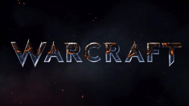
This is the logo for the upcoming Warcraft movie. It’s been a long, long time since I thought about that word without “World of” in front of it.
This Is The Logo For The Upcoming Warcraft Movie.
See Games Differently
Now you can get the top stories from Kotaku delivered to your inbox. Enter your email below.
By subscribing you agree to our Terms of Use and Privacy Policy.
This is the logo for the upcoming Warcraft movie. It’s been a long, long time since I thought about that word without “World of” in front of it.
Comments
39 responses to “This Is The Logo For The Upcoming Warcraft Movie.”
That looks like the Starcraft logo…
Must’ve run out of a marketing budget =p
I mean, i guess to be fair, the actual game logo lends itself well to the cartoonish aesthetic of the game, and if they’re trying to ground this live action movie into a more real-life aesthetic, this suits it a little better, as generic-dark-grit looking as it is…
Still doesnt take away that fact that as soon as i saw it i thought “Starcraft”
I think it’ll look less Starcraft-y in motion. I get the impression that’s stone/marble but in this still picture it comes off as steel because of all those sharp ends and the way it sits on the black. Makes it look sci-fi not fantasy. The W in particular looks make it look precision cut rather than forged. Looks more like Doctor Who than Conan.
The spacing and C also seem off. I know technically it’s WARCRAFT in the standard logos but it’s always laid out as WarCraft with the points on the C acting as the center. It gives the standard logo a much bolder, more powerful shape.
The new logo comes off as controlled and finely crafted where the older logo is more along the lines of fighting the elements into submission.
its their signature font, they would be crazy not to use it
warcraft font but not warcraft styling (they use a flat design with different colour scheme usually – i think yellowish if i remember)
still early days yet
never know, the movie may take a few odd twists and turns
+1 for the title logo from me
Random person: “Is this a sci-fi war movie?”
To be fair the orcs are from another planet and assuming more movies are made, more sci-fi elements will appear.
you mean like warhammer?
Orcs are a fungus in the WH40k universe.
well the dranei and orcs are aliens, the dranei had spaceships.
Yeah but even then it’s extremely soft about it. Like early Stargate or Thor. The Dranei have magic space ships. They run on crystals and magic dust when you dig into it, but unless it’s part of the story it gets glossed over (especially the Orcs coming from space).
Don’t get me wrong, I’d love to see the movie dig into that stuff (mostly because I find straight fantasy boring), but it probably isn’t going to be part of the movie. It’d be season three stuff in a TV show.
I cant help but feel that Blizz may be inserting a little distance between themselves and this movie by not using the usual Warcraft IP logos etc
I think the traditional Warcraft logo doesn’t translate to marketting a movie to a wider audience very well… I mean the current logo is 20 years old.
Personally I don’t think you can judge the potential of this movie based on the fact they’ve changed the logo… Many franchises change key actors in the middle of their series and they tend to do quite well.
To me, that seems like the logo starts out all in metallic silver font then perhaps burns to a blackened font to finish? Pure speculation ofc.
Aside from the bit where it spells out “Warcraft”, no element of that logo fits Warcraft as I know it.
On the other hand, how many movie logos matter in the slightest?
Looks fine to me. Besides, logos are no indicator of a quality movie. Having a half-decent director like Duncan Jones is much better.
eww.. thats it. why would you ditch years upon years of branding for that.
I can understand the move from an artistic perspective and I’m not outraged they changed the logo or anything, but the branding is more or less the entire reason the movie is going to exist and it’s what they’re counting on to make it a success, so why get so far away from it? I mean the movie may be good, the script and actors could be fantastic, but this is getting made because the Warcraft name was enough to sell a billion people on the concept of MMOs.
I just don’t get why you’d make a Warcraft movie and then distance yourself this way.
it actually makes perfect sense.
the top half of the letters are wood based (horde) with the bottom half being steel (alliance) like the old days of horde and alliance. because this movie is just gonna be about orcs and humans
Hollywood’s a very particular beast. It has its own needs which it rates much higher than faithfulness to source material. For example, trying to get an actor to wear a helmet or mask for an entire fucking movie is like trying to convince most cats to take a bath (and the main reason a Halo movie will never, ever happen). Expecting the Warcraft movie to maintain the same art direction loved by fans of the game is… a tad naive.
Dredd would prove you wrong I believe. But I get your point, it’s just not always true. About the helmet thing that is.
‘Most’ cats for a reason. 🙂 Dredd is definitely an awesome exception. And the first Judge Dredd movie was utterly apalling for not being an exception. Karl Urban was outright awesome for the subversion, and unfortunately, the movie probably commercially unsuccessful for it, too.
They might bastardize whatever they touch, but they’ve learned over many, many years what makes money in the movie format and what doesn’t.
Not really, Dredd is an excellent point in Transient’s favour. See Stallone’s Dredd vs Urban’s. It was actually quite unusual for Urban to be so willing to cover his face the whole time and insist on authenticity.
I can see the clean silver text representing the alliance being burned away to the rusted and charred horde variant with the sound of war drums in the background and a slow push in. I personally would add something to the background, maybe a few more embers or a touch of orange glow because at the moment it seems a little too clean but I don’t mind it
Yes… don’t use the correct font.. that would be ridiculous. also looks like war frame-ish
They should cast John Cusack while they’re at it.
travis fimmel is supposed to be in this movie
probably going all ragnar lothbrok on some orcs 🙂
am i the only one who has a bad feeling about this?
This is not the movie you’re looking for…
The director has done some good work in the past (especially Moon). I’m willing to give him the benefit of the doubt. This logo is probably from the studio marketing department, so it’s hard to tell how much it’s influenced by the film being produced.
Dam film makers, changing something because they want it to ‘appeal to a wider audience’, why couldn’t they just leave the writing the way it was? it was good the way it was, THAT’S WHY IT WAS SO POPULAR! I can tell this film is not going to stay true to the Warcraft universe, this title says it all. It’ll be Transformers and Michael Bay all over again…
Warcraft fans are going to watch this anyway, even moreso if it’s believed to deviate from “authentic” as it’ll give them something to rage about online for months! (see: Dungeons & Dragons.) To reiterate the core message of the comments so far: they need to make sure they pick up some mass-market appeal.
Personally, I’d much rather the whole thing got re-imagined as a high-school rom com…
“At Warcraft High, when Arthas Menethil finds out he and his ‘Silver Knights’ have to share the football field with Thrall and the rest of the Horde he summons his friends for one road-trip they won’t soon forget…”
“…Can Malfurion Stormrage stop Archimonde the Defiler, win the heart of Tyrande, repair the relationship with his brother Illidan, and make it through prom?!”
“Lok’tar Bro-gar!”
It’s a movie you need to have the blue and orange tone.
My bet is this will turn out like the Transformers movies. Great to those who know jack sh*t about the franchise but make the actual fan’s eyes bleed.
As for the logo it needs to be different from the games. This is Blizz’s first step into movies they can’t have people who are not current fans confusing it between the movie and another game. And as stupid as that sounds there will be people that do. *Lookin at you parents who think Link is mario and everything is a Nintendo 😛 *
I’m hoping it’s more like the first Star Trek reboot: well thought out, with careful attention to canon
Reminds me of Transformers logo.
Looks too modern