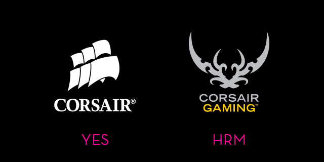
Corsair, long famous for making stuff like RAM and cases for gaming PCs, also make some pretty nice peripherals as well. Given the fact they build good stuff, have a cool name and a cool logo (basically a pirate ship), it’s weird they felt the need to make some changes.
The company, seeking to differentiate its more dedicated gaming stuff (like mechanical keyboards) from its more general offerings, has launched a sub-brand called Corsair Gaming. And its logo is this… thing. Which few people are feeling.
So bad has the disappointment gotten amongst “fans” (I’m always wary of using that word in relation to companies) that there’s a petition urging Corsair to change it, saying “The new ‘Corsair Gaming’ logo does not reflect the attitude of a premium and professional Corsair”.
The associations with “tramp stamps” have been swift and plentiful, which is probably the last kind of tone Corsair were hoping for when seeking to brand a line of premium PC peripherals.
Even my girlfriend said it looked like a butterfly with a heart in the middle. She also threw the word ‘cute’ in there to add insult to injury. Like a bad tramp stamp, we then talked about ways to cover it up.
Other common complaints are that it looks “cheap”:
One of the reasons I by corsair products is that they have a very sleek design while still keeping some of the cool looking ‘gaming’ designs. The new logo is not sleek. It looks more like something you would find on a very cheap led lit case instead of a corsair keyboard.
I just don’t think Corsair really knows who their demographic really is. Or perhaps they do and want to appeal another: the reachable amount of 14 year olds wearing TapOut shirts that have $US200 to throw down on a mechanical keyboard.
There are always folks who react negatively to a logo change, but what’s interesting here is that nearly every complaint I’ve seen comes with an actual explanation beyond simply “I don’t enjoy this, aesthetically”. People are saying, perhaps rightly, that it cheapens the brand, and affects their perception of what that brand stood for.
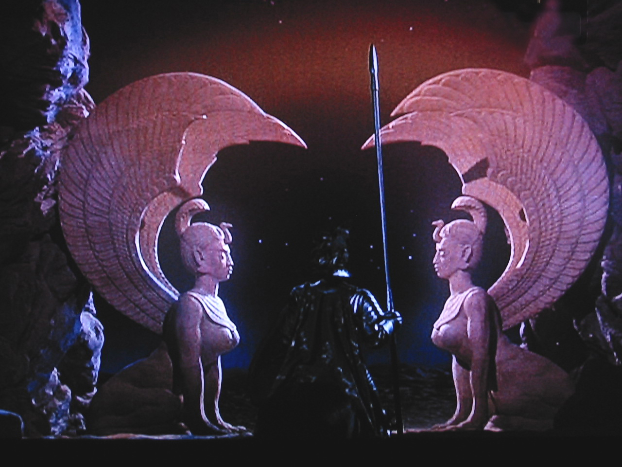
Also, the more I look at it, the more I see those two big statues from The Neverending Story.


Comments
35 responses to “Gaming Company Changes Logo To ‘Tramp Stamp’, Fans Horrified”
Am I the only one that thinks the most jarring thing about the logo change is that fact that a weird, abstract, spiky lobster thing is a terrible logo for a company named after a pirate ship? It would be like if Jaguar changed their logo to a clam…
Its two crossed pirate swords? doesn’t that match the Pirate Ship theme?
Clams are the shit yo! Very in right now!
I must be strange because the new logo actually look like corsair swords (you know, wickedly sharp blades wielded by vicious pirates). I don’t quite get the angst over the logo design as it’s not that bad.
I agree, it does appear to be two swords crossed over each other. I don’t think it’s that bad, but I can see where people are seeing the whole ‘tramp stamp’ thing.
Plenty of tramp stamps look like crossed swords or knives too.
You’re not the only one, thought that looked like crossed swords too.
I saw the swords first too. I think it’s fine and honestly wouldn’t influence my decision at all on whether or not to buy a keyboard.
I think if it was more immediately identifiable as crossed swords people would have less of an issue but in its current state it comes across like the tribal decals you get in the old NFSU games
I think people generally dislike the sharp, jagged, tacky, aggressive logos many companies aimed at tacky, aggressive men use.
Affliction, Ed Hardy, Tapout etc.
a corsair sword isn’t a thing.
A corsair would have used a cutlass, scimitar or rapier.
The corsair logo appears to be two cheap cast swords bought from a army disposal store for $50 each.
Cooler Master already have the ’14 year olds wearing TapOut shirts that have $US200 to throw down’ market down pat.
The invasion of Crab People begins..
I have a corsair keyboard and I really love the old logo. So classy. It’s not like a different logo would change my buying decisions, but I prefer the original.
It starts with this small logo, next iteration the corsair mouse pads will look like this.
http://assets.razerzone.com/eeimages/products/13963/razer-goliathus-control-gallery-3.png
nice mousepad… looks like a bigger version of the one i already use. Razer make nice mouse pads.
I meant purely off appearances. I currently use a corsair mm200 extended looks like this.
http://www.corsair.com/Media/catalog/product/m/m/mm200_ext_a_m40_k70.png
Razer probably makes great products but the logo on that pad just looks unappealing to me.
Yeah I have one of the Razer mouse pads and while I love it on a functional level I could really do without the stupid looking logo taking up the whole thing.
Not nearly as bad as Westnet’s Goatse logo design. Google it. Probably not at work.
Hahaha nice
Hahah
I prefer the term ‘scrag tag’….
Couldn’t they have just made the logo the other half on the ship?
Looks like a bat’leth… yeah, I went there.
I guess they can now sell their products under that logo for a 10%-20% mark up because it says gaming on it.
Awful change. Not the kind of person to show off the inside of my PC, but that’s an embarrassing logo.
Mmmm … tramp-stamp 🙂
Keep the original logo and just add the “Corsair Gaming” tag underneath it. The new logo is unnecessary.
Looks like a crab to me.
Corsair’s new gaming case gave me crabs.
I get the impression that it’s two stylised, crossed cutlasses?
Dude if it in any way really looked like the sphinx guardians from The Neverending Story then it would be way way better.
It looks to be designed to look like a whole bunch of things, but too bad it looks terrible. The first thing that came to my mind was a shitty cheap old tribal tattoo…
I bloody hope the mouse pad I just order has the sails not the stamp!! That way it fits in with my H100i.
I would prefer they kept the sails but ultimately I guess it doesn’t matter so long as they continue producing quality products. Not sure I’d purchase something with that new logo slapped on, but I tend to prefer the simpler designs without fancy decals anyways…
The original logo is simple and instantly recognised. I agree that the new logo looks cheap because it is so similar to thousands of other designs out there.
Stick to the sails Corsair. If it aint broke, don’t try to fix it…
i almost brought the RGB k70 keyboard but when i saw the keyboard had the new logo i opted for the much cheaper non RGB k70. Purely because of the horrid logo i couldn’t bring myself to see that almost every day.