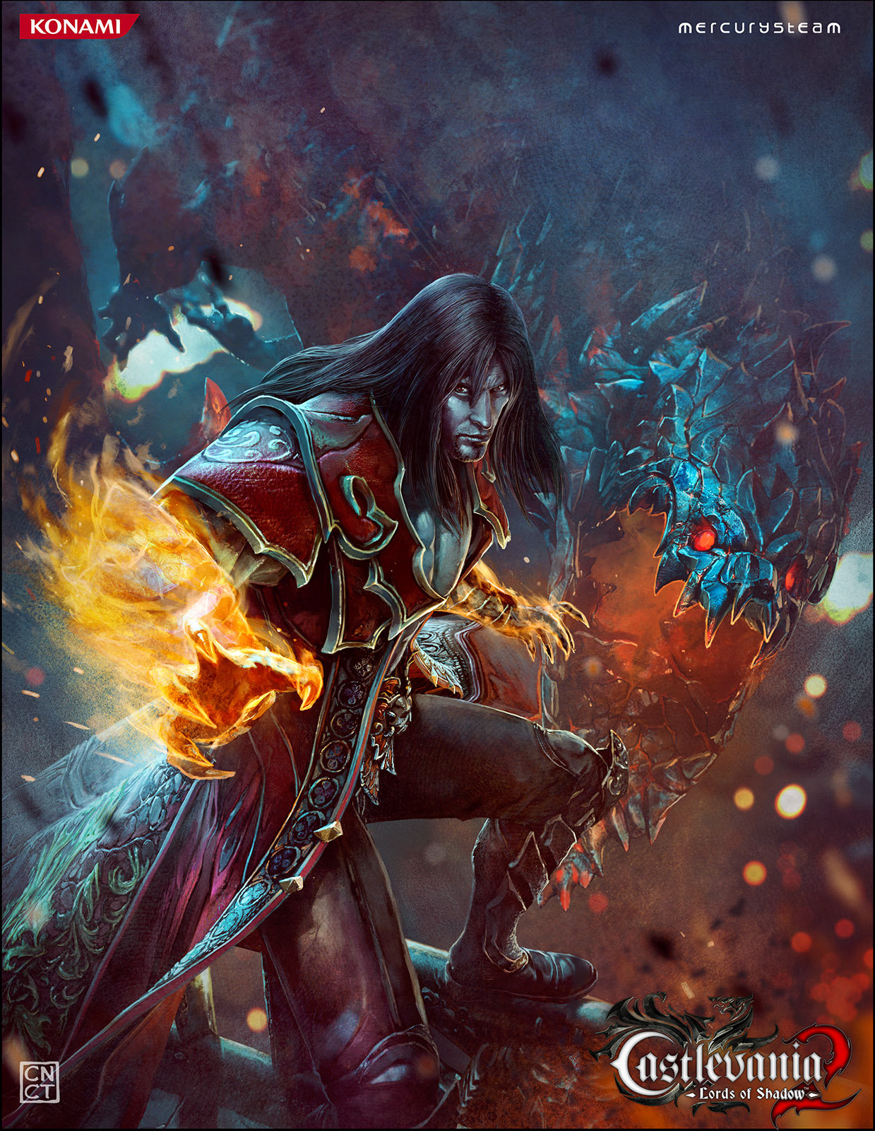
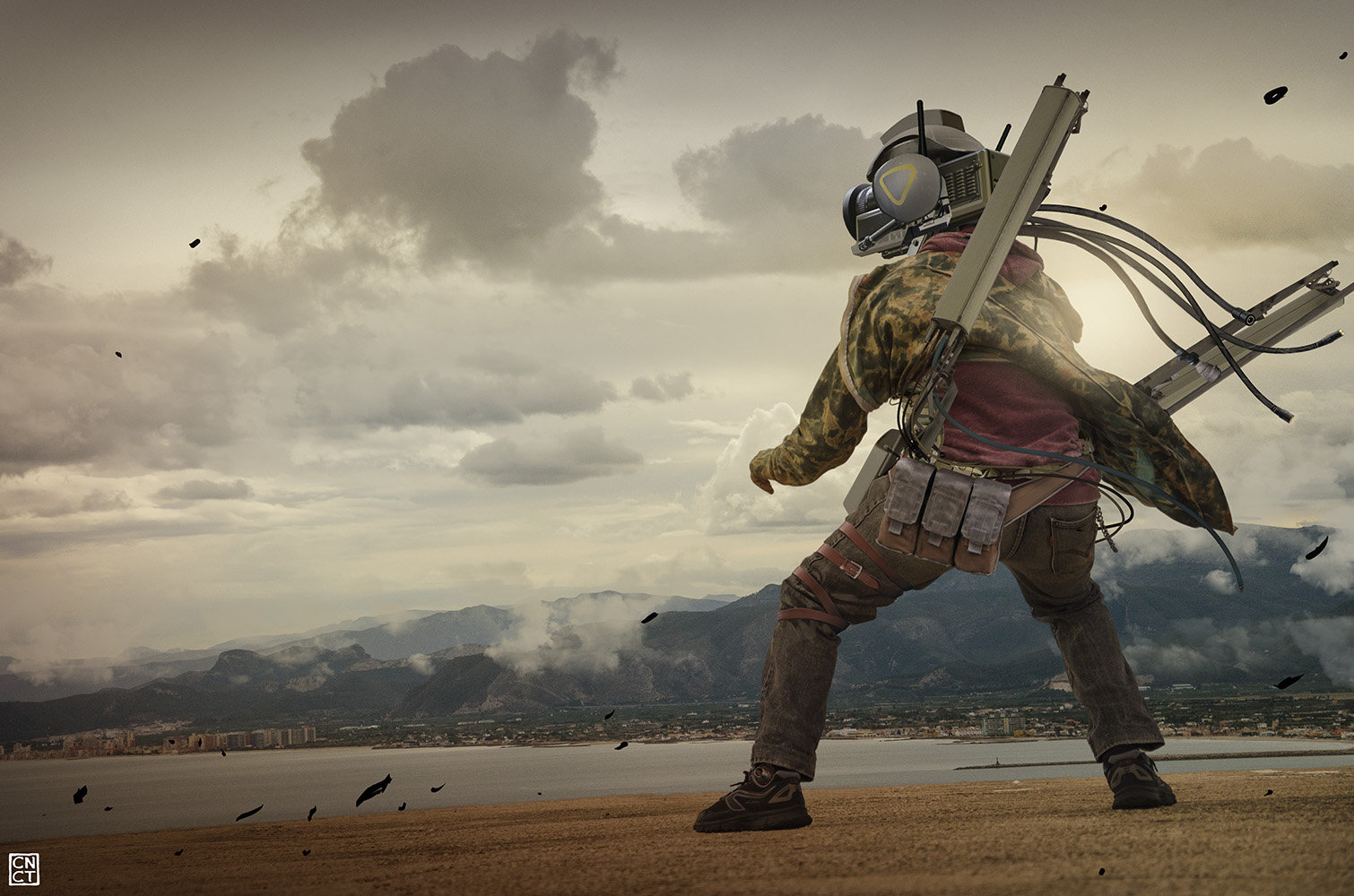
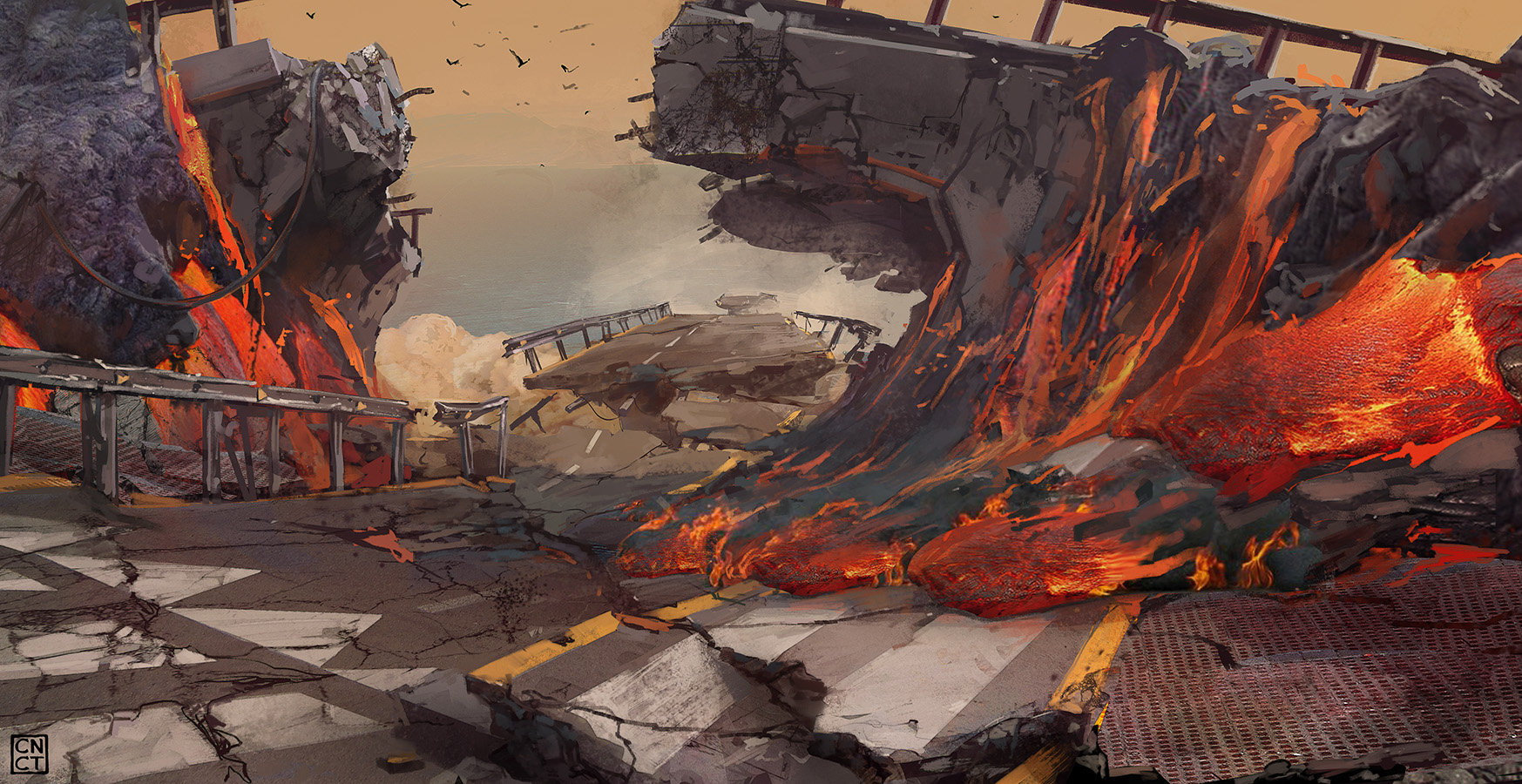
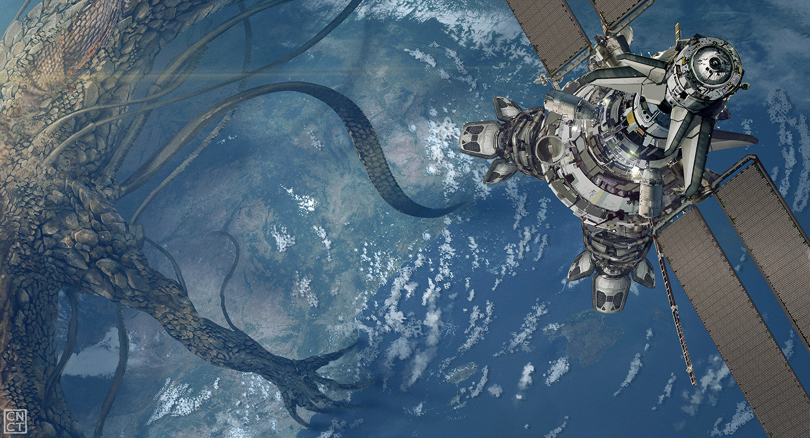
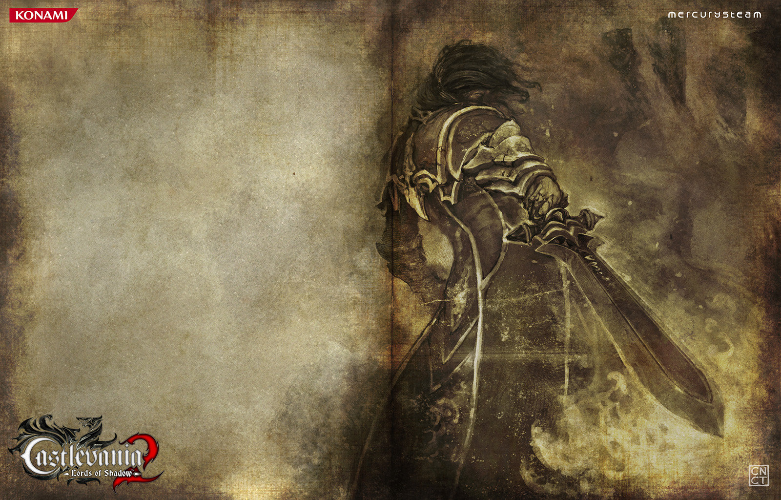
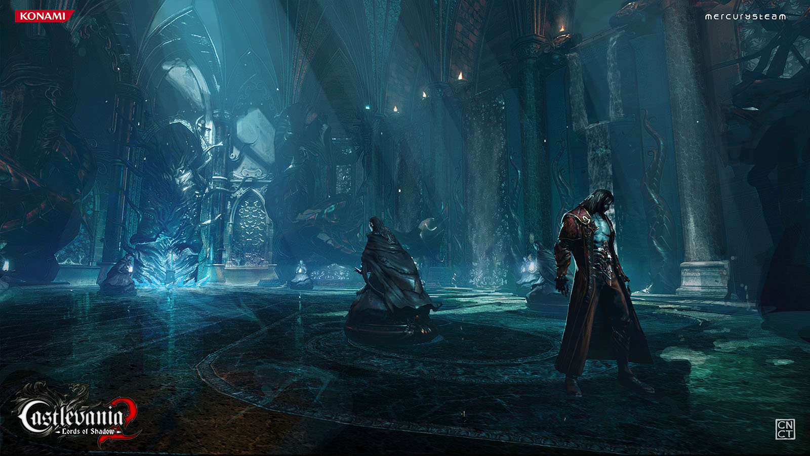
Carlos Nuñez de Castro Torres is a Spanish concept artist and illustrator who has most recently worked on the Castlevania: Lords Of Shadow series.
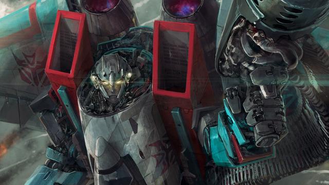
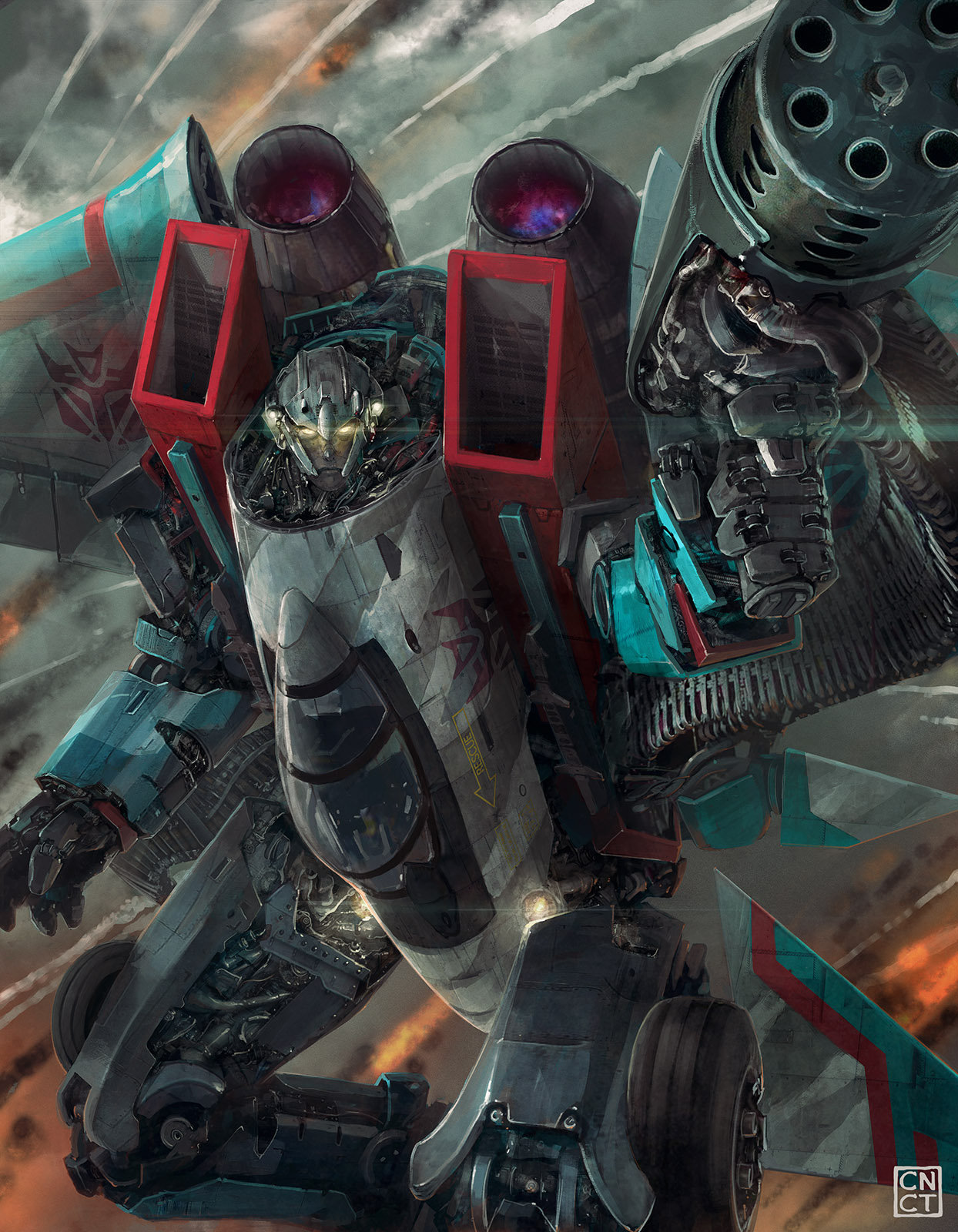
Would it have been that hard for the designers on Michael Bay’s Transformers movies to do something like this? This Starscream has some of the organic complexity they went for, but by casing it in blocky “armour” like the cartoon series, it strikes a nice balance between update and homage.
You can see more of Carlos’ work at his personal site.
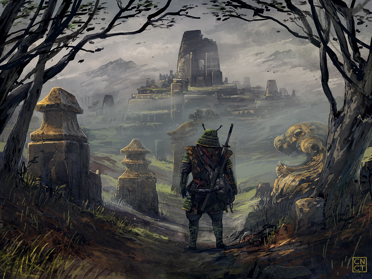
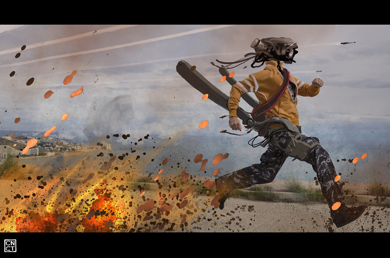
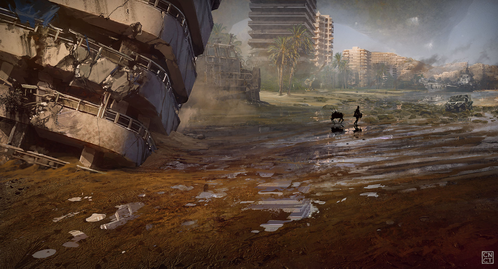
Fine Art is a celebration of the work of video game artists, showcasing the best of both their professional and personal portfolios.
Comments
10 responses to “Fine Art: If Only Michael Bay’s Transformers Had Looked Like This”
Had the Bayformers looked like that, we’d have all at least been visually happy with them.
Now all I can do is pace around constantly muttering, “Why didn’t they look like that?”
It would have fixed 50% of what was wrong with the movies.
Looking back I think add a plot and decent characterisations and the designs could be forgiven. Apparently Starscream is especially squished out and folded in the movies to help him roughly appear in scale with the other robots.
My thoughts are that a giant Starscream would block too much product placement..
Nope. They’re too busy, too ugly and make no sense visually. You can’t tell ‘what goes where’ at all. That’s part of the fun of the toys. At least the old toys. ‘Ah his legs become the back of the car, his arms are the doors…’ etc etc. Now its ‘His arms splinter into 700 pieces and become the door, the frame, the window, the wheel…’
There are so many ‘close-up’ shots in the transformers movies which are supposed to help us imagine we’re there in the scene, but they just break immersion because by zooming in so close to the transformation with so much metallic shades shifting all over the place, it’s impossible to really see clearly what’s going on. all you know is stuff moves and suddenly you’ve got a robot where a truck once stood.
I always compare the Transformers transformations to Iron Man when Tony puts on the suit (for what is Iron Man but a Human Transformer?). The Iron Man transitions are always clearer and more satisfying to watch.
Perfect comparison. Ironmans design could’ve been complicated and ugly but solid plates etc made it beautiful and exquisite to watch.
well.. these Transformers were meant to be 10ish alien designs and so to the transformations. They transform quickly and to a massive extent. All that render also means cgi and film tricks (blur and confusion) had to be used to reduce the animation cost. Ironman was few transformations and the design was intended to look humanoid.
I do wish the Transformers didn’t look like tin foil scrunched up but i’ve accepted some of the rationale (finally by the 4th movie you see more humanoid designs). But still in general the movies urgh -_-
The Bayformers, at least visually, look (mostly) okay. The Decepticons not so much, hard to figure out what the deal is with the faces; then again, they are meant to be aliens.
I just found it more difficult to correlate who was talking with who/what I was seeing.
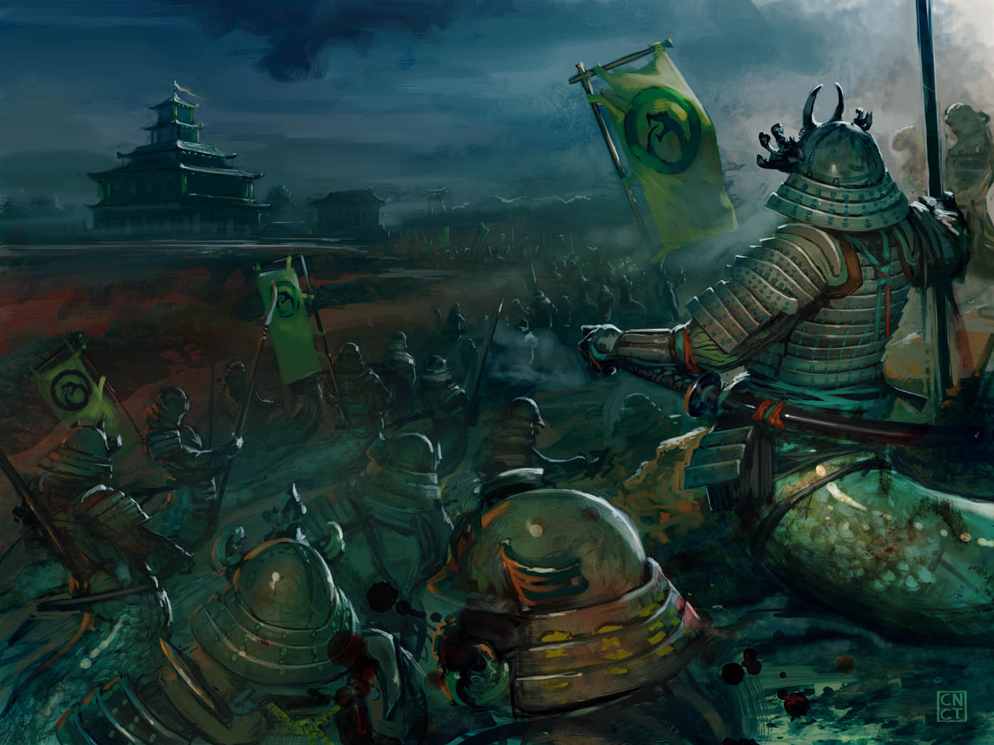
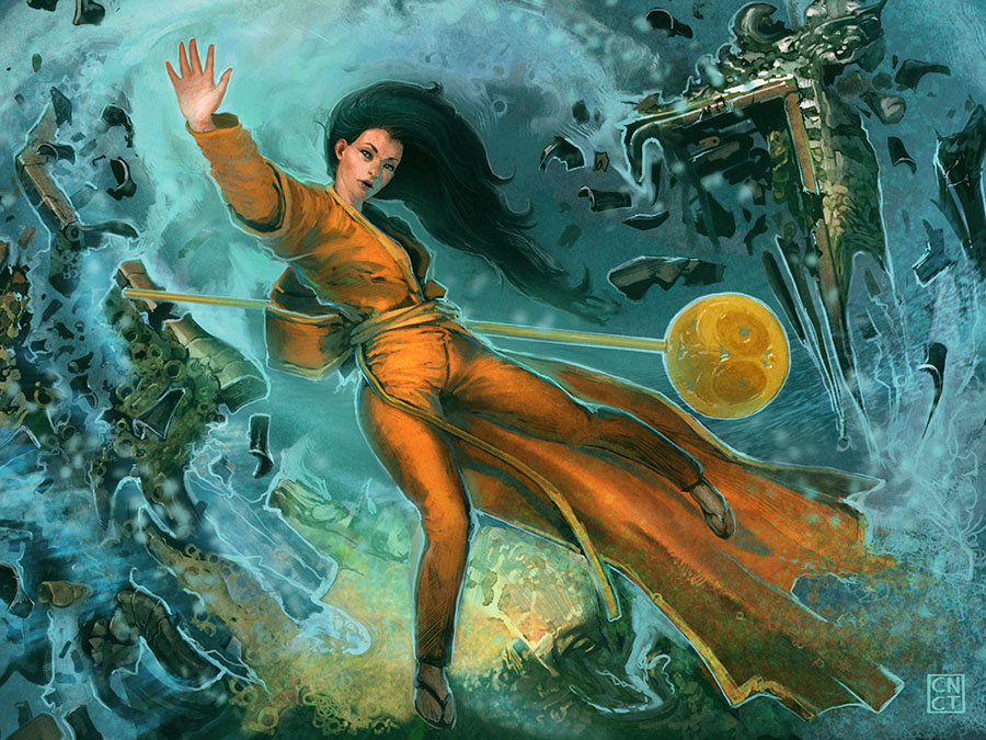
Naga Samuria? Cool concept.
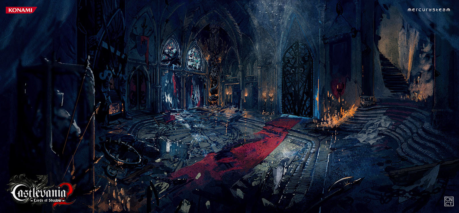
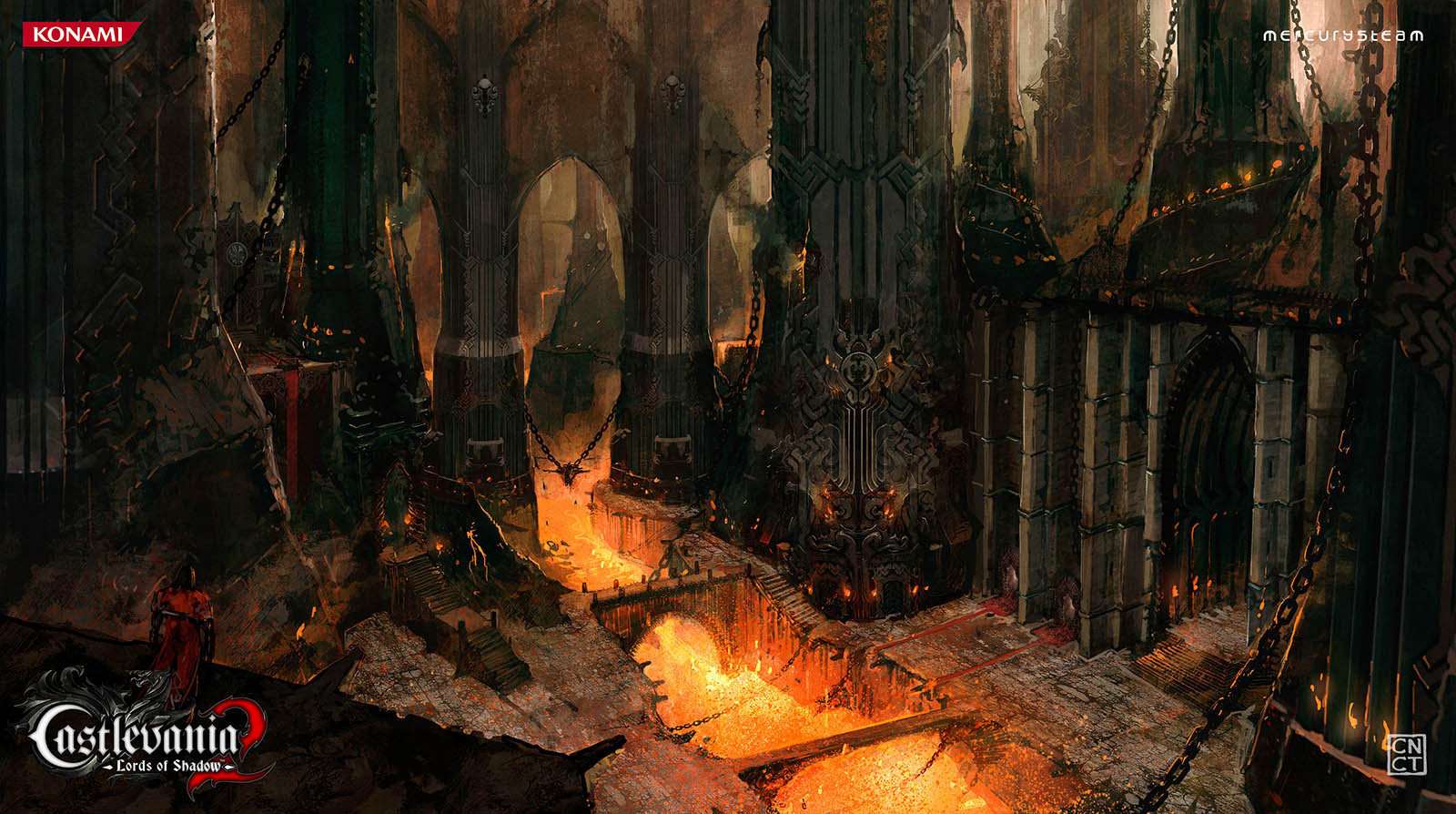
and Castlevania 2 was pretty cool.