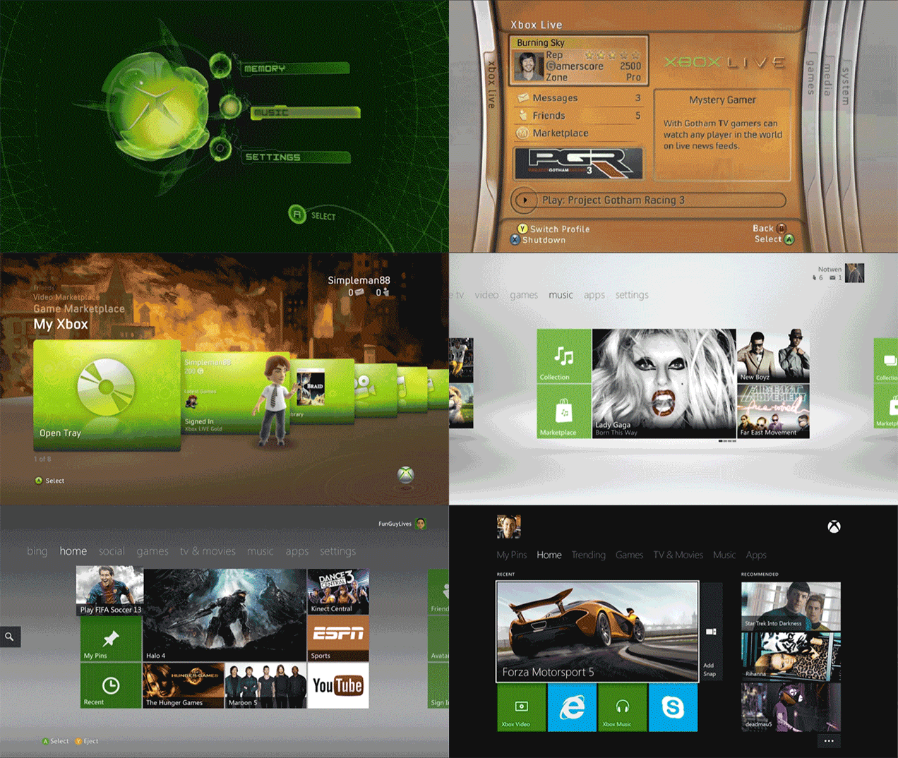
Oh for the days before Microsoft’s torrid love affair with stacked rectangles, back when curves were the order of the day, and orange seemed like a great idea.
Inspired by a Reddit post from couchpotato9099 with images borrowed from Redditor eiketsujinketsu’s super-smooth “non-potato” version of the animated GIF, this image is a monument to falling in line. What started off as a neon green dream machine slowly coalesced into an extension of Microsoft’s signature software product, a companion to your rectangle-laden PC and square-stuffed Windows Phone.
I wonder what it would look like today had it stayed the orange blades course?

Comments
9 responses to “The Xbox Dashboard Has Come A Long Way Since 2001”
The curved 360 dash, i was thinking. I remember that one
Just looking at that reminds me of something.
The first, best and just about only feature of the original Xbox dashboard/ HDD combination was the ability to play a custom soundtrack.
The 360’s terrible curved arrangement didn’t do much more either, but it did play customer soundtracks.
WHY THE FREAKING CRAP CAN’T I PLAY A F*CKING CUSTOM SOUNDTRACK WHILE I’M PLAYING FORZA OR TRIALS ON THE XBONE! IT’S BEEN OVER A YEAR YOU F*CKING STUPID ASS MICROSOFT!!!
AHHHHHHHHHHHHHHHH!!!!!!!!!!!!!!!
For what it’s worth I’ve been having issue with Music when the app is snapped and streaming from my Surface… after getting rather irate with one of the ‘support’ staff they let slip that background playback is slated for January. Still stupidly late, but not far off hopefully.
I notice the further along it goes the more ads that are forced in.
Last I recall, mine was still on the third one there. Actually, I think it ended up on the fourth thanks to a Kinect-related upgrade (dammit I wanted to play Gunstringer :P).
Had to use one with the fifth/sixth for a while a couple of years ago, god it was awful. Hell even the fourth was somewhat annoying.
RIP blades 🙁
It feels kinda cool knowing that I’ve been playing xbox for a while that I’ve seen and still remember all of these dashboards. Seeing this was a treat!
Oh and the NXE update is my favourite dashboard. The blue guide popup was the coolest.
Hey mike, the blades weren’t just orange each one has a different colour shoot me if I’m wrong but it was like green for games, orange for live etc etc
nxe was the best, before it went over to the stupid windows 8 tiles.
i still cant believe the xbox one dash is worse than the 360 dash.
why release a dash with less features than the last one?
they are slowly re-adding features but it makes no sense the xbox one should of had all the features of the 360 at launch.
I loved the blades. The only saving grace of the avatar age was that you had the mini-blade system when you hit the guide. I used that for everything and abandoned the dash.
Now, all I see when I look at the xbone is…
http://www.maxconsole.com/maxconsole/contents/RKLS00000011867/icon_xl.jpg
When did advertising take over priority to a nice user experience?