Like Toshi, I’ve been reading the manga I Am A Hero, and like Toshi, I’ve been loving it. But I wanted to spend some time today looking at one aspect in particular that leaves me speechless every time I flick through it, and that’s the art.
One of the things that I love about my favourite manga (Blame!, Akira, Lone Wolf & Cub) is the quality of the linework amongst the best artists. While the majority of Western comics end up coloured, many manga are drawn solely in black & white; while there are practical considerations behind this (it’s faster for serialization), I also tend to prefer it, because it helps draw my eyes to the finer details, which in turn can really help immerse me in a comic’s world.

[Image: Kengo Hanazawa [Shogakukan]]
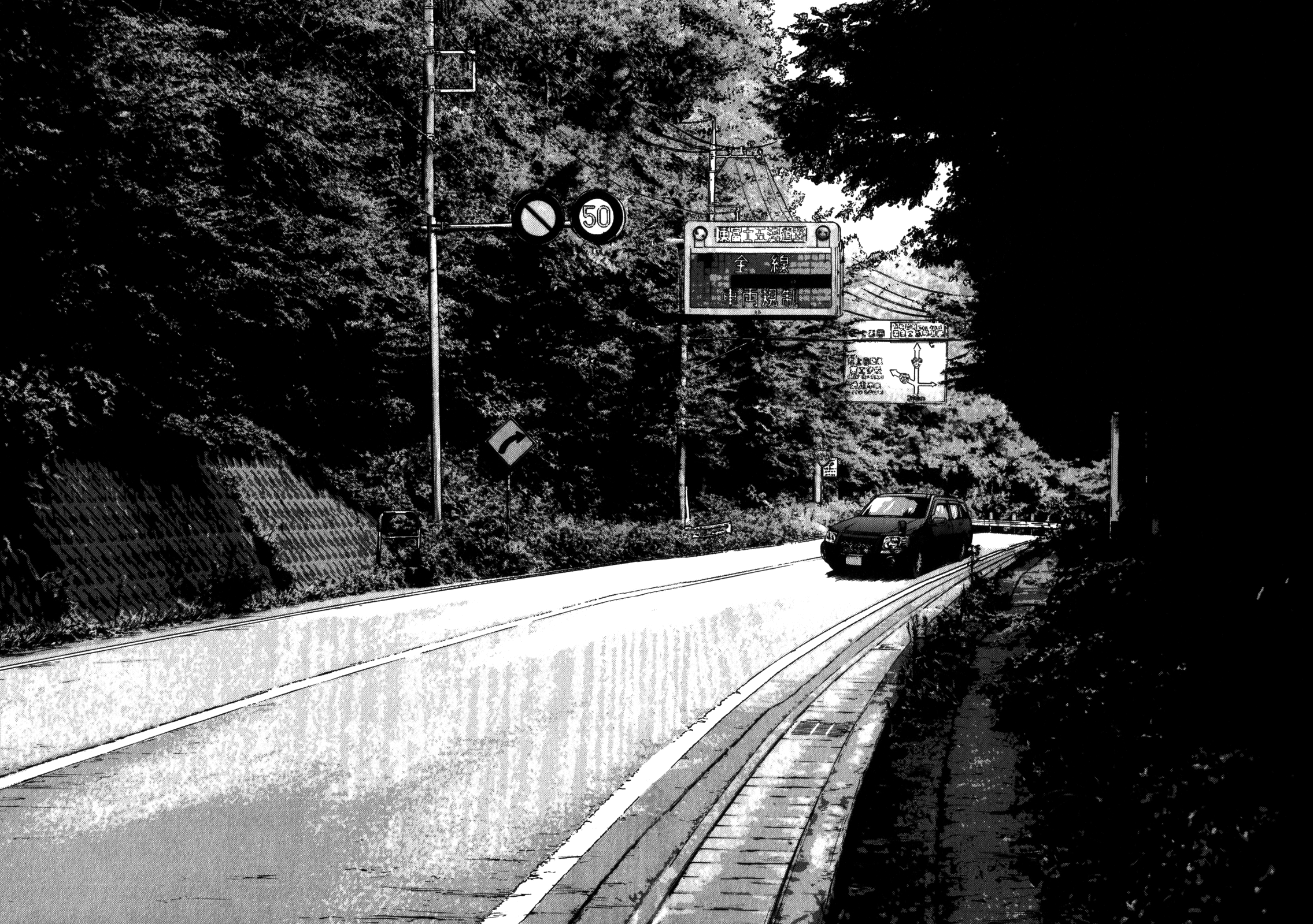
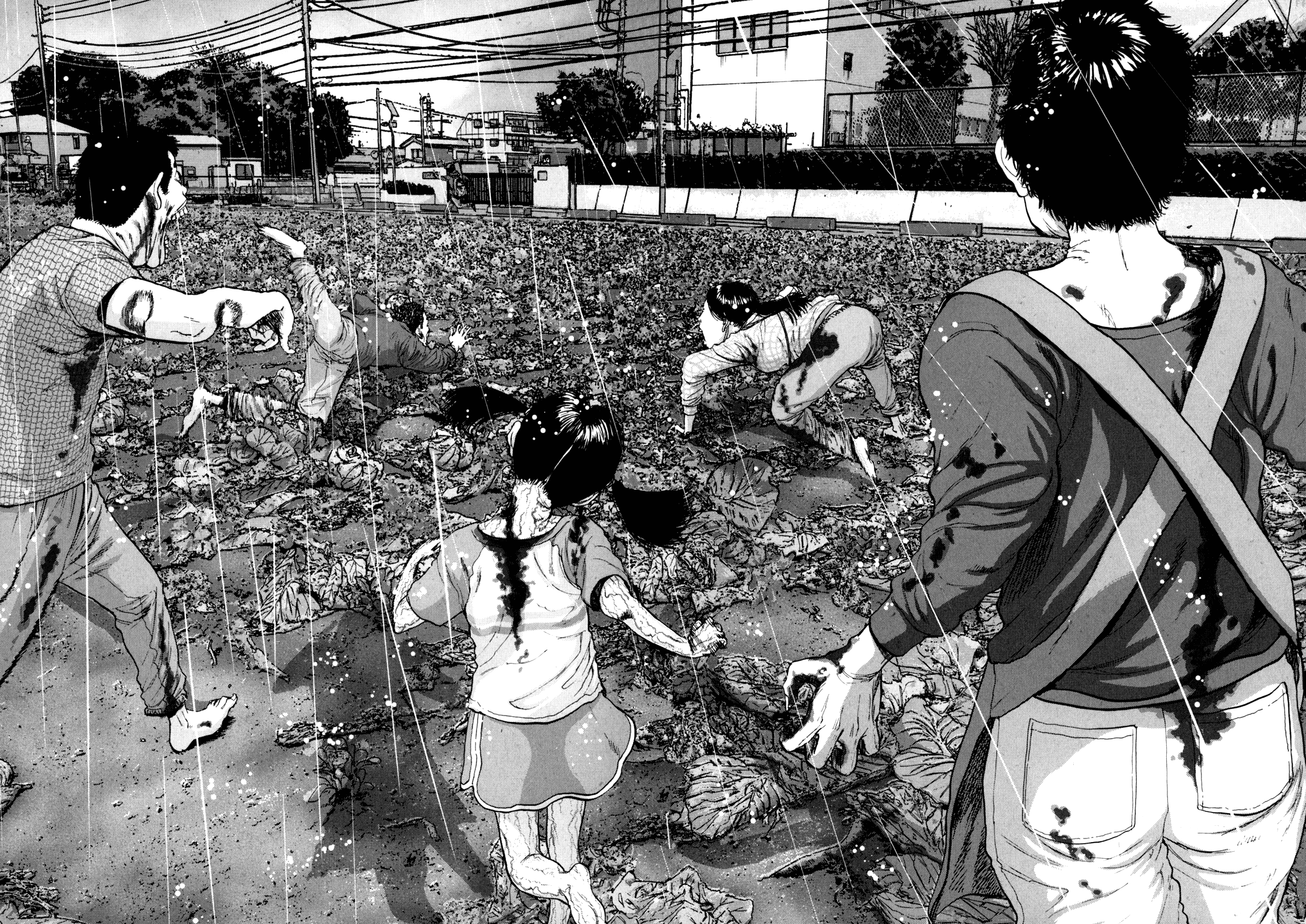
I Am A Hero is gorgeous throughout, an effective blending of gritty realism and stylised action (there are even sections drawn from an FPS perspective), but Kengo Hanazawa’s art really gets inside your head every 10-20 pages, when he takes a break from writing and just blows out an entire page (or two), devoting it to a single frame.
Occasionally this is to show some important action, but most of the time it’s just…art, a still shot amidst the chaos of I Am A Hero’s zombie apocalypse, maybe a landscape shot showing a city in ruins, maybe a close-up of some zombies to give us a good look at how gross they are.
Sometimes it sets the mood, sometimes it’s framing a key moment, other times it’s directly influencing the pacing, breaking up the flow to act as the pause before the plunge.
Regardless of the subject or the intent, every time he does it, it’s absolutely incredible.

[Image: Kengo Hanazawa [Shogakukan]]
I’m loving I Am A Hero for other reasons, too — the contrast of Japan’s polite culture and awkward otaku vs a zombie apocalypse is a fascinating hook — but mostly it’s just because I cannot get this art out of my head.
Dark Horse will be releasing an English-language version of I Am A Hero, starting with Volumes 1 & 2, in April 2016. Look out for it when it lands, because I can’t recommend it enough.

Comments
9 responses to “I Am A Hero Is One Of The Best-Looking Comics I Have Ever Read”
This is the l nd of thing that had me interested in manga in the first place. I remember Gunsmith Cats having ultra cartoony characters with ultra detailed cars, guns & clothing. Lots of little touches that show the artist took pride in their work.
Same with some of Ghost in the Shell, Shirow did those flat looking cartoon heads on realistically detailed bodies (albeit unrealistically proportioned) & tech with all sorts of little details that blew my mind.
I don’t see it so often any more.
The main difference with Shirow’s stuff, is it’s all done in the same style, and so works really well as a whole image. As I said below I think maybe the backgrounds are traced or filtered which I’m not sure really works overall.
I know what you mean, it does look a tad off.
It’s just nice to see that level of detail, even a straight up trace would take forever.
That is true. Oh the wrist pain.
Me after looking at Shirow’s ladies :p
The backgrounds look like traced photos, or like photos run through a photoshop filter, whereas the characters look drawn traditionally. I’m not really sure about stuff like that, as I feel like it doesn’t quite gel, like there’s a disconnect between the two styles and the characters almost feel like they’re floating on top.
Yeah, I have the same feeling about it.
I tried to read this and after about 20 pages i havent gone back.
The beginning is slow and boring. Like, pointless boring.
I will try to give it a go again cause i like a good survival zombie story and like the article says the artwork is very wel done.
I keep reading even though the initial chapters about Hideo kun’s working life is boring. But when the outbreak occurs, the story gets much better afterwards!! Now I can’t stop reading it…