Have you ever noticed that movie posters often look totally different when released in other countries? I have! Sometimes they’re good, but sometimes they’re not. This might be why.
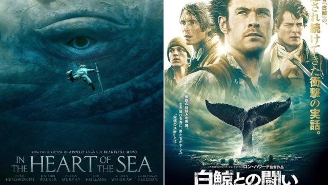
Even online in Japan, people will comment how the localised movie posters look “dorky.” They’re often covered in text and are very busy. A fairly recent version of this is the Birdman poster, which was universally blasted in Japan for being not cool. The latest one is the Japanese In the Heart of the Sea poster, which is being criticised online in Japan for “ruining” another interesting foreign movie poster. But, hang on.
This “terrible” Japanese poster is really just the international one-sheet. So, it’s not the movie’s Japanese distributor who has strayed from the original poster! Still, that being said, let’s continue.
[via Mana_Teapot]
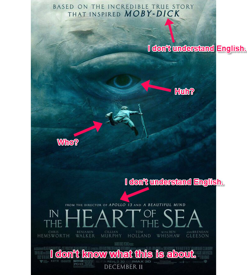
Japanese Twitter user Mana_Teapot, however, thought about why the localised posters were so “uncool” and came up with this reason, using the US and Japanese In the Heart of the Sea posters. Note that Mana_Teapot doesn’t actually consider the Japanese poster to be “uncool,” but is simply trying to explain the changes in the wake of Birdman poster brouhaha.
Mana_Teapot pointed out concerns people might have about the U.S. poster, which would lead to the decision to make a dorkier localised one. Kotaku has translated these comments into English (above and below).
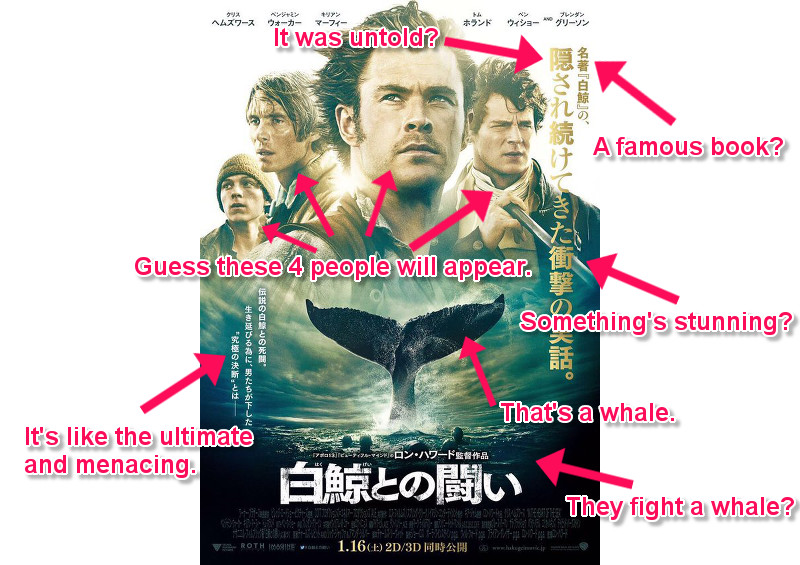
[via Mana_Teapot]
The Japanese poster is filled with buzzwords like “stunning,” “ultimate,” and whatnot. If you’ve ever watched a movie on Japanese television, even a localised Hollywood one, you’ll notice how often, whenever characters appear on screen, both the character’s and the actor’s names appear. This is done, apparently, so viewers do not get confused. (Note: This doesn’t generally happen on DVDs or Blu-rays.) Japanese television is also crammed with text, too, to underscore what people are saying in real-time with various different fonts — certainly useful for the hearing impaired among us.
Visually, Japanese viewers might be used to processing lots of text on a regular basis, which might be why Japanese posters are sometimes wordy. That’s probably why the Japanese In the Heart of the Sea poster might look like the other international one-sheets, but has more text. More context, even.
Not all Japanese movie poster designs take this approach — in fact, many of the best ones don’t. So while people online in Japan might be quick to poo-poo their country’s movie posters, they shouldn’t! But this might explain how localisation changes the way even promotional images look.
Top image: Warner Bros.
Comments
12 responses to “Why Movie Posters Are Sometimes… Different”
Interesting article, cheers
I agree, I love reading articles like this. Thanks Kotaku
Funny thing is Australia actually has the Japanese dorky one.
My local cinema has the giant whale/small man version.
The guy one is all over bus stops in melb.
A little off topic but I remember being in Malaysia and seeing a giant billboard on the free way of X-Men DOFP which basically only had Blink (Fan Bing Bing) on it with other characters small in the background. When seeing the movie the only thing she says in 2hours is “times up”. Still she must have movie pulling power in Asia.
Yeah, they definitely seem to tailor movie poster priority for who’s in it and how the audience might feel about them.
A lot of Chinese posters in particular are pretty crazy in that they always seem to try and fit thirty people into the poster, all trying to look more or less equally cool.
Fan Bing Bing is a goddamn superstar in China. You’ll notice a hell of a lot of blockbusters will have a token Chinese or Korean actor in them now. Hollywood has begun to tap the next big keg of honey: Asia.
Only 5 (I think) foreign films a year are allowed big cinema releases in China. Having a popular Chinese actor in the movie is a good way to be guaranteed some sweet, sweet profit.
The poster is a selling tool. So in Japan where the movie is less likely to get attention, they would rather tick all the boxes and show as much of the films selling points as possible. An attractive cast, drama, a giant whale and based on a true story – SOLD. Artistic integrity is the last thing on their mind.
I don’t understand why on the US poster the arrows points to text and say ‘I don’t understand English’.
If they were to use the same poster but localise it for Japan, wouldn’t the text be in japanese, and thus the point is invalid.
I do understand the point that Japanese culture is accustomed to wordy detaled descriptions of things compared to the West’s fondness of imagery and representation; just don’t get the point of pointing out the text is in English?
For this film at least, there might be other reasons Japan wouldn’t want a big picture of a whale on the poster. People might mistake it as an ad for a new restaurant.
daaaaaaamn 😀
But I think maybe if they see a poster with not much text on it, they figure it must not be important and then it gets ignored.