Are you having trouble articulating just why the PC version of Final Fantasy VI looks so terrible? Or, alternatively, do you think it looks just fine and find yourself wondering why everyone’s complaining?
Game developer Lars Doucet (Defender’s Quest) has published a great detailed analysis of the smudgy, blurry redesign of Square’s Super Nintendo classic, which launches on Steam today. He points out a number of the flaws that make this new art style feel so off, including blurry filtering and resolution distortion.
As an example, Doucet points to this pillar. Take a look:
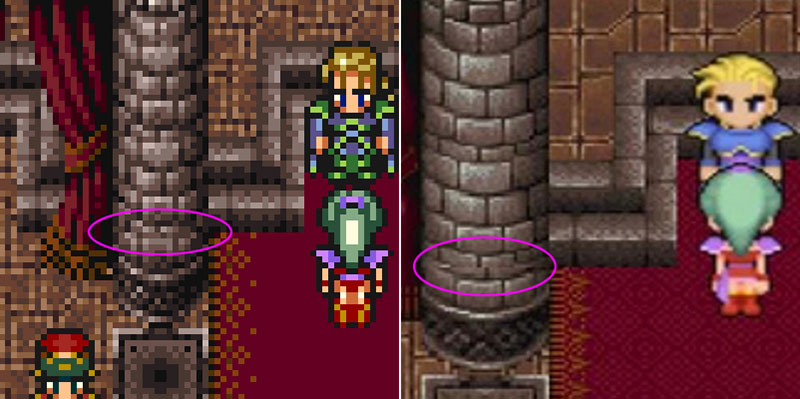
Inconsistency is the biggest problem here. In the Super Nintendo version, pictured on the left, everything is pixelated, so fudging a few tiles doesn’t make any difference. But in the clearer PC version, pictured on the right, you can clearly see tiling flaws that just shouldn’t be there.
Read Doucet’s entire piece if you want the full analysis.
If you do want to play Final Fantasy VI, please don’t get it on PC until Square releases a version with proper art. Hunt down the GBA version or play the Super Nintendo Virtual Console port on Wii or Wii U.
Comments
4 responses to “Why Final Fantasy VI PC’s Art Looks So Bad”
This is my favoritest game of all, and I hate what they did to it…
It isn’t on the wii u virtual console. I dont know why they cant just release the entire wii catalogue on wii u. Unless they dont have any other games upcoming??? Chrono trigger would also be nice.
Glad I held onto my PSOne copy.
Soo… basically here’s an article that’s going to explain why FFVI’s PC port (which was basically a crappy mob port) design choices make it look terrible..
We’ll explain it by
Step 1) linking this much better written blog/article from another site first!
Step 2) pick one significant dot point which is the crux of the argument and then make a paragraph!
Thumbs up! Jobs done! Let’s go home!
Yeah… i’m slightly cranky today and felt like taking a pot shot at another “Luke”-level “article” xD
Edit: oh and for the record the link was a very interesting analysis of why everything looks “wrong” on the port xD