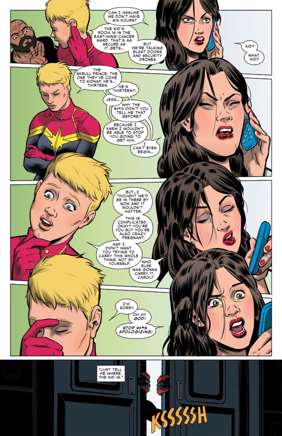
Spider-Woman is in the middle of a very fun, unconventional storyline right now, which centres on the pregnancy of its lead character. And the series’ charms are greatly increased by the excellent art on its pages.
Spoilers follow.
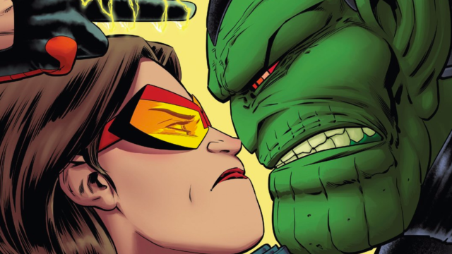
The art team on Spider-Woman consists of penciller Javier Rodriguez, inker Alvaro Lopez, colour artist Rachelle Rosenberg and letterer Travis Lanham. Together, they skillfully hit the challenging mixture of tonalities that writer Dennis Hopeless is offering on the book. There’s creepy alien weirdness…
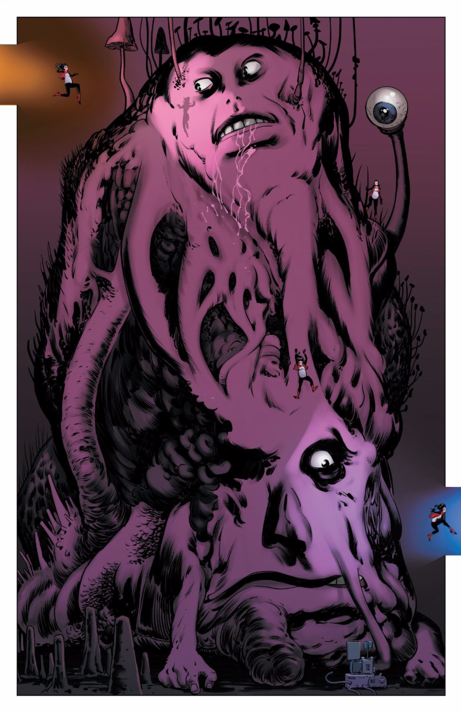
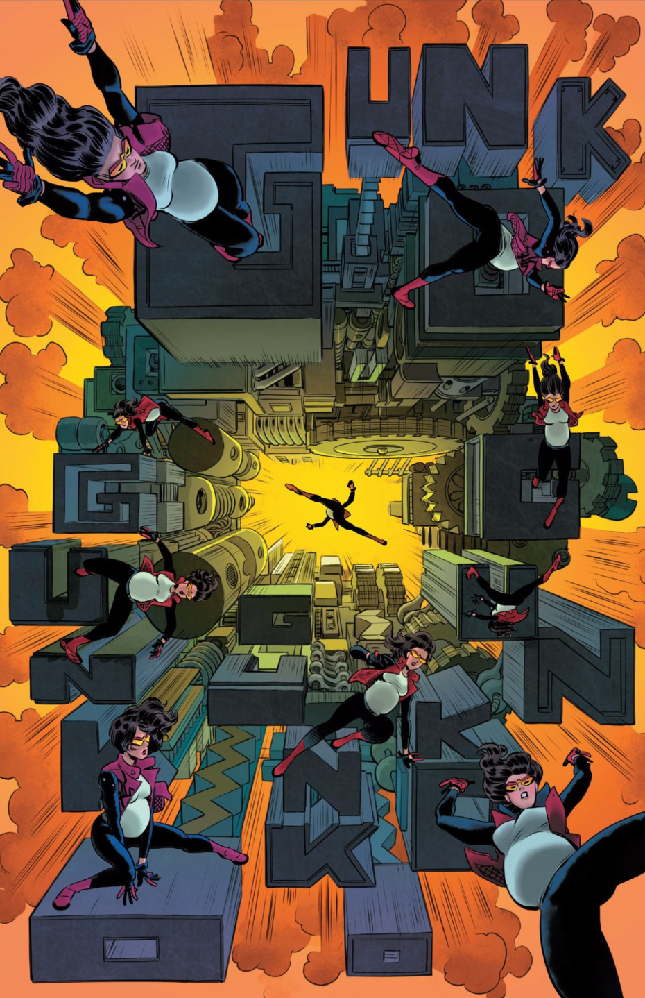
eye-catching action…
and sharp interpersonal tension.
As seen in Spider-Woman #3, the inventive layouts, fantastic shading and colourwork and intense camera angles make everything sing in this series. Very fine sequential storytelling happening here.
Comments
4 responses to “Spider-Woman’s Artists Have Been Killing It”
I personally don’t like art like this, it is hard to go from something like Capullo, Fabok or Marquez to something that feels like it took a lot less effort.
That being said I also don’t like the more campy comics that you tend to find most prominently in Marvel’s catalogue, so it may just be a style incompatibility.
Yeh, good art or not I don’t think I’ll get into this one. Although the latest marvel reboot is annoying as ever, some of the books are really quite good like unbeatable squirrel girl which is so different and quirky, invincible iron man, doctor strange, star wars and Darth Vader are great looking and also feel spot on.
But.
Image and other publishers are where the real meat is at….my god I can’t adequately describe just how epic and artful sandman overture was. Bitch Planet, deadly class, Saga, Velvet, Zero, sex criminals…and my current obsession
Black Science, just a great looking Sci fi adventure.
If I paid for all my comics ( I still do buy many traded and hard covers ) I probably would have stopped reading DC and Marvel a long time ago, even though it all started with a love of XMEN.
Comics are in good hands these days there really is something for everyone, many ppl still view them as trash tho, which is unfortunate.
Have to agree with Vaegrand. I find the art to much too old school, reminding me of the art style of most mainstream comics from the 70’s and early 80’s which lacked detail or any personal flair. The coloring is passable but uninspired. Give me Humberto Ramos / Joe Mad any day.
All that flipping can’t be good for the baby