The debut game from Kojima Productions won’t be coming any time soon. While the studio will be using third party development tools to speed things along, making video games takes a long time. Logos, however, can be done much more quickly.
Last December, Kojima Productions first released its new studio logo.
[Image: Kojima Productions]
And then back in March, we got a more detailed, full-body look at said logo.
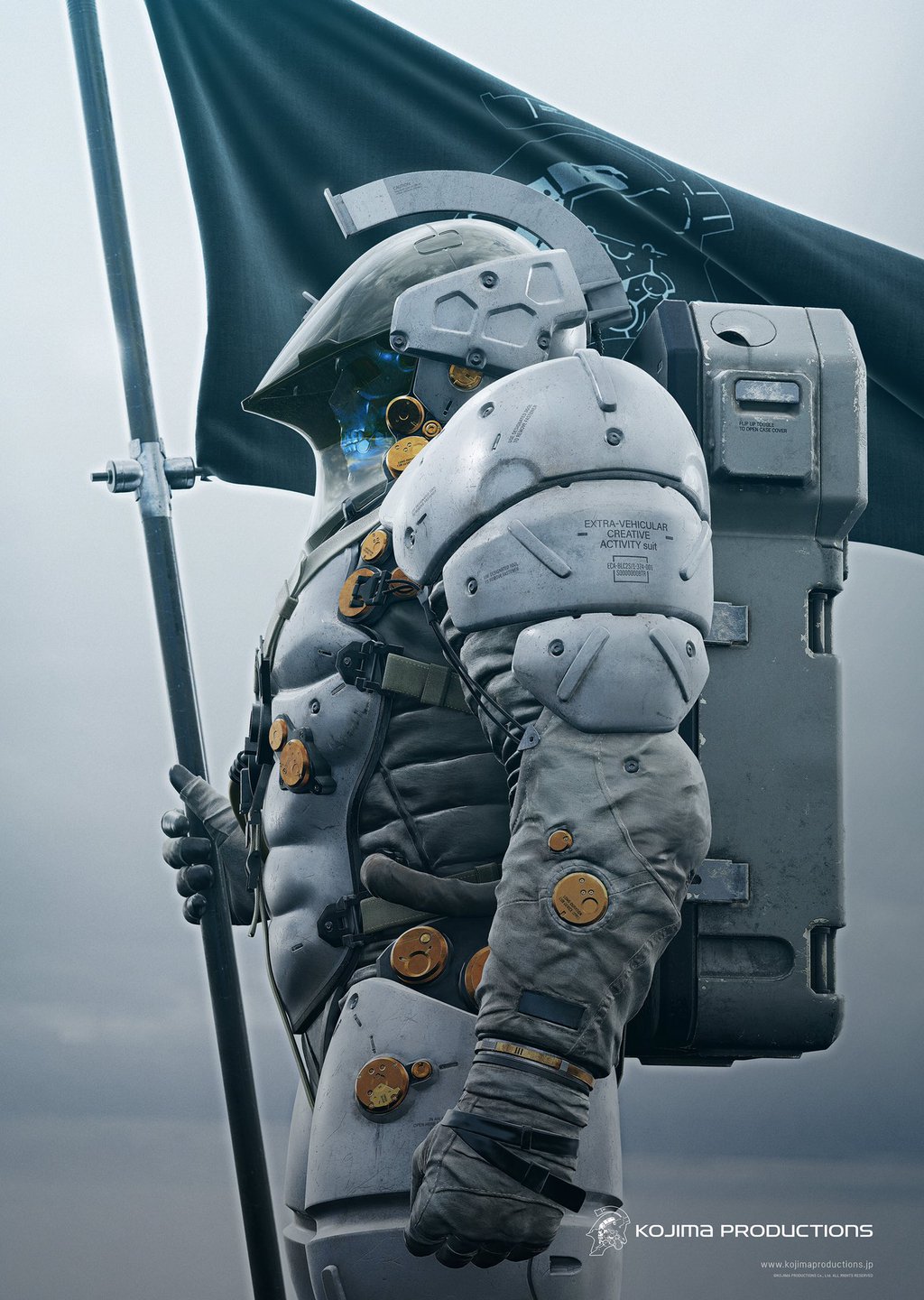
[Image: Kojima Productions]
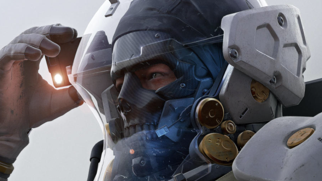
Now, via Gamespot, we’re getting an even more detailed look.
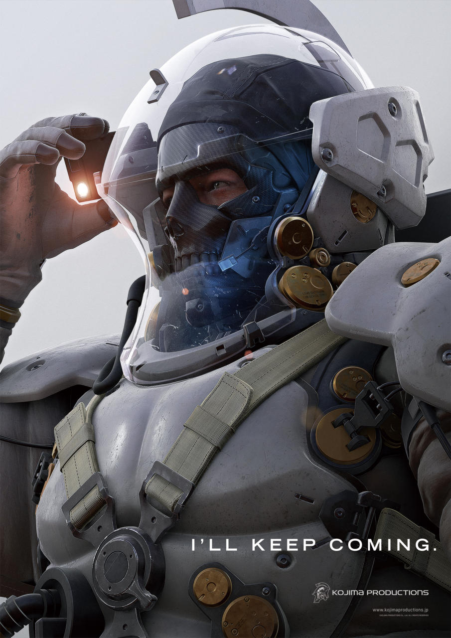
[Image: Kojima Productions via Gamespot]
No clue if this is just the logo or a teaser for the studio’s to-be-developed game. Regardless, the tagline “I’ll keep coming” seems to mean we can look forward to more logo art. Maybe a mugshot sans mask? An aerial view? Underwater?
Comments
10 responses to “Kojima Productions Continues To Churn Out Logo Art”
Is this a logo or a mascot?
It’s certainly not a “proper” logo but what’s happening is an expansion of the logo through exploration (expansion) of assets (the astronaut) to grow an identity which is part of the brand.
Having said that I think they should be going the other way and explore a more simplified version of the logo as it really doesn’t work as it is (looks like it has been put together by the illustrator, rather than an identity designer.) Things like scalability and whether it can be applied to multiple applications are a real issue.
Incidentally the tagline “I’ll keep coming” makes me snigger like a 13 year old…
That’s true. I think if they got rid of the skull and just used the profile of the helmet as a solid colour that could be quite striking and easy to recognise.
I swear that’s Norman Reedus under that mask.
defs
Silent Space a Hideo Kojima game
I don’t understand why this is a big thing. It just feels like a filler for a slow news day.
I’ll keep coming…
ifyaknowatimeen
My hips are moving on their own!
“I’LL KEEP COMING”.
That’s what she said.