Games artist David Hellman pointed this out on Twitter over the weekend. I will never unsee it, and I’m not sure how I’m going to reconcile this over the years to come.
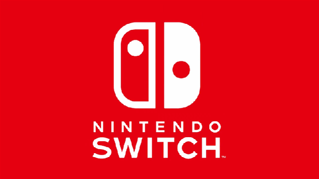
Did you notice the Switch logo is not symmetrical? Each side has a different apparent visual weight, so the logo is “balanced” by eye… pic.twitter.com/rFp34LyOoA
— David Hellman (@davidhellman) January 6, 2017
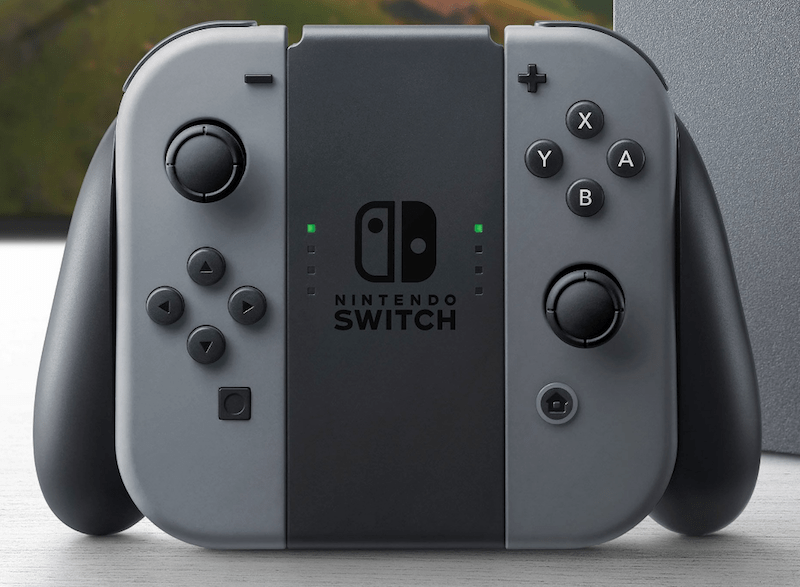
As someone who craves order in my product and logo design I was already uneasy about the two dots not being symmetrical, but could live with that because they’re in the logo to represent the stick placement on the Switch’s controllers.
But the halves themselves? This is no accident, and it is both infuriating and, reluctantly, a little impressive. The logo as it is looks symmetrical even though it’s not, but when you go and actually make it symmetrical:
If the sides were really equal it would look like this. pic.twitter.com/klrwTWpNvi
— David Hellman (@davidhellman) January 6, 2017
It looks all messed up.
Well played, everyone involved.
For more on the Switch than just its wonky-arse logo, remember that the console is getting its proper debut this week. The event kicks off at 3:00pm Friday AEDT, and we’ll be covering it live right here.
Comments
15 responses to “The Nintendo Switch’s Logo Is Not Symmetrical, And Arrrrgghhh”
great, thanks. Now I can’t unsee this.
Might look a little too Yin-Yang if it was symmetrical? Also it’s a literal representation of the controller.
I love this.
Good luck sleeping tonight!
Let’s hope the author never sees an Xbox controller.
I also think the dots being where they are makes your eye process the whole shape like it was an ‘N’.
N for Nintendo!
Not seeing a difference…
It took me ages to actually spot the difference. Don’t focus on the dots, the difference with the symmetrical version is the red side is slightly skinnier and the white side is slightly fatter.
It’s not really something you’d spot unless you were looking for it.
Or some arsehole pointed it out.
It’s like kerning… once you’ve been made aware of it you can’t help but notice it every time.
Relevant xkcd.
Visual symmetry like this example, is very much a fundamental of design. Similar to the spacing (kerning) between letters in a typographic logo.
The asymmetry definitely does annoy, and it is definitely not what I would’ve done with the logo (I would’ve had exactly either side of the center be the white & red stripe respectively, and have made the white line’s thickness match the red.).
BUT, there is one cool thing about the unusual placement: the red line’s thickness and placement perfectly matches the “E” in Nintendo.
The reason I’m guessing for the asymmetry in the first place is how absence & contrast can effect how our brain perceives size and size relation. At a quick glance at the original logo you’d think that both halves are, well… HALVES. But as this article has pointed out, they are not indeed symmetrical. It’s just how our eyes perceive the difference between the outlined half and the solid half.
Ever check out the kerning on the Hello Games logo?
https://upload.wikimedia.org/wikipedia/en/d/d4/Hello_Games_Logo.png
It’s the G isn’t it?..
The white portion looks bigger if you have it kept symmetrical. So they (rightly) adjusted the logo to ensure that it looks visually symmetrical along the vertical axis.