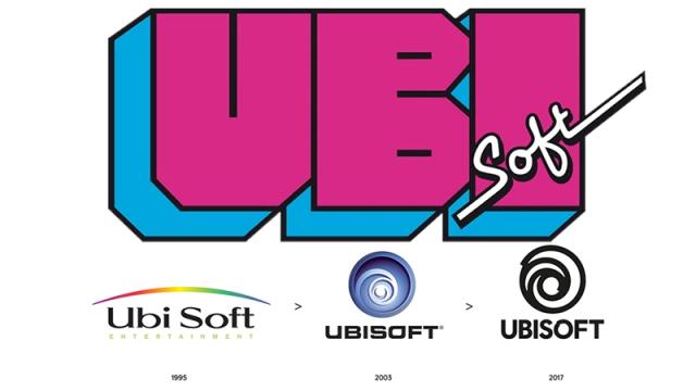
Ubisoft announced its new logo today, marking the third major brand makeover since the company switched from game distributor to developer back in 1995. That’s what happens when you throw away something as perfect as the magenta and cyan original.
Look at those glorious block letters. Behold what looks like two half Ps desperately trying to B. The use of a cursive font for the “soft” is just perfect. How else are we going to know something is soft without touching it?
Ubisoft swapped that glorious branding beast for something safer and more presentable in 1995. The “Ubi” and “Soft” sides, stripped of their cutting-edge ’80s look, turned to each other for comfort — they were officially married in 2003.
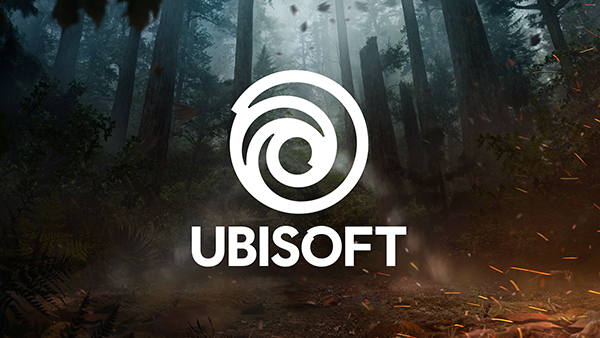
Ubisoft’s new logo is hollow, presented against the backdrop of a world shattered by one poor design decision made more than two decades ago.
Comments
2 responses to “Ubisoft’s ’80s Logo Is Still Their Best”
I just hope that it will continue to be altered to reflect the game it is attached to
The 80s and 90s logos are time capsules of awesome.