In my first few minutes with the PS4 HD remaster of Final Fantasy 12 I was awestruck by how fresh it looked. As a recent blog post by designer Robert Yang explains, however, the new game’s new coat of paint seems to have come at the expense of its soul.
Image credit: Candyland
Remasters are getting more and more common every day. The category has grown so much over the last few years that it’s now necessary to break it down even further in order to distinguish complete remakes like Metroid: Samus Returns from games like that receive graphical overhauls but otherwise remain the same underneath like The Last of Us on PS4.
The Zodiac Age falls into the second group. The gameplay remains untouched and it doesn’t include original assets. Instead things have been retouched using the computing resources of the PS4 to take the game beyond what it was graphically capable of on the PS2.
And at first glance it looks absolutely great, closer to how you remember Final Fantasy 12 looking then how it actually looked. But upon closer inspection, there’s something missing. Remixed to look more crisp and vibrant, the game lacks the same cohesion of the original’s blurry impressionism.
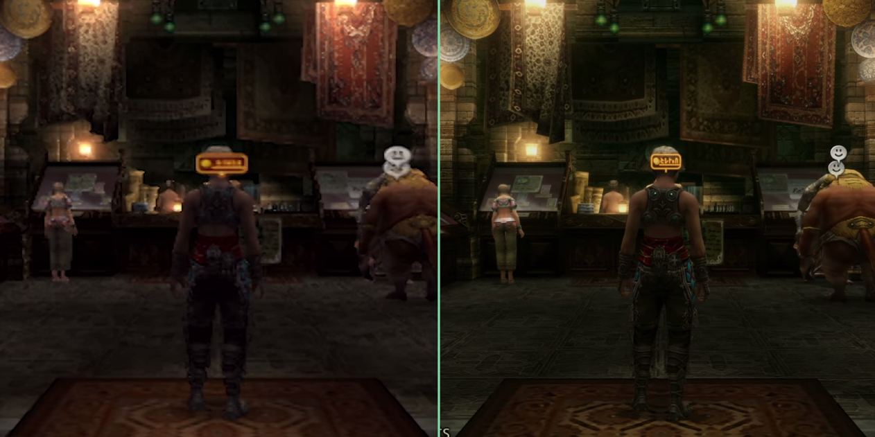
Image credit: Candyland
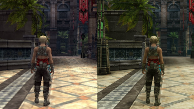
In the above comparison, you can see what this means in practice. On the right, The Zodiac Age is more clearly defined with details that are easier to discern, while the left shot taken from the original game on its native 480p resolution running on the PS2 looks muddy. What it lacks in sharpness, however, it makes up for with depth.
The carpets towards the back of the shop are dark and faded. Individual textures are weaved together by shared volumes — dark floors and wooden counters contrasting with the warm lights hanging from above. In the remaster, the contrasts have been ramped up so that every little object pops.
There’s more information on the screen, in other words, and it’s clearer, something that Yang argues is a betrayal of the original game’s artistry. “On the PS2, the game’s environment and characters looked cohesive and balanced, albeit blurry and aliased and low-res (like any other PS2 game played on a CRT television),” he wrote in a post on the subject yesterday.
“Still, every cinematic shot was reasonably composed, and you basically knew where to look. Everything looked like it belonged together. But here in this remaster, the entire world is practically screaming at you. “LOOK AT THE DIRT AND GRIME ON THIS WALL!!!”
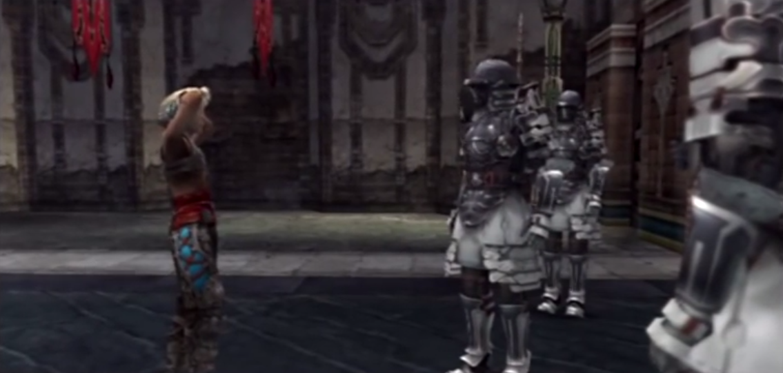
Taken from Final Fantasy 12 at 480p
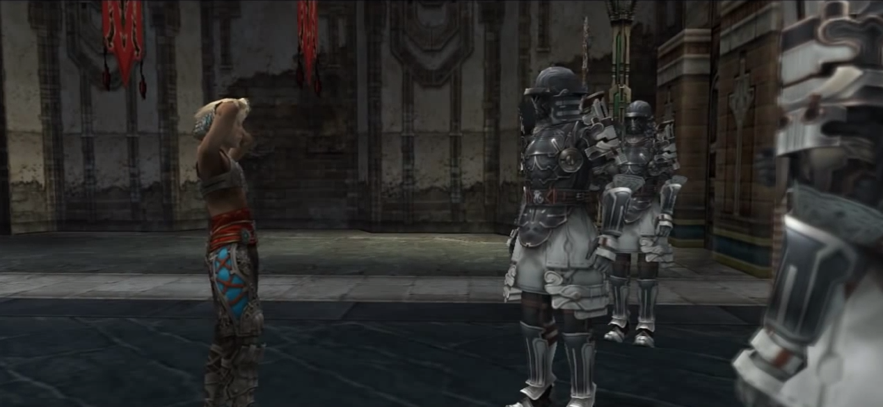
Taken from Final Fantasy 12 running in HD on the PCSX2 emulator
Taken from The Zodiac Age remaster
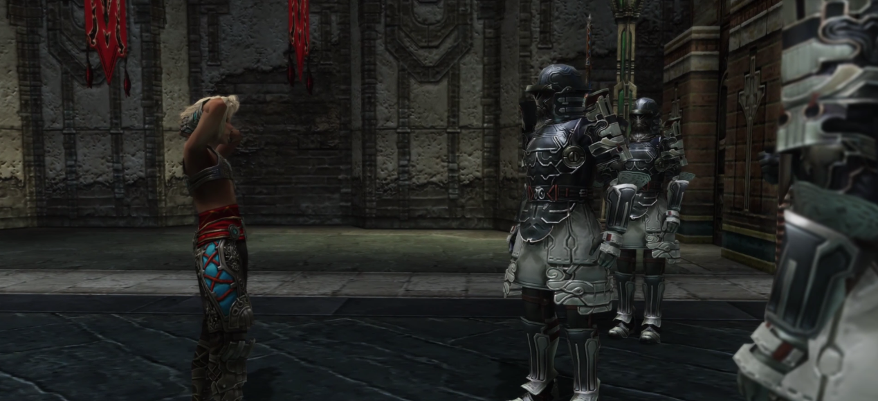
You can see what he means with this scene that takes place early in the game as its anime Aladdin protagonist, Vaan, is trying to leave the city of Rabanastre. The PS2 version is ill-defined while every little line in the remaster is popping out.
The embossed lines and glare on the soldier’s armour are competing along with the highlights on the pavement and the cracks in the mortar on the back wall with everything else going on in the scene for attention. By themselves, each little details feels fresh, but taken as a whole it’s a bit of a mess, making the simpler up-resing of the emulator look like a better middle ground.
In his post, Yang praises the artistry of the original Final Fantasy 12 for how much it was able to squeeze out of the limited 4 MB of texture memory it had available to it. Things like Vaan’s face were symmetrical to save space, while the designers made up for the “flat” appearance this strategy entailed by fine-tuning every line of pixels to prevent them from all fusing into muddled soup of indistinguishable features:
“It takes a lot of training to make a thin pixel art “jagged” line look smooth. You have to carefully paint the lines and selectively blur the edges to look good to the viewer. Anti-aliasing pixel art without muddying your shapes is practically an art form in of itself. When you don’t have a lot of texture memory, every pixel counts! The artist had to handpixel every of those loops perfectly in order to get that metal to pop like that.
In this way, the original Final Fantasy 12 represents a high-point in this era of 3D game art. This old school low-polygon low-resolution handpainting style involved a special mix of realism with pixel art sensibilities, and you don’t really see this thing anymore in games.”
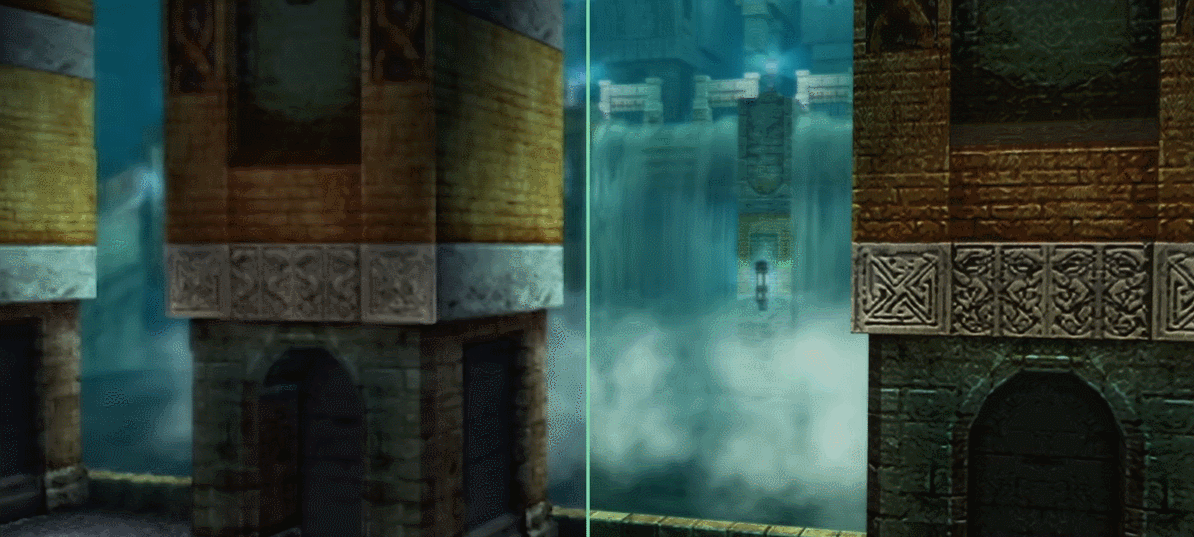
In the game’s Garamsythe Waterway, a labyrinth of aqueducts and passages below Rabanastre, you can see what’s lost when new layers of detail and contrast are thrown on top of the old edifice. The Waterway gets noisy. Foggy backgrounds are replaced with incandescent streams, while the nearby pillars look less ancient and more like a veneer.
Yang argues that there’s a “truth to materials” effect which gives the original a more natural and authentic feel because it was the direct result of many people crafting a vision within the confines of the PS2’s technical limitations. The Zodiac Age, put together under the constraints of time, money and an outside studio rather than those of the PS4 is less focused as a result.
“If I had to guess, the artists probably did this: (1) scale up texture by 200%, (2) increase contrast, (3) desaturated a little for that grayish next-gen feel, (4) apply a sharpen filter, (5) overlay a noisy detail texture on top to try to make the surface look more detailed,” he writes. More eye-catching like like the over-saturated photographs of blue sky or ocean sunset you might see at a local street festival but lacking intent, with algorithms and automated up-scaling making the original scenes and visual moods more diffuse.
Reviewing one of the early impressionist exhibitions in France in the spring of 1874, the art critic Jules-Antoine Castagnary described what unified the artists who participated as a “determination not to aim for perfection, but to be satisfied with a certain general aspect.”
The Zodiac Age, for all its improvements, lacks that aspect at times, at least in its visual presentation. “They are impressionists in the sense that they paint not landscapes but rather the sensation produced by the landscape,” Castagnary went on, and it seems to capture the difference between the two games well.
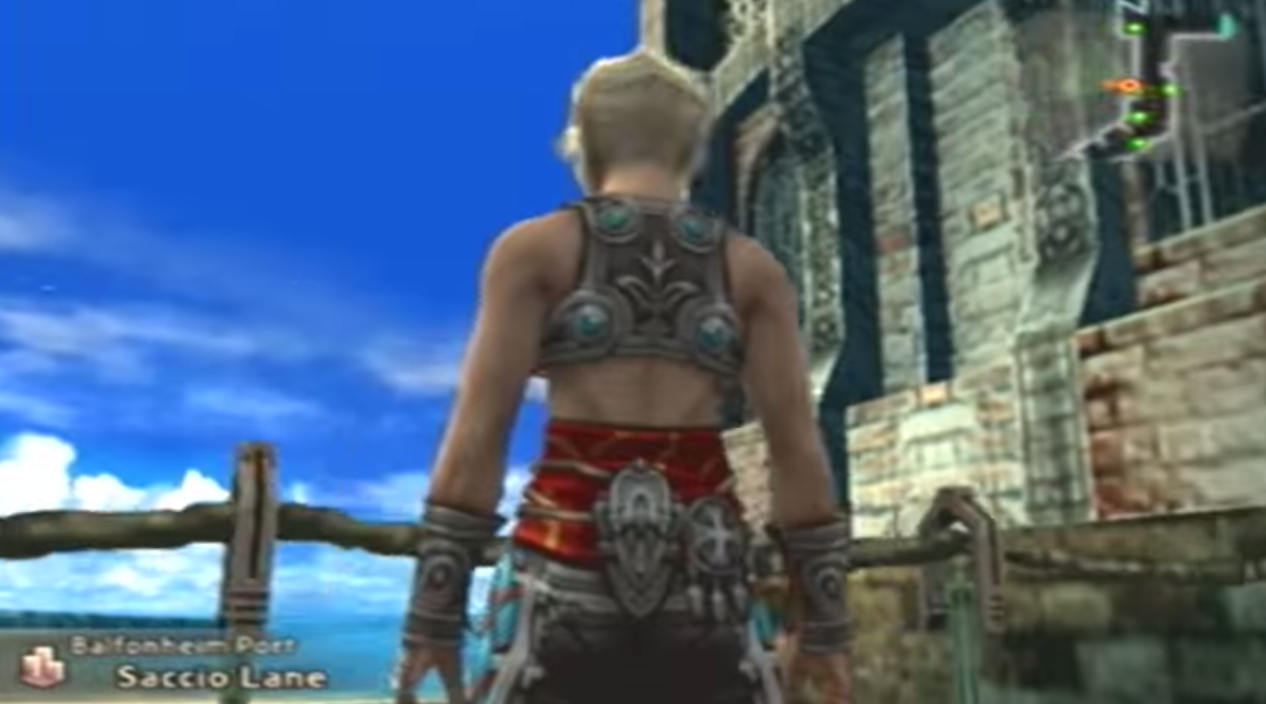
The trees look more like trees in the remaster. The walls have more stones in them, but as Yang writes, “that’s not a particularly honest nor interesting thing for a wall to say.” And while Vaan’s abs no longer look like something out of a horror movie, the overall sensation of the rest of the game has been flattened and lost between all of the sensory overload to achieve that effect.
Comments
24 responses to “Final Fantasy 12: The Zodiac Age’s Remastered Look Comes At A Cost ”
Nup. Still give me HD anyday.
You don’t see it anymore because whilst it might have been okay on smaller, 480p screens with nothing better to compare it to, today, on massive 4k screens with other games to give you a comparison, it looks terrible…
I don’t have a CRT TV.
Ha.
The current generation of remasters has been a disaster as far as retaining artistic direction and visual tone are concerned. It’s been a subtle reminder that nostalgia is a bloody great marketing tool.
Unless your company’s name is vanillaware.
Author forgot the “Filed to: Satire” tag at the top of the article.
You seriously don’t appreciate this sentiment? It’s like hearing the winner of The Voice singing vs. a real artist. The winner strives for perfection, the voice for the voice’s sake, to win a competition. But the artist strives to show you something real, something imperfect. Their voice might not be flawless, but it’s their own, and they use it to sing their own songs.
This is a reach.
I get the idea, classic games were not made to have the super clean pixelated look they have in emulators, rerelases, even ‘retro inspired’ indie games, they are supposed to have some blur provided by CRT to smooth the edges. I also understand playing a 8/16bit game with those razor sharp pixels today betrays the original look and feel.
Those doesn’t mean this cleaner look say for FFXII is inferior and it certainly doesn’t mean people would be happy with a blurry image to remain faithful to the original release. If remaining that pure is that much of a priority time to fire up the CRT and enjoy. For the rest of us let us enjoy the comforts that the rerelease brings.
I’m not even buying into the idea of ‘lack of details allowed for a more unified and cohesive theme’. Artistically, I just can’t see much support for that assertion. It’s a serious reach, the kind of argument that you have to tilt your head and squint at.
I don’t agree with the article, but I do think there’s some merit to the “cohesive blurriness” concept. I don’t like posting about it too often, but I was responsible for the FF7 2D remake (snes style, not the nes one) that made the rounds a few years ago. In the course of working on that I spent a lot of time studying the background images in the original game, trying to work out what-the-hell-is-that-blurry-blob-there so I could redraw it in my snes-styled conversion. Doing that I picked up a lot of the seemingly unintentional design rules that makes FF7’s design so cohesive.
In short FF7’s design works so well because everything looks like complete shit, and I say this lovingly. Clearly at the time FF7 was made the devs didn’t know just how low res and low colour the prerendered backgrounds would end up being. This results in backgrounds that are high contrast with *tons* of blurry doodads in the background. FF7 is pre-rendered, but if we were to pretend Square had the original assets and decided to retexture and rerender the backgrounds it would completely change the feel of it – it would be visually overwhelming like the Phantom Menace and feel sterile like Advent Children.
Anyway, I totally shifted the goal-posts here, I still don’t think the concept has merit in the original article, but the concept is true elsewhere.
Yeah. I’ll agree it’s definitely a concept which can apply somewhere… I just don’t see it applying here.
When you have logos that you need to then apply as favicons or small pixel based versions, it’s paramount that you work within the right formats and pixel count. A vector logo that can scale to any size can’t simply be shrunk down to a 15x15px box, you need to adjust it to make sense in that format. It’s especially important if you have logos with lots of curves.
It’s the same with graphics. Decisions are made based on the hardware available and those decisions can actually be what’s best for the game, even after a sterile remaster simply ups the resolution and contrast.
For any of us who didn’t bother to mod our PS2 and import the Japanese International release, it’s more than just a graphical tune up. The new job system and item placements make a big difference to gameplay, so it could be described as a first category remaster with new “assets” for the new items.
Oh, and it looks and plays much better on PS4 thank you very much.
There *might* be argument for some of these HD rereleases to come with a CRT filter.
I still prefer the look of the HD stuff on my LCD though. Maybe if I had a nice Sony Trinitron to play some of this stuff on I’d give the argument some credence.
I fired up the original release on my 60 inch 4k tv out of interest and I can report that it really looks like dog shit.
100% disagree with this article. In the case of both FFX and FFXII, the update in graphics has blown me away in both cases. What the update does it confirm in my eyes how amazing these games looked when the first came out, for them to now look just as amazing without a considerable amount of work. I feel like the games now look more “real” and more vibrant than ever which is great.
At the end of the day, put the 2 together and I’d rather play the remaster because it’s the same game but better looking…
Oh yeah this is what painters use. (I’m an artist by trade)
It’s called found and lost edges, as well as simplifying forms by grouping them together by making them either similar is town or sharpness.
Which I’m assuming what’s happening here. Also similar to paintings, if objects or details are so soft or blurry, your brain fills in the blanks, sort of like how you see images in clouds.
Whether this was used by the development team at the time I can’t be sure. But I’m guessing if I were developing a games art assets, I would account for resolution and what reads as well as what doesnt read. I also might use this to my advantage by not making each texture overly detailed. I would also pay attention to lighting a grouping shadows to make cool scenes.
This might be a problem for some remastered games, and also why old games really do look good in our memories. Playing on an old tv actually creates a pretty cool filter that old games actually would use. It’s also probably why these games inspired our imagination so much too, because things weren’t all told to use visually so our imagination would fill in the blanks.
It really probably would make game worlds more mysterious and deep.
Interesting topic.
*t’s called found and lost edges, as well as simplifying forms by grouping them together by making them either similar is tone or sharpness.
Finally someone who understands the principles behind these sorts of things. So far these comments have been either wilfully ignorant or painfully naive.
Except this person isn’t insulting or generalising someone’s preferences because they don’t share yours.
If i’m guilty of that then i’m in good company. “This should be filed under satire”, “Ha.”, “This is the video game equivalent of people saying vinyl is better than CD.”, etc.
It’s not about insulting preferences, it’s about understanding that the creator’s original intent is important. They made decisions based on the hardware that were made with the assumption it would be displayed a certain way. Because of that, some of their decisions do in fact look better than an HD remaster, compositionally; objectively. The scene with Vaan and the guards embedded in the article is a perfect example. The third image by far has the worst depth in it.
Sorry forgot my account -Another reason as to why the hd feels weird to look at is in a painting if all elements are sharp your eye doesnt know where to rest, because everything is asking for your attention visually.
But at the same time im glad they re-realsed this game. It really was a great game that came out at a weird time so people completely forgot about it. If hd is what makes people buy and play it, so be it.
This is the video game equivalent of people saying that Vinyl is better than CD.
I’d say the difference is a bit larger than that example.
Due to how the human eye works and brain work.
You dont really hear deeper music due to the sound being grainy.
If painters updated paintings to hd it would be a massive difference visually.