Uno is testing out a slight redesign of the classic family/hate game. And it’s a practical one, making some changes so that colour blind players aren’t stuck staring at a hand full of red and green cards and going “oh, great”.
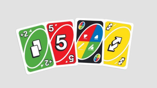
As Fast Company report, the redesign is being trialled with copies being sold directly from Mattel’s website, and instead of changing the iconic colours of the main deck, adds small ColorADD icons next to the numerals on each card.
ColorADD is a universal “sign language” of sorts for people who are colour blind, and by adding the system’s icons to each Uno card, the game will instantly have everyone on the same page whether they’re colour blind or not.
It sounds minor, but when you consider that in some nations (rates vary depending on ethnicity) up to eight to nine per cent of the population experience colour blindness, and that Uno is one of the biggest games on the planet, it’s actually something that’s going to be a positive change for a lot of people if it ends up being adopted into the wider retail release. And even if it doesn’t, they can always just buy the version that works for them!
Comments
3 responses to “Uno Releases New Card Design For Colour Blind Players”
My red/green colour blindness always screws with me when I play video games. It never ruins an experience but it certainly makes playing some things much harder
So your playing Hard Mode, basically the whole time, no matter what?
ReCore did this nicely with their colour based enemies and attacks. When it shows a colour it has a circle with the up, down, left and right arrows on the side. These match up to the D-pad directions you press to change weapon colours. It was a pretty clever was of handling it.
Always nice to hear when a product/service/ect. receives an accessibility upgrade
Good work