Since 1993, Magic: The Gathering has had, more or less, the same logo. There have been updated versions, but they were slight. That’s true of the latest iteration, but compared to the earlier updates, the changes are noticeable.
[Image: Wizards of the Coast]
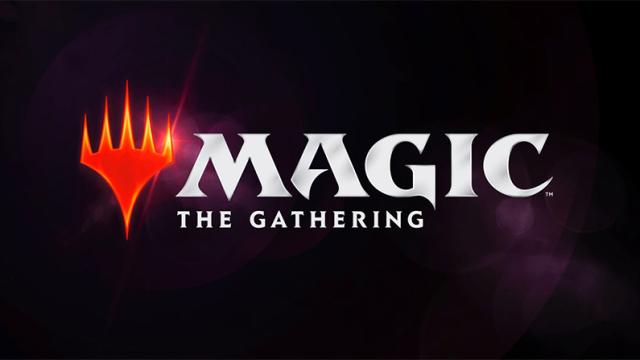
Recently, a brand new logo was revealed (above), which looks similar to the Magic: The Gathering Arena logo, the online version of the the collectable card game.
But see how it compares to the previous logos.
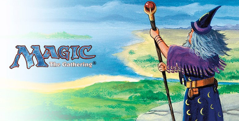
1993 — 1999
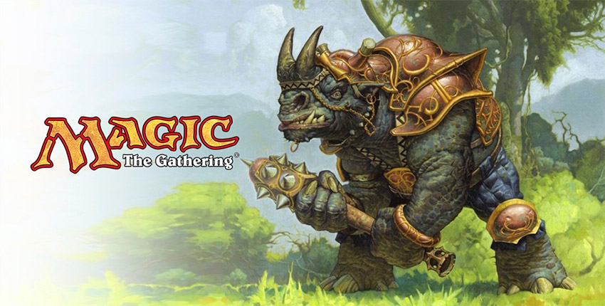
1999 — 2015
2015 — 2018
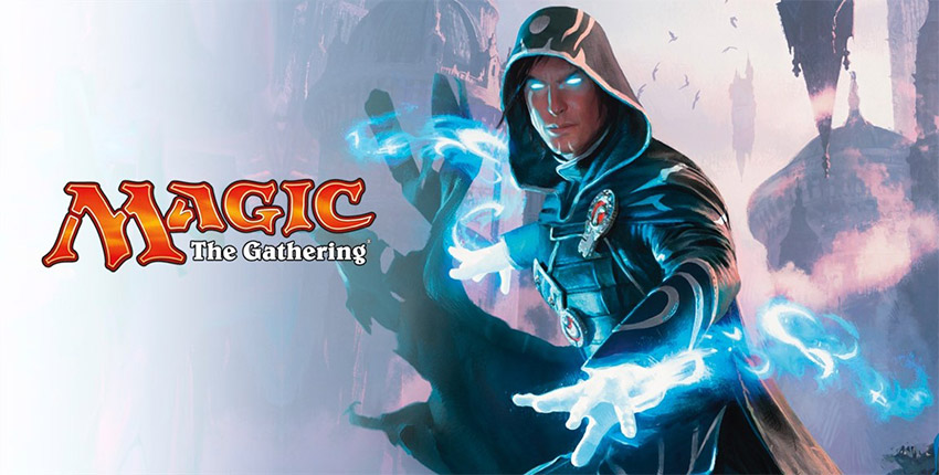
I feel bad for that last logo. Its orange-yellow font didn’t have much time to shine.
Comments
One response to “Magic: The Gathering Gets A New Logo”
But im only new to magic, im attached to the logo, dont take it away from me noooooooooo