Steam’s desktop app has gotten better over the years, but its mobile app is pure trash. Which is why fans like Thano9, fed up with its ancient looks, go and imagine their own redesigns.
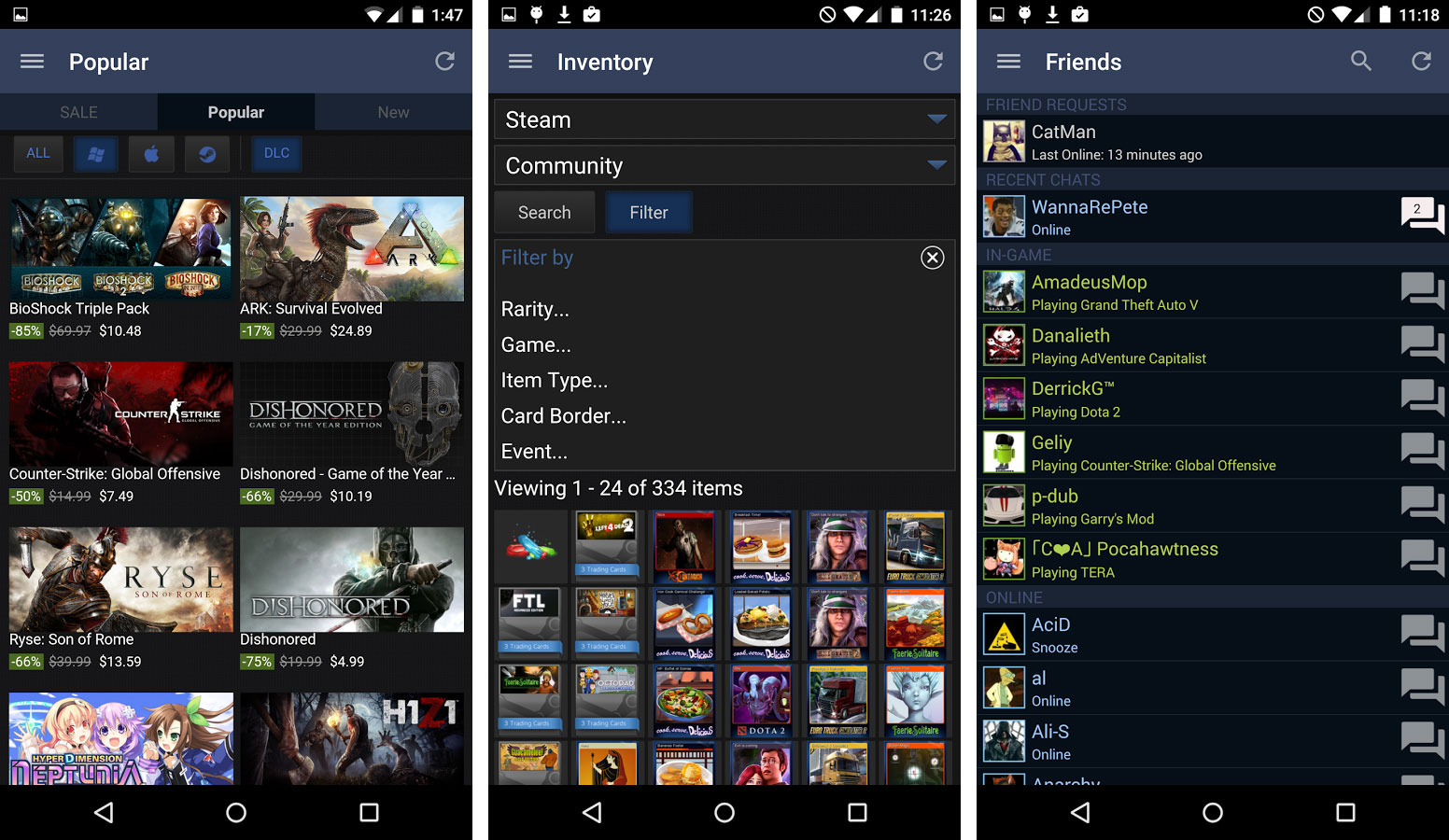
For reference, here is Steam’s app as it appears today, in 2017:
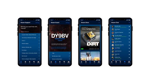
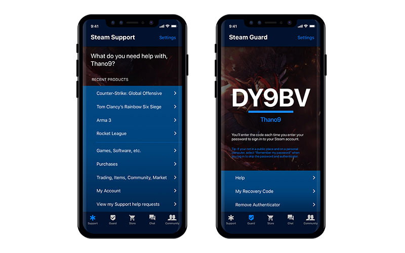
And here are more detailed shots of Thano9’s design mock-up, which is what an app from a big and profitable online company should look like in 2017:
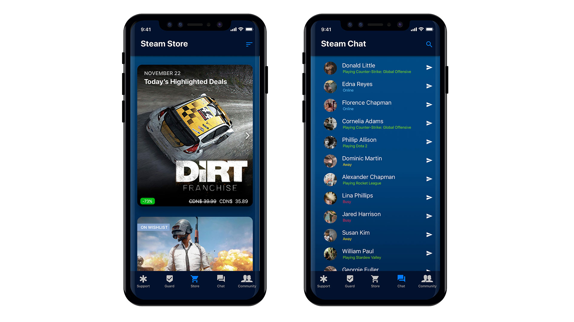
This take on a dedicated Steam app looks good, appears functional and is reasonably modern and stylish to boot. Valve’s official app is none of those things, and given its current decrepit state maybe never will be, but hey, we can dream.
The two things it does a lot better than the current one are make better use of modern, large screens by using bigger images, and breaking the relevant sections out into buttons at the bottom of the screen, rather than hiding them behind a slide-out menu.
Comments
5 responses to “Fan Redesigns Steam’s Terrible Mobile App”
Valve doesn’t make UI, Valve makes money.
And hats. Lots of hats.
And yet Steam is the only way to play PC games. Everything else about PC gaming is good though. Such a damn shame.
In a recent interview, Gabe said the new Steam Mobile App would launch with Half-Life 3
R.I.P.