
Dragon Ball Z villain Frieza suffering after protagonist Krillin uses a solar flare attack. Also, me after looking at Discord’s “light” theme.
The long, contentious list of things that divide us – dogs vs. cats, Labor vs. Liberal, tomato sauce vs. mayo – has an entry just for gamer aesthetes. There’s a war among Discord users over whether people who use the gaming chat app’s “light” theme are wicked, infernal hellbeasts or normal humans who like white backgrounds.
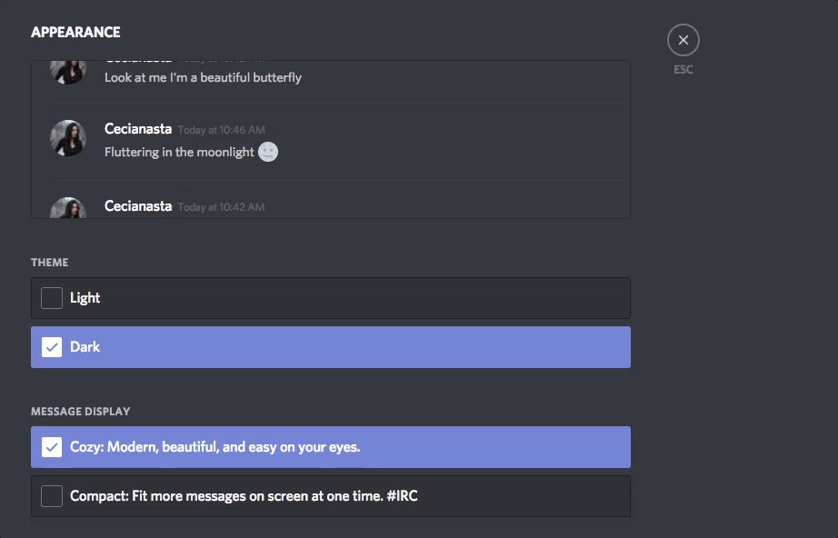
Discord’s signature look is dark. On top of a default grey background, users type in white font. Compared to other chat apps like the more office-friendly Slack, Discord’s got a look that appeals to denizens of the night. It also falls squarely in line with the shadowy look popular among gaming apps like Battle.net, Epic Games’ launcher and, of course, Steam.
It turns out that, underneath that doomy exterior, Discord’s got a “light” theme, too. And boy, is it light. Turning it on after months of Discord “dark” feels blinding. It’s a bleached, stark white with medium-grey font. It’s like looking outside your window at a six a.m. sunrise after grinding on Diablo 3 all night. It hurts me:
Aaah. Our eyes.
Of course, there are Discord “light” apologists. Some people just think it’s easier to read (probably, they are the same people who wear sunglasses inside). The great majority of Discord users, apparently, think those people are wack:
People who use Discord’s light theme be like pic.twitter.com/eNf2yqa5LP
— Deathro (@8bitDeathro) April 16, 2018
You haven’t experienced true bullying until your peers find out you use discord light theme
— 飛T (@m_feiTi) March 15, 2018
Theres at least one person out there using discord light mode and that scares me.
— THE ALMIGHTY GOKU (@virgoTestified) April 2, 2018
imagine falling in love with a girl to find out she uses discord light theme
— レベン (@obscuredraven) March 8, 2018
Discord light theme in a nutshell pic.twitter.com/WVWAvg3PlT
— Jelly Fish looking fool (@LorshZontek) March 16, 2018
me: uses discord light theme
me: shows a screenshot
everyone: yells at me. manifest physically in front of me and kick me to the ground— ????BeeBee✨ (@AstraleStella) April 9, 2018
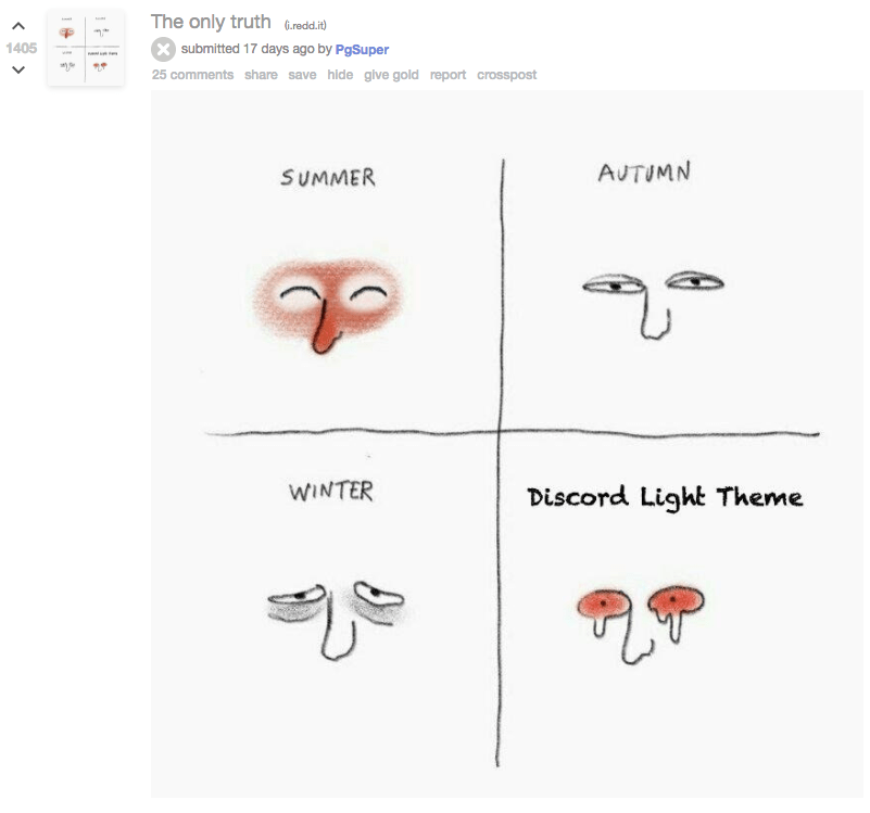
Graphic: PgSuper
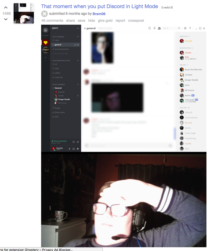
Graphic: Bram06 (Reddit)

Graphic: BionicRabbit (Reddit)
discord light theme users pic.twitter.com/xqdAFxm8y4
— pillow II (@yummypillow) February 19, 2018
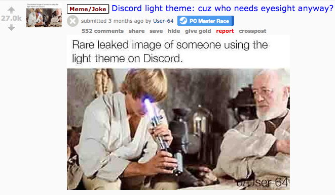
Graphic: User-64 (Reddit)
Even Discord is in on the joke:
Rare photo of a Discord developer working on light theme pic.twitter.com/Gz9d4x0oJX
— Discord (@discordapp) March 14, 2018
Sure, someone might ask, “Who cares what colour scheme you use on your private gaming chat app?”. I don’t have a great answer, but I do have the truth: a lot of us.
Comments
15 responses to “Nobody Understands The People Who Use Discord’s ‘Light’ Theme”
Apparently I’m one of “those people” since I use the light theme. I use a light theme on practically every app that allows it because I find it easier to read. That’s the simple and only logic behind it.
I use the light theme too and yeah, it’s because it’s easier to read for me. Black text on white background is how most books are written, after all. Do the dark theme people complain that books are too bright to read too?
The thing is the Discord light theme is REALLY bright. Most things are normally subtle shades of grey which makes things a bit easier on the eyes, bu that Discord theme feels like it’s pure white.
It probably depends a bit on the display too. For example I have a phone that automatically dials down the brightness in the evening (blue light filter), and in lower light generally any time of the day. So if I’m using Discord on the phone it never seems “that” bright. SImilarly, I’ve tried to get a comfortable brightness level on my PC monitor rather than just dial brightness up to 100%.
I had an old monitor where the brightness was ridiculous even at low settings. I suspect discord would suck on that.
@WhitePointer: Exactly, I’m used to 40+ years of reading books so black on white feels “right” when reading. Maybe my eyes (brain I suppose) are trained to that and if I spent a few months forcing myself to read white on black it’d be ok. But I doubt it.
I forgot to bring my glasses to work today. I just put the empty case into my bag because I do nothing but listen to music on the train in. Today I’ve had to invert the colours on my monitors just to be able to read the screen. I only wish there was a dark theme to the Microsoft office suite. I mean Kotaku, Gizmodo and a whole bunch of sites have night/dark mode and its brilliant. Dark mode projects a lot less light and makes it less straining on your eyes. I haven’t struggled as much as I thought I would today.
There is a Dark theme to Office 2016/365. It is under File > Account > Office Theme
There is Colourful, Dark, Black and White.
Sadly we’re stuck on Office 2013 at work. I did get told about inverting the colours using the magnifier, and my god It’s what I’ve always wanted. Now if only I could make it so pictures and videos stay the same, and only bright white backgrounds on emails, spreadsheets and the like would go black/dark grey
Office 2013 offers a dark theme though? Or is the Dark grey theme not dark enough for you?
If not you could always use a work around. Assuming you don’t have specific colours set up in your spreadsheets you just select a larger range of cells and flip the background and text colours to your liking. Do your work, then reset the colours to default before you save. Not ideal but it works. I’d imagine you could do something similar in Word though I haven’t used it in so long I’m not sure exactly how.
Yeah I have the dark theme, but it only covers the borders and menus. In outlook my inbox list is still white. The Magnifier does the trick with inverse colours for now
Pfft. I assume people who dislike the default-everywhere-except-gaming Light profile are the same kind of people who never left home without their libraries of emo-ass winamp skins on a 3.5″ floppy.
DON’T @ ME
Never even used winamp 😎
It really whips the llama’s ass.
But why would a llama have a donkey…
It’s not just gaming, software development tends to preference dark themes as well. It’s not ubiquitous, but most developers I’ve worked with over the last 10 years prefer dark.
Like me. I much prefer dark. Light themes are skeuomorphic and work well with reflected light (eg. pieces of paper, e-ink readers), dark themes work better with emitted and projected light (eg. monitors, cinemas).
I used WinAmp for a while but way back in the day I preferred QMP (Quintessential Media Player). Sadly it was discontinued years ago. Even then I using a shiny metal-look skin not a dark one 🙂