The best Batman artists always do something cool with the Dark Knight’s cape. It’s a given. Norm Breyfogle did that and so much more, re-inventing almost every visual aspect of Batman’s mythos.
Last week, the sad news of Norm Breyfogle’s death hit the comics community hard. The 58-year-old artist was a veteran of DC, Marvel, Valiant, Eclipse and other comics publishers. Breyfogle came to prominence during a red-hot six-year run drawing Detective Comics, Batman, and Shadow of the Bat in the late 1980s, a tenure that resulted in one of the most unique interpretations of Gotham’s Guardian.
Breyfogle’s Bat-work started in 1987, a few years before the 1989 Batman movie, and carried on through the release of Batman Returns. His style was perfect for a time of rapid change for superhero comics, with big crossover events, ambitious tonal shifts and — specific to Batman — blockbuster movies arriving in cinemas.
While lapsed fans, young newcomers and superhero sceptics were encountering a Dark Knight designed to look as though he could be “real”, the art in Batman comics was getting more frantic than ever. Prior to Breyfogle, Neal Adams returned Bruce Wayne to his moody pulp-influenced roots, Marshall Rogers bathed him in architectural splendour and sharp 1970s style, and Jim Aparo drew superb superhero melodrama.
But when it came to spotlighting the freakishness of the Batman’s very existence, few were better than Breyfogle. His style scoffed at realism.
That isn’t to say he ignored the importance of detail in his drawings. You can see finely rendered or expertly emphasised elements on almost every page he did. But the most crucial aspect of Breyfogle’s approach was his decision-making with regard to when to render detail or aim at something more impressionistic.
His Batman changed shape and size, looming dramatically or hurtling across the page in linework that felt like vectors of force were burned into the page. And his designs for the Batmobile, grappling hooks and various utility belt paraphernalia made each bit of gear feel sleek and evolved.
Oh, and the cape. It swirled and danced. Sharpened to points and spread to impossible lengths. All Batman artists do this, of course, but one thing that struck me as I re-read Breyfogle’s Bat-work is how rarely he repeated his cape-drawing tricks. In particular, the panel below stands out because he moves the cape out of the way to show Batman’s body.
It’d probably be faster to do the opposite, but that choice highlights the urgency of the Dark Knight’s form in motion and the idea that it takes incredible effort to swing across Gotham City.
This constant shifting made that era’s Batman — rendered in partnership with Aparo — feel like it could contain many moods. This was a good thing because Breyfogle was illustrating stories from Alan Grant, John Wagner, Mike Barr, Denny O’Neil and many other writers. A big chunk of his tenure had him drawing scripts at a blistering monthly pace with stories ranging from semi-comedic to starkly dramatic. Breyfogle was up to the job every time.
A slew of new villains was introduced during this time and Wagner and Grant in particular — writing both as a team and separately — threw characters such as Ratcatcher and Mr Zsasz to Breyfogle to draw for the first time. Of those new villains, Ventriloquist and Scarface were my favourites because the contrast between the meek human and the murderous puppet made for situations that could be both funny and scary.
Another important thing to note about Breyfogle is that he cranked out pages. Working on a monthly book before cape comics had its big decompression moment meant that he handled denser stories and layouts. Perhaps as a concession to pace and density, his style got faster and looser as time went on, but that only heightened the strengths of his approach.
The bulk of my engagement with Breyfogle’s art happened during his long Batman tenure. I liked his artwork immediately because it was, at its core, paradoxical: Wild, angular and electric but also tightly composed and rigorously rendered. He could swing from grim and foreboding to comedic or concerned with ease and never made it feel like he was betraying the characters just to show off his chops.
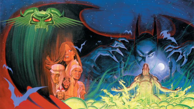
For me, the high point of Breyfogle’s Bat-oeuvre was the Birth of the Demon graphic novel written by Denny O’Neil. First released as an impressive hardcover, the hand-painted story tells the origin of Ra’s al Ghul across the centuries of the near-immortal archvillain’s lifetime.
The period-piece nature of the story meant that Breyfogle couldn’t simply rely on the tools he’d sharpened drawing Gotham City over the years.
But he dove into the challenge with relish, turning in pages of epic blood-and-sand desert drama that clearly channelled the sweep of Lawrence of Arabia. Emotions run high in Birth of the Demon. We see the young man who would become Ra’s al Ghul suffer traumatic loss and change psychologically as the decades roll by, and it all works because Breyfogle expertly walks a tightrope between exaggeration and portraiture.
Keep in mind this was long before technology made digital painting commonplace. The brushwork is visible in places, making Breyfogle’s command of colour — sickly oranges, cool greens, ominous dark blues — breathe. Look at how he cloaks Bruce Wayne’s face in shadow and anger. That decision communicates the idea that this man is still the Batman, even though he’s taken his mask off.
Breyfogle’s other major moment in the Bat-mythos came in Batman #457, the first issue where Tim Drake became Robin. It was legendary artist Neal Adams who designed the new look but Breyfogle made it sing. Tim’s super-suit looked shiny and slightly futuristic, an appealing new Robin for a new era.
Drawing Tim in cool action sequences sold readers on the character, which must’ve been met by a sigh of relief by DC editorial after the disdain for and cruel fan-vote-mandated death of Jason Todd.
It’s probably worth noting that another of my favourite Breyfogle stories happened years after his Batman run — at Marvel of all places — and wound up making a deeply personal impact on me.
Written by Christopher Priest during his legendary run, Black Panther #30 is a story that’s half flashback, half tying up loose ends, showing a young Steve Rogers in Wakanda for the first time while T’Challa sits in front of a Senate committee to answer questions about his recent adventures.
With a title like “The Story So Far”, this could’ve been a phoned-in fill-in assignment for Breyfogle.
Instead, the artist’s skill with emotional expressions made this story land hard for me.
Years later, when I was writing Rise of the Black Panther, I knew I wanted to touch on and re-contextualise some moments in “The Story So Far”. I’d forgotten that Breyfogle drew that story until I revisited it, and it’s clear that his work is what made it so impactful.
The swagger he gave to a young T’Chaka, moments of impenetrable cool and wistful emotion for T’Challa, a Captain America whose eyes looked just different enough during WWII and the present day… I never forgot any of it.
That was the kind of art that Norm Breyfogle made. Brows that furrowed or peaked in ways that you couldn’t ignore, moody shadows that revealed while also obscuring. The sweep of an entire city or jungle battle, rendered with full effort. He drew comics like nobody else and I’m glad I got to see — and gently nod at — his work.
Comments