In Tokyo’s Akasaka, there is a fashionable-looking restaurant that serves up cuisine made with Japanese soup stock called dashi. It looks great.
It might even be so good that it’s “da shit”!
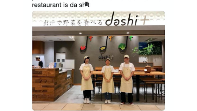
pal on FB has alerted me to the fact that this restaurant is da shit pic.twitter.com/cNplvqdukR
— Peter Durfee (@Durf) April 22, 2019
The establishment’s actual name is “Dashi Plus,” which is written in English with a plus mark that inadvertently turns “dashi” into “dashi+,” causing English speakers to see “Da shit.”
Might have been better to write that out with the word “plus” instead…
ブランディングをお手伝いしたdashi+@赤坂サカス。米倉涼子さんご来店ありがとうございました♫#米倉涼子 #赤坂サカス #赤坂ランチ #ダシプラス pic.twitter.com/drYykQKTSd
— 岡田一雄 (@kazuoka1402) September 5, 2018
Branding by OK Brand.
ブランディングをお手伝いしたダシのお店「dashi +(ダシプラス)」赤坂サカスBizタワーB1に8/24オープン。ミシュランシェフが作るお出汁と野菜のコラボです。 #ダシプラス #赤坂 #赤坂サカス #赤坂グルメ #赤坂ランチ #ミシュランシェフ #お出汁 #ブランディング #デザイン pic.twitter.com/nPvj9MeqBY— 岡田一雄 (@kazuoka1402) August 24, 2018
Nah. Veggies and soup stock is da shit.
Comments
4 responses to “Tokyo Restaurant’s Logo Is “Da Sh*t””
… or you can go to that weird toilet bowl themed restaurant in Japan
Reaching. The parsing and use of a different colour means that, IMO, in no way does that look like ‘da shit’.
And yet, when I look at it, it does indeed look like ‘da shit’.
On the plus side (pun intended), a subtle ‘da shit’ gives the place a cool grungy vibe. If I were them, I’d roll with it.
I wonder if there is any English phrases or words that sound funny to Japanese speakers due to sounding similar to Japanese.