The next generation of console gaming is here, but it’s surprising how much the new Xbox Series X UI resembles the older Xbox One interface. Beyond the fancy ray tracing, faster loading times and killer new graphics, the Xbox Series X feels hamstrung by a boring, cluttered UI we’re already familiar with.
Here’s how the UI currently looks on Xbox One consoles.

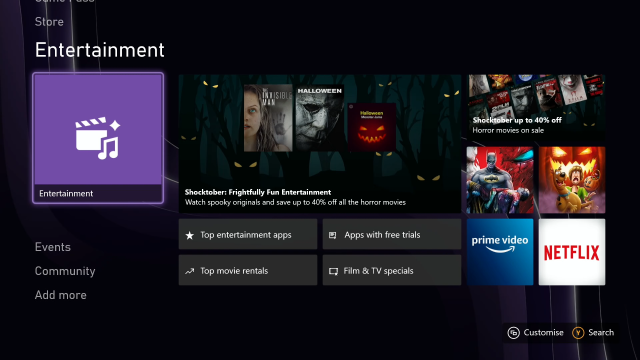
And here’s what the Xbox Series X UI looks like:

Feels familiar, doesn’t it? In fact, outside of a few small tweaks, it’s largely the same.
Rather than focusing solely on gaming, the shared Xbox UI features multiple menu segments for entertainment, the Microsoft Store, in-game events and community sharing. To find your actual game library, you’ll need to jump to the bottom left corner of the screen, to a smaller icon called ‘My games & apps’. There’s so many icons and options on-screen, it’s actually fairly to find the first time.
The Xbox Home menu fills up with recently used apps, rather than games you actually own so the first time you jump in can be tricky. The menu can also be pretty annoying if you’re just using the Xbox Series X for gaming, because it’s filled with advertisements for Xbox Game Pass, new TV and movies, and recommended games.
Part of this is to do with Xbox’s focus on being an all-round entertainment machine rather than just a gaming console, but it just makes the menu seem overstuffed. There’s multiple different home pages, each of them with 10+ tiles for advertisements, photo sharing from friends and a bunch of other submenus that are large and obtrusive. Your games take up only a small minority of the screen.

But beyond this issue, the reuse of the current Xbox One UI is just a baffling choice.
The Xbox One UI was updated in mid-2020, and it’s this menu that’s been appropriated for the Xbox Series X. By installing the new UI so early on the Xbox One, Microsoft has effectively (and disappointingly) taken the shine off the Xbox Series X.
It’s for this reason the Xbox Series X doesn’t feel new until you really dive into a game. My first impression upon setting up the Xbox Series X wasn’t delight, it was “oh, this is just the Xbox One again.” There’s not enough here to differentiate the Xbox Series X and last generation’s consoles on a surface level.
You could boot up the Xbox One and the Xbox Series X and not be able to tell the difference between them because their menus are so similar outside of a few subtle touches. It lacks the ‘newness’ you’d expect from a new console, and while first impressions aren’t everything, it is a major disappointment.
Stay tuned to Kotaku Australia for further news, updates and reviews for all things Xbox Series X and Xbox Series S.
Leave a Reply