I cannot believe I am praising a video game because I can see it, but hear me out. Somewhere along the line, maybe in the last decade and some change, shooters have become a visual mess. I cannot tell you how many times I’ve had to squint hard in games like Battlefield to try and determine if I’m looking at an enemy or just some weird-looking texture. Half the time, I won’t get it right and end up shooting at nothing. Then of course, I’ll probably die moments later.
Then you’ve got all these “realistic” games, with dull or dark colour schemes that aren’t parseable at all, even if they are true to life. It’s extremely common, especially in battle royale games, to die without seeing where the hell the bullets are coming from. Or to die without knowing if you even did any damage!
And so, after spending a few dozen hours in Halo Infinite’s multiplayer, I am thrilled at just how communicative the game is about nearly everything you’d want to know while trying to shoot other people in the face. Dialogue barks are constant, even if you’re not in a party chat discussing tactics. Despite hearing them over and over again, I don’t get tired of reused audio lines because they’re actually pretty damn useful. It also helps that there’s a surprisingly large variety of these audio cues for nearly every situation you can think of — and some that you wouldn’t expect.
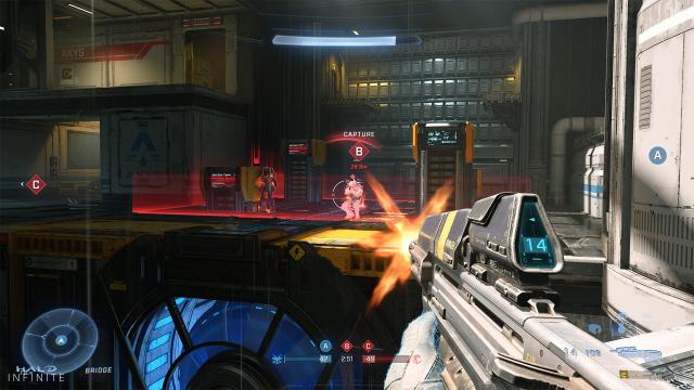
Spartans (or the map itself) will automatically show you things like whether or not the enemy has a power weapon and when said weapons spawn — not to mention where. A teammate might die in a totally different location and the game will tell you exactly that, even if you didn’t see it go down. You’ll know if someone on the opposing team is enjoying a kill streak. When you’re running low on ammo, your character will tell you without needing to look at the part of the UI that denotes how many bullets are left. Then you’ve got the radar, which, while not new, still helps you determine whether or not enemies are close to you. I’ve never had a multiplayer video game by itself be more useful than an actual human teammate before.
But the visual cue I like most is what happens when you actually land something on the enemy. When you shoot someone, a large, red overlay will come into view. If you drop their shields, you can tell, allowing you to quickly swap to a weapon that can pop someone off in a single hit. The outlines themselves are fantastic for making out enemies from far away. All of these details help make me a more competent player and teammate. It’s a far cry from the brutality of games like PUBG, which largely leave you to fend for your own. The visibility, along with regenerating shields, helps me feel like I always have a chance of getting a reversal against furtive enemies.
Even games like Fortnite, which are arguably bright and visually distinctive, have mechanics that create a visual nightmare. Try showing a newbie footage of a player building those giant skyscrapers that help you evade enemies in Fortnite. You’d likely have to explain every bit of that jittery mess of instant walls and stairs.
You can definitely learn to parse everything with due time and experience, and most of us do. But that’s work. And, as it turns out, it’s not work that the player should have to do given good enough visual and audio design.
So thank you, Halo Infinite: it’s been a long time since a shooter didn’t make me feel old and visually impaired.
Leave a Reply