The “this changes everything” mantra is certainly overused in the tech sphere, but occasionally it’s justified. The release of Gran Turismo 3: A-Spec on the PlayStation 2 in 2001 was, without question, one of those bewildering moments. The series’ earlier entries on Sony’s first gaming console were revolutionary because they redefined what racing games could be, but it was GT3 where the tech finally caught up with the vision. Nothing looked or felt like it before, and most developers struggled to deliver anything on the game’s level for a good several years following its launch.
I certainly remember GT3 blowing me away as a wide-eyed kid, but not purely because of the realism of its gameplay. I’d frequently get lost in the mere act of navigating the game’s menus — visiting the various dealerships, surveying the events and, of course, listening to its peerless select-screen jams. It’s the events I’d like to highlight today, because 22 years on, they still fill me with joy.
To understand why it’s useful to know what came before. When choosing a race in the first two games, you’d navigate slow, unattractive menus loaded with yellow icons and white text. It wasn’t pretty and you got the sense it wasn’t really supposed to be — you’re here to drive after all, not push a cursor around. But with GT3, Polyphony Digital made the artistic decision to blanket players’ TVs with lavish, full-screen posters, really making each event feel like, well, an event.
To be perfectly honest, I don’t know if this would’ve been possible on the PS1 — maybe the switch from CD-ROM to DVD allowed Polyphony to store more and higher-resolution images on the disc, or maybe the PS2 had more headroom to load them faster. In either case, as someone who was always drawn to weird and creative expressions of graphic design from a young age, you can bet I took notice.
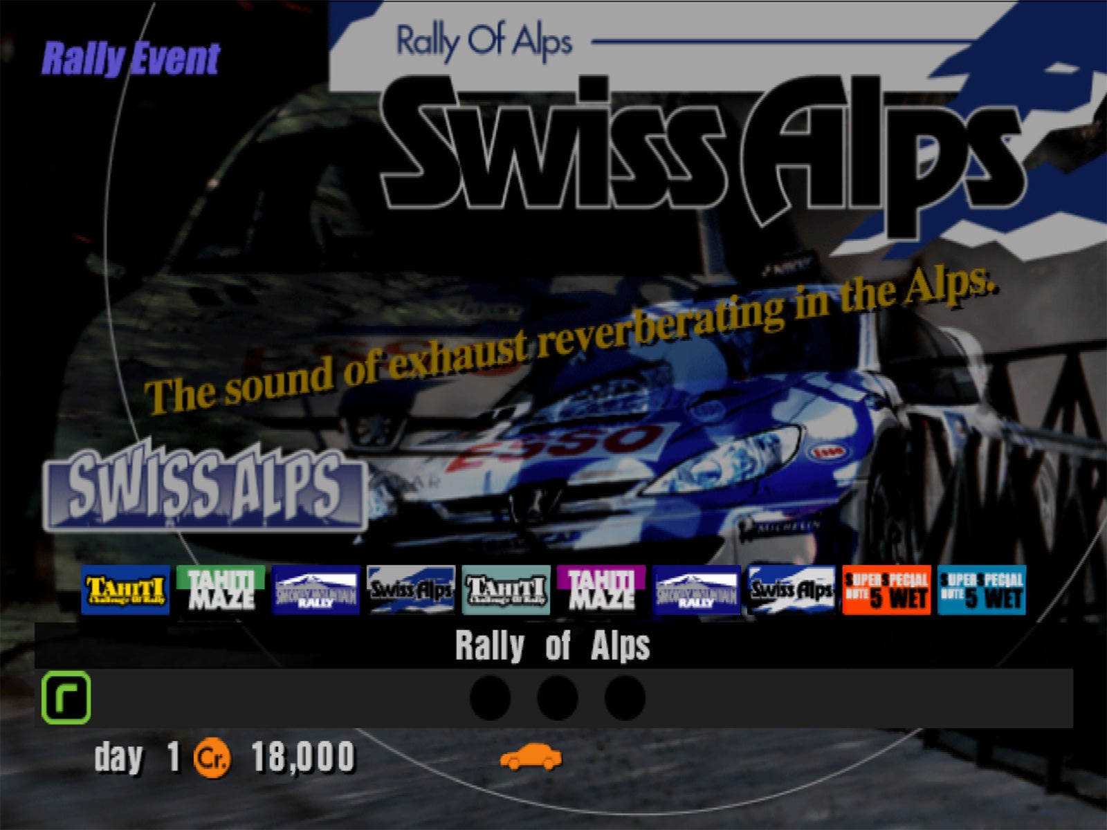
The artwork itself is so unashamedly of the era. Some of the posters repeatedly layered semi-transparent photographs and game assets so many times that it could be difficult to discern what you were actually looking at, particularly on a fuzzy, old tube TV over composite cables. Case in point: the “Rally of Alps” below, where there looks to be an in-game Peugeot 206 WRC car superimposed over a photo of one. Why? For impact.
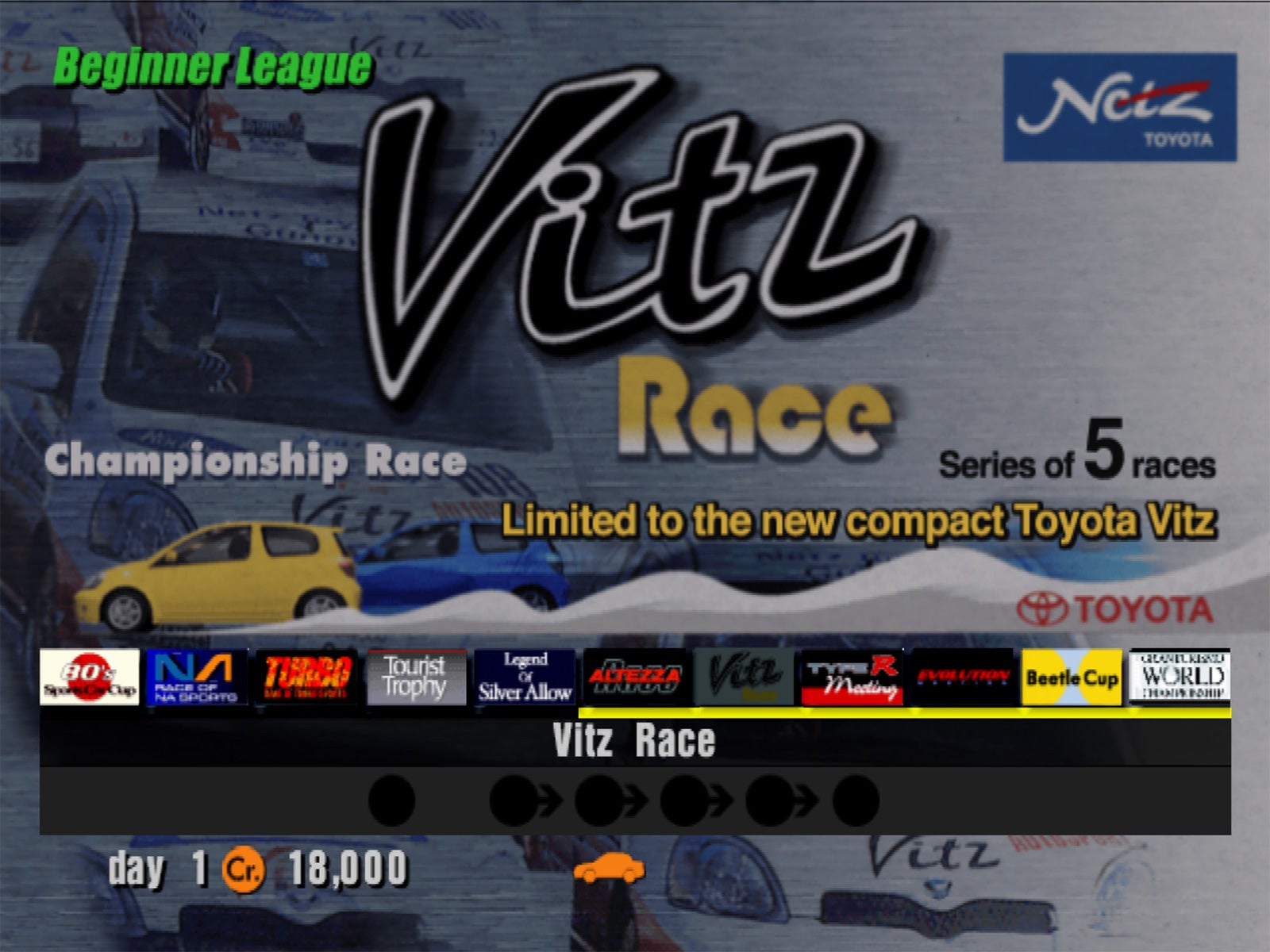
I love this next one for similar reasons. Although it’s a little hard to tell with the strip of thumbnails blocking the lower third, the Vitz cup cars in the background are all actually the same Vitz cup car, Photoshop-stamped and scaled five times in a descending fashion, so it looks like an image of a race if you’re not paying close attention. Sneaky!
As you’ve likely noticed, the other reason these event graphics are so entertaining is because of their rather flowery application of the English language. Proper localisation wasn’t necessarily commonplace in games even by the early aughts, which is how we get flavour text like “our beloved and tricky circuit, Laguna Seca” and the infamous “4WD Challenge” screed:
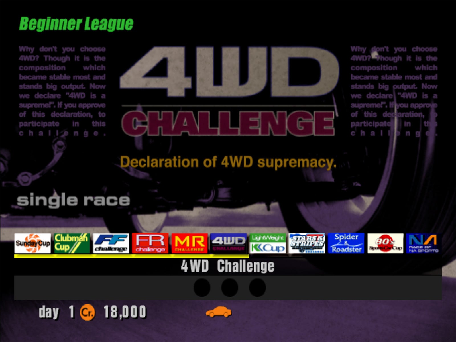
Funny thing about the paragraph in this poster: thanks to sleuths over at The Cutting Room Floor, we know today that Polyphony’s artist actually lifted ad copy from Apple’s website — in this case, for the PowerBook G4 — about the computer’s titanium chassis, and changed most of the nouns and adjectives to form a paean to all-wheel-drive cars. Brilliant.
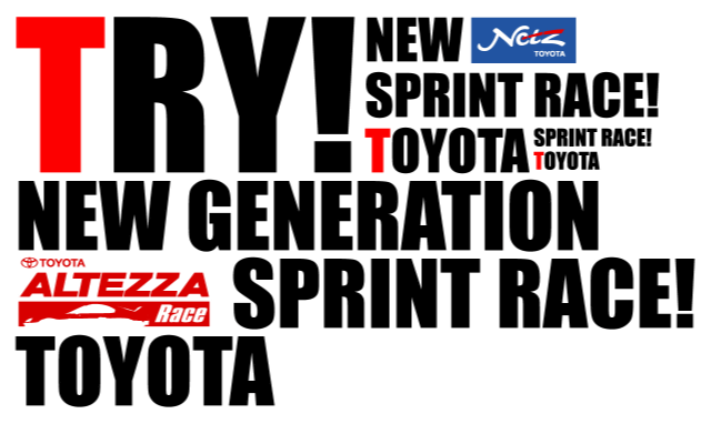
That version with the Apple placeholder text is actually from a pre-release build of the game, where you can find many more oddities, like this beta version of the “Altezza Race” poster that features no images of the Toyota sedan — just repeating text in Impact font. I love it, even if it gives me a headache if I stare at it for too long.
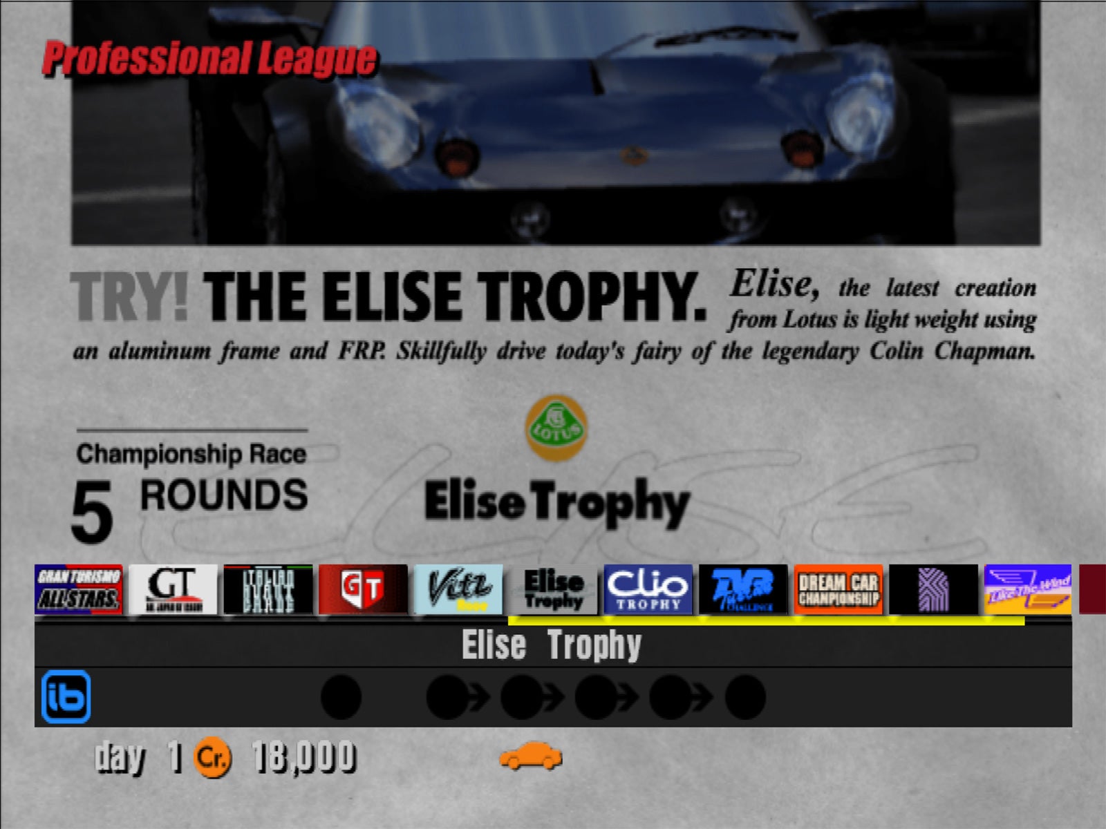
Accosting players to “try!” was evidently a theme for GT3’s visual designers, as confirmed by this “Elise Trophy” poster that did actually make it to release:
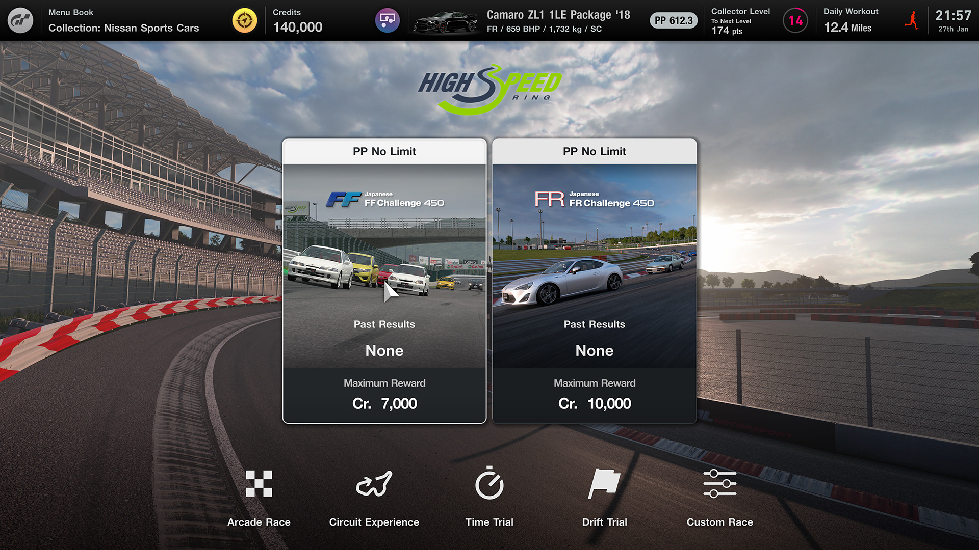
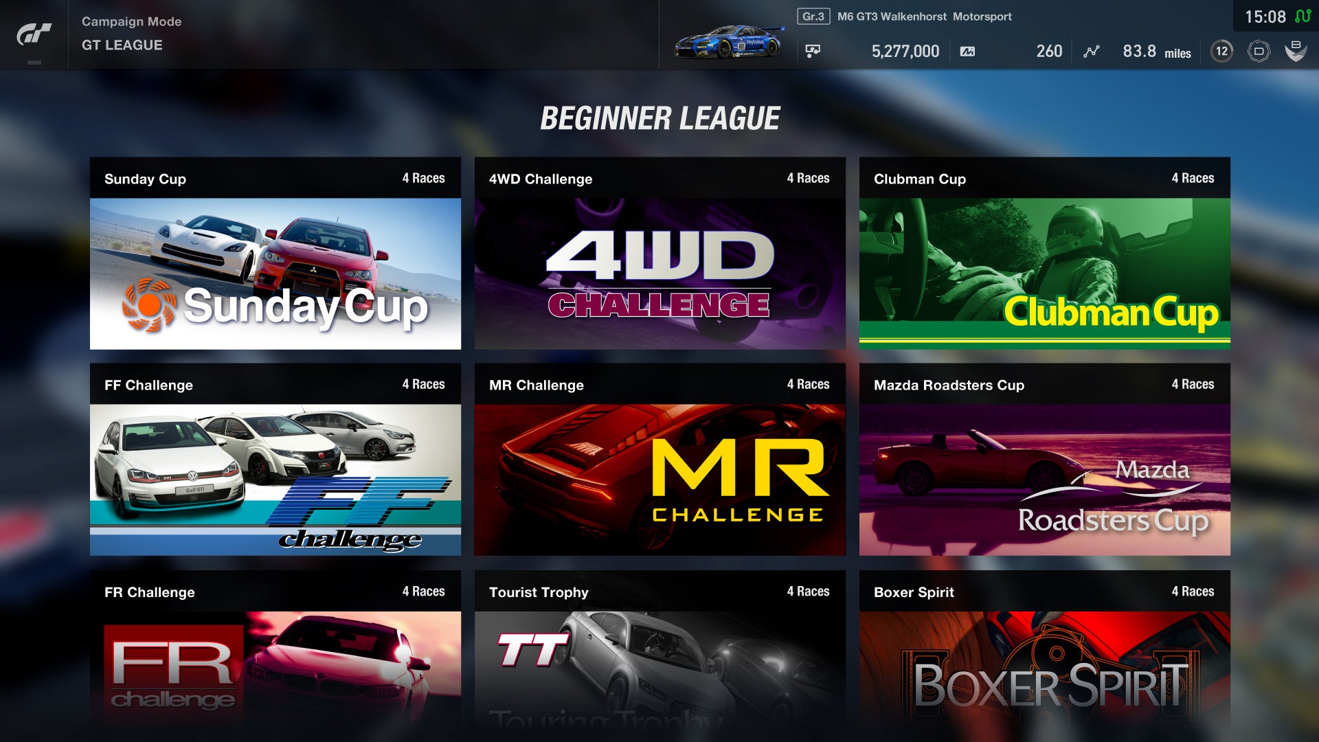
There are so many of these, and they’re all so random and delightful. They also cultivate a lighthearted enthusiasm that’s lacked from most racing games since. For example, this is how the typical event screen looks in Gran Turismo 7. No colourful, full-screen propaganda — just a logo paired with a relevant in-game screenshot. I’ll commend Polyphony for continuing to use the same logos for races like “FF Challenge” that actually date all the way back to GT3, but where’s the excitement?
This is something GT7’s predecessor, GT Sport, actually got right by the way — having recreated many classic GT3 event posters with images from the latest instalment. And just like the old days, they’d balloon up to fill the display when you selected them. It was a lovely tribute for longtime fans.
Whenever I go back and play old games, the one thing that always impresses me is how developers were able to build such engaging worlds and mythologies despite the fact that the actual simulation was so rudimentary and limited. Tech may have improved by leaps and bounds, but modern titles still have something to learn from the classics. The stuff in-between the on-track action matters almost if not just as much, and GT3 continues to prove why more than two decades on.
Comments