A legendary artist with killer runs on Spider-Man, Punisher and X-Men will reportedly be drawing the Man of Steel this year. According to comic-book rumour site Bleeding Cool, DC Comics’ flagship superhero will be getting a new interpretation from John Romita Jr, the second-generation creator whose family name is synonymous with rival publisher Marvel.
Romita is supposedly joining DC Comics chief creative officer/star writer Geoff Johns, who appears to have cleared the decks to start in on a new run on Superman.
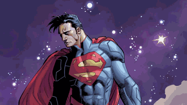
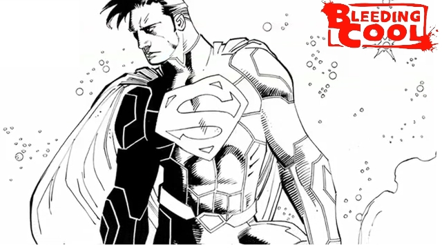
Romita’s only drawn Superman one time before, on the cover of a collection of old-school DC/Marvel crossovers. The drawing above hews closely to the ceremonial Krytonian armour style that Kal-El’s been sporting ever since the New 52 relaunch, with the plating looking more raised and three-dimensional. A formal announcement of the new creative pairing is expected later today on DC’s YouTube channel.
Update: The episode of DC All Access debuting the new team is up now
Johns’ output for the New 52 has been a mixed bag, for me, mostly standard fare in the trauma-driven, dour-superdude paradigm that he helped cement in the late 1990s. I’ve liked his writing on Superman in the past, though, particularly in his run on Action Comics with Gary Frank and Andy Kubert on art. Here’s hoping that the Johns/Romita run is a return to the brightly-inflected Superman seen in that interpretation.
[via Bleeding Cool]
Comments
14 responses to “Superman’s New Look To Come From One Of Marvel Comics’ Biggest Artists”
New look ? All that’s different is a slight hair change.
They really need to lose his New 52 suit. There’s something completely ‘dictator-ish’ about it. That’s not Superman at all.
I like his New 52 suit. I like that he’s actually wearing something somewhat armoured into battle. Fighting city destroying villains in spandex is just silly, even if you are Superman.
It’s not the actual armour that disturbs me, I think it’s the high collar? It just looks wrong on him? It has that dictatorial element on it in all the images.
Ah, yeah, that does look a bit tyrannical.
Lose the collar, I think it’s fantastic. With the collar, not so much. That’s all.
I think the design works great for an Injustice-style take on Supes (in fact, he rocks a very similar look, collar and all, in the Injustice game and the now-ongoing comic series), but in a series where he’s not supposed to seem ‘dictator-ish? Not so much.
Then again, a Superman without the grundos on the outside still seems weird to me, so what do I know? ^^
In the alt universe, where he’s the dictator superman ruling the world, it suits him to a tee, it’s very authoritative, very much so. As for the underwear, it takes some getting used to and I’m still convinced in a few years, they’re going ‘to go back to basics’ with him and return to a costume less complicated and more like the original. They always do. Always.
go away, spandex rules!
Worst Superman ever
Emo
The renderation of Superman looks like Daniel Craig with a wig.
I think this one looks more dramatic and superman does not need armour, that’s why he is superman, with armour, I’d rather then have Batman.
Any thoughts on why that collar style is called the Chinese Collar and the relationship to why some feel that the collar gives superman a dictatorial look…
It’s called Chinese or Mandarin collar as it originated clothes worn in ancient China. As to why it gives Supes a dictatorial look, that’s probably because it’s used a lot in military uniforms both in real life and in movies (remember Star Wars Empire officers?), and it gives Superman a military look, which is perfect for a Superman gone dictatorial as in Injustice series, but for a normal good guy regular Superman? Not so much.
God, how I hate that stupid collar:) I could almost stand the rest of the costume if they only get rid of it.
Eh. I actually really like it.
Collar up, no speedos, padded suit.
He actually looks like a badass, for a change.
I really hate JRJR’s art tbh. He uses a lot of straight lines for everything and makes a lot of it big and rough… it ends up looking like everything is really lazy and like Rocky after he’s been beaten up. The colourist in the above pic has added a lot of light shading to make it look more three dimensional, and they’re often not given enough credit(I also never remember their work).
JRSR’s art is beautiful, and I also really like most of Jim Lee’s. Steve Dillon is also pretty bad(at least for faces). Rob Liefield does disproportionate stuff sometimes. Most comic book art is quite good I think… I just tend to remember stuff which is really good, really bad, or really consistent/distinctive. Greg Land’s stuff tends to look very over-sexualised but decent, and Mark Bagley’s is quite distinctive and a bit cartoony(he’s a really nice guy, he drew me a sketch at Supernova once!).