
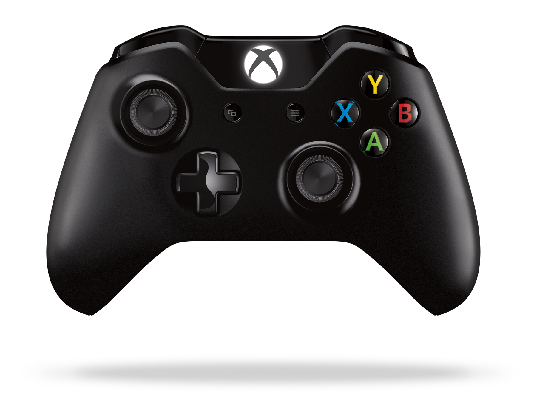
What do two overlapping rectangles and three parallel lines mean to you? They’re the labels on a pair of buttons on the Xbox One controller, but eight months since that console’s launch, you’d be forgiven if you failed to predict what pressing them actually does.
The left one is the View button. The right one is called Menu. If you’re unsure what exactly they do, I hope it gives you comfort to know that game developers and apparently even Microsoft are at least a little mixed up about what they’re supposed to do, too.
I’ve been testing the two buttons on a variety of Xbox One games lately. I’ve been pressing them when I’m on the Xbox One dashboard, convinced there’s a method to their apparent madness.
Today, I reveal the results to you. Plus, I’ve got an idea for Microsoft about how to make their buttons make more sense.
But first… first, I am going to share the best information I’ve managed to obtain about one of these buttons. That would be Menu (the one on the right!).
“I think you should think about the right button as the right click [on a mouse] if you’re a PC guy,” Phil Spencer, the man in charge of the entire Xbox division at Microsoft, recently told me. Phil Spencer should know! I’d warned him that I’d be investigating these buttons. He seems cool with that.
He explained the Menu button some more: “If you were in Windows and you saw something where you wanted to bring up — I’m not saying this is universally true — what actions you could take on something, you hit that one and it will usually bring up some context menu of things that act on that entity.”
Xbox boss Phil Spencer: ‘I think you should think about the right button as the right click [on a mouse] if you’re a PC guy.’
It turns out, as you’ll see below, that thinking of Menu as “right mouse click” for the Xbox One controller clears just about all of that button’s confusion up.
The View button? Not so much. Spencer again, speaking about View: “[It] is more of a navigation between the different windows. I’m not saying the buttons are infinitely articulate, but that is the frame I have in my head when I use it.”
It sounds cool. The intent is good. But this story that you’re reading, obvious fishing attempt for a Pulitzer that is, is about execution.
Let’s do a quick history lesson.
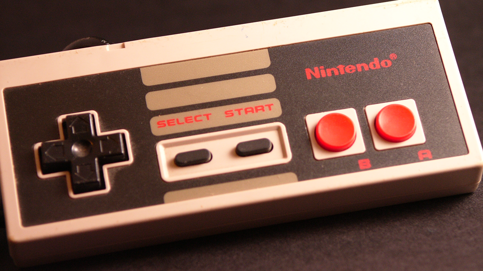
This is the Nintendo Entertainment System controller from 1985. It’s a classic. It has two buttons in the middle: Select and Start.
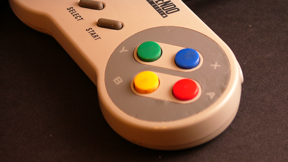
Super Nintendo from 1991? Same thing:
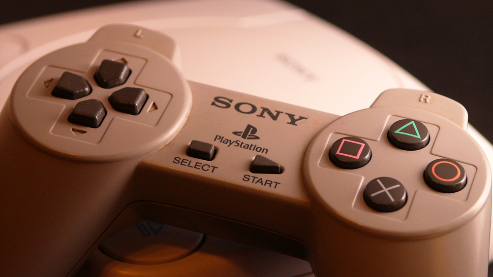
The first mid-90s PlayStation controller? Ditto.
Skipping ahead… the 2006 PS3:
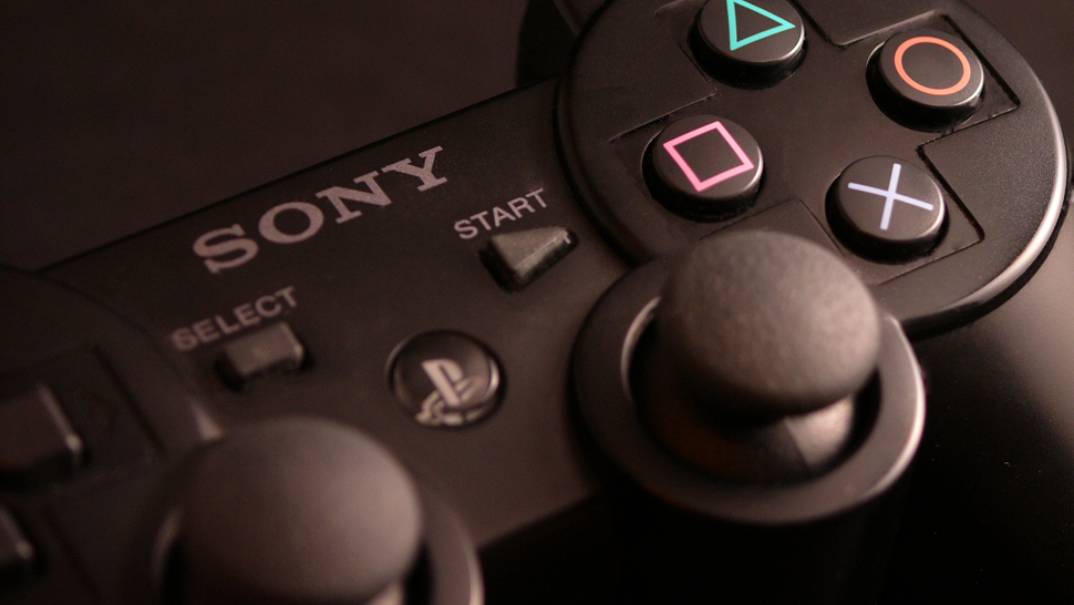
Select.
Start.
These buttons have been commonplace for generations, but it’s also been clear for a while that their usefulness is expiring.
In the old days, the Start button might have propelled you from a menu into the action of the PlayStation game you were playing, but the X button might have done that, too. The Start button had been pausing games for years, but newer Home buttons now often do that, too. And Select? It hasn’t had a clear purpose for a long time. Because of this, we’ve seen some tinkering.
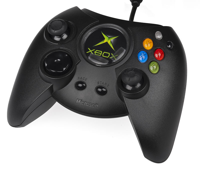
This is the original controller for the first Xbox circa 2001. Select is gone, replaced with “back.”
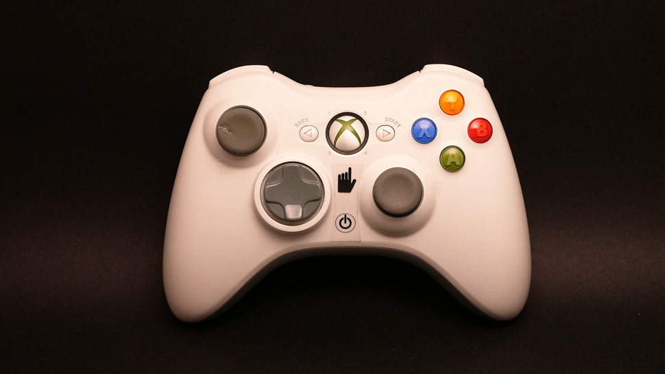
Here’s the Xbox 360 controller from 2005:
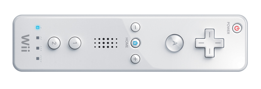
Here’s the Wii Remote from 2006:
Nintendo hasn’t backed off the Start and Select concept altogether, as you can see from last year’s Wii U GamePad. Their reclassification of the Start and Select buttons as + and – is a hint that they don’t think the old paradigm is perfect either…
Finally, here’s 2013’s PlayStation 4 controller, which, like the Xbox One controller, has chucked Start and Select altogether:
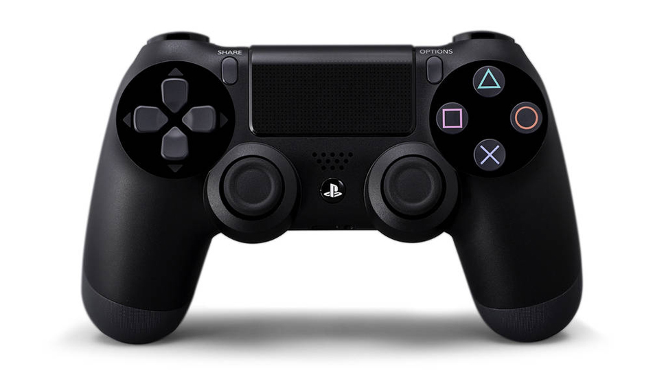
Share and Options, see? Why not? You use the Share button to capture and share screenshots and videos (in theory… but using it can be a bit confusing). You get lists of options with the Options button as if it was, you know, a right mouse click.
History lesson over.
Shall we dive in to how the Xbox One’s versions of Start and Select — Menu and View — actually work? We’re going to begin with how these buttons work in a variety of Xbox One games.
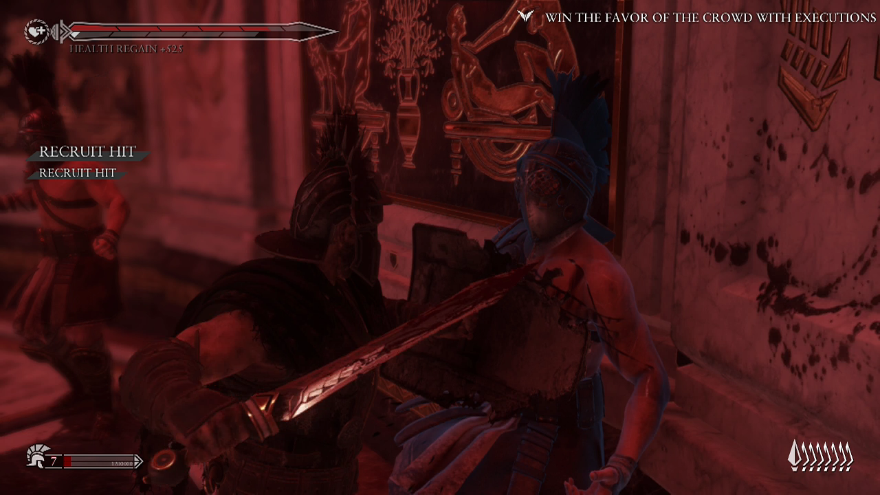
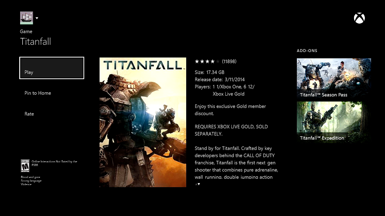
Ryse: Son of Rome was a launch game for the Xbox One. I liked it. If you go to Ryse‘s menus and press View or Menu, nothing happens.
If you go into the action…
… pressing View gets you this:
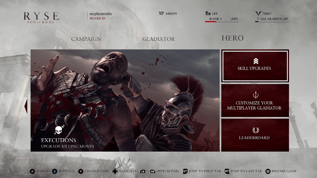
…pressing Menu get you this:
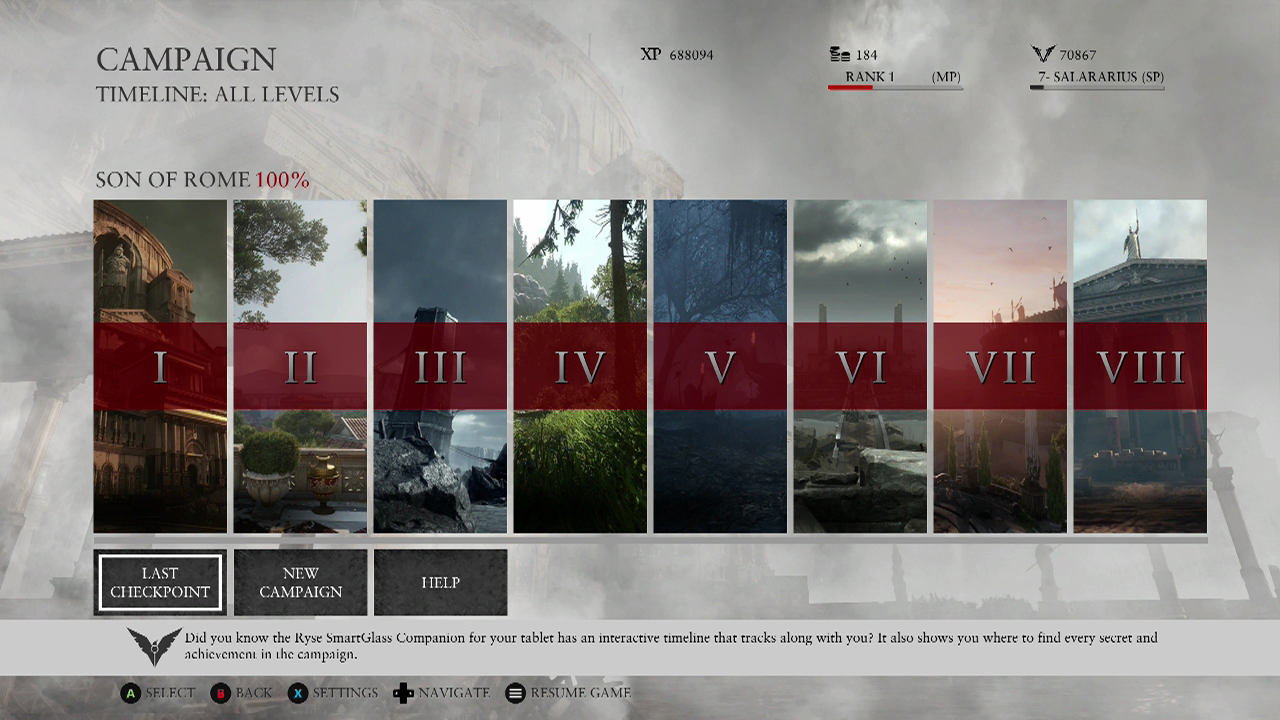
That sort of makes sense, maybe?
The View button is showing you windows of move upgrades. The Menu button is showing you a level-select screen. Strangely, you have to press Menu to exit either of them. You can’t exit the View button by pressing View. Logical? Confusing? As you’ll see, we can at least say, “Hey, it uses both buttons!” This is not true for all Xbox One games.
In the Xbox One launch game Lococycle, the View button doesn’t do anything. Menu pauses the game and brings up menus:
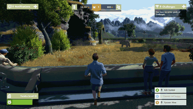
In Zoo Tycoon, another Xbox One launch game, the View button doesn’t do anything until you’ve pressed Y to get into that game’s overhead tycoon view. In that view, pressing View snaps the camera to the entrance of your zoo. Wait for it…
The Menu button pauses the game:
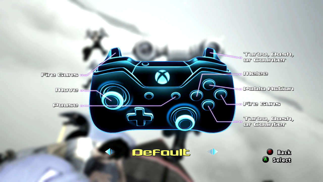
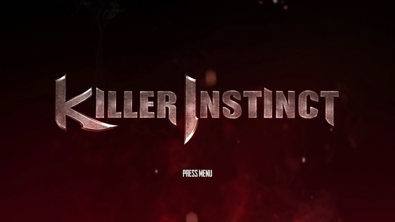
In another Xbox One launch game, Killer Instinct, the View button is used to taunt opponents. Menu pauses the game. This can be changed, though. You could map View to medium kick or heavy punch, if you’d like:
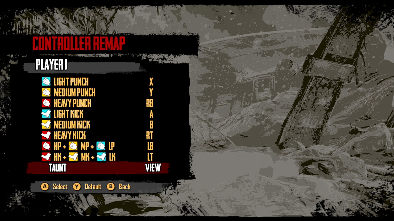
You might (emphasis on might) find it interesting that Killer Instinct is one of the Xbox One games that actually asks you to press the Menu button to get the whole game started. In this game, the A button won’t do that.
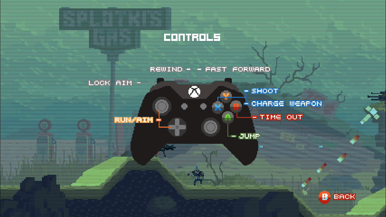
Indie game Super Time Force also beckons you to press the Menu button (though A will work in this case)…
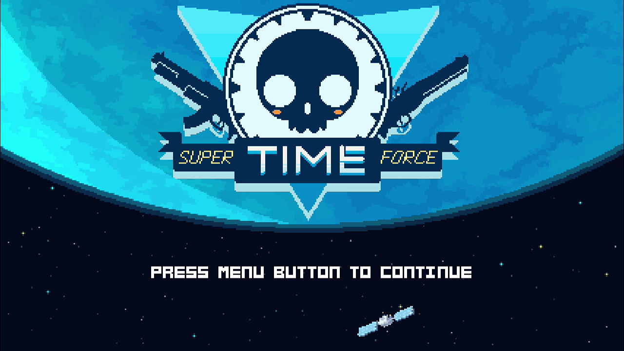
Super Time Force game doesn’t officially have any role for the View button, but if you press it while playing the game, you’ll see that it clones the function of the B button, triggering the game’s signature Time Out mode.
Xbox One launch game Forza 5 is a weird one. The Menu button doesn’t do anything when you boot the game up, but View, for some reason, will back you out from the game’s main menus to the game’s very first start screen.
So pressing View will take you back, from this…
…to this…
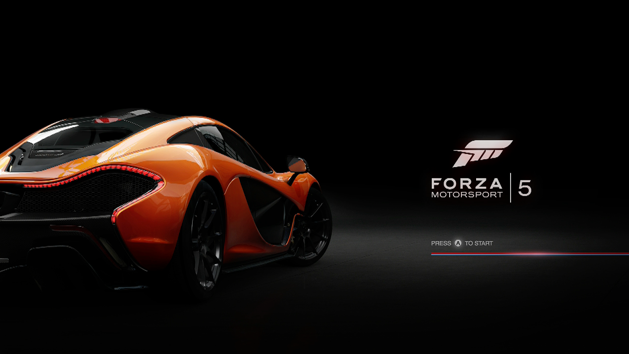
Why? No one knows! Well, at least I don’t.
Note that Forza is still a “press A to start” game. To hell with that Menu button.
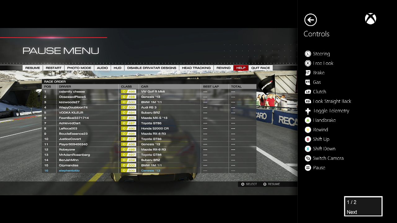
Once you get racing in Forza, the Menu button pauses the game and brings up menus. The View button cycles through in-game camera angles, from behind the car to a cockpit view.
The Forza people might be onto something.
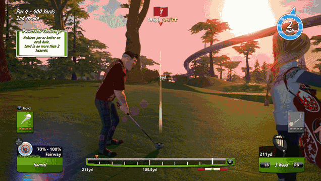
Maybe the View button should be used in games to change the view! I guess the Powerstar Golf people would agree. In that game, Menu pauses things and View switches views as you can see here:
How about Titanfall?
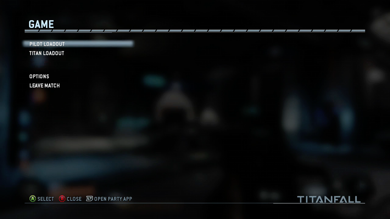
In multiplayer, pressing View gets you this:
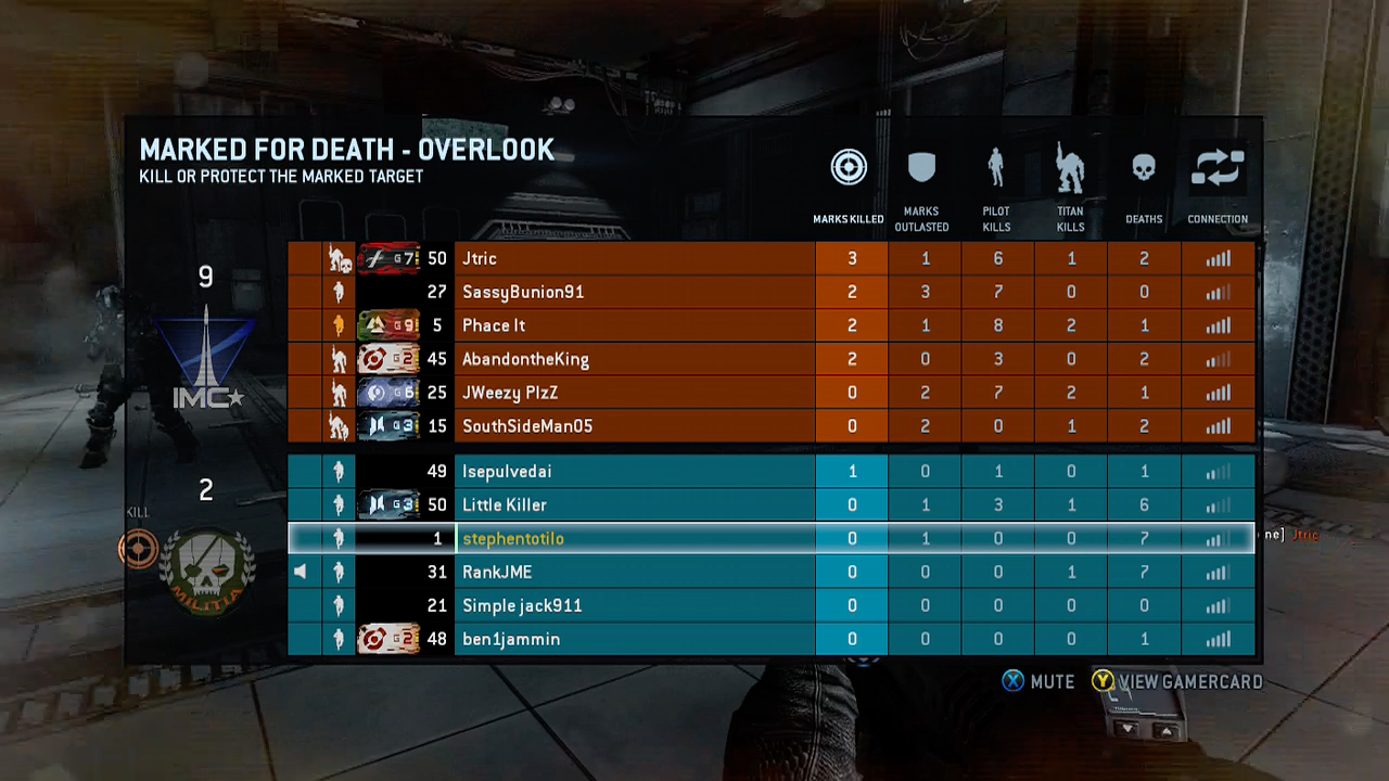
Menu gets you this:
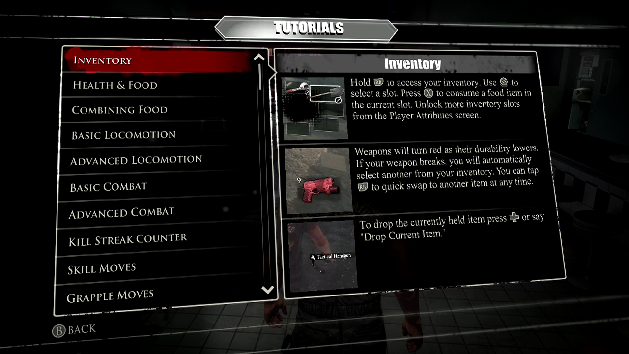
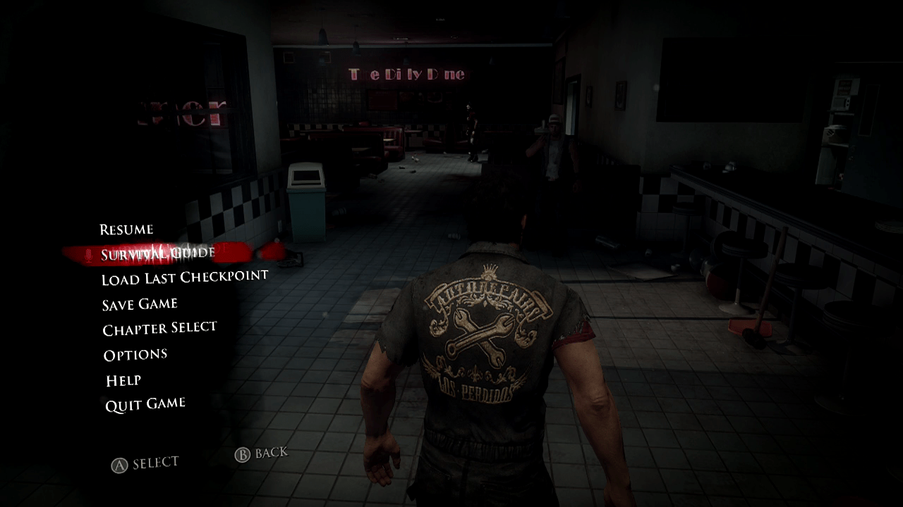
Dead Rising 3?
View gets you tutorials:
Menu gets you:
One more game! This is a good one. Crimson Dragon, a game that uses the Kinect sensor a little bit. Now don’t look for the in-game control guide to tell you what the View and Menu buttons do. Useless, see?
If the game won’t tell you, I will: In Crimson Dragon, Menu will pause the game and produce menus like you see above. View is altogether more awesome. Whether you’re in the menus or actually playing the game, it will toggle the appearance or disappearance of a small blue-framed box in the lower left corner. That box shows you what the Xbox One’s Kinect sensor can see of you! This is handy, given that the game, which involves flying dragons, uses the Kinect to detect whether you’re leaning to the left or right. Leaning really far either way triggers a barrel roll.
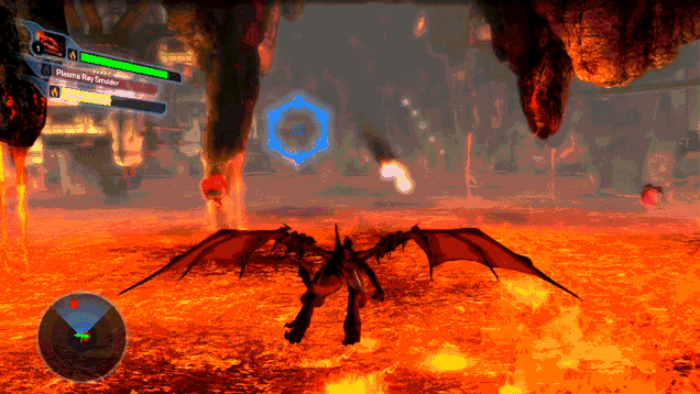
Smart idea, Crimson Dragon people! Too many Kinect games leave me confused as to whether my gestures were detected by the sensor. This makes things more clear.
Let’s talk about Netflix next. I know it’s not a game, but you might think that all that Menu-as-pause-button stuff would apply to Netflix.
Nope! If you press Menu while you’re mid-show, you get a dropdown menu, but the show you’re watching doesn’t pause.

At least the Menu button does something in Netflix. Pressing View while you’re using the Netflix app does nothing. Oh well.
While most of the games I mentioned above were published by Microsoft, maybe we shouldn’t expect the View and Menu buttons to have any consistent functionality in Xbox One games. After all, the X, Y, A and B buttons do different things. The triggers do different things. It’s nice that Menu usually pauses these games, but why can’t View be used to change the camera view in a racing game and to taunt an opponent in a fighting game? To answer my own question, it can do that, but it might as well be called the Z button if it’s going to have that kind of algebraic versatility.
Let’s look at the Xbox One system itself, though, and see what the View and Menu buttons do there. It’s at this level where Spencer’s right-mouse-click concept is most applicable.
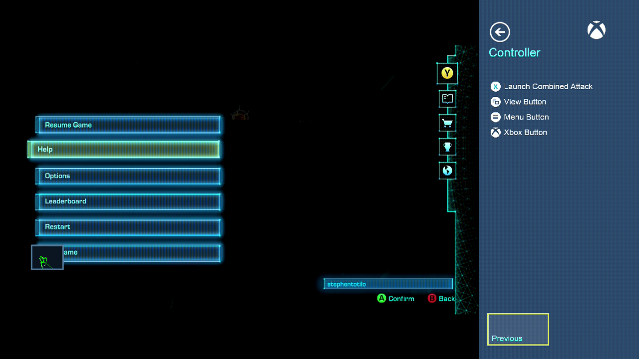
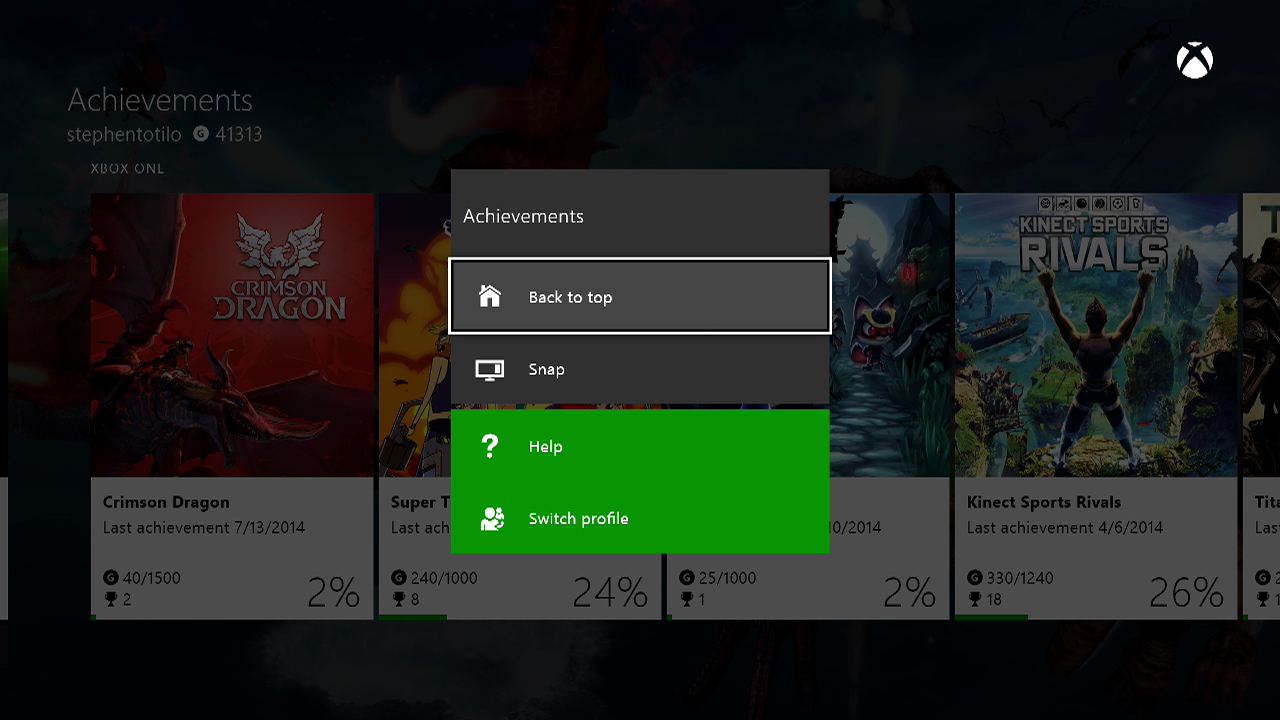
If you’re on the system’s Achievement app, and press Menu, you get this dropdown:
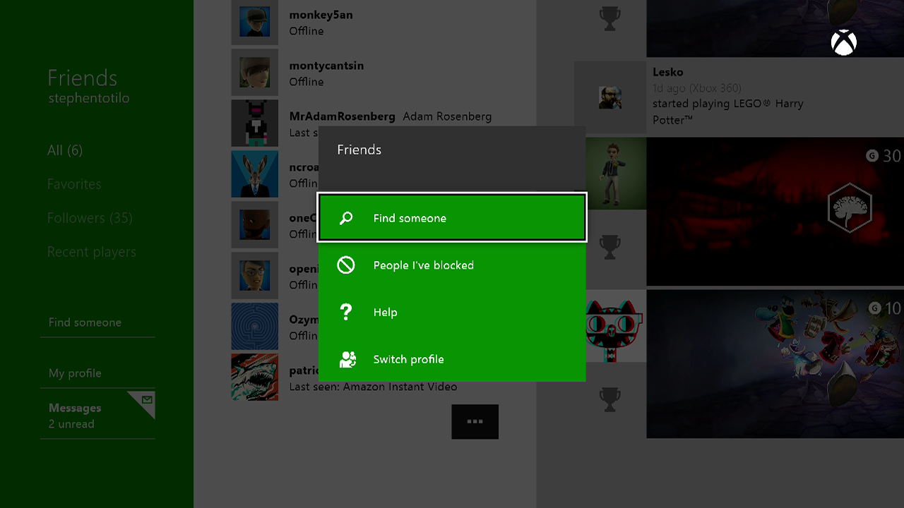
Press Menu when you’re on the Friends app and you get this:
Press Menu when you’re in the online store and you get this:
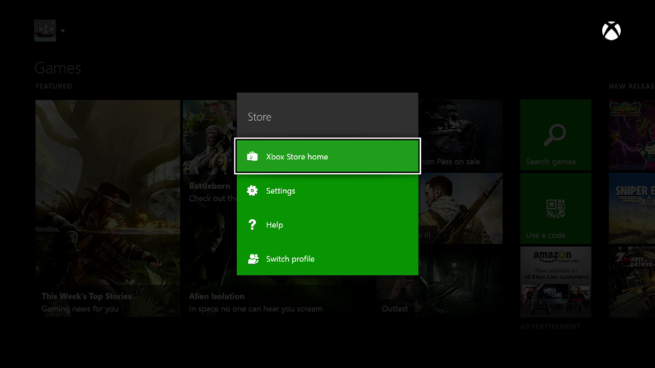
All good!
Less good and somewhat more perplexing: pressing the View button in all of those above situations does nothing. It’s like one of those keys on your keyboard that you never use.
If only it was all this simple: Menu button used on the Xbox One dashboard; View button neglected. It’s not.
Now bear with me, because this is going to be a bit confusing…
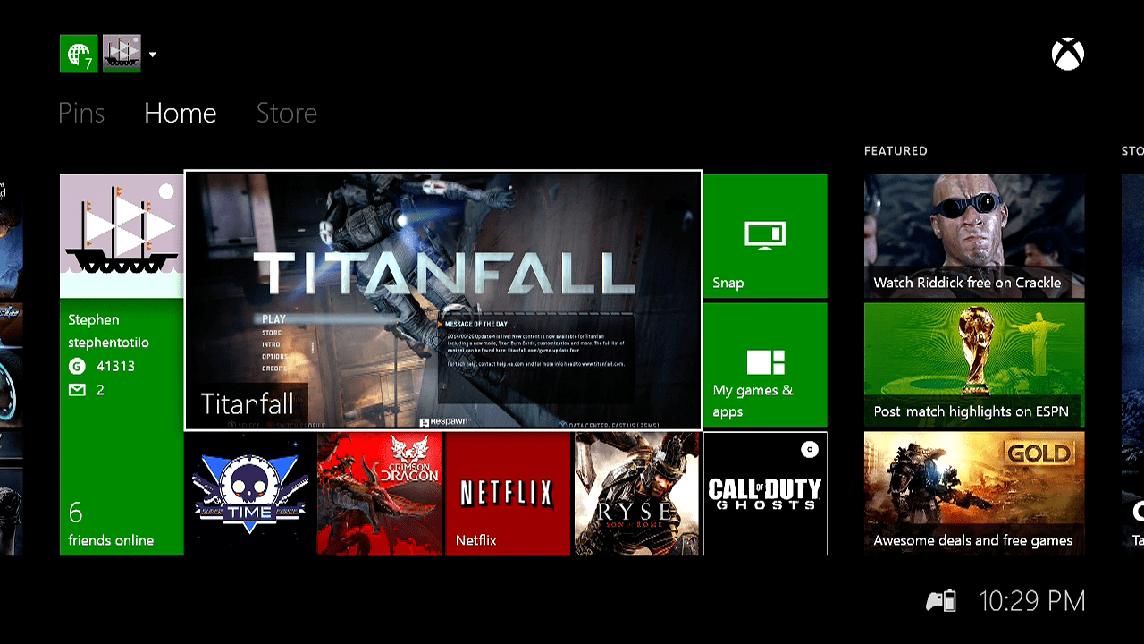
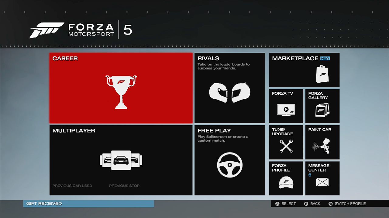
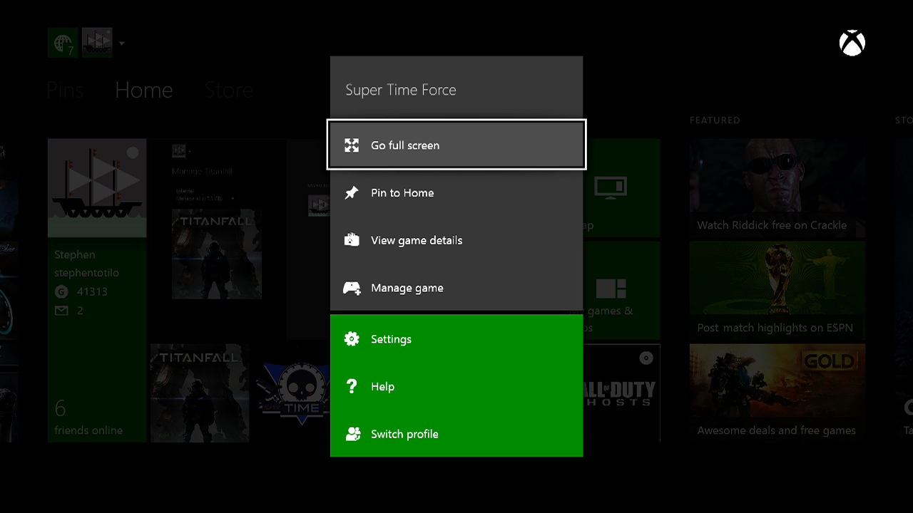
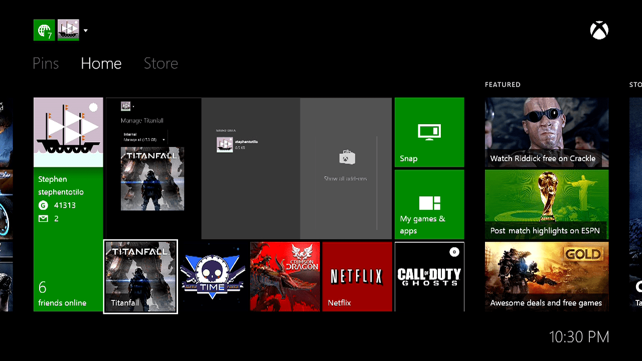
On the main home screen of the Xbox One dashboard, you will see one large pane — the hero window — and four boxes below it. The hero window shows you the game or app that you’re currently running. The squares below show you the previous four that you had running. If you select any of these with your controller and then press Menu, you’ll get a dropdown menu like this:
If you highlight the big hero pane and select View, you’ll get a “Manage” view…
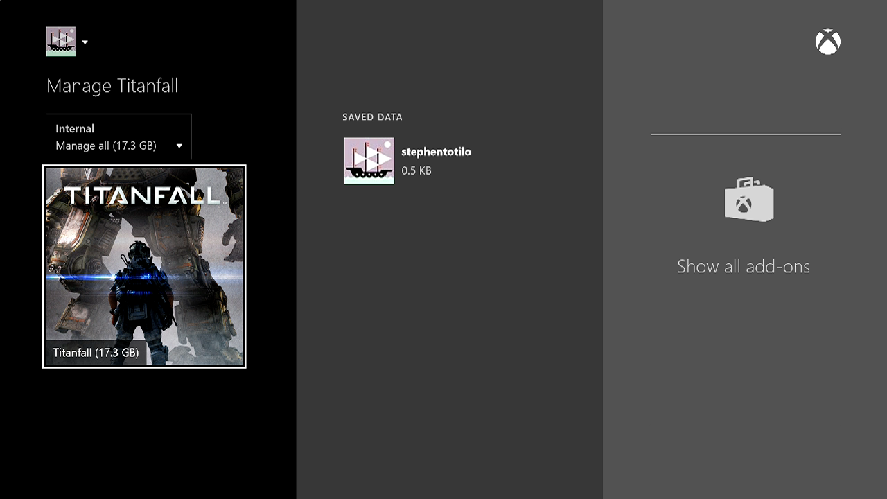
The Manage view is used to uninstall your game and maybe manage your save files, I think. You can also see add-ons — at least some of the time. The Manage view appears differently if you’re selecting a game when it’s in one of the four squares below the hero pane.
This is what it looks like if you’ve highlighted one of the four lower squares and press View:
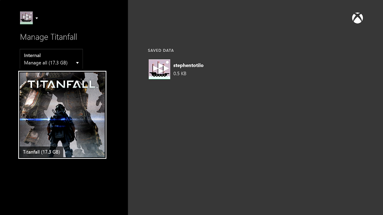
We’re in the Manage view, but where did the Show All Add-Ons thing go?
The strangest thing about the Manage view is that, even though you enter it by pressing View, you can’t exit it by pressing View. If you’re in Manage view and press View again, you go to the Xbox One’s game store.
Pressing View when you’re on the store does nothing. You’d best hit the controller’s Xbox Home button to get back to where you started.
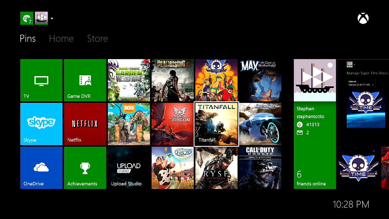
One last thing about this. From an Xbox One user’s perspective, the hero pane and the four squares below it are no different than the square “pin” icons that can be assembled to the left of the main dashboard screen. Those pins serve as shortcuts for quickly loading the game or app they represent. But there is a difference. Pressing View on your pins does nothing.
What to make of all this?
After all this poking around, I’m feeling good about the Xbox One’s Menu button. It’s mostly being used for consistent purposes on the dashboard and in the system’s games. It produces dropdown menus on the dashboard; it pauses games.
The View button, however, is a debacle. It’s not being used consistently, and it’s not really being used well anywhere other than in Crimson Dragon. It’s a rebelliously-labelled button that has no good cause. Happily, I have a cause for it: Snapping.
One of the big, distinct features of the Xbox One is that it can run and display two applications on your TV at once.That’s Snapping. It’s the thing that the PS4 and the Wii U can’t do! You can be watching TV or playing a game on the main part of your TV screen and “snap” an application into a bookmark-shaped strip on the right. Currently, the best way to start snapping an application is to use a) the verbal command “Xbox, snap…” or b) to double-tap the Xbox One controller’s circular home/Xbox button.
If Snapping is a signature Xbox move, why would you have to double-tap a button to activate it? I mean, imagine if there was a dedicated Snap button. It might look strange to label that button with the word “snap” and, hey, it’s too late for that anyway. The controllers are already in people’s hands. But this View Snap button that we’re talking about already bears the iconography of two rectangles interacting with each other — snapping together, if you use your imagination.
I dare say that the View button is begging to be re-worked as a Snap button. Put that in an upcoming firmware update, Microsoft?
It’s certainly not too late for Microsoft to get its Xbox One buttons working in a useful, predictable way. They could do what I’m suggesting and re-brand the View button. They could leave it be and simply use it better — and help developers figure out what to use it for, too. It’s their call, naturally.
I’m at peace with the idea that the video game controller Select button is nearly dead. I’d now like to see the Xbox One’s replacement start to make more sense.
Comments
33 responses to “The Xbox One’s Controller Buttons Don’t Make Enough Sense”
what does A, B, X or Y mean?
The first day I had mine I learnt Menu and View, Menu = Menu/Pause/Options, View = Map/View scores.
A = Attack, B = Block, Y = Yes, X = Xylophone
You heard me…
COOKIES… COOKIES FOR DAYS! 😀
So View is the old Back button of the 360.
The Menu button looks like the Menu button on my Android phone and my friends Android phones (We all have different ones).
Pretty much yea, its exactly the same as Back/Start on 360 Select/Start on Ps1, 2, 3… if you haven’t used a console in the last 20 years you may be confused for about….5minutes?
I think it’s the size of the article that confuses me. Moving from a 360 controller to an XBone you may not check what they call the buttons but they are in the same place and have the same function.
Start or now Menu is Pause/Save
Back or now View is Map or Sub Menu.
Yea you got it.
I dont get what the issue is, i looked at the xbone controller and thought “cool a menu button and what essentially looks like an ALT+TAB”.
View = Shows another area or window with information (ALT+TAB)
Menu = Menu….
And that appears to be what they are, where’s the confusion?
Having only used it for my PC and not owning an Xbone maybe im missing something?
I’m a little amused that the Xbox controller has two icons on their buttons that are far more associated with Android being the multitask/switcher and menu (aka the infamous ‘hamburger button’). It always throws me for a loop.
Well, the ≡ on Android brings up the side panel (menu-like list), and on Xbox, most games gives you a menu screen (side panel-like list).
If you don’t know that two or three parallel lines means menu and that two overlapping rectangles/squares has something to do with windows/the arrangement of what’s on the screen then you can’t have used much in the way of electronic devices in recent years. Right here in front of me my Samsung tablet has the parallel lines = menu button, and my HTC phone has the overlappig squares = show me my choices of windows button.
its just start and select with different names… how is that hard to figure out for… anyone? honestly they do the same thing and all consoles since the NES have has similar buttons it doesn’t matter what you call them.
Yep pretty much, except when I played on ps4 for the first time, select is gone and it brings up share instead, took me about 5min to figure out the touchpad was the new select.
It annoys me that they are just a picture. I think they should have put the words View/Menu underneath the buttons as well.
EDIT: As for their functions, I’m perfectly fine with what they do.
Thinking about the menu button as a right click menu is a terrible idea.
I’ve never played a pc game where I wanted to pause by right clicking.
View/Select/Back/- are always going to do things based on the needs of the game (wherever it needs an infrequently used button that isn’t pause), and so I think View and – are fine names, Select and Back rarely select things or go back.
If the buttons aren’t always used for the same types of actions, then they shouldn’t have an icon and name that try to convey an action type. Simple as that.
A, B, X, Y, Square, Triangle, Circle, etc, have worked perfectly fine for this reason.
X, Square, Triangle and Circle do try to convey actions. I can’t remember exactly but I think X is cancel, Square is map or menu or something like that, Circle is ok and Triangle is look, but it’s upside down for some reason (this was before the twin sticks, so the plan for the PlayStation was to have a Triangle toggle between the directional pad controlling player movement and camera movement).
When it was thought up all games were meant to follow this layout. That plan went up in flames almost instantly, which worked out brilliantly in the long run. I’m hopeful the good things about the XBOX One layout stick and the sort of half baked bits get lost. Console operating systems need a dedicated context button.
The buttons may be commonly used for the same/similar actions, but the icons on the buttons themselves do not try to define them. That’s the difference.
Triangle may not be related to camera anymore, hell, from a consumer point of view it never was because nobody went along with the plan, but when the controller was being designed Triangle was the primitive equivalent of the N64’s C buttons. Obviously in practical terms they’re just A, B, X and Y with different icons on them but historically they’re no more random than Back/View and Menu.
They’re pretty much exactly the same as the XBOX One’s Menu and View buttons in that they’re unlabelled, unexplained icons intended to mean something and serve more specific functions, but their meaning was almost instantly disregarded due to them being placed in positions that already had established generic buttons. Back and now View aren’t treated any differently to Select, just like X, O, Triangle and Square are treated just like A, B, X, Y (with the exception of the whole ‘yes/cancel’ thing).
They’re also the same in that they make typing out directions on the controller more painful for no good reason. =P
To be pedantic, O (circle) means “correct” and X (cross) means “incorrect” in Japan, which is why they’re on the Playstation controller, so O means “yes/select” and X means “no/cancel”. Annoyingly this was swapped for the Western release of the console and has since been the absolute bane of anyone who owns a console from one region and plays games from the other, because the functionality of those two buttons is hard-coded into the OS and games based on their region so you end up accidentally going backwards and forwards like an idiot when navigating menus that jump between the game and the OS (eg save systems or the PS button menu).
The rectangle overlapping the rectangle is the same icon on my phone which means an update is available. (z1 compact)
Because Snapping isn’t a primary feature. Even on my Surface I’m not a huge fan of it but it can be used well, some people love it and Microsoft want to promote it. However it would still be bad design to pretend it was a primary feature like the Windows Key, Guide Button or Context Menus. It’s more like Windows Key + Left Arrow, you wouldn’t have a dedicated button for it or build anything around the functionality but it works well as a background feature.
The three lines menu button is also something Microsoft are pushing for along all their products rather than just the XBOX One. You’ll see it pop up on a lot of their touch screen apps and it really is just the logical conclusion of the pause button (which no longer simply ‘pauses’ games or ‘starts’ them).
This makes sense. On my winPho three horizontal lines = ‘menu’ in the browser
The best example I can think of is the XBOX One Smart Glass app. For some reason the Australia Post (mobile) website has the same thing, so maybe I’m wrong and it’s not a Microsoft specific thing. Either that or the designer just ripped off Microsoft’s layout. =P
It’s actually called the “hamburger” icon and has been used for quite a number of years now. I’m not sure who came up with it first, but Android apps generally use it as well. If you use the Steam App, it uses that icon to pull out the menu.
Ah. I actually started to put more thought into it’s origin after I made that comment and realised it was in a bunch of other stuff too. I think it’s just because it’s so natural everywhere else but on the XBOX One controller it stood out for being not-Start.
True, but for me the Vita remote play makes up for it on PS4. I’ve never really had the urge to watch TV and play a game on the same screen at the same time…maybe on different screens kind of at the same time 😛
Its not just TV you can snap, youtube, internet explorer, achievement tracker, skype, basically any other app non gaming.
Oh okay. My TV can do this (it’s ‘smart’ and has Skype, youtube and some other crap) and I can’t say I’ve actually felt the need to use it. But that’s just me.
Yea I got a samsung smart TV but its a nightmare to use, and I cant have them on the screen at the same time as I’m gaming. I don’t use snap allot but the achievement tracker is handy as its in real time if your grinding something out, think also the machinima app searches the game your playing and gives you hint videos and as there is no custom music player on the xbox yet snapping internet explorer to the side with pandora or something similar playing music works, you can also customise which screen has the higher volume or none at all.
I always just assumed the buttons lost their names because I can never remember back taking you back, and start generally hadn’t been required to start most things for a long time. So they just became buttons, that in game, served the same purposes that start and back did in the past, and on the dashboard, offered dashboard specific contextual actions, hence the images they now have.
I mean, I don’t have an xbox one, but, it just seems logical to me.
On the Xbox 360 Dashboard, Back was a second B-button, and Start was a second A-button. So you could start games/apps/menus with Start, and go back through menus with Back. Probably why Forza still behaves like that on Xbox One.
But in Halo, Back brought up the result from the last played game (kinda makes sense, “back to history”. Start brought up the settings panel (account/system preferences) … here, the names View and Menu could represent that perfectly.
Start is the same as google chromes menu button. And the view is the same as the android app switch button. Microsoft copyright!
Glad you could come out from under that rock and join us! Poking fun aside, both of those icons have been around for years. The “Menu” button sports what is known as the “hamburger” icon and has been a standard icon for menus on smartphones for quite a number of years now. Think of it as a list of options, with each bar being a menu item. The dual rectangles have been used by Android at least for a number of years to allow you to switch between apps (or views). Other applications use it in a similar fashion as well to do something with the current view. Think of it as a set of cards that you are flipping through or bringing up out of the deck.
I do agree with Start and Select having lost their meaning very early in the piece. Back in the days of the NES and SMS, Start and Select did exactly that. The only way to select a menu item was with Select, and the only way to start playing was with the Start button. It’s always been ironic though that Start is used to stop the game by pausing.
The real mystery that’s been bugging me since the original xbox is: why won’t game devs let me map the controls how I want them? “left handed” and “right handed” aren’t real options
The reason why Forza goes back to the “Press A to start” when pressing the view-button on the menu screen, is most likely a left-over from previous games, where the back-button could be used as a back button.
On Xbox 360, the back and start buttons was substitutes for B and A respectively.