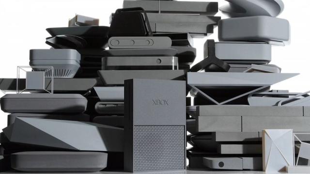
Polygon brings to our attention a curious reveal from the Microsoft Worldwide Partner Conference today: a bunch of rejected prototypes that the Xbox One team developed prior to the Xbox One design we’re all familiar with.
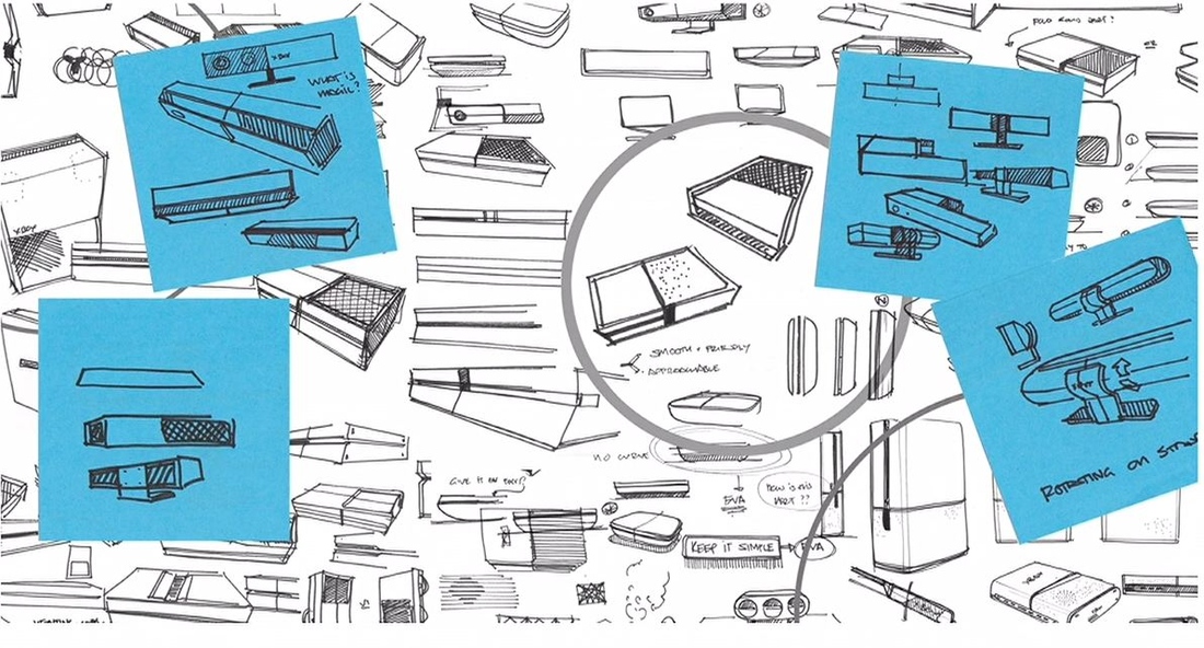
The prototypes pictured above are the result of these early sketches:
Seem like a lot? Naw. The Xbox One controller had two hundred prototypes! Alas, there are no pictures of those. But what do you think of the early console designs? Did they make a good choice by going with this instead?
Curved, cubed, tiny and fantastic: Check out this pile of rejected Xbox One prototypes [Polygon]
Comments
10 responses to “These Early Xbox One Designs Didn’t Make The Cut”
Without the Xbox logo they could easily be mistaken as 4Play designs too. Big square boxes. How uninspired. At least previous generations there were some great (albeit weird) prototype designs.
Don’t you know that gamers these days are ashamed of their consoles? Gamers want consoles to live in their entertainment cabinets dressed as home theater so that guests won’t be tipped off to our childish past time. According to Sony, their console is designed to not look like a video game console.
When it came to naming the console and designing the box, Microsoft either thought too much or too poorly and either way they ended up with the most generic device on the market.
HTC One, Nexus One etc and a box that cannot stand out as something more from a shelf full of other cable boxes.
There is no inspiration or bravery in this design, does that make it safe?
Actually, my first thought on the design was that there was some manager or supervisor there telling the designers they had to design something that could be manufactured as cheaply as possible. That’s what the design represents to me. It also makes me want to stay the hell away because they might manufacture the rest of the xbox that way too and I currently own both consoles.
Edit:
Actually, now that I think about it. It looks a lot like my old 386 but instead of a 5 1/4 in drive there’s a CD slot and black instead of beige.
It could be worse, may have ended up looking like the bin style mac pro
http://www.macobserver.com/tmo/article/is-it-apples-new-mac-pro-or-a-japanese-trash-can
I guess I don’t get trends the xb and ps and mac pro all look crap…..but I guess if its too out there it may go out of fashion quickly…..and I guess it will mach my amp and bluray player that I already have as part of my home theatre…..so may be a safe long term look?
i dont get everyone’s hatred for the designs of the xbone and the ps4 – whats WRONG with boxes? all your stereo and av equipment are boxes. these are designed to fit in with that. if you WANT it to look different, get an aftermarket mod case or something. i for one am glad they decided on a staid design.
Looking at those sketches they were pretty sold on the half-half design from the get go.
Every single one of those designs is incredibly uninspired. They all look just….. bad. Like really bad.
Shows the kind of thought that went into designing the Xbone though haha.
200 prototypes to produce a controller that is nigh on identical to the existing 360 controller? Seems like money well spent.
i’m just not sure why it’s so massive… they really ought to have taken any number of cues from apple on the physical appearance of the thing