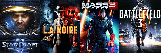
You’ve likely noticed it, and probably even joked about it: it feels like every game (and movie) these days is all about the colours blue and orange, at least when it comes to posters and box art. There’s a very good reason for that.
It’s more than a trend: there’s some science and colour theory behind it, which attempts to explain not only why the colours are so widespread, but why the trend has shown no signs of abating.
Known as “orange and teal” or “amber and teal”, priceonomics explains (via Laughing Squid) a theory that the effect has dominated the movie business over the past few years thanks to the prevalence of colour digitisation (where the colour palette of a movie is digitally altered).
The big change that digitization made was it made it much easier to apply a single colour scheme to a bunch of different scenes at once. The more of a movie you can make look good with a single scheme, the less work you have to do. Also, as filmmakers are bringing many different film formats together in a single movie, applying a uniform colour scheme helps tie them together.
One way to figure out what will look good is to figure out what the common denominator is in the majority of your scenes. And it turns out that actors are in most scenes. And actors are usually human. And humans are orange, at least sort of!
Given that contrasting colour schemes are the ones that tend to look the strongest, the shades opposite orange on the colour wheel are…teal. So if one of your most prominent colours is orange, then it stands you should make the other blue.
Another theory is that the onset of digitisation and the recent trend towards orange and teal is a coincidence, and that the two colours were popular in film (and games) long before computers started messing with everything. It’s just that because a few big series (Transformers, Battlefield) started using it that it’s moved on from being a signature look to a convention.
“Unlike other pairs of complementary colours”, TV Tropes’ entry on the trend says, “fiery orange and cool blue are strongly associated with opposing concepts — fire and ice, earth and sky, land and sea, day and night, invested humanism vs. elegant indifference, good old fashioned explosions vs. futuristic science stuff. It’s a trope because it’s used on purpose, and it does something.”
Whichever it is, it’s clear looking at movies, their posters and the promo art for video games (here’s a website that only shows examples of amber & teal box art) that the trend is here to stay, at least for the foreseeable future.
Comments
8 responses to “Why So Many Games (And Movies) Are Blue And Orange”
It could also be said that red is the most striking colour (it has the highest ‘chroma’ or saturation of all hues) so having red/orange on the cover will catch the eye. In order to make the red/orange stand out you have to have a complimentary opposite next to it to create maximum impact. No one wants green and red (it just makes me think of christmas) so blue contrasted with red/orange is used instead.
Red also has big psychological impacts to humans thanks to the association with blood.
Yea there are definitely a lot of psychological connotations that go along with it.
The “opposing end of the colour spectrum” theory doesn’t hold water when you consider the lack of red/green and yellow/purple posters. The “opposing concepts” theory rings true, as it represents conflict, which excites the human mind in so many ways, and on so many levels.
I absolutely hate this Teal/Blue and Orange thing that’s going on these days. Most current movies have it (especially action movies eg. Transformers) and what’s worse is that Hollywood has been applying it to older movies via Blu-ray as well – eg. Terminator and Aliens.
Yeah, I am a colourist, and the ‘blockbuster look’ is in demand, and it usually means a push towards orange and teal in general. It makes sense, as it is a dynamic look, and works in well with skintones, but it has certainly become the go-to look and is feeling a bit tired.
I am so agains the revisionist colour of BD releases of classic films though, as a colorist, I go through and colour correct them back to the prints for my own viewing pleasure, and it is quite amazing how much they have tweaked some movies compared to their theatrical releases.
Of course colour timing utilising the opposing sides of the colour wheel is nothing new, it has been used in all visual art for hundreds of years, but it has certainly been overused recently in movies.
Can’t say I noticed, tbh.
You’re a few years behind – just look at the games in the picture above, the most recent is about 3 years old.
They are contrasting, eye-catching colours and the trend was noticed and complained about constantly a couple of years ago, which is why less and less games are using them (I think the new trend is green and red/brown though, seems to be picking up more and more).
This isn’t the first article on the subject either. It seems to get rehashed every 6 months or so.