There’s an art to designing a good user interface. Some companies, like Apple and Google, know this. I get the impression Valve… doesn’t. At least not all the time.
The company’s “Big Picture” version of Steam is fantastic. It’s simple, clear and fast to navigate. Its bread-and-butter, though – the standard desktop client most people use – is a bit of a shambles.
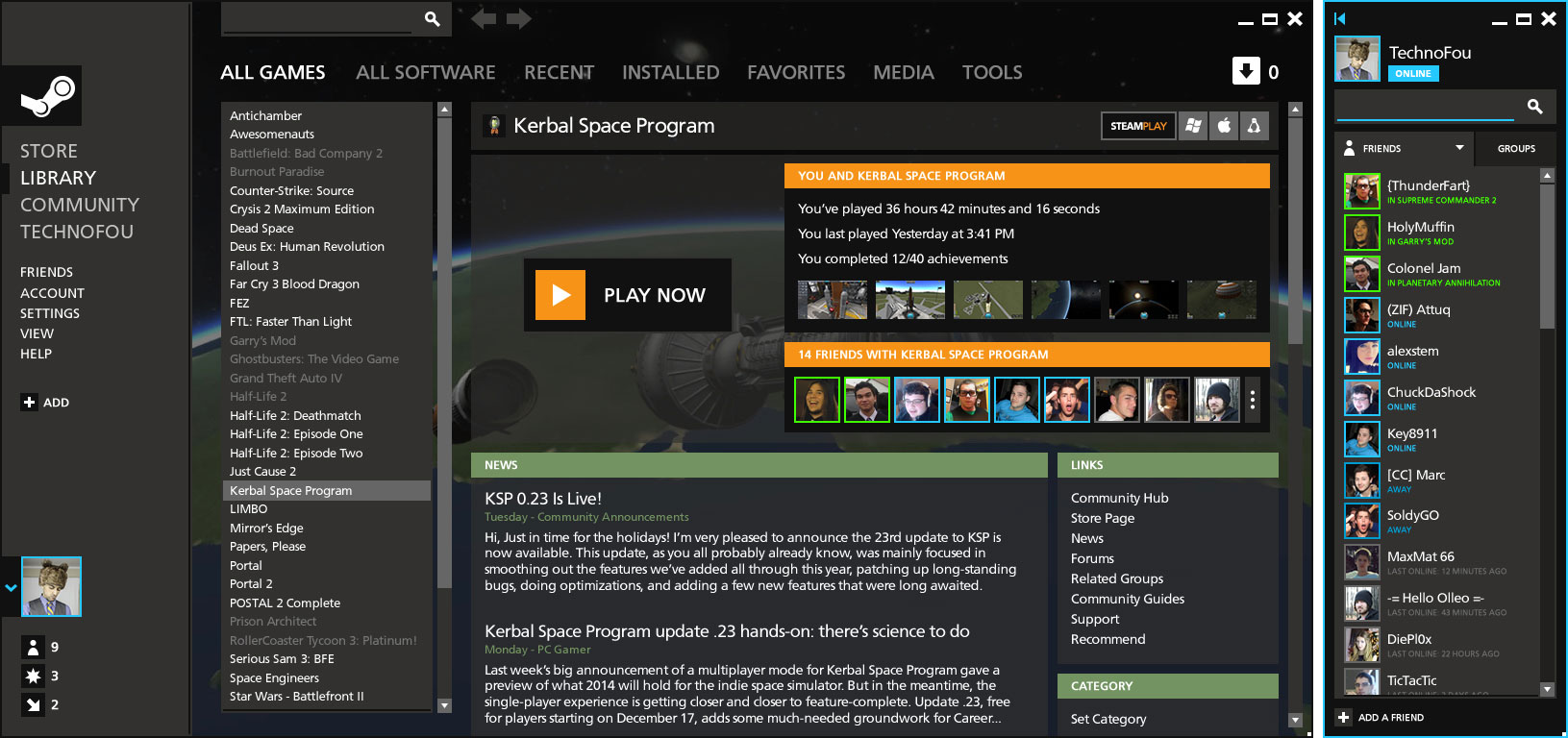
Not only is it slow, but it’s awfully cluttered. The main “tabs” across the top of the screen work well enough, but once you get into more detail – especially on the store pages – things get messy.
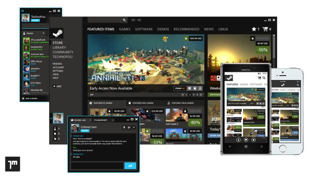
In an attempt to clean things up, designer Jay Machalani – whose work on Windows 8 we showcased a little while ago – has taken a swing at redesigning the platform.
“[Steam is] messy, unorganized and filled with old design principles and ideas: the exact opposite of what Valve is”, he says. “Don’t get me wrong, I love Steam and it works impressively well, but I think we need to move around the furniture and repaint it, get something as sharp as the company itself.”
The main areas he’s looking at are things like the visual appearance (“the use of gradients, half-opacity elements and textured diagonal lines are very dated”) and the way Steam’s services are displayed and organised (“Steam is also suffering from poor app organisation and a lot of repetitive navigation. There are too many unclear menus to do the same task all around the app”).
The redesign concept is universal, Machalani tackling both the desktop client and mobile apps. You can see some examples of his ideas in this post, or if you’re interested in checking out his complete pitch, head to his site for more detail.

Comments
41 responses to “Steam Is Great, But It Could Do With A Redesign”
But it works and it’s hardly slow (well, not if mine’s anything to go by and definitely faster than the current IOS). Last thing we need is multiple redesigns every year or so, like IOS, FB and Youtube have done, and the legion of people who’re pissy with it, banging on at the top of their voices, like IOS, FB and Youtube have done.
It’s pretty slow for me. If I want to say, look at achievements in skyrim, I need to click shift-tab, which is fine, click the achievements button, and then wait about 5-10 seconds and wait for the page to load. Its similar if I want to browse games with the steam client. Its less annoying on their website, but the steam client isn’t very useful because thats pretty much what it is, just a browser for their website,
Gotta agree. The library is fast, but the rest of it that uses Steam as a browser for their store, community pages and so on, is regularly slow.
Need to steamroll that interface FLAT, all the hipsters like their things flat these days.
It sounds like you haven’t tried to categorize your games list. That is such a tedious and horrible interface:
* The dialog to select/create the category looks like you can set multiple categories (which would be neat), but you can’t
* After moving the game, it scrolls up to the category to show you where it moved it. If you have a large game list like me, that means you need to scroll back down again after each categorization.
It may not sound bad, but give it a try and I’m sure you’ll see my point.
Or, yknow, something useful:
http://www.enhancedsteam.com/features.php
Thanks for the link – this looks really good!
Why haven’t Steam integrated these things already? I have been wanting to know what I own and what’s on my wishlist when browsing for years…
I think they just need to make a workshop page for steam itself, dont think too many people realise steam supports skinning
They are usually unstable.
I prefer the old design because the list of games told you more information like meta-rating.
Scroll doesn’t work for me properly on steam.
Works fine for me, but I’m open to try a new layout.
Could definitely do with a way to better sort and categorise games.
It’s so tedious that I gave up. But now 1/3 are categorized and the rest aren’t, so I’m not sure where half of them are.
But it’s too tedious to bother rolling back on it …
Its a shame that WP8 app isn’t the real deal 🙁
I don’t really see what they have done that makes it so much better.
So they have added a left navigation to replace the drop downs across the top and then put the sub navigation items across the top. Then they have splattered a bunch of colours through the client for no really obvious reason other than they think that looking like windows 8 means it isn’t ‘dated’
I’m sure steam could do with a redesign but I hope it isn’t this. It does nothing to overcome the biggest issue I find with steam which is trying to browse the back catalogue. When the best way to browse is to search things could be improved
Steam essentially functions like a clunky web browser, especially for the store parts. Fixing that up would do wonders for the average user. Cleaning up the overlay would be pretty rad too.
They don’t need to do a complete visual update to make Steam functional and if they did, it would probably just be a desktop friendly version of Big Picture mode.
I wish they could show more stuff per page.
I wish I could add stuff to my cart from the search / listings instead of only from the game’s store page.
I’d love to be able to filter and organize my games list more fine-grained than ‘stuff that’s installed’ and ‘stuff that’s not installed’.
They need to completely re-think the way that Early Access stuff is displayed. At the very least think about putting some information down on how complete a given Early Access game is, as there’s no differentiation between a barely functional alpha and a feature-complete public beta that’s a week or two away from full release. Also that stuff pollutes the new releases area.
There’s heaps of areas that Steam could be cleaned up.
All good points.
Add to cart from listing should be possible, I guess the only things they need to be careful of is with early access and other DRM if the user wasn’t told about it. The forums are already full of people crying about how game X comes with uplay and they never would have bought it if they knew or I want a refund on game Y because it requires an internet connection.
You can currently setup your own categories for your games which will break your installed into the segments you want. Which is ok but really fiddly. I’ve also lost all my categories and allocations multiple times so I don’t bother with it
Agree with everything you say about early access, it almost needs it’s own area, section or even keep it as part of greenlight. I don’t know the solution but I don’t like it mixed with my stuff.
All those things and more can be improved but looking at the above ‘solution’ it doesn’t appear to have addressed any of them
I haven’t really looked at this proposal in depth, and I probably agree with you about it specifically. I do think Steam is well overdue for some major structural enhancements though.
I don’t know how steam OS works but I imagine it could be a selling point if steamOS is got a new improved redesign and the old GUI stayed the same.
I don’t think it needs a redesign, but the client could certainly do with a code refresh. It’s slow and clunky, especially when compared to using Chrome to access the store/market/community pages.
Fix that and they can keep the same UI for the next decade as far as I’m concerned.
I’d simply like to be able to arrange my games into folders with just a simple click and drag. Instead I have to right click on each and every title to “move to” a folder. Surely this is not too much to ask.
Personally I think the current mobile version of steam has things almost exactly right, that redesign version looks really quite awful.
Desktop steam really does need work though, the search is a mess, you can find stuff you’re after well enough but if you want to look at the list of stuff on sale, you’re on page 5 & look at a title then go back out, you’re dumped back to page 1 and on occasion the titles are in a different order the next time… that’s pretty damned bad
I’m certainly open to a good redesign, but if what’s in those screenshots above is a suggestion, I’d have to say absolutely not. I never run Steam maximised, it occupies a very specific size on my screen and an extra sidebar would make the main content area far too small to be useful for me.
I think Steam does need a redesign. The more they’ve added the less user-friendly its become.
One thing that really annoys me, when your browsing the games list and scroll down some pages, click on a game page, then decide to hit ‘back’, you’ve got to click down every single page you’ve just sifted through to get back to where you were. Its so annoying, especially when you’re just browsing games in a certain genre.
Apple has good UI design? Have you ever used itunes? its the most unweildly piece of shit ever created.
This. I spent half an hour when they introduced iTunes 11 (or whatever it was) just trying to copy songs to my iPod.
Steam doesn’t need a redesign, it’s a overhaul of functionality because the market search is inherently basic, similar to store search, store is overloaded with DLC’s and should highlight wishlist and remove owned games.
Then comes the stagnant archaic library management, SPUF which should be phased out and friend/group chat needs to be improved.
There’s a lot of things to criticize steam about but when it comes down to it, it’s a client to run games, stalk profiles and make trades happen…it works in a basic level but can be so much better.
A redesign will make it user friendly a tad bit but frankly they need a whole overhaul on the client and those that are web based.
Gah, no! That would mean we’d be left only with SPUD, and nothing good could come of that.
I’ve been using Metro for Steam http://www.metroforsteam.com. I prefer how it looks compared to the default skin. Runs well, too.
“There’s an art to designing a good user interface. Some companies, like Apple and Google, know this. I get the impression Valve… doesn’t. At least not all the time.”
Has anyone noticed the snarky intros to Kotaku posts? All of them are written with the expectation that their observation is immediately agreed upon by all readers.
I would like an “add to cart” tab next to each title on that main page. To save having to go to each game page, adding to cart, continue shopping, and then starting on the main page again. Would be really useful during the steam sales.
Store functioning less like a web browser would be a great start.
Although being able to open links in new tabs, arguably the best part of a web-browser, is something sorely missing from Steam.
I think it’s fine the way it is and it only frustrates me when companies change appearance so you have to relearn everything. Though it does bother me how slow it is and how broken it can be at times.
I don’t think this is a good idea. Steam’s Ui isn’t perfect, but it is not bad enough to warrant forcing people to relearn an interface. The screenshots look very cluttered, although I do think showing playtime down to the second would be useful. However, I would like an option to have another drop-down menu under LIBRARY just for demos.
The biggest annoyance I have with Steam (aside from category management) is the purchase interface – that’s a pretty important one.
The issue I have is that you can’t open up game pages in new tabs. This means if you’re going through the New Releases / Top Sellers / etc you can’t open interesting games in a tab.
You need to go into each one, maybe add to cart, then go back to the store page, find which section and page you were on, and continue looking through.
It makes it painful to buy multiple titles, and it’s cost them sales by probably more than just me.
Hold Shift and left click the game you want to look at, mate. It’ll open up a new window.
Never knew that, thanks!