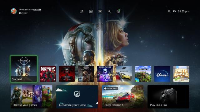
Microsoft’s long-awaited dashboard redesign for the Xbox Series X/S is finally rolling out for everyone starting today. It’s a welcome update that lets players highlight their favourite game art while also opening more options to get around the Xbox home menus more quickly. If only it didn’t still include so many Game Pass ads.
“When we first showed Xbox Insiders what we were working on we heard your feedback clearly—you wanted more room to show off custom backgrounds or game art, quicker navigation options, and more personalization,” Ivy Krislov, Xbox experiences product lead, wrote over on the Xbox Wire blog. “Over the last eight months since initial release, we’ve implemented changes to meet those requests and have a new Home that feels fresh, puts the focus on your games and apps, and creates space for beautiful backgrounds.”
The new dashboard, which will slowly roll out to all Xbox Series X|S users in the days and weeks ahead, includes five main improvements:
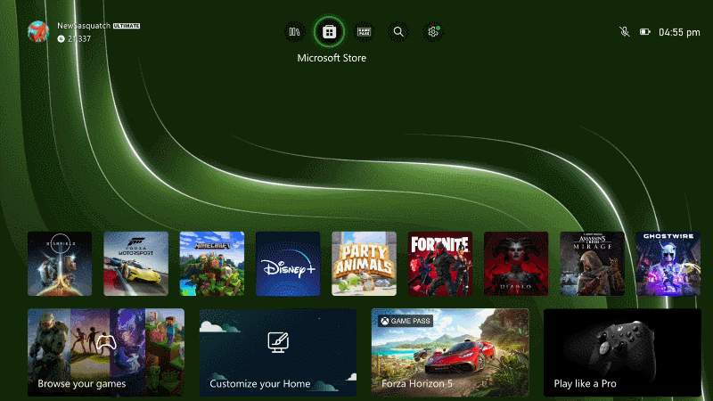
- Adds quick access menu for Game Pass, Settings, and more at the top
- Pushes the first group of icons lower to make room for background art
- Introduces an option for dynamic game art so the background changes depending on the icon currently selected
- Curates lists of games you might be interested in
- Lets you pin suspended games to the home screen.
On the whole, the redesign is a nice mixture of minimalism, customizability, and efficiency. No core feature or option is more than a couple of button presses away, and the rest of the time, it’s easy to display your favourite Xbox backgrounds rather than having your eyeballs accosted by a ton of random squares. I especially like being able to have my Quick Resume queue out in the open rather than stashed away in a submenu.
There are still some issues, however. The pinned groups at the bottom after the first page are wedged below a mandatory “Recently Added to Game Pass” row. One of the slots on the home screen is also reserved for advertising Game Pass games, even if you’re already subscribed like I am. Another tile is dedicated to hawking other paid content, deals, and new sales. And once you scroll passed your pinned icons, every new row is basically something about Game Pass: which games you might like, which ones are leaving soon, etc.
“Too many Game Pass ads” was the original complaint when Microsoft first tested the redesign. It has certainly improved things on that front, but it still didn’t do away with them entirely. The PlayStation 5 home screen has plenty of ads too, depending on where you scroll. Those also suck. I paid hundreds of dollars for these consoles. It would be nice not to feel like I’m getting bombarded with deals and upsells, as though I’m standing in front of a service station register.
Leave a Reply