Sometimes, you get shown one thing and then decide to look at a whole bunch of things related to it. That has been me over the past few days with old video game logos.
Over the years, it’s fairly stock-standard for companies to change how their logo looks. Maybe they’ll change it a little bit, beginning life with a dog in the logo and years later deciding they don’t even want the dog there. And hey, maybe there isn’t even a dog. Sometimes they have the same logo from conception to present, and it has never included a dog once.
But logos change! Perhaps it’s to keep up with current trends, as the 90s were a truly wild time and it seems like a lot of these companies just decided to make their logos look Super Fucking Sick Dude before opting for plain letters years later. This has fascinated me for a long time, but never really shocked me.
And then I was informed by game developer and Gexpert Izzy Kestrel that Naughty Dog’s logo used to look like this.
personally i don’t think anyone should be allowed to watch The Last Of Us unless this logo appears before the start of every episode pic.twitter.com/rASfKDFEwD
— izzy “will be at GDC” kestrel (@iznaut) March 19, 2023
I was in shock. And that’s where the rabbit hole began. I’ve gone through the depths of Logopedia and Wikimedia Commons and found so many old and current logos of video games, video game developers, and video game publishers. I thought it might be fun for us to look at them, talk about which ones we prefer, and whether or not we think the company made the right choice with the final product.
Now, before anybody comes for my throat and chokes me to death over a missing video game logo, not all of them are here. Some of the logos of these companies were pretty much copies in different colours, or the company’s name was simply in different boring fonts. I’ve gone for the more jarringly different, or the most interesting evolutions here. Let’s go!
Naughty Dog
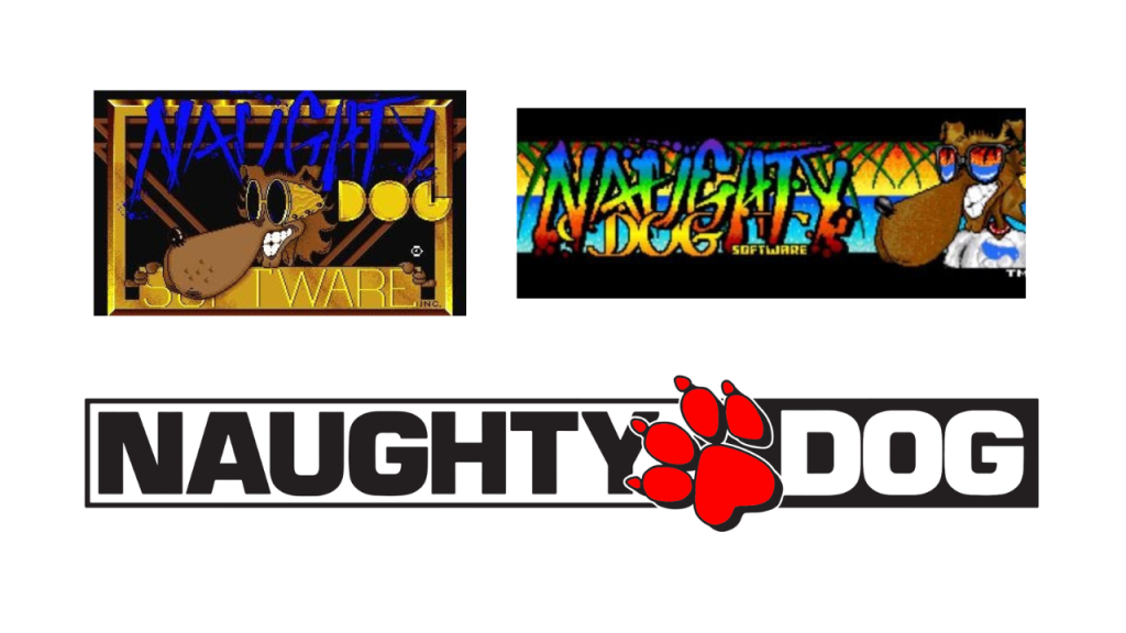
Okay. I think the Naughty Dog logo change is one of the most unforgivable, but not THE most unforgivable. I love this cool dog, I relate to this cool dog. I wear sunglasses sometimes, so he’s actually just like me. The original Naughty Dog logos are such relics of the 90s that I understand why they changed it, but I definitely do miss it.
Nintendo
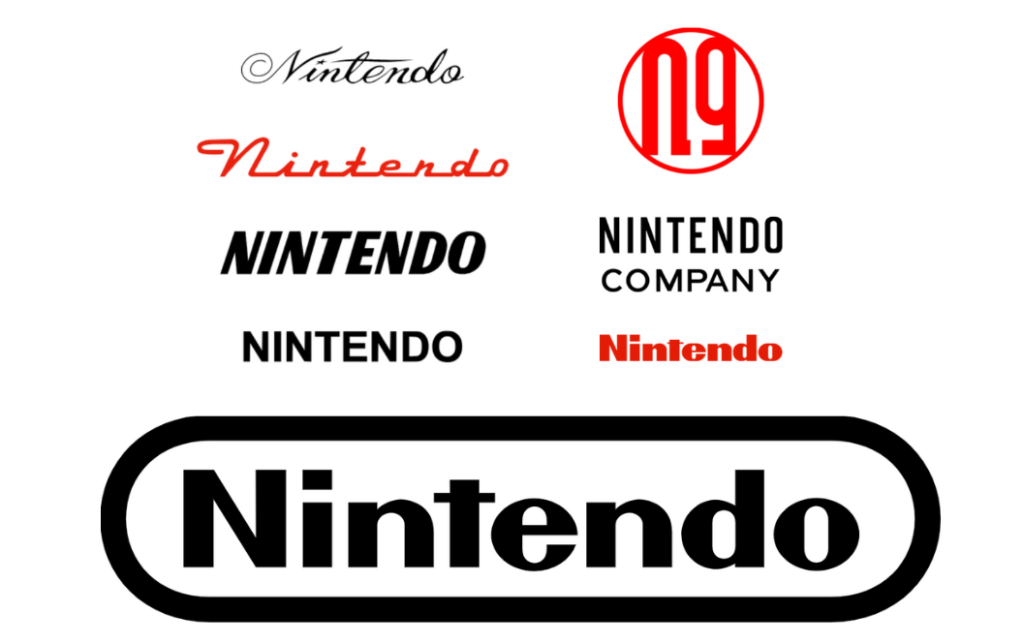
I know that Nintendo has evolved as a company just as much as the logo has, but it is crazy to me that almost all of these logos look like they could be for a car company. Right? Right? That said, I love every single Nintendo logo. I think they’re all great in their own special way.
SEGA
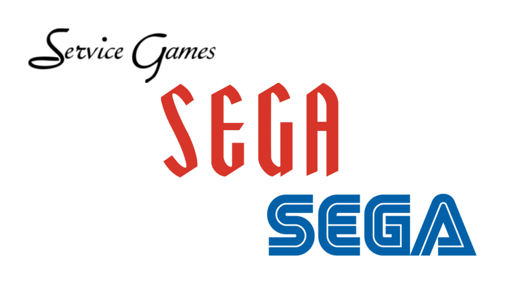
Today, I learned that Sega is short for Service Games. I didn’t know that until today. It’s important for me to be transparent with you here, and let you know that I don’t know every single thing about video games. I’m still learning. That aside, Sega found its footing in terms of its current logo fairly early on in the game, but I am truly obsessed with the Ye Olde Sega logo it had in the middle there. It’s my favourite.
Grand Theft Auto
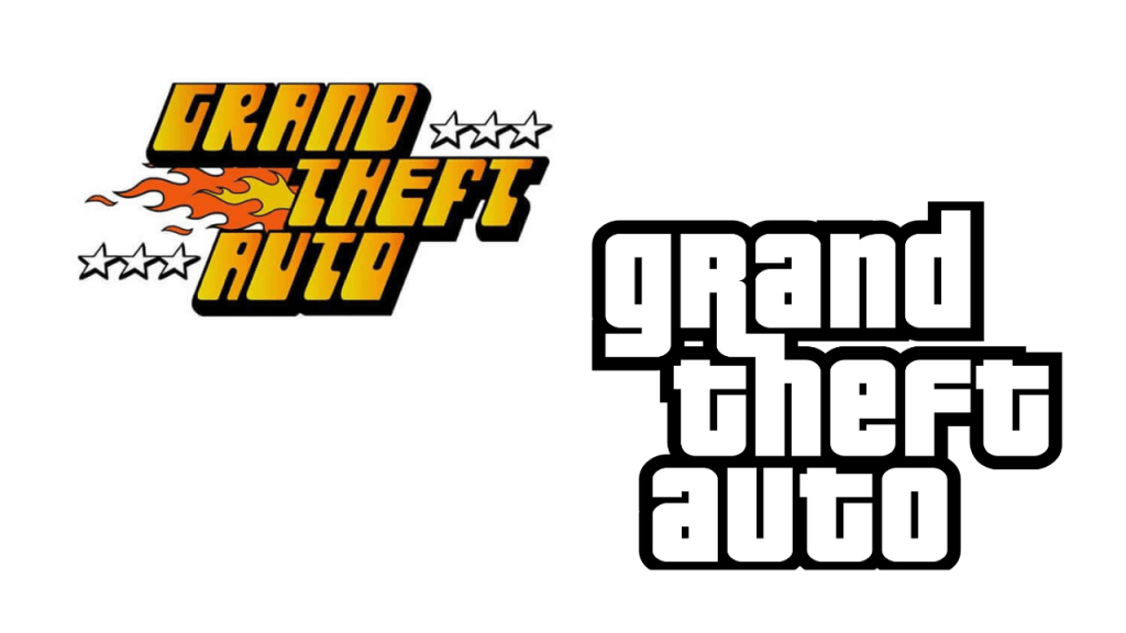
This really feels like a de-yassification. I genuinely think the old Grand Theft Auto is one of the coolest title logos I’ve ever seen. It goes unbelievably hard. I hope they go back for the sixth game. This will be the only exception in terms of video game logos.
Rare
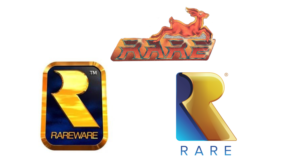
I only found out about Rare’s old logo with the gazelle today thanks to Rare co-founder Tim Stamper posting a picture of the logo last week. This logo is so COOL! It looks both tacky AND expensive, which is almost impossible. That said, the N64-era Rare logo is undeniably iconic, and the current logo kinda looks chewy. I’d love to grab it and chew it for a bit. I didn’t include the black and green logo because it’s boring and ugly.
CD Projekt Red
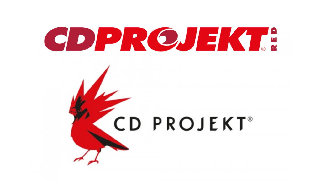
I think that this was a good change, honestly. The newer CD Projekt Red logo has a spiky bird, which is undeniably cool. The previous logo looks like the logo for a printing company, or an off-shoot of a supermarket chain. It looks like the logo of a store that exclusively sells wet jackets. Not a fan.
Square Enix
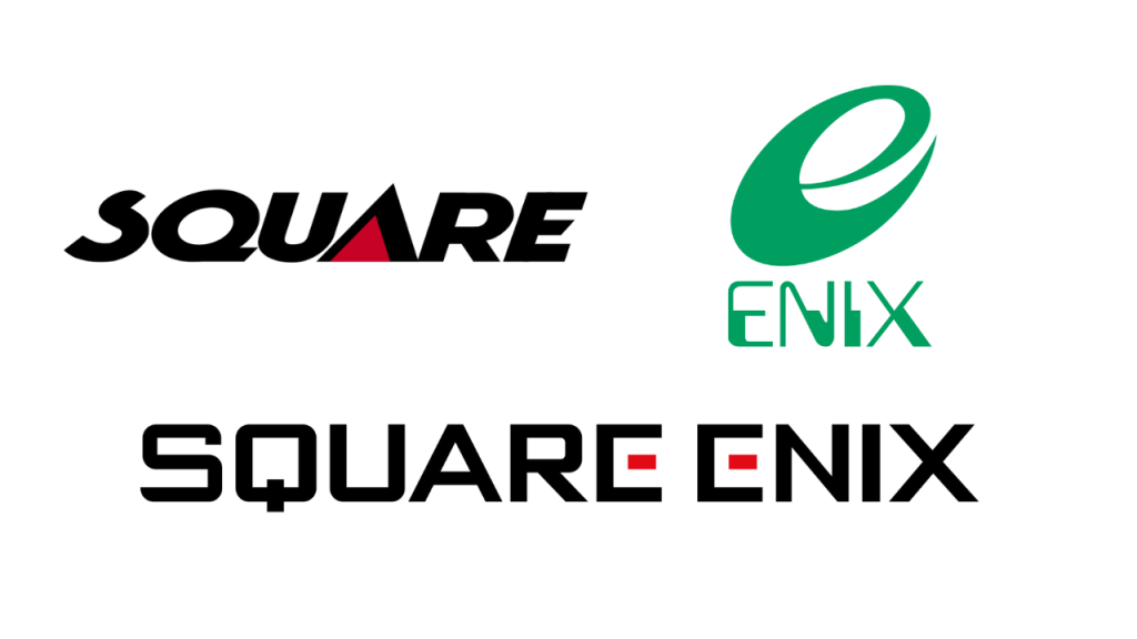
I think Squeenix is a special one because it’s actually the conglomeration of two companies. I think that the current Square Enix logo is actually the perfect mix of both Square and Enix’s logos, sans the Internet Explorer-like ‘e’. I like that in a merged logo. Taking the best from both logos to make one clean one. It’s really nice.
Konami
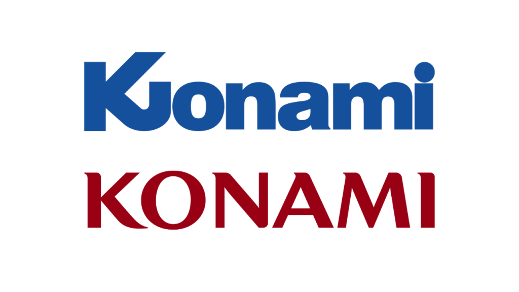
Konami upgraded when it came to logos. However, Konami’s output could actually relate to either of these logos. The second logo looks like a brand that would release Silent Hill and Metal Gear Solid, and the first logo looks like a brand that would largely work in gambling games. It’s perfect!
Infinity Ward
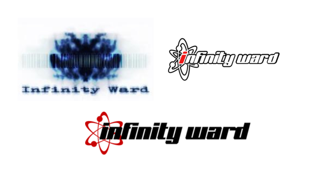
The first Infinity Ward logo gives me Evanescence energy. It’s Evanescence, it’s The Matrix, it’s that one PSA that you always used to see before a movie where it’s like YOU WOULDN’T DOWNLOAD A CAR! Y’know what I mean? The logo now is great, but that old logo is really something.
HAL Laboratory
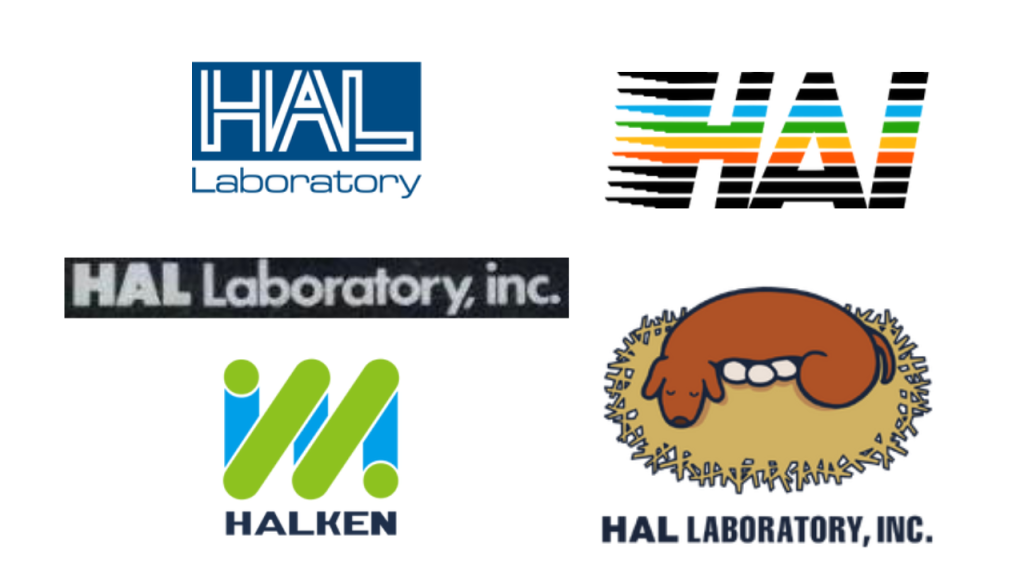
Only one of these logos makes the most sense to exist alongside Kirby, the golden boyo of Hal Laboratory. I think we know which one. In saying that, if you showed me any of the logos that AREN’T the egg dog and told me it was for any kind of company that’s NOT a video game company, I would believe you.
Epic Games
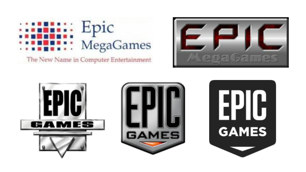
Every single logo here makes sense except for the first one. That is truly the least epic logo I have ever seen in my life. That is the logo of a doctor’s office that specialises in weird rashes. The rest of them scream ‘Video Games’. They are so video games, it’s not even funny. Don’t laugh, it’s not funny.
Criterion Games
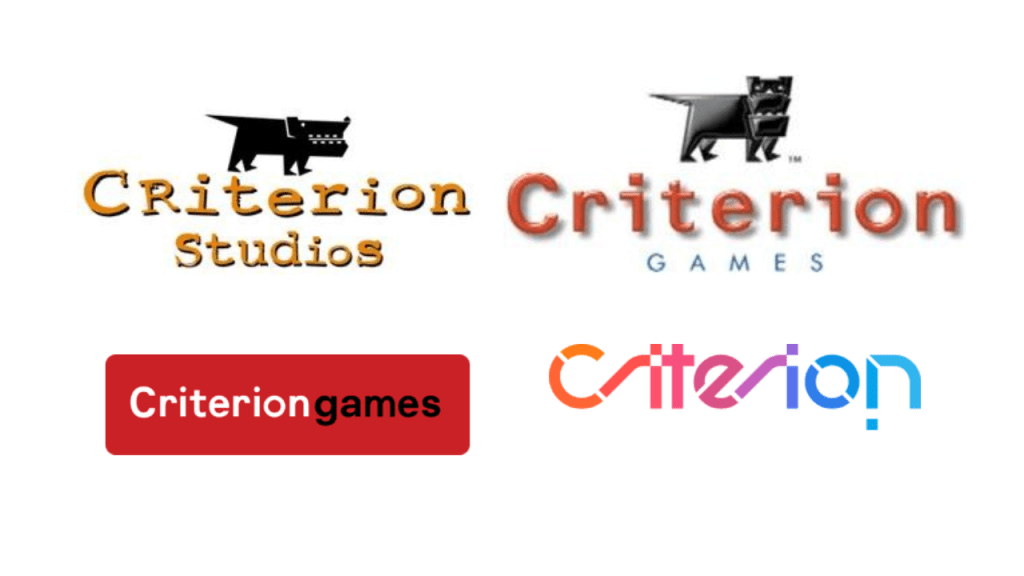
But this one… THIS one is funny. You’ve got the dog looking to the side, and then suddenly… the dog is looking at you. The dog is looking directly at you. And then it’s gone! There’s no dog! And then it’s completely different from what we started with. What happened to the dog? At least with Naughty Dog, there was a paw print. But with Criterion, I am convinced that they left the gate open on purpose so the dog would run away. All because it decided to look into the camera.
Crystal Dynamics
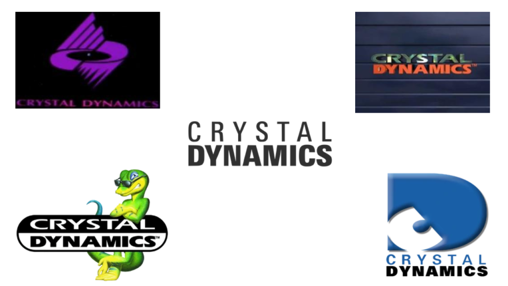
I think we all know which one is my favourite. I personally love when a logo has a much-loved and well-known character in it. The Gex Crystal Dynamics logo is easily the best one out of all of them. It’s the most iconic, by far. Sadly, Gex hasn’t been seen since.
BioWare
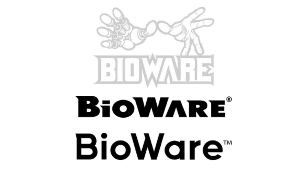
And then there’s BioWare. I think BioWare is the perfect example of a logo slowly being simplified to the point where the only sign of the original logo is on a single letter. In this case, it’s the tiny little spike on the top left of the B. I actually think the middle logo is my favourite out of all three. I think it’s got character, but not too much.
Leave a Reply